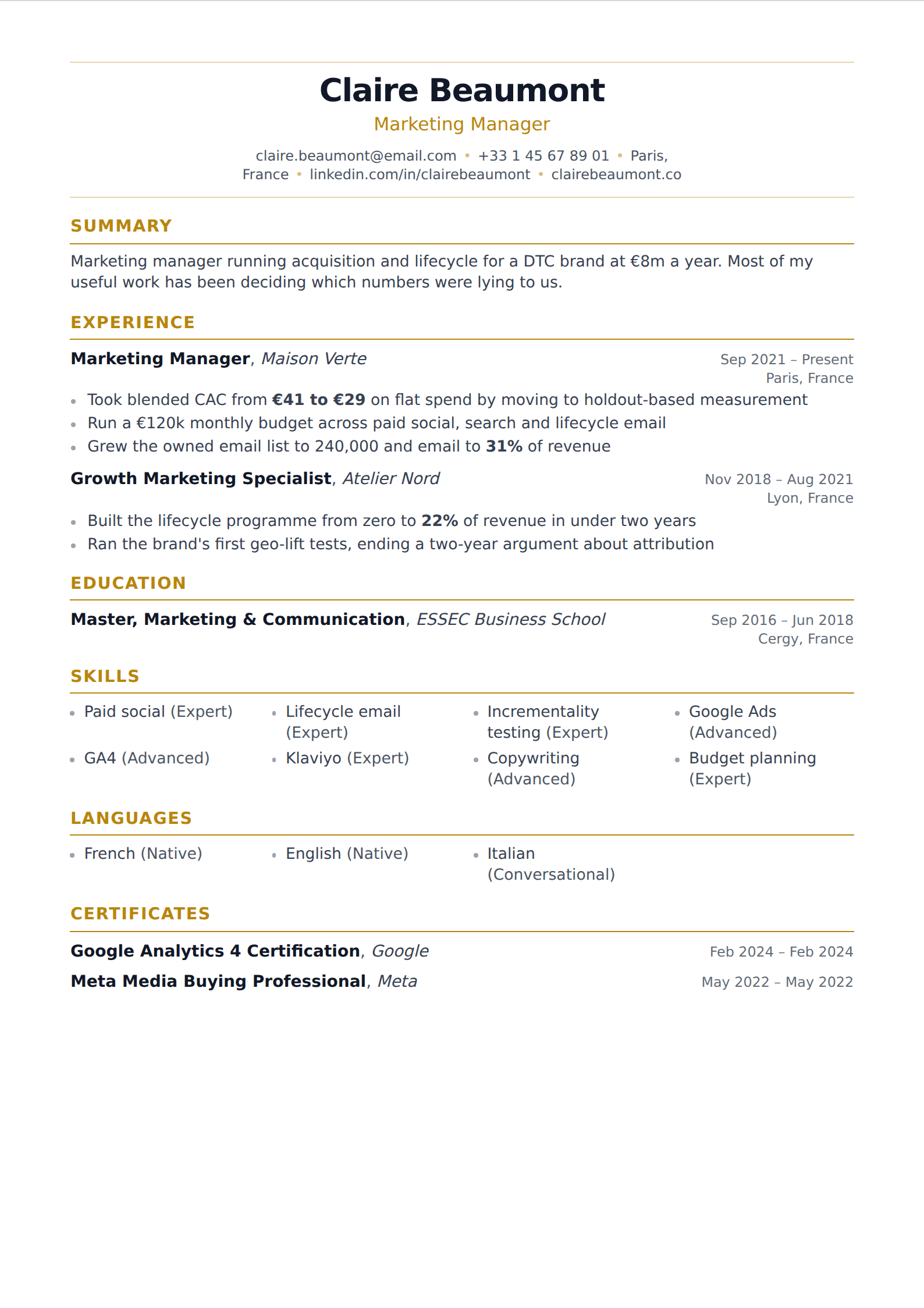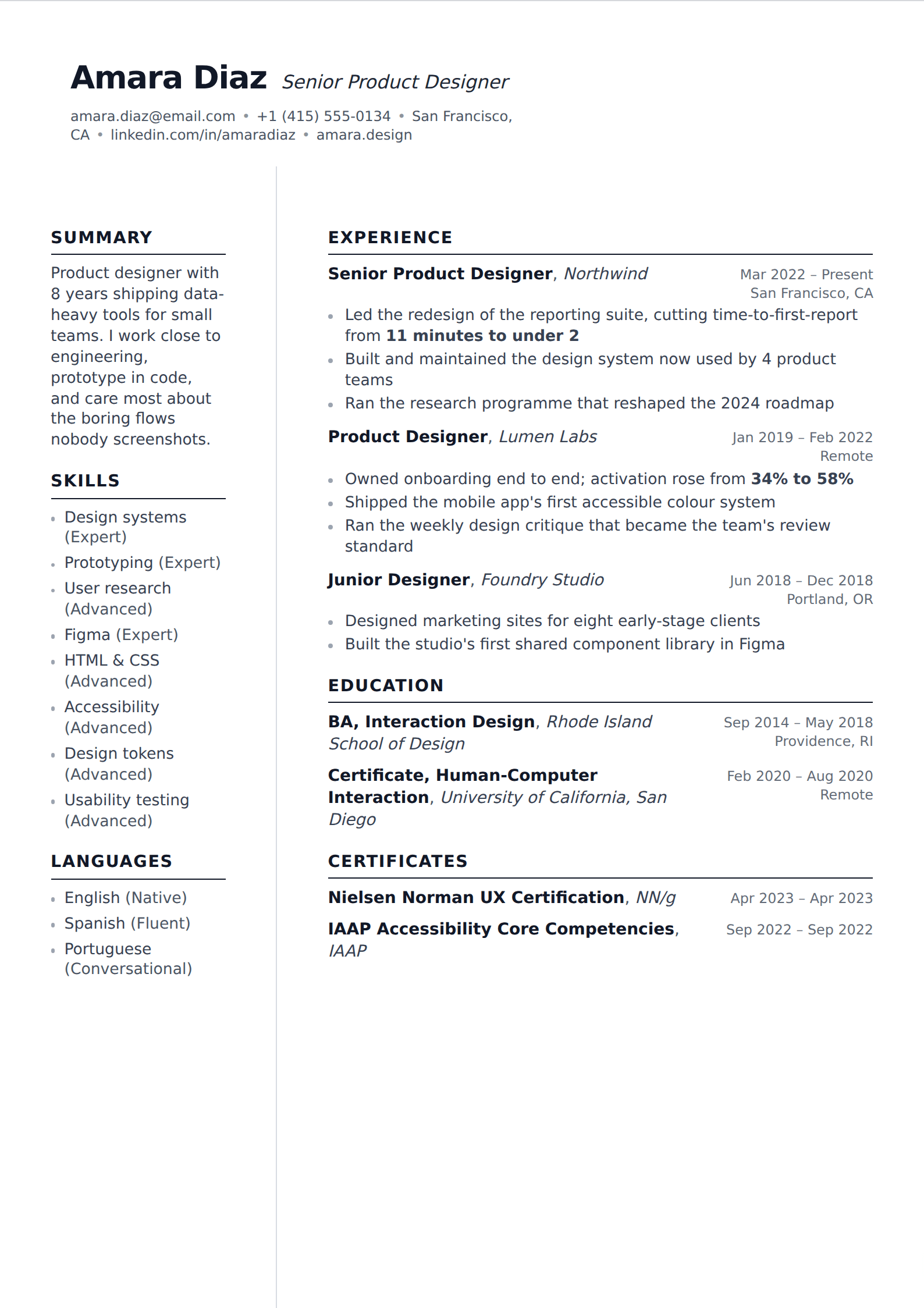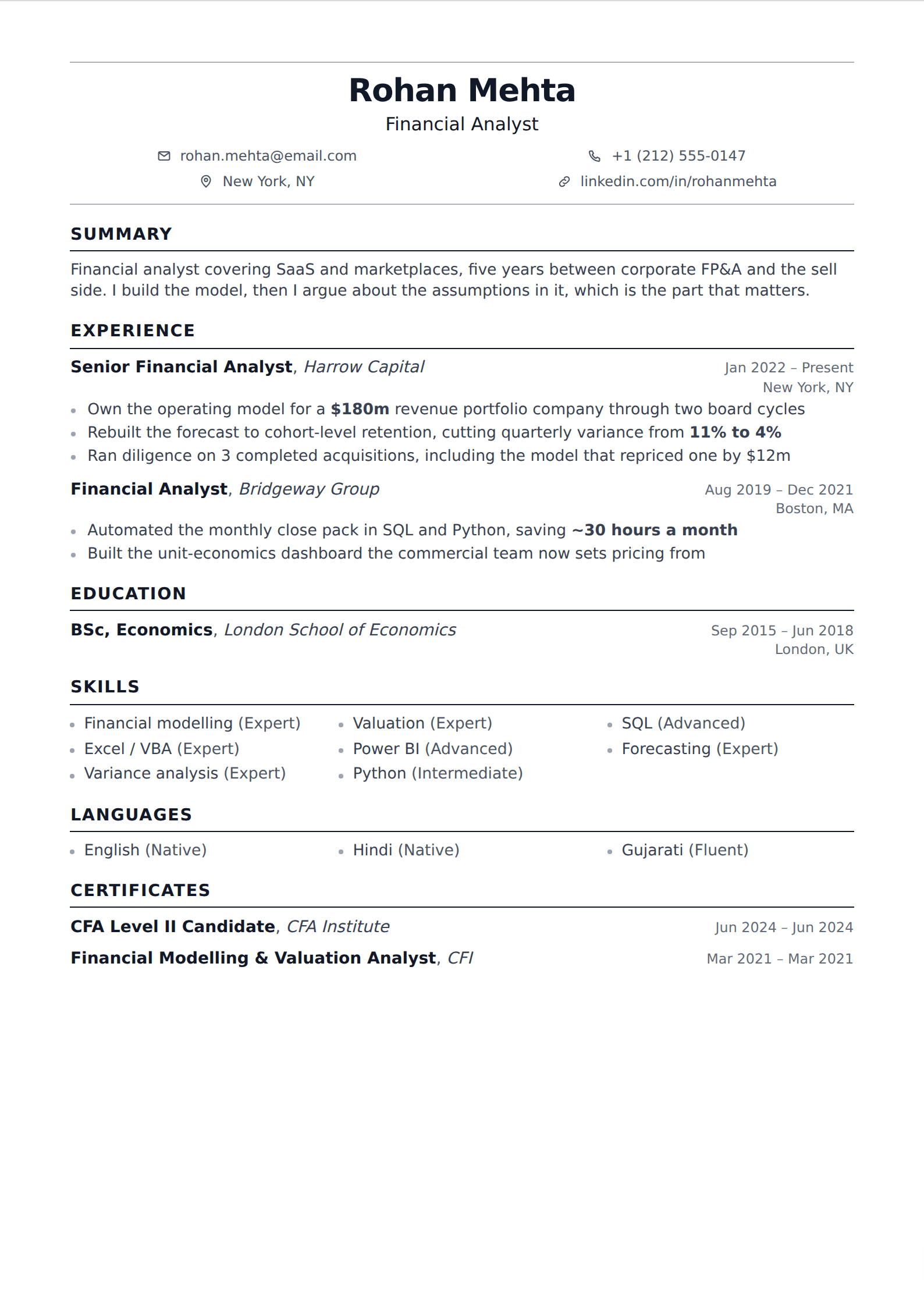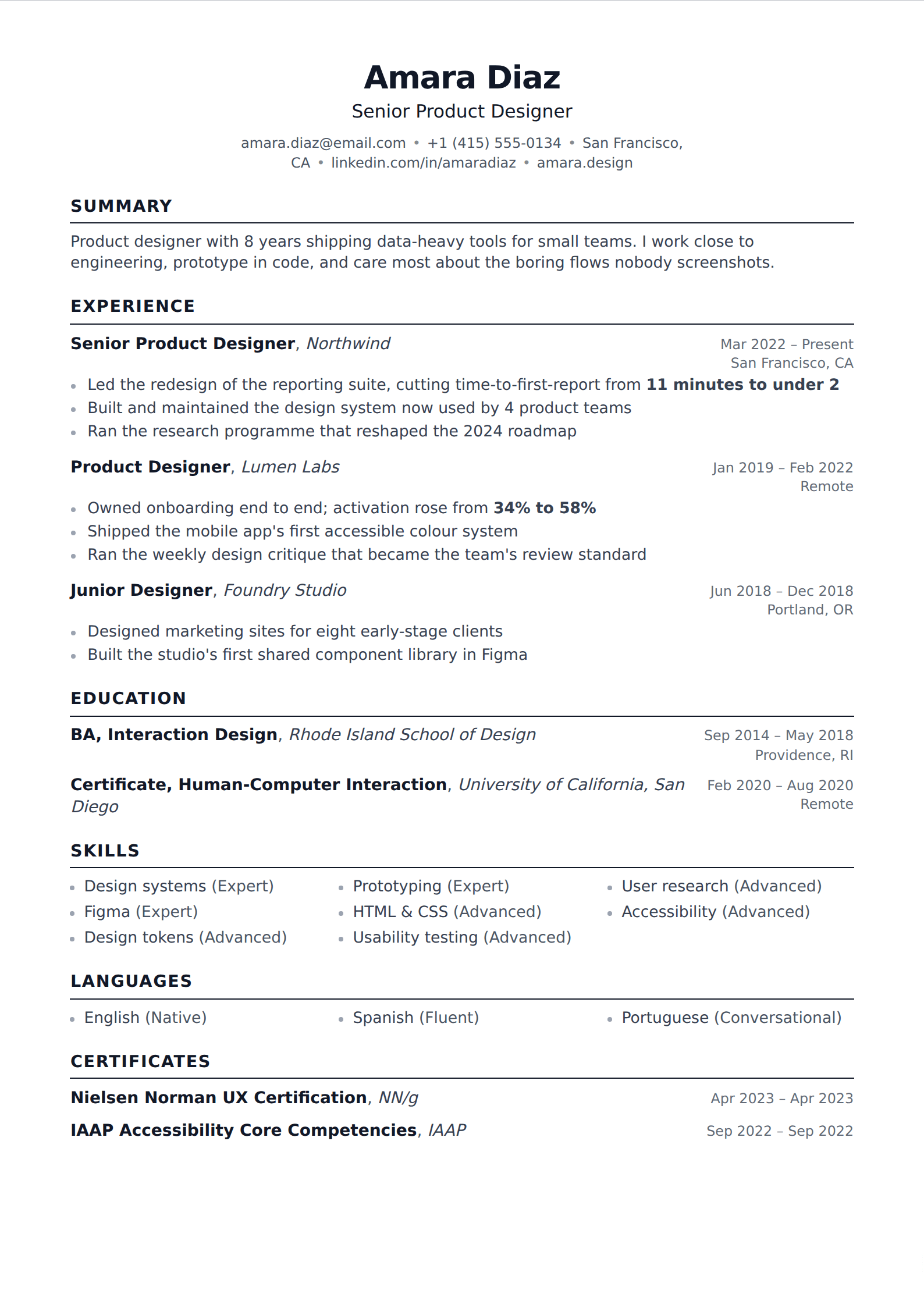
The ten-second test
Put your resume on a screen, look away, look back for a count of ten, and look away again. Write down what you retained. If it is not your current title, your seniority, your field and one thing you achieved, the page has failed the only test it routinely faces.
This is not a metaphor for how recruiters read. It is close to literally how the first pass works when there are two hundred applications and an afternoon. Everything that survives that pass earns a second, slower read; nothing else is ever read at all.
What the good ones have in common
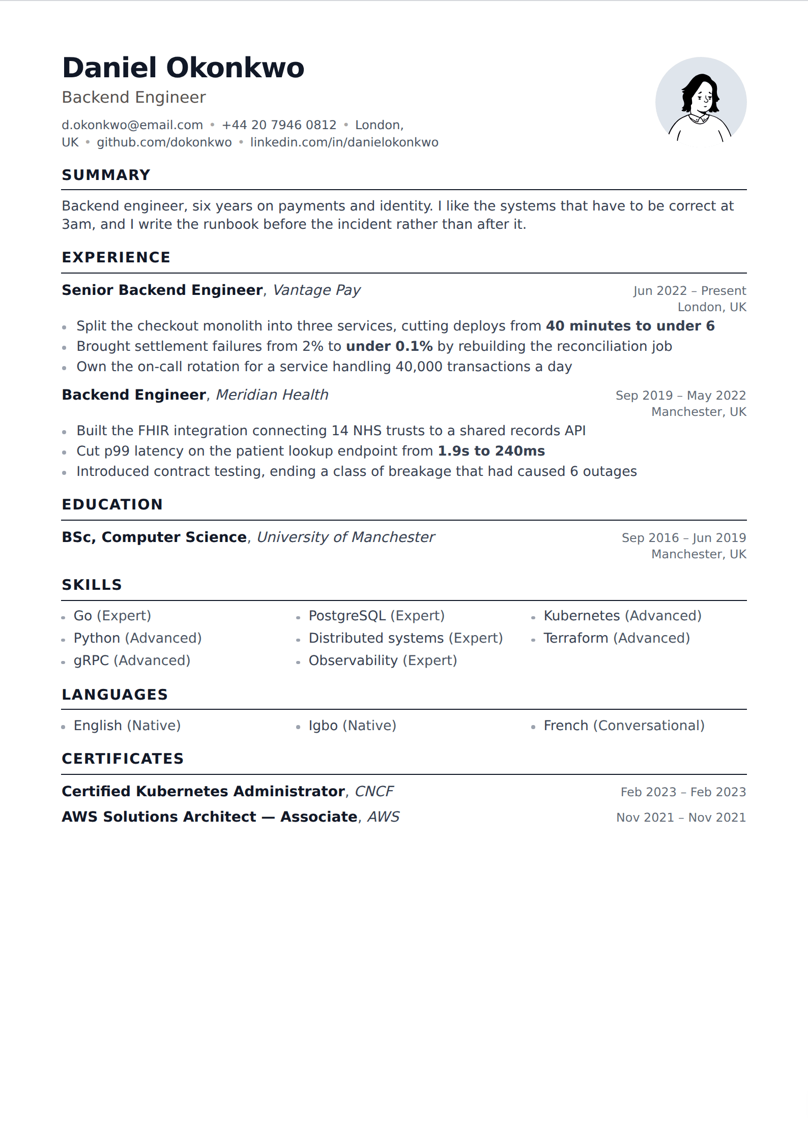
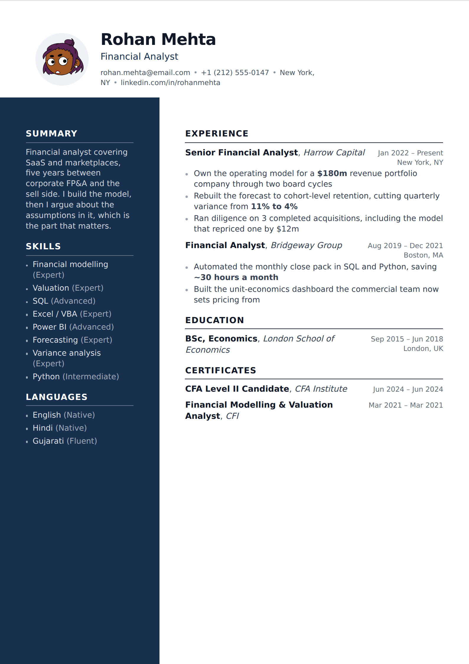
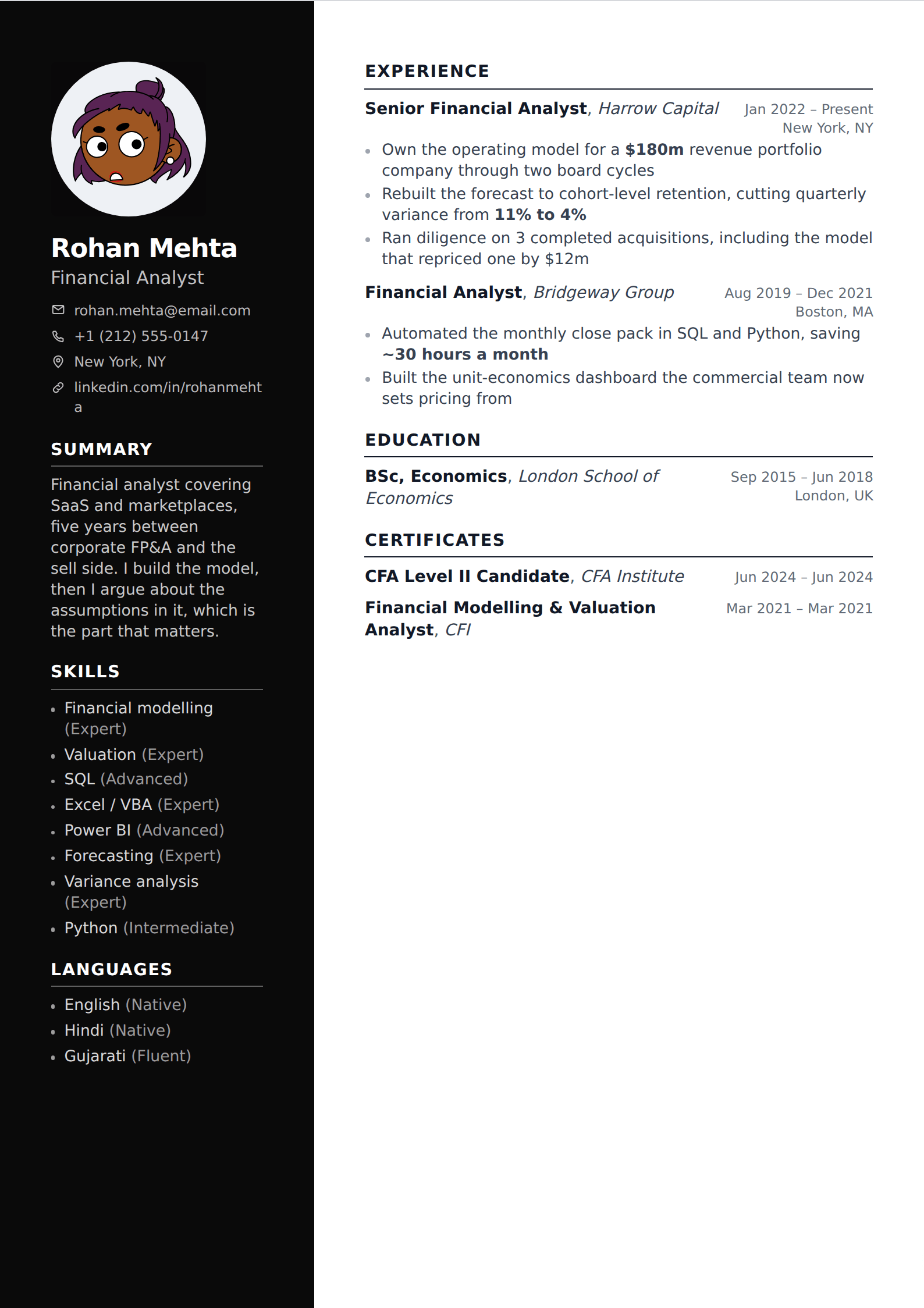
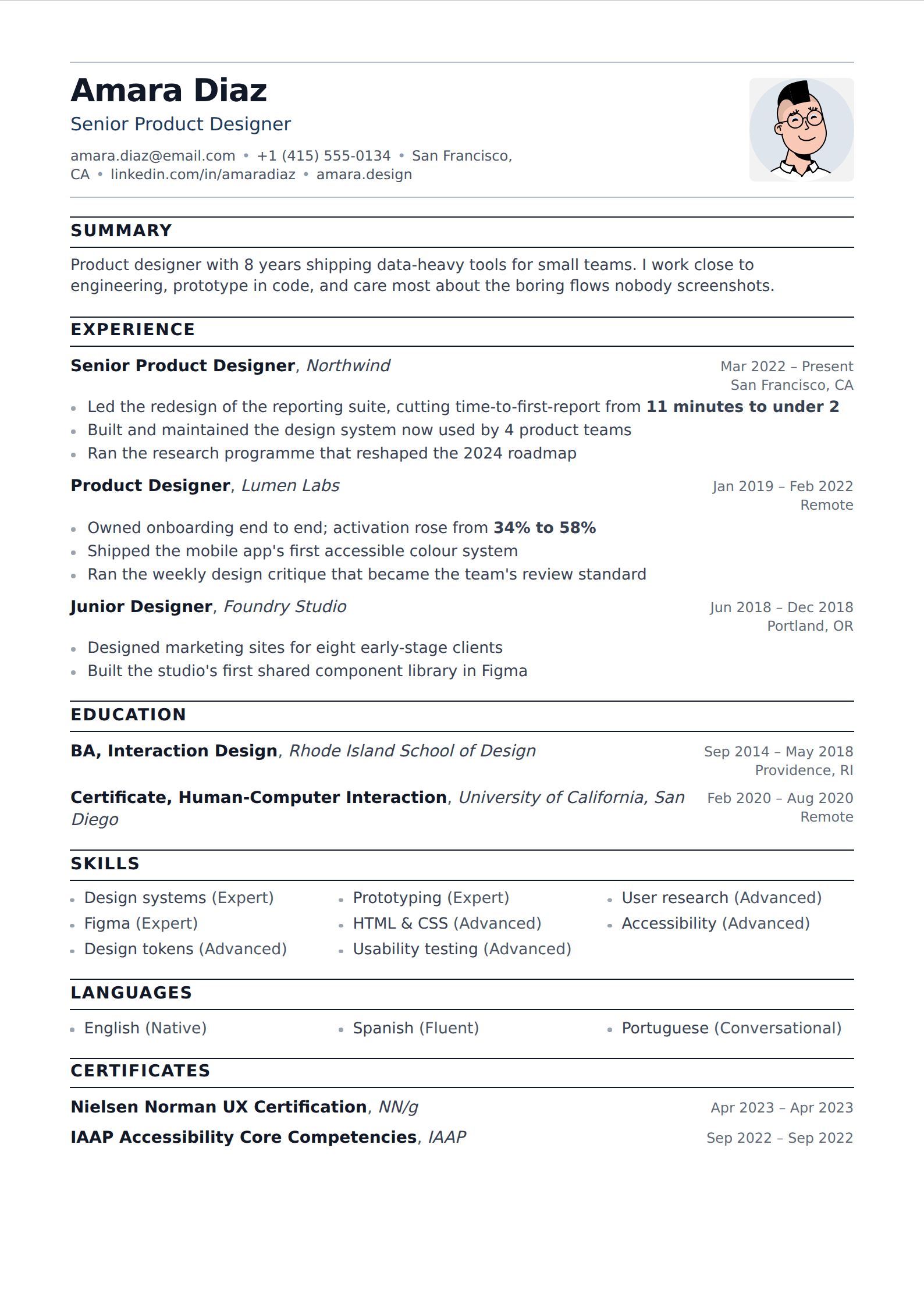
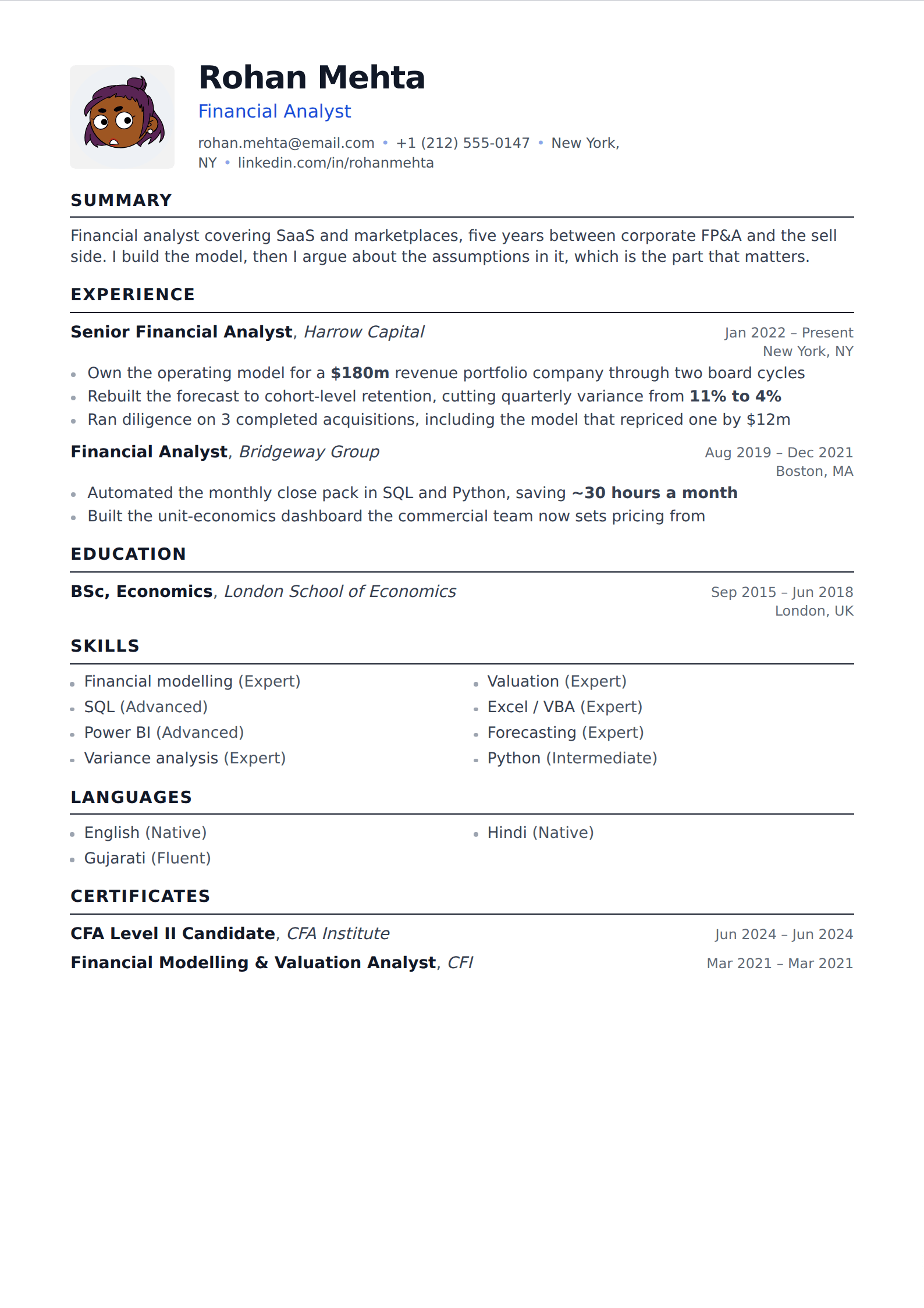
Set beside each other, strong resumes across every industry share the same small set of properties, and none of them is a design choice.
- A single clear hierarchy: name largest, section headings next, job titles above employers, body text uniform. Three type sizes, not seven.
- Reverse-chronological experience, so the reader's eye lands on now rather than on 2016.
- Bullets that end in a result. Not every one — three or four across the page is enough to change how the whole thing reads.
- Numbers where numbers exist, and honest approximations where they do not. "About 40 hours a month" beats no figure and beats an invented one.
- White space that survives contact with a printer. Margins no tighter than half an inch, line height above 1.15.
- One page under a decade of experience, two after. Never a third that exists to hold a 2007 job.
- Consistency in the small things: date formats, tense, punctuation at the end of bullets. Inconsistency reads as carelessness before the reader can articulate why.
What has actually changed
Less than the advice industry implies. The objective statement died and was replaced by the summary. The references line disappeared. Full street addresses came off. Skills sections got more specific and stopped being lists of adjectives. Applicant tracking systems made single-column layouts the safe default. That is roughly the complete list of changes over fifteen years.
What did not change: reverse-chronological order, one to two pages, outcomes over responsibilities, PDF as the delivery format. Anyone telling you the fundamentals have been overturned by AI screening is selling something. Parsers made the format more conservative, not less.
The one genuinely new pressure is volume. AI has made it trivial to apply to two hundred jobs, so employers receive far more applications per opening than they used to and the first pass is faster and harsher than it was. That pushes in the direction of specificity: a resume visibly written for this posting stands out in a stack where most were written for none.
How it should look on the page
One column unless you have a reason. Ten to twelve point body text in a normal typeface. Section headings that are obviously headings without being decorative. An accent colour is fine — one, used on headings or a rule, not four. A photo only if you are applying somewhere that expects one, which in the US, UK, Canada and Australia means no.
The failure mode is not ugliness, it is density. A page shrunk to nine-point type with quarter-inch margins to fit everything is harder to read than any font choice could make it, and the fix is cutting content rather than compressing it. If it does not fit at eleven point with real margins, you have too much on it.