
Professional resume templates
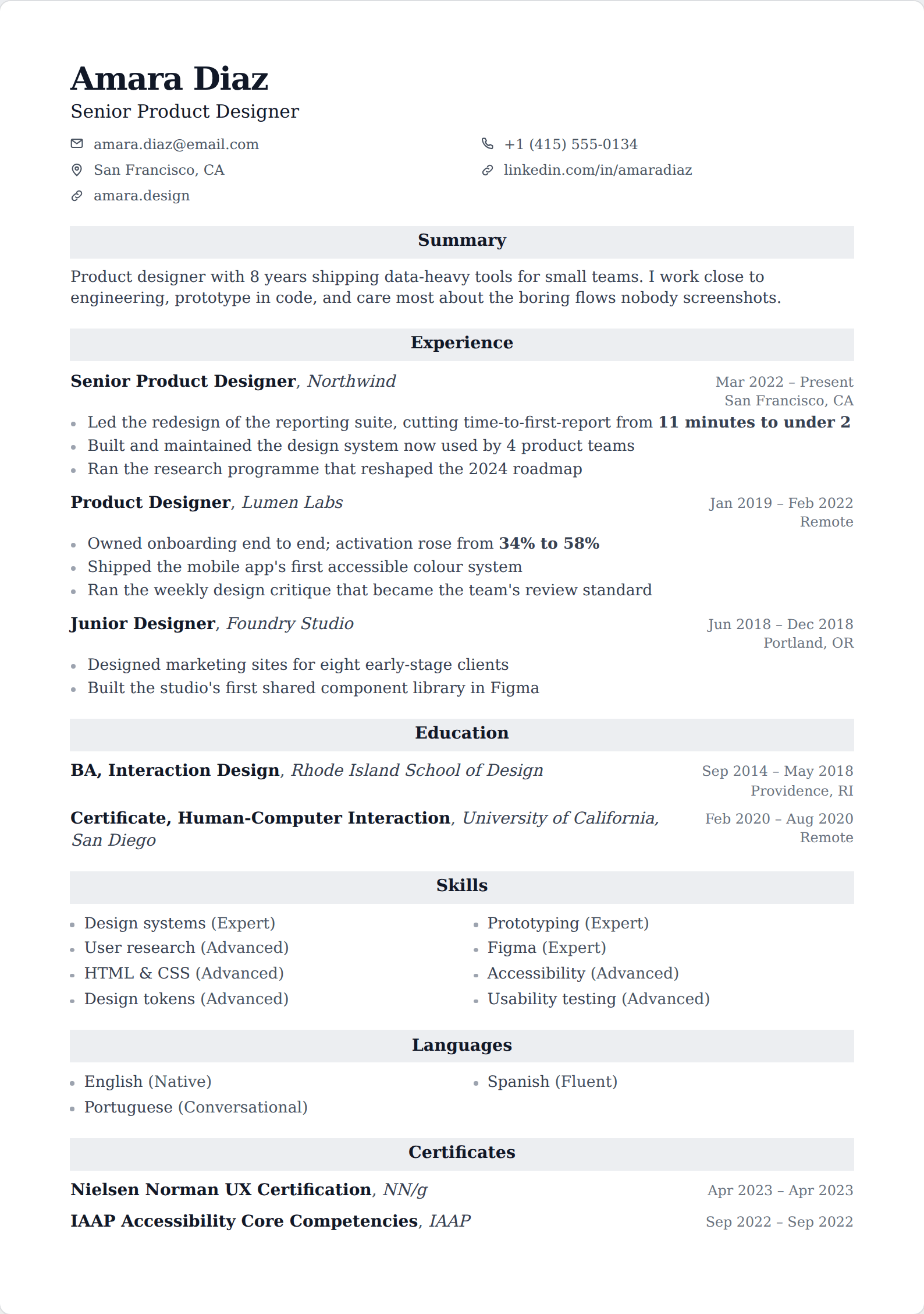
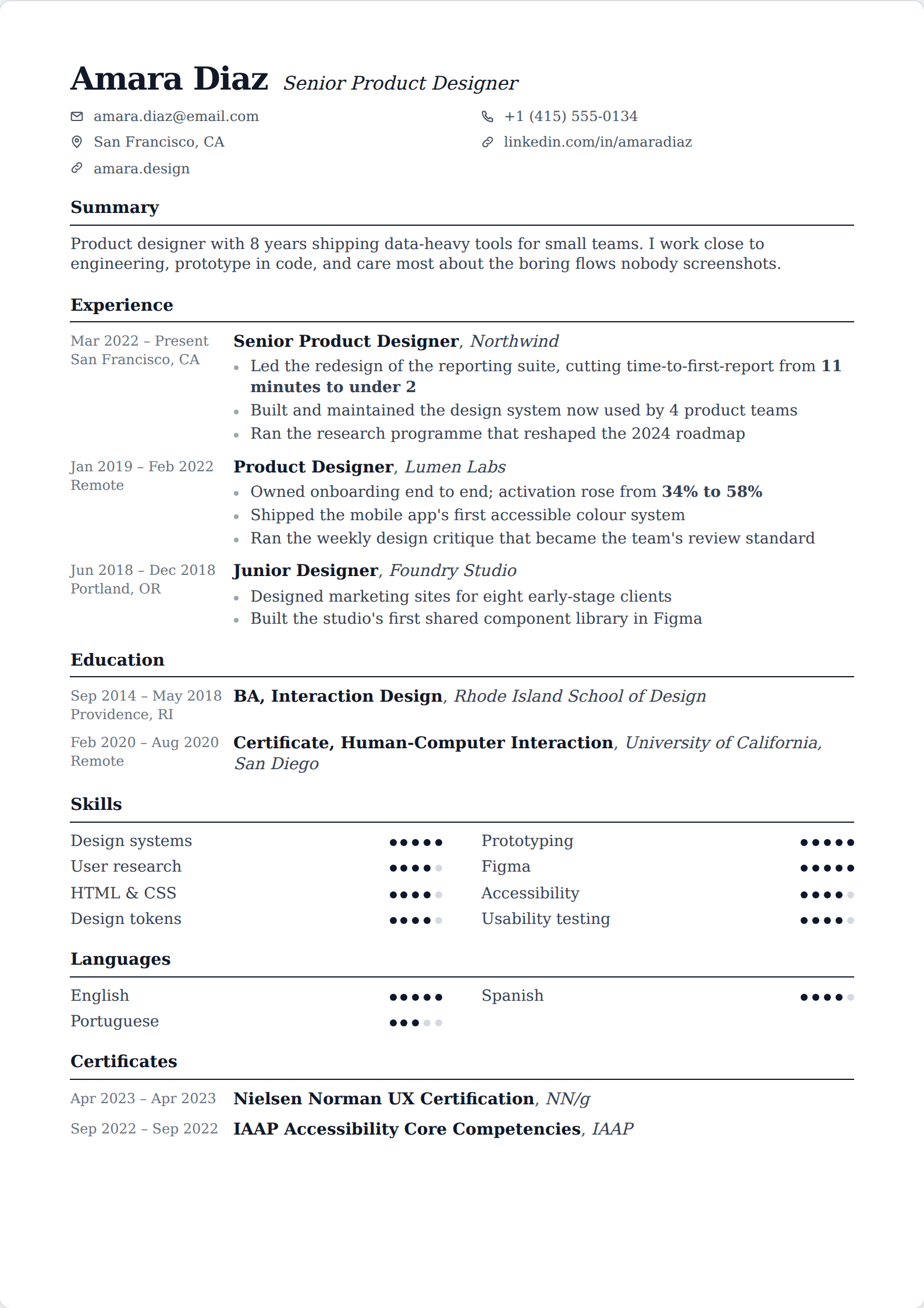
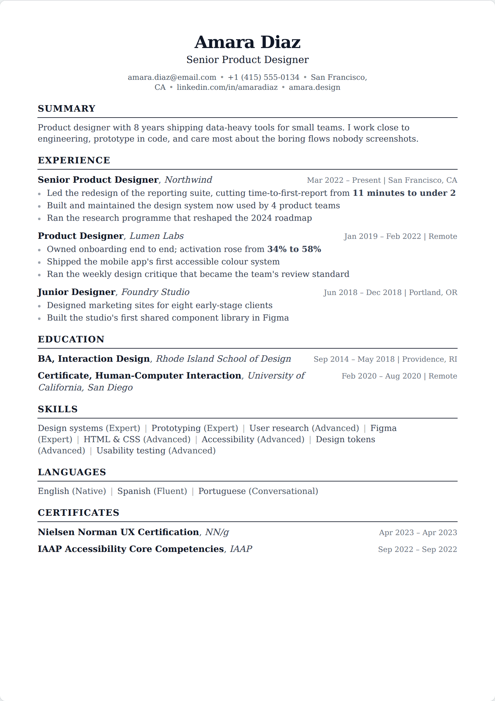
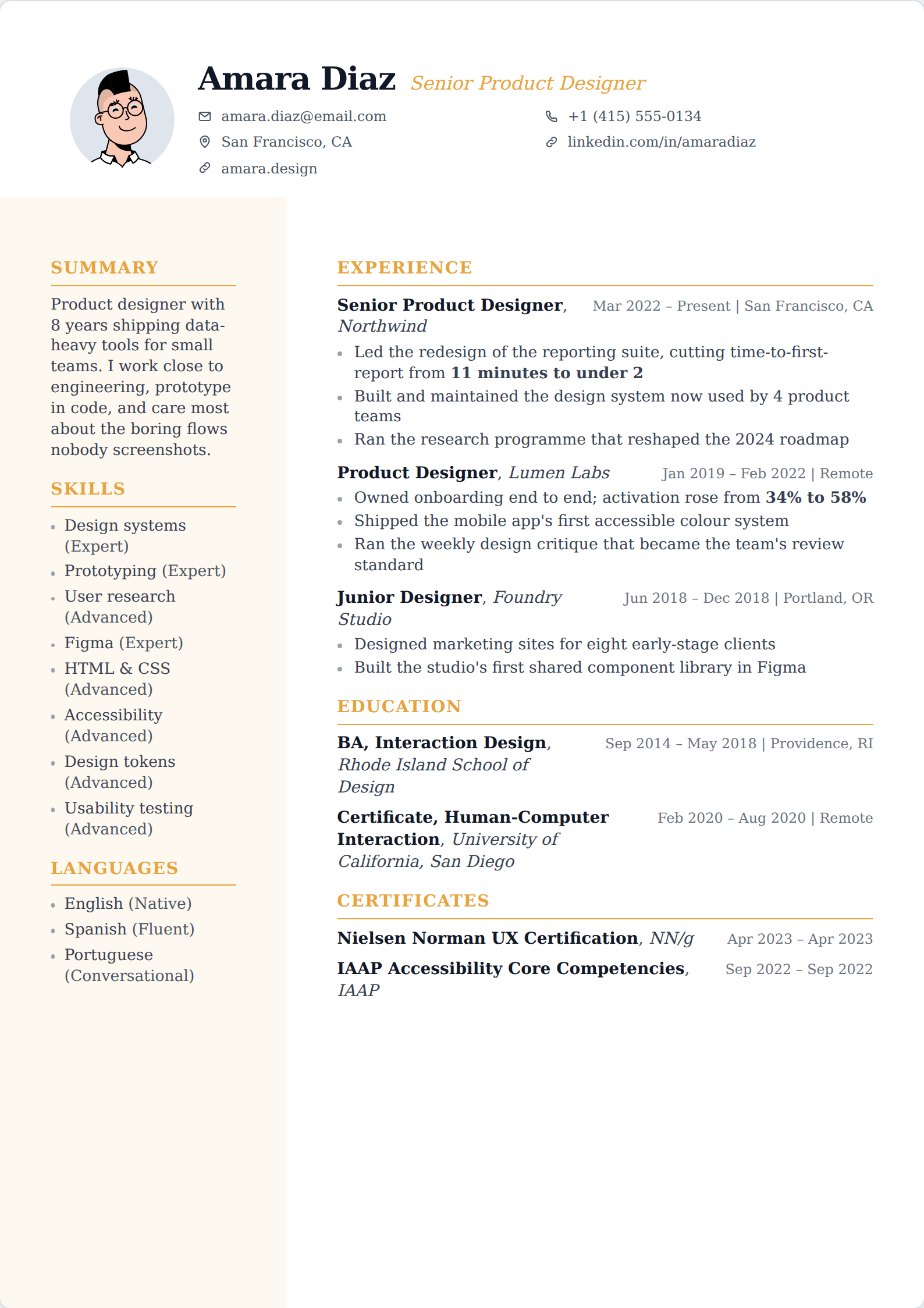
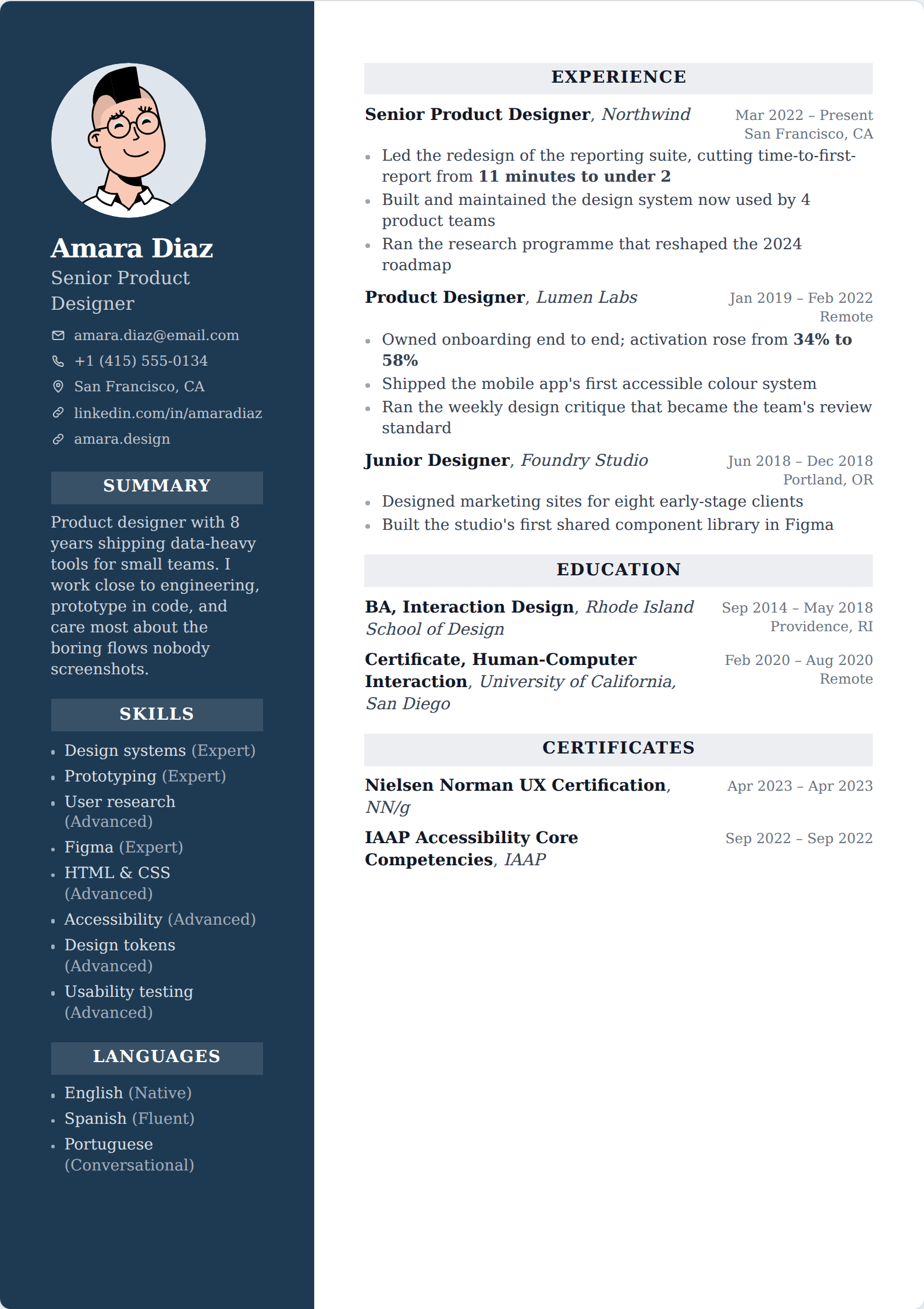
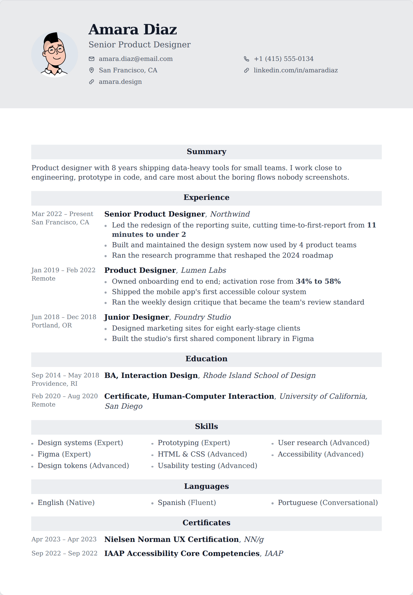
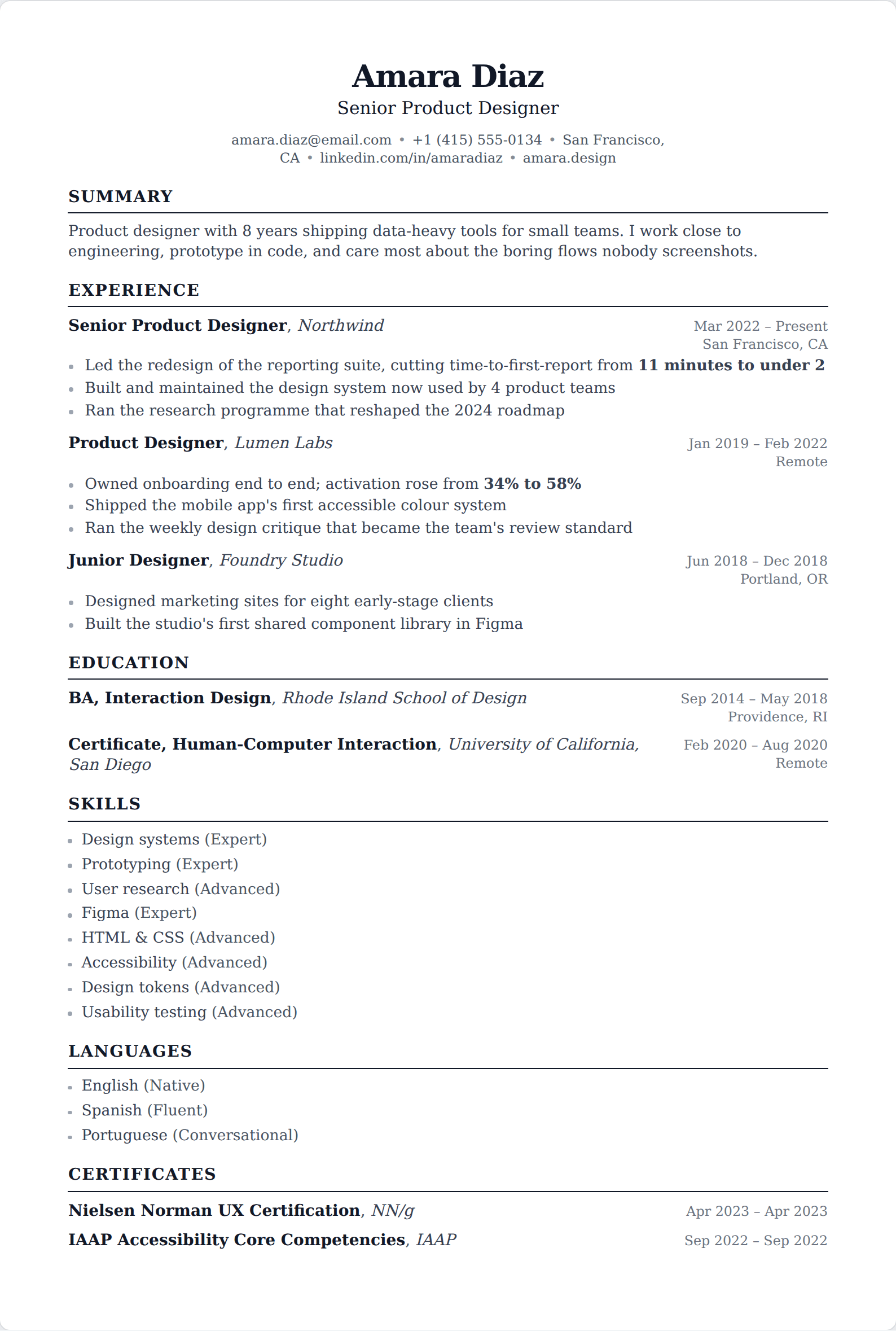
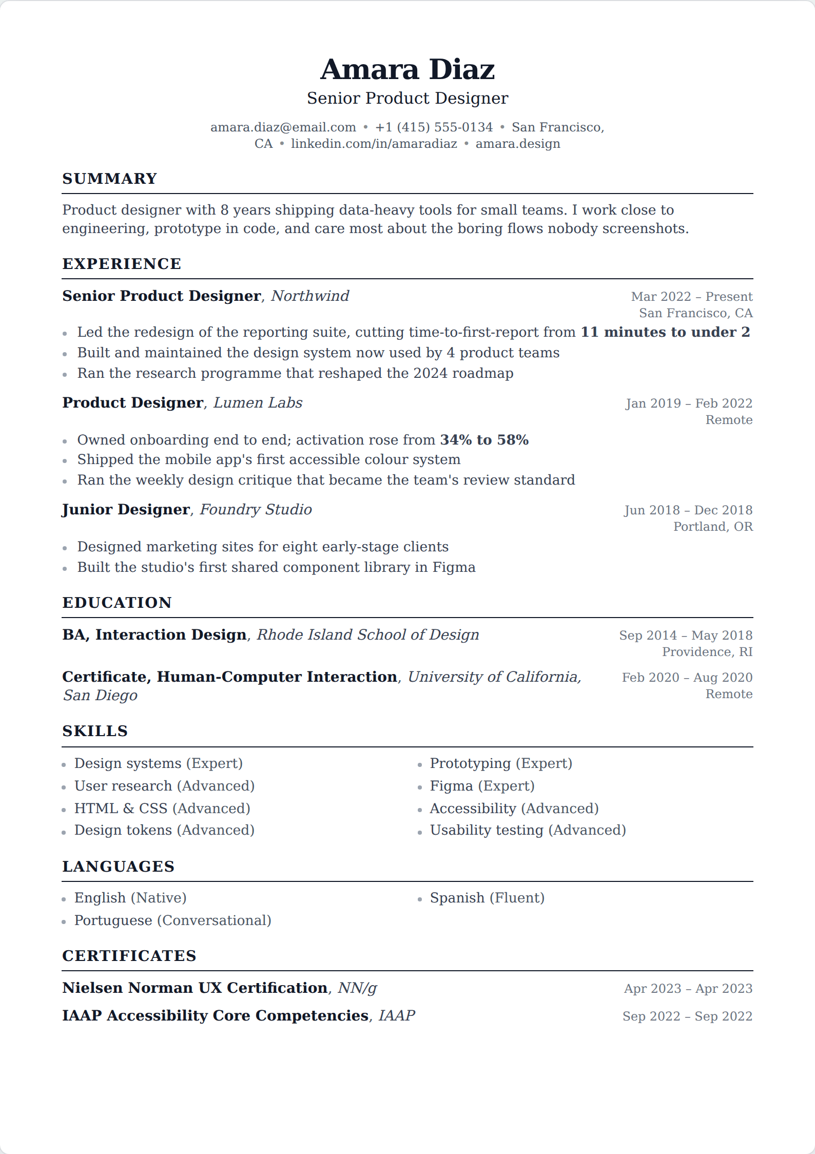
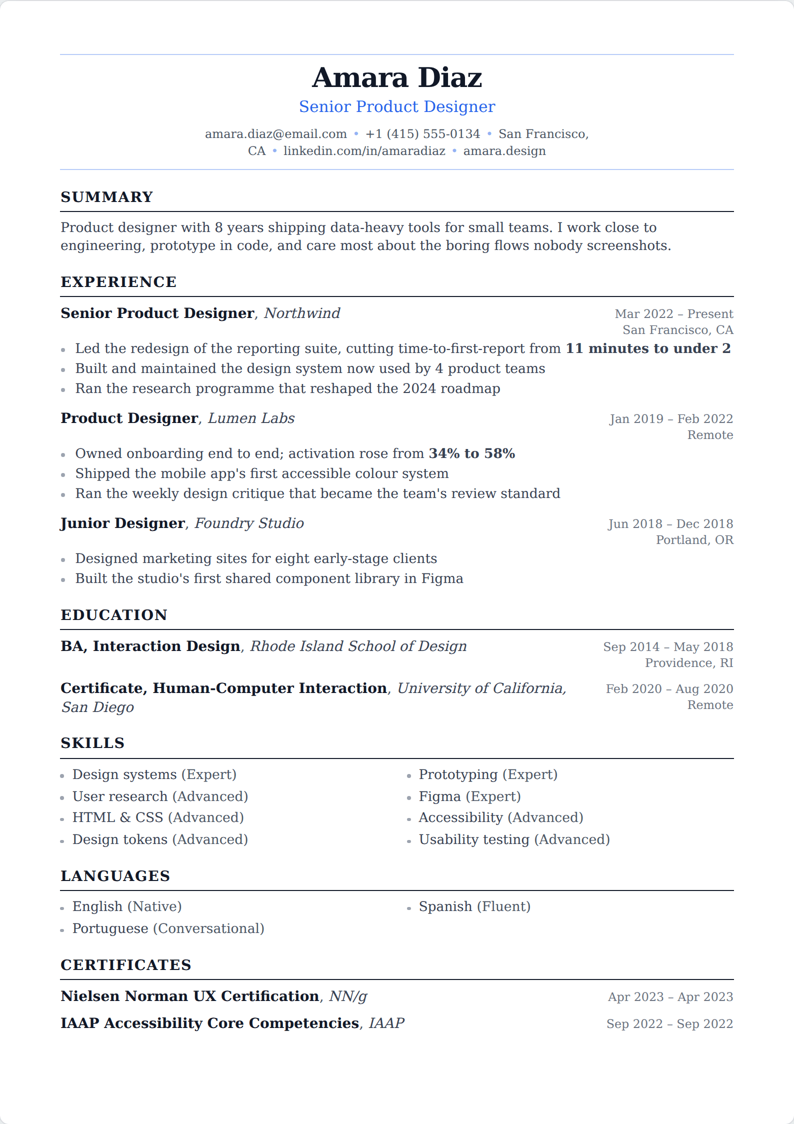
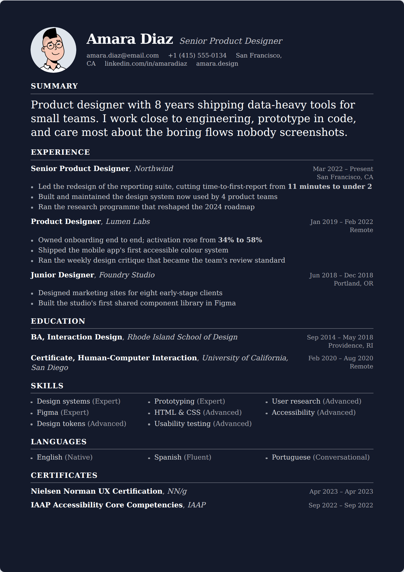
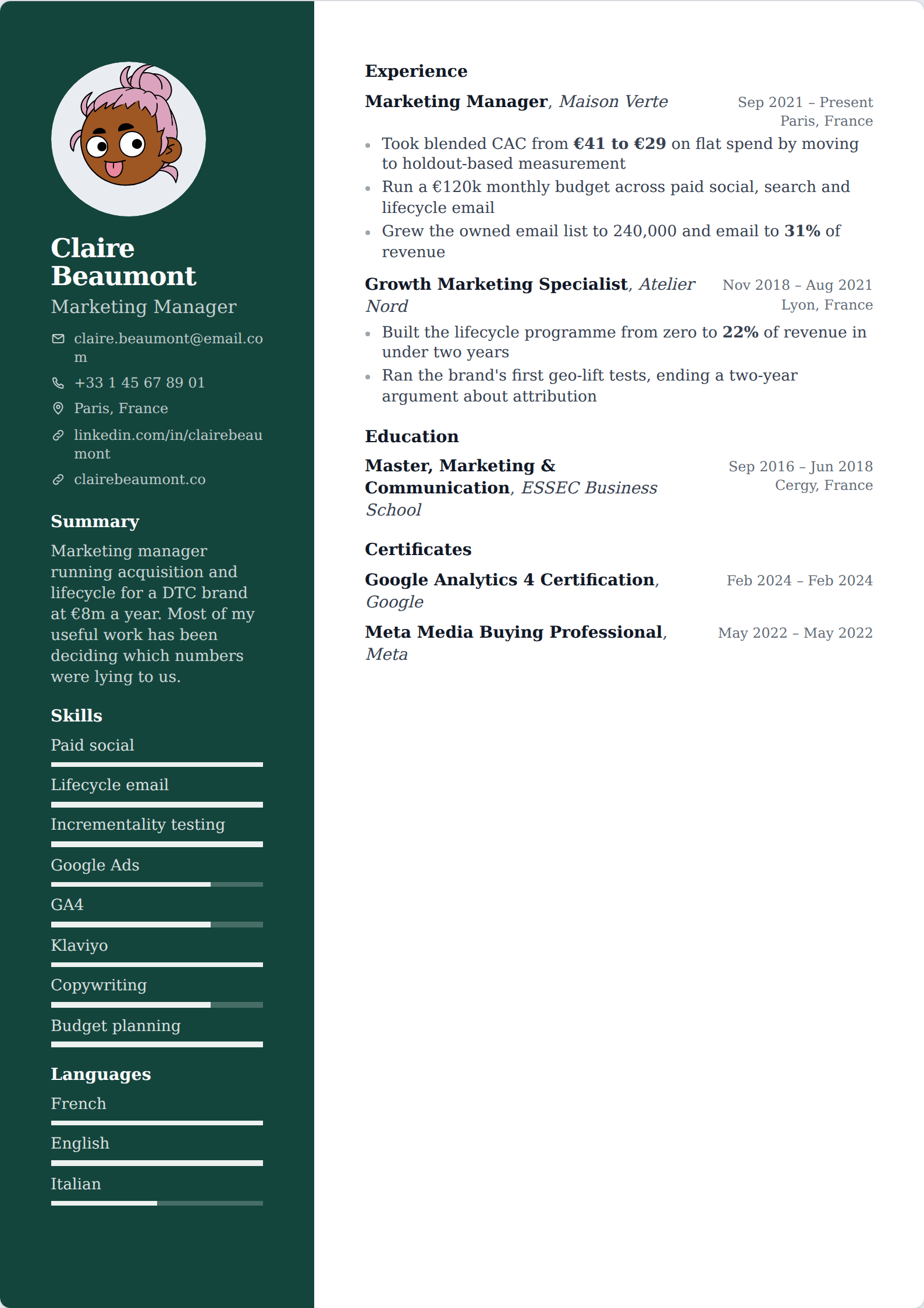
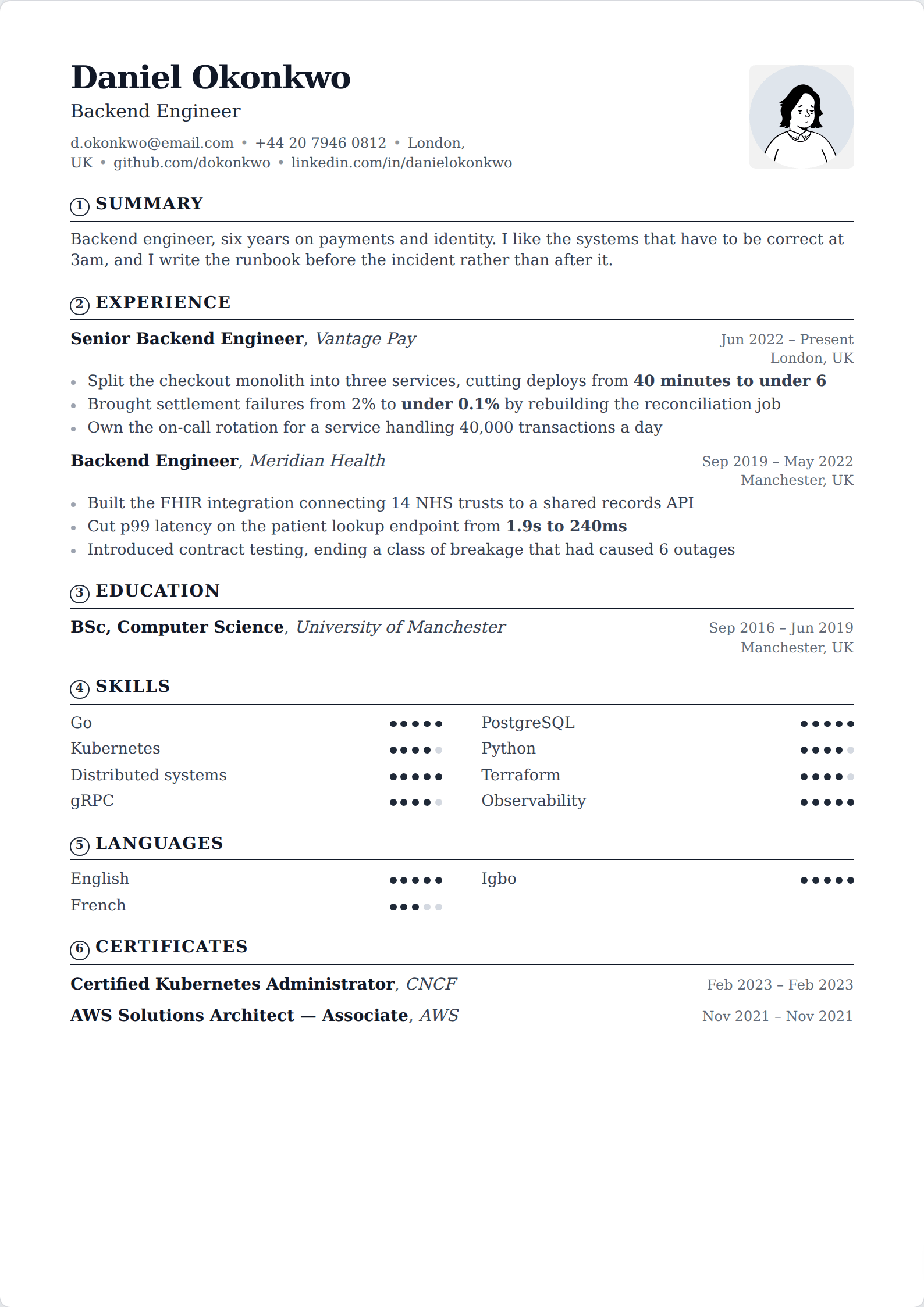
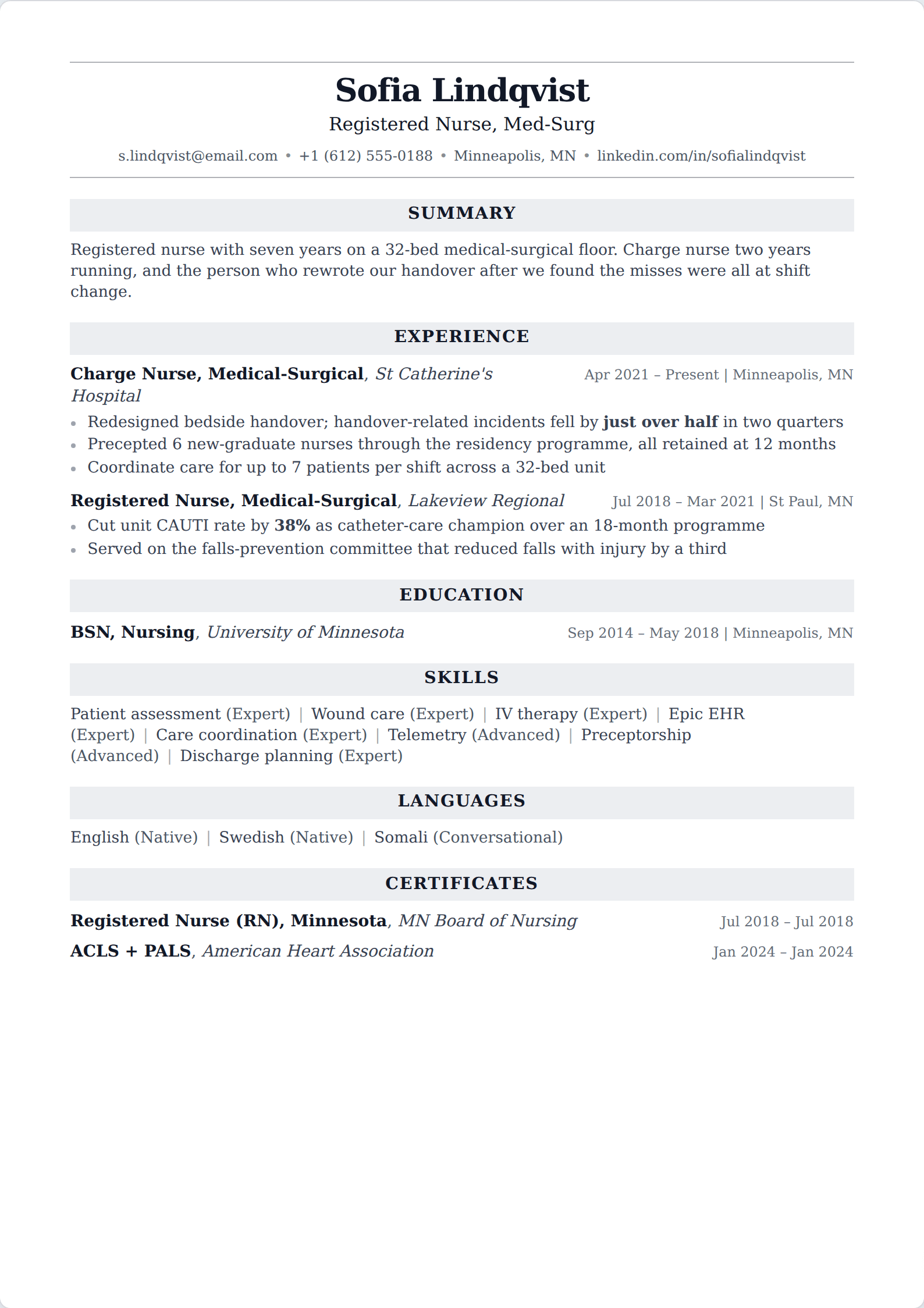
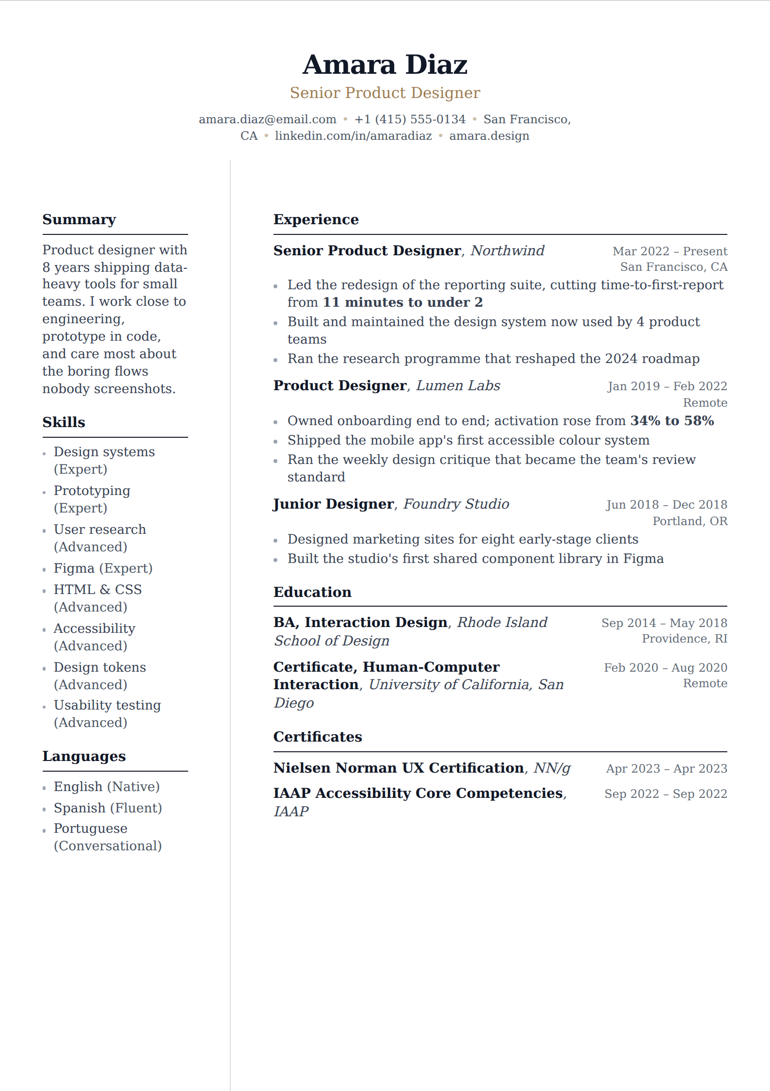
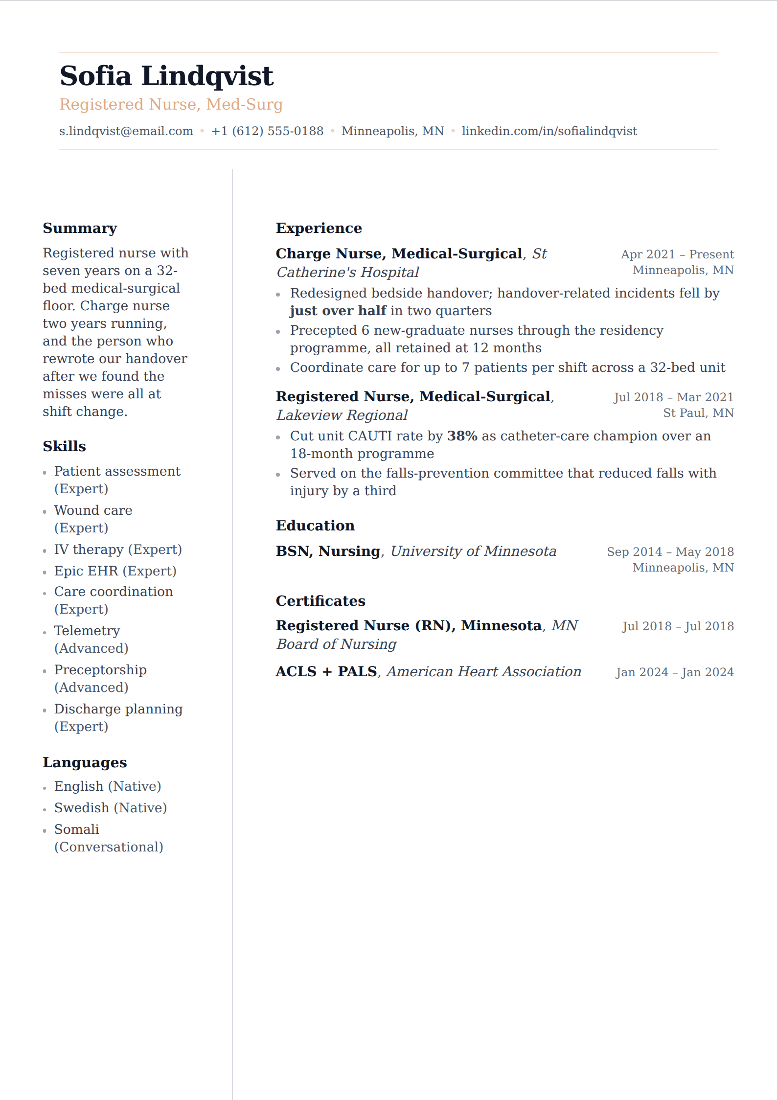
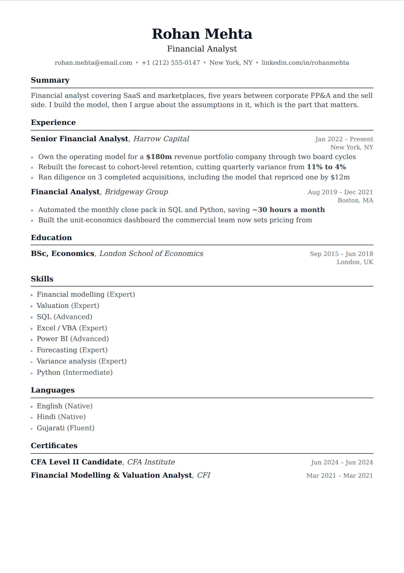
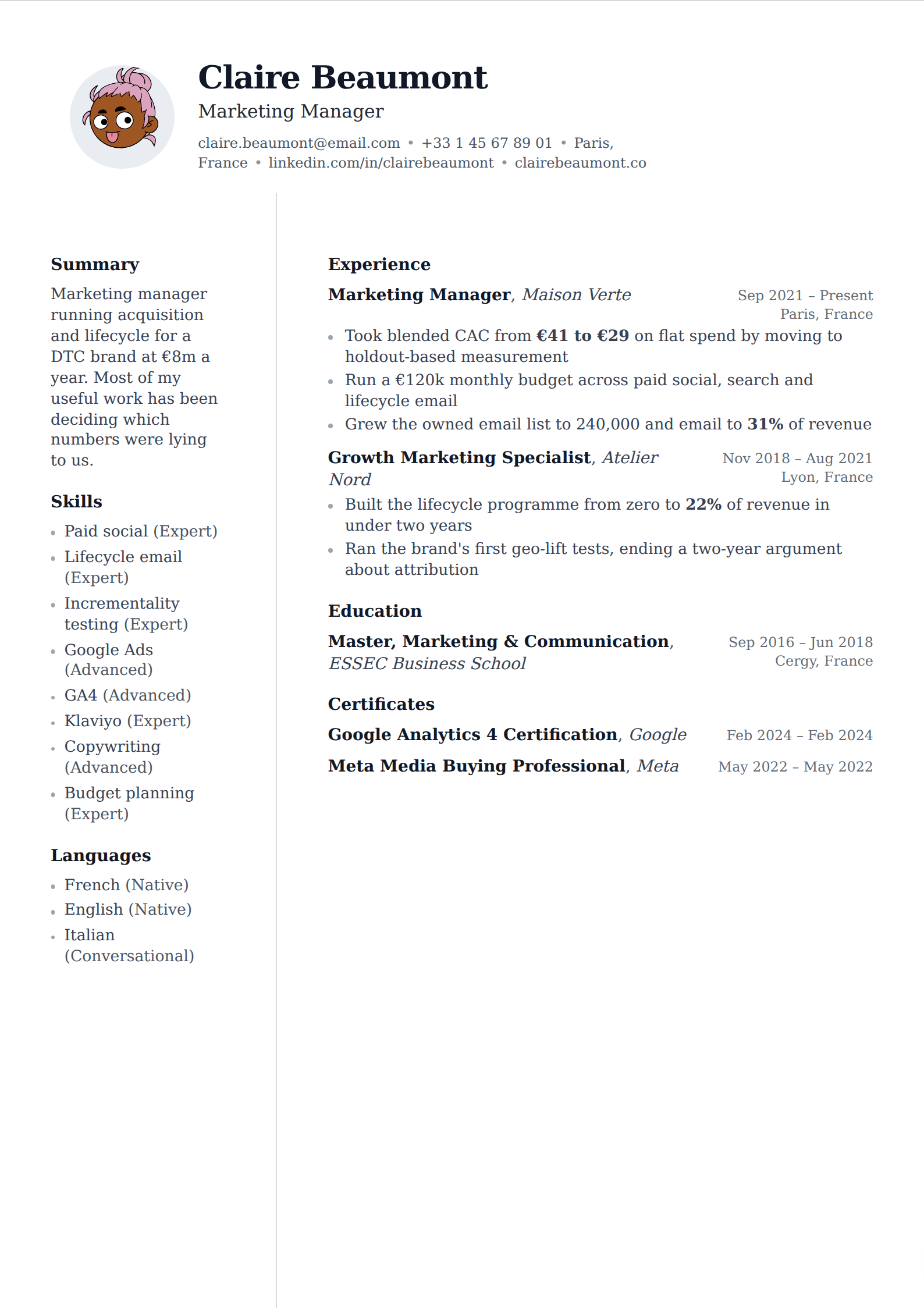
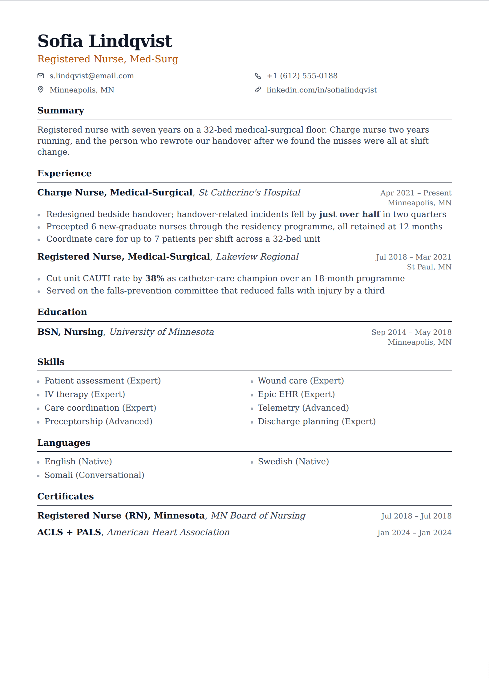
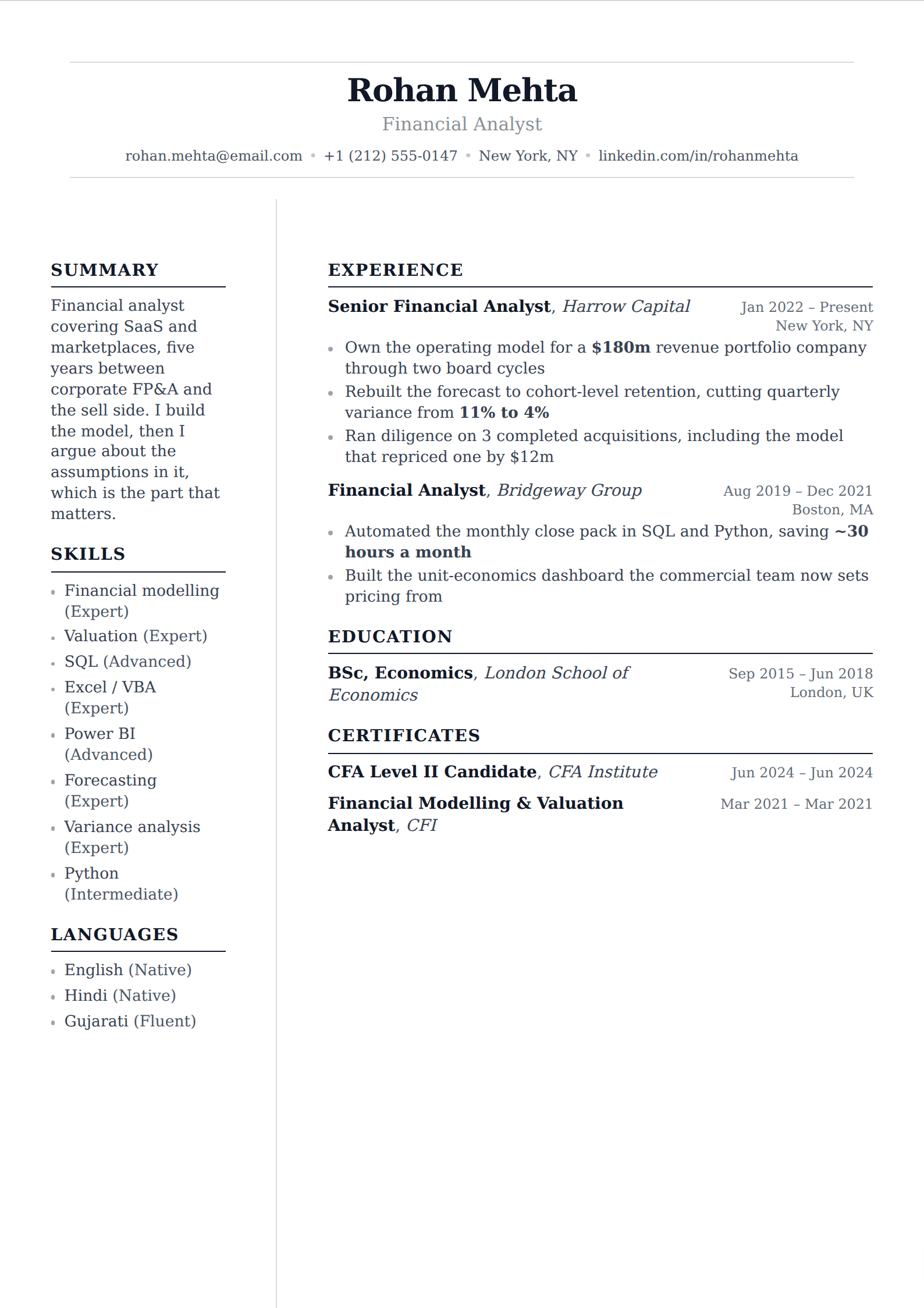
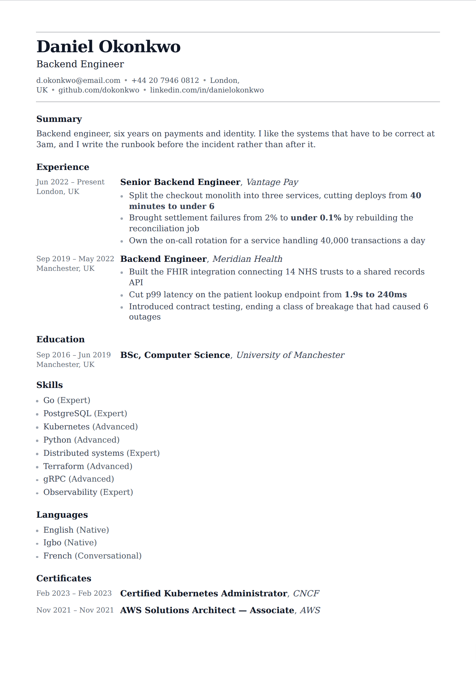
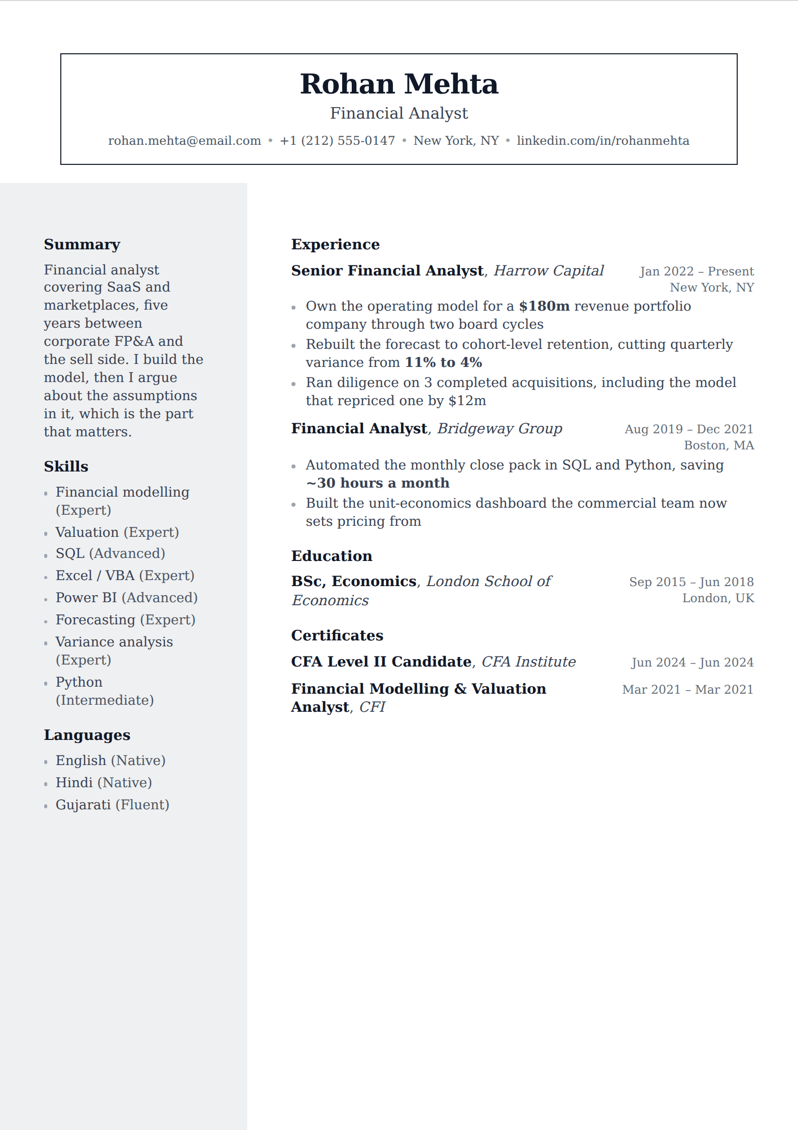
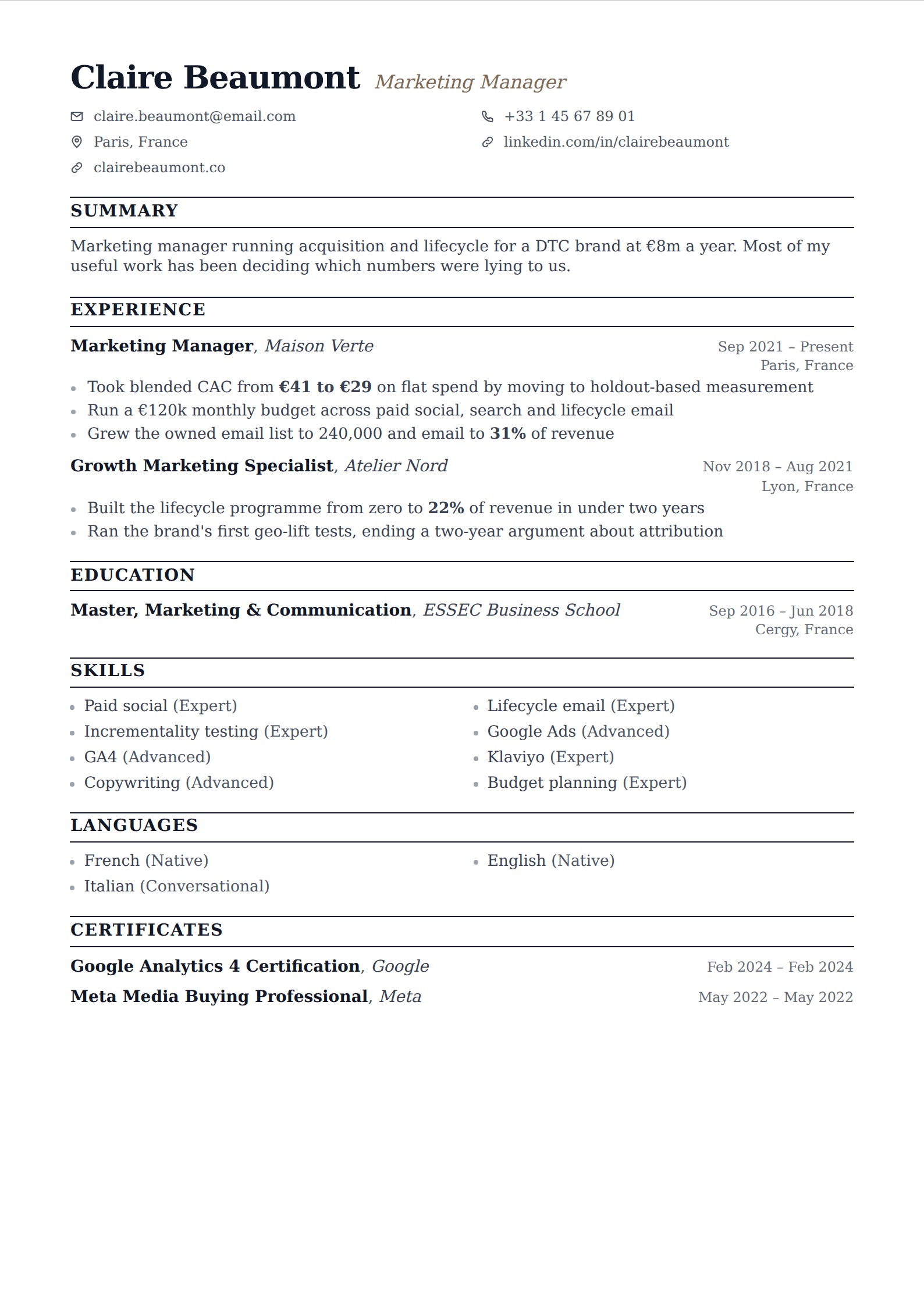
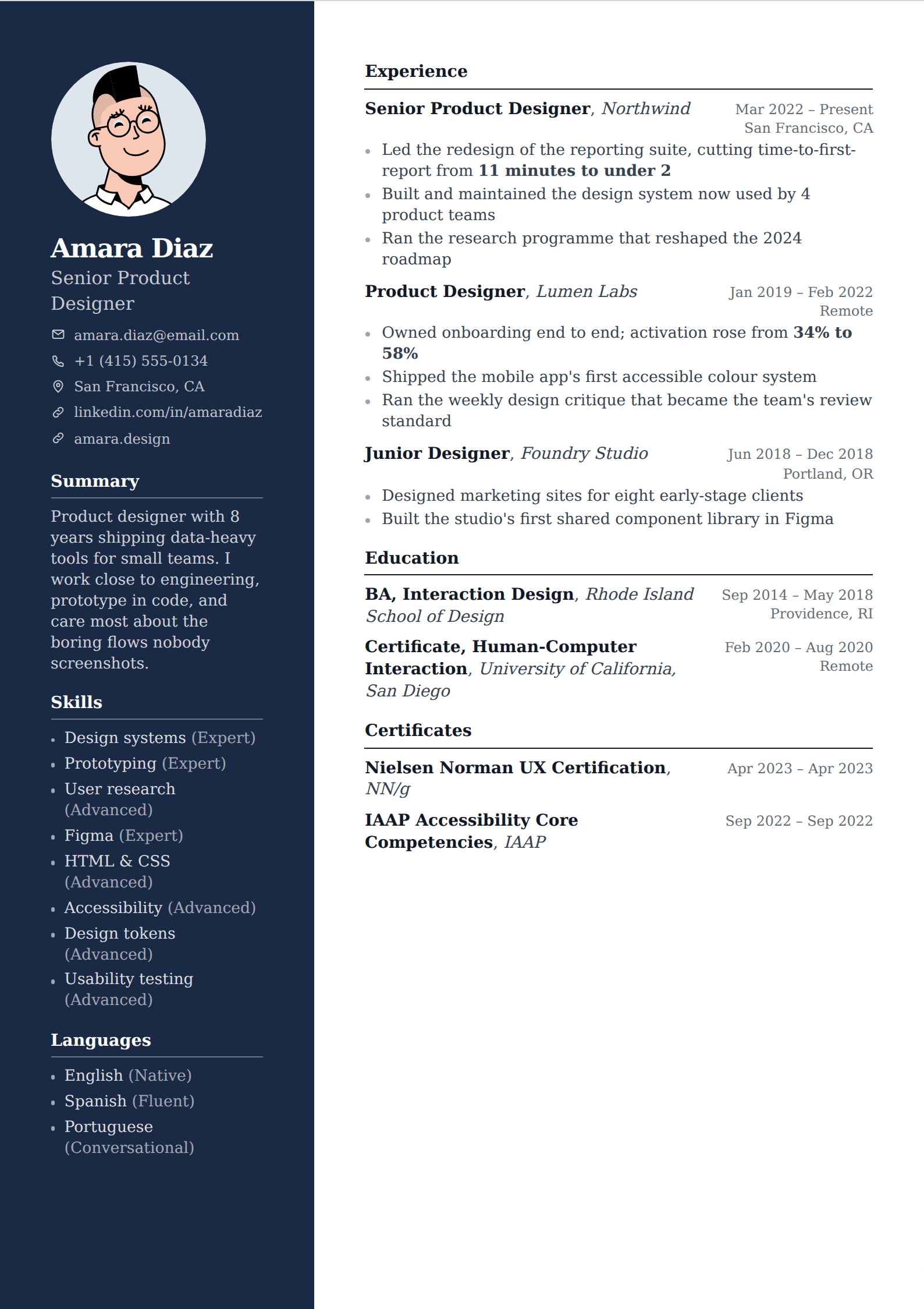
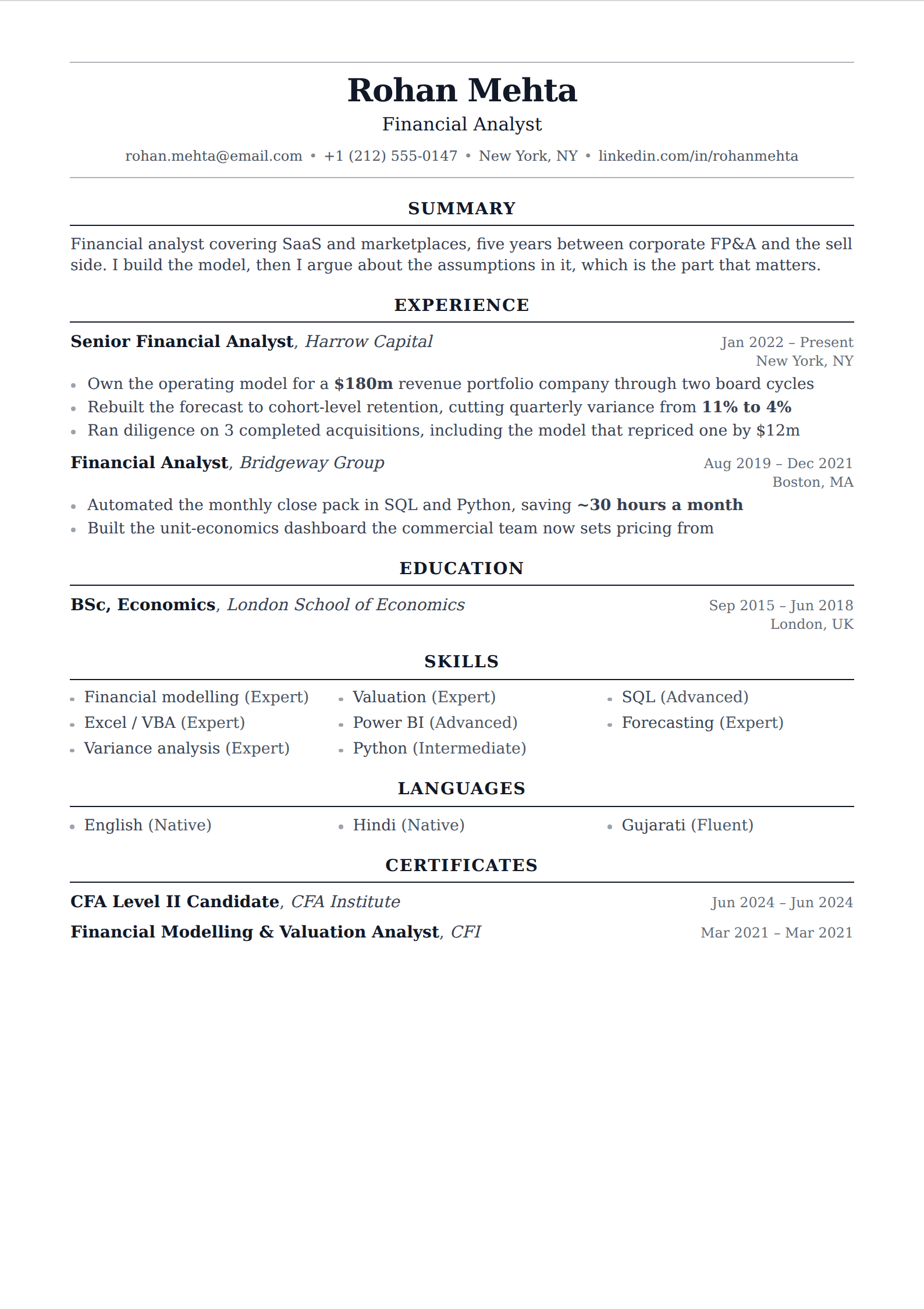
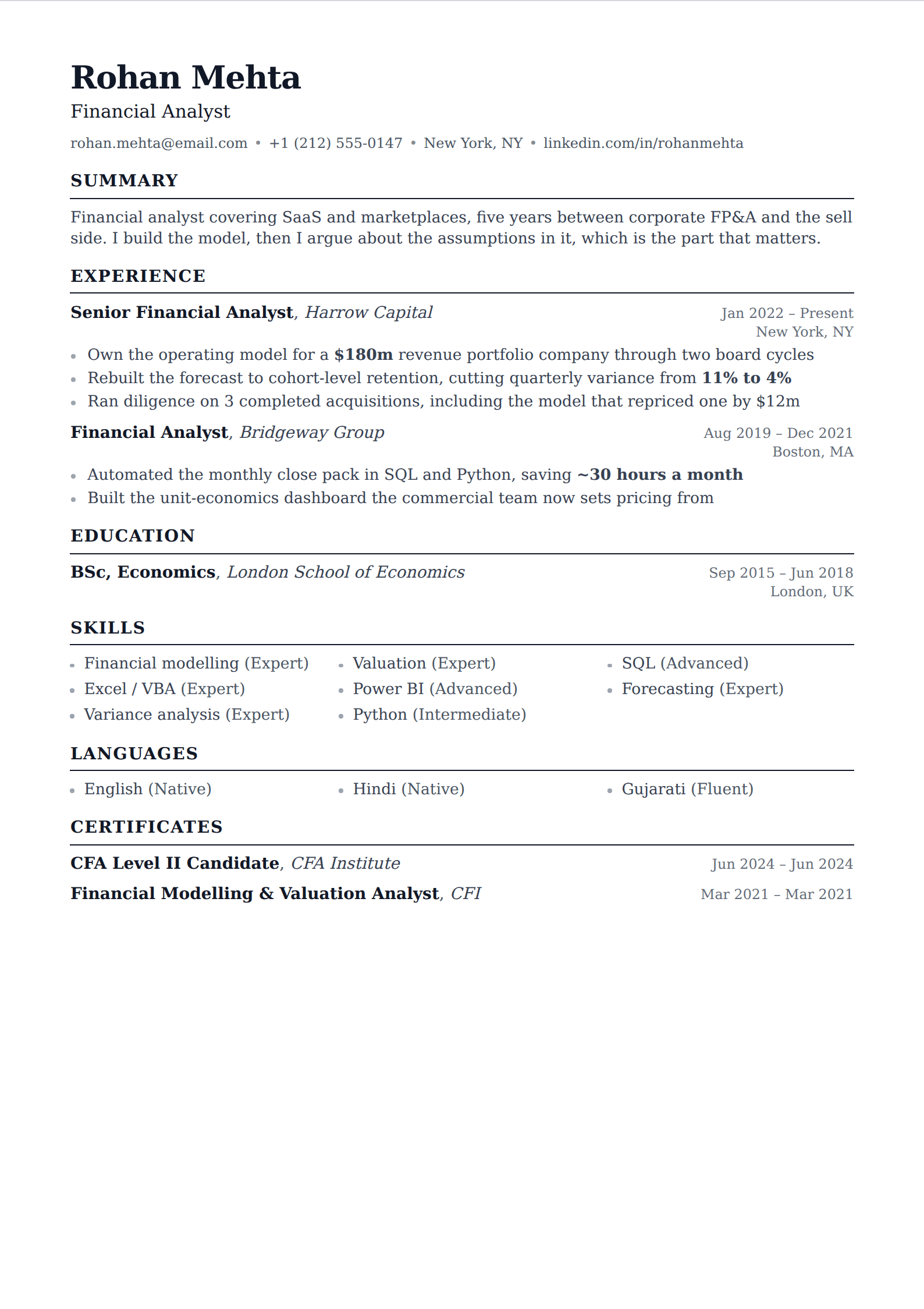
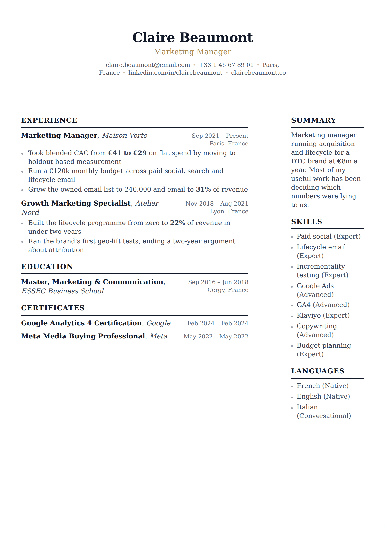
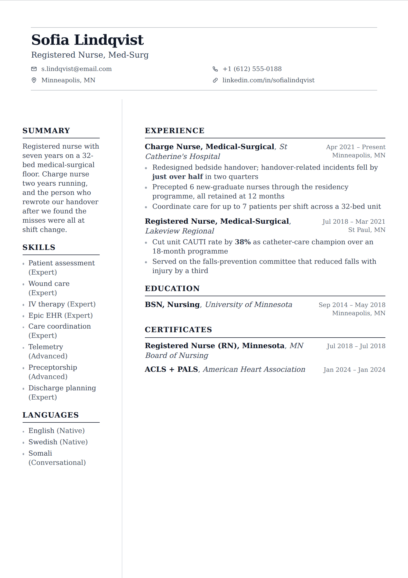
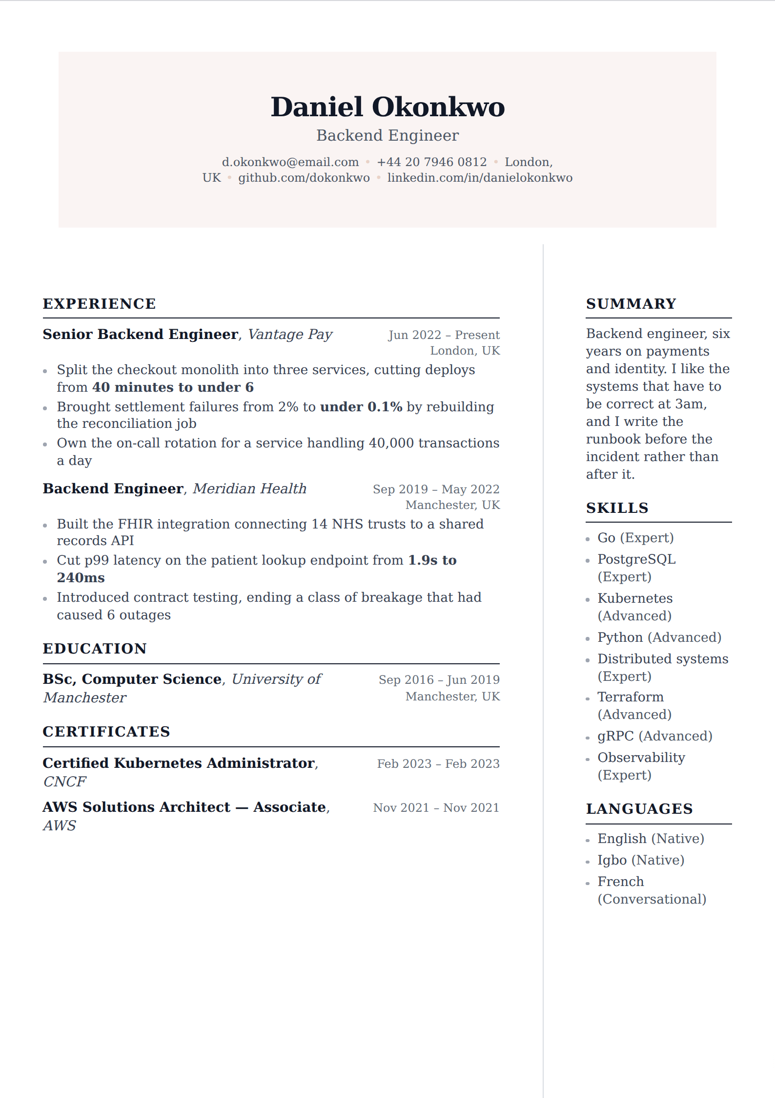
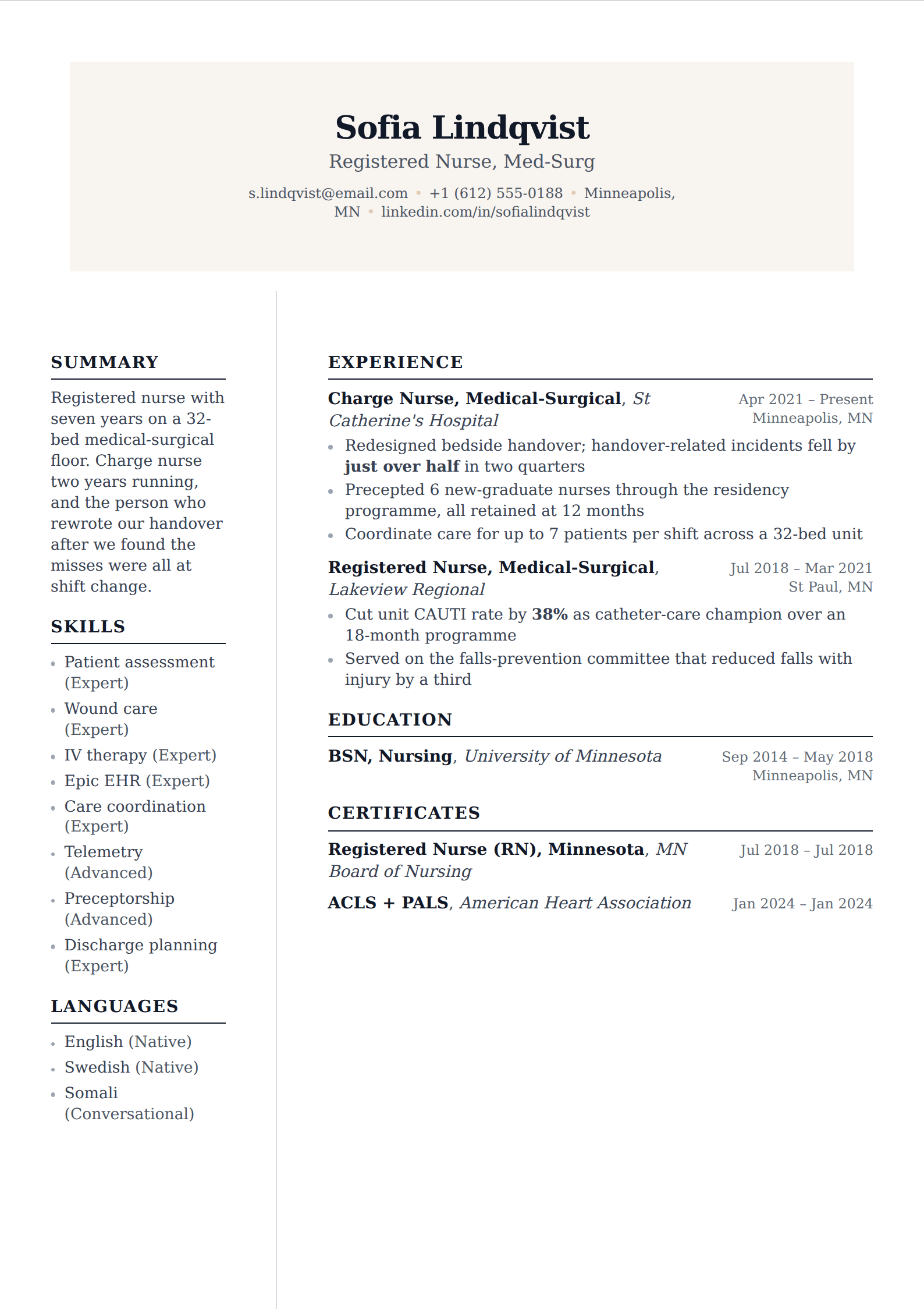
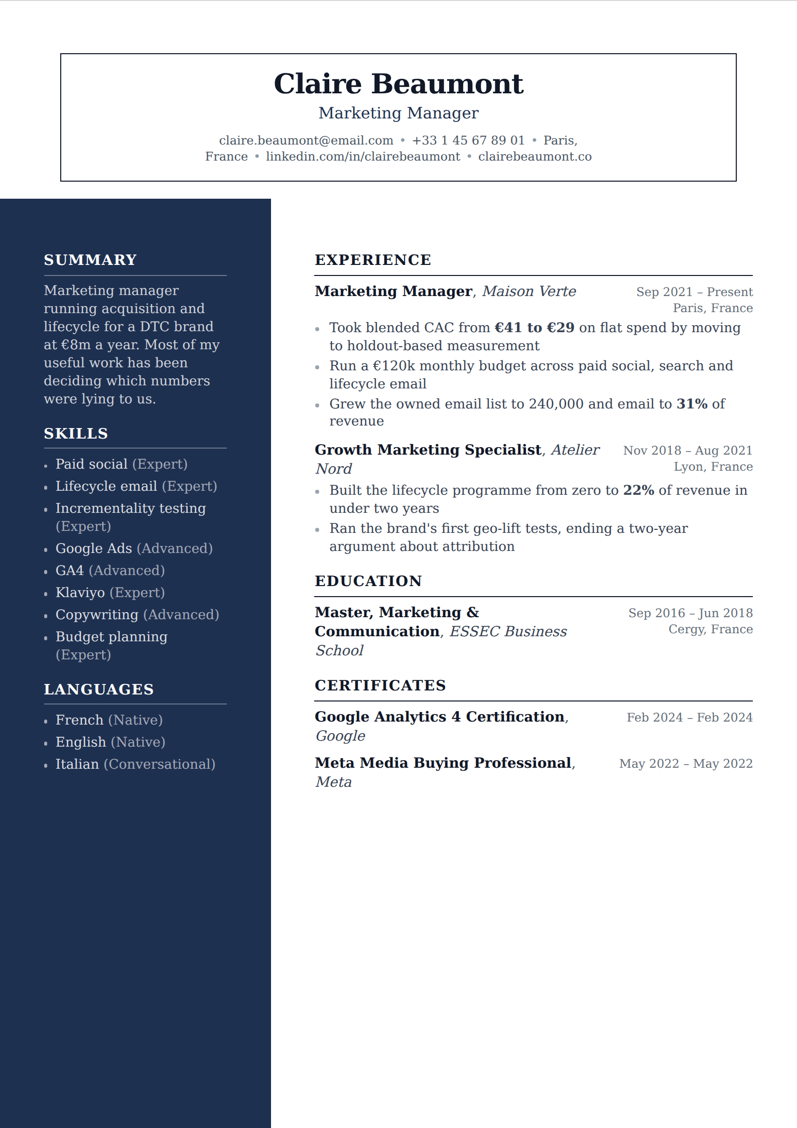
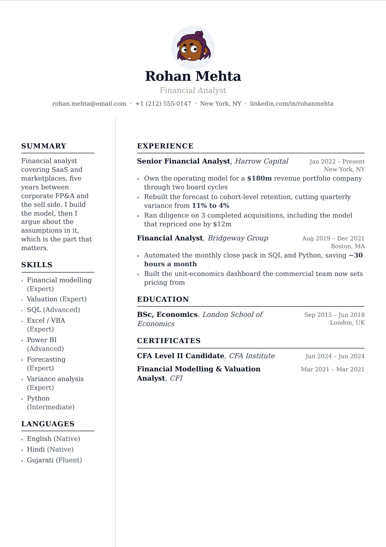
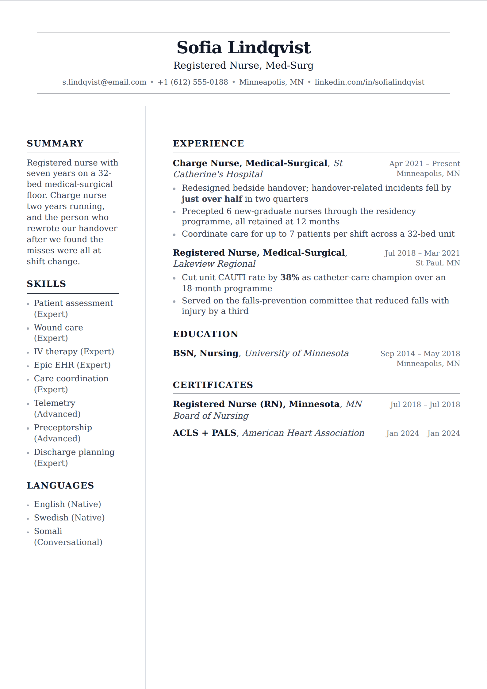
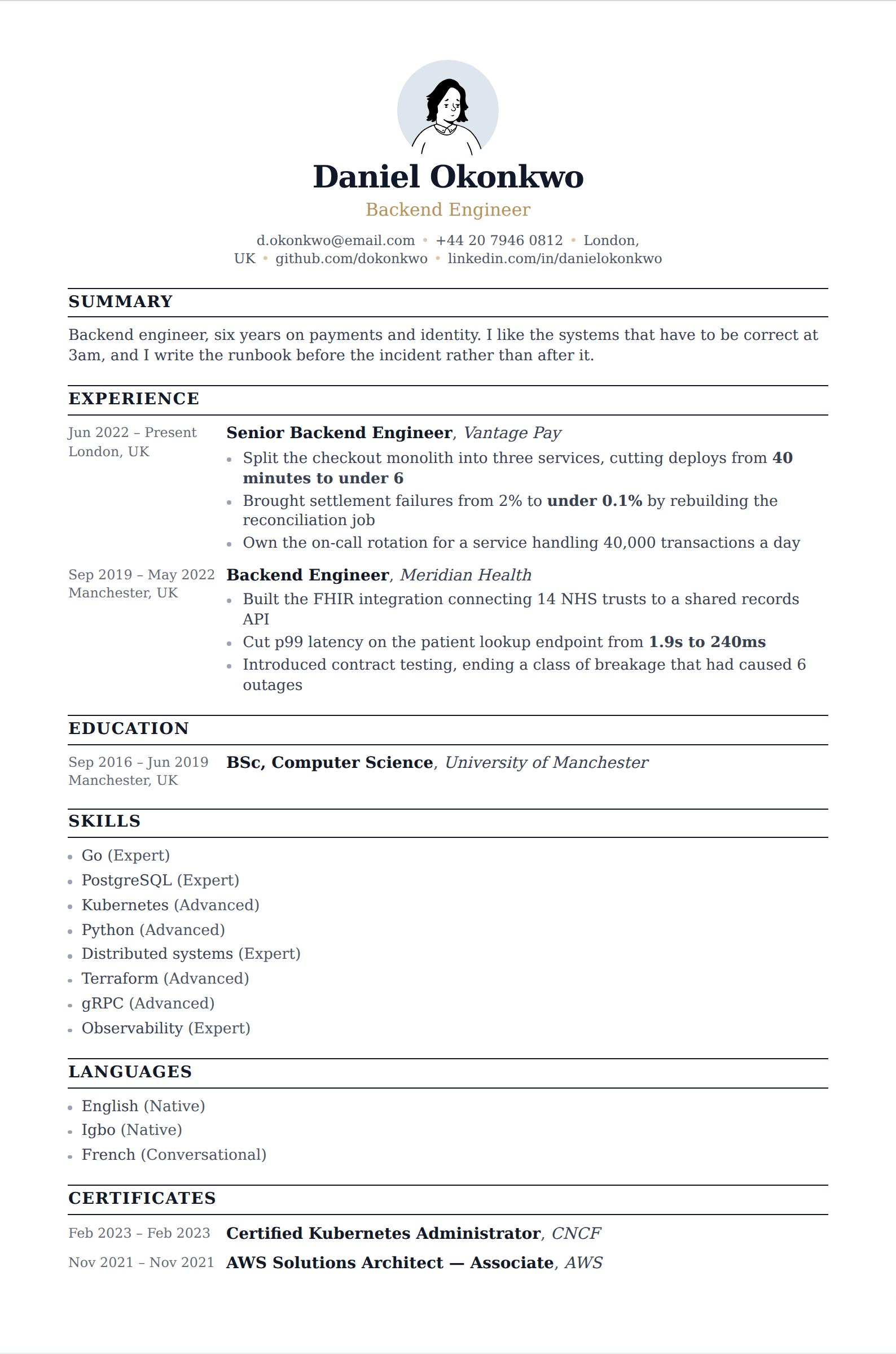
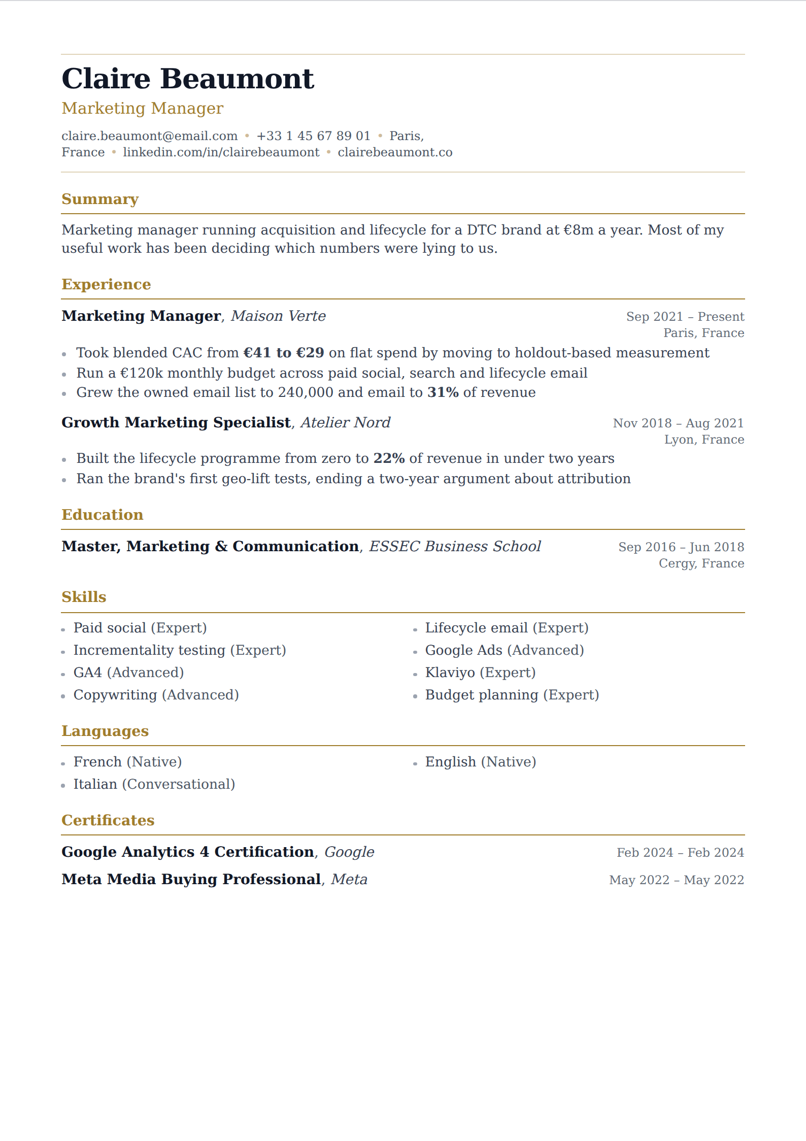
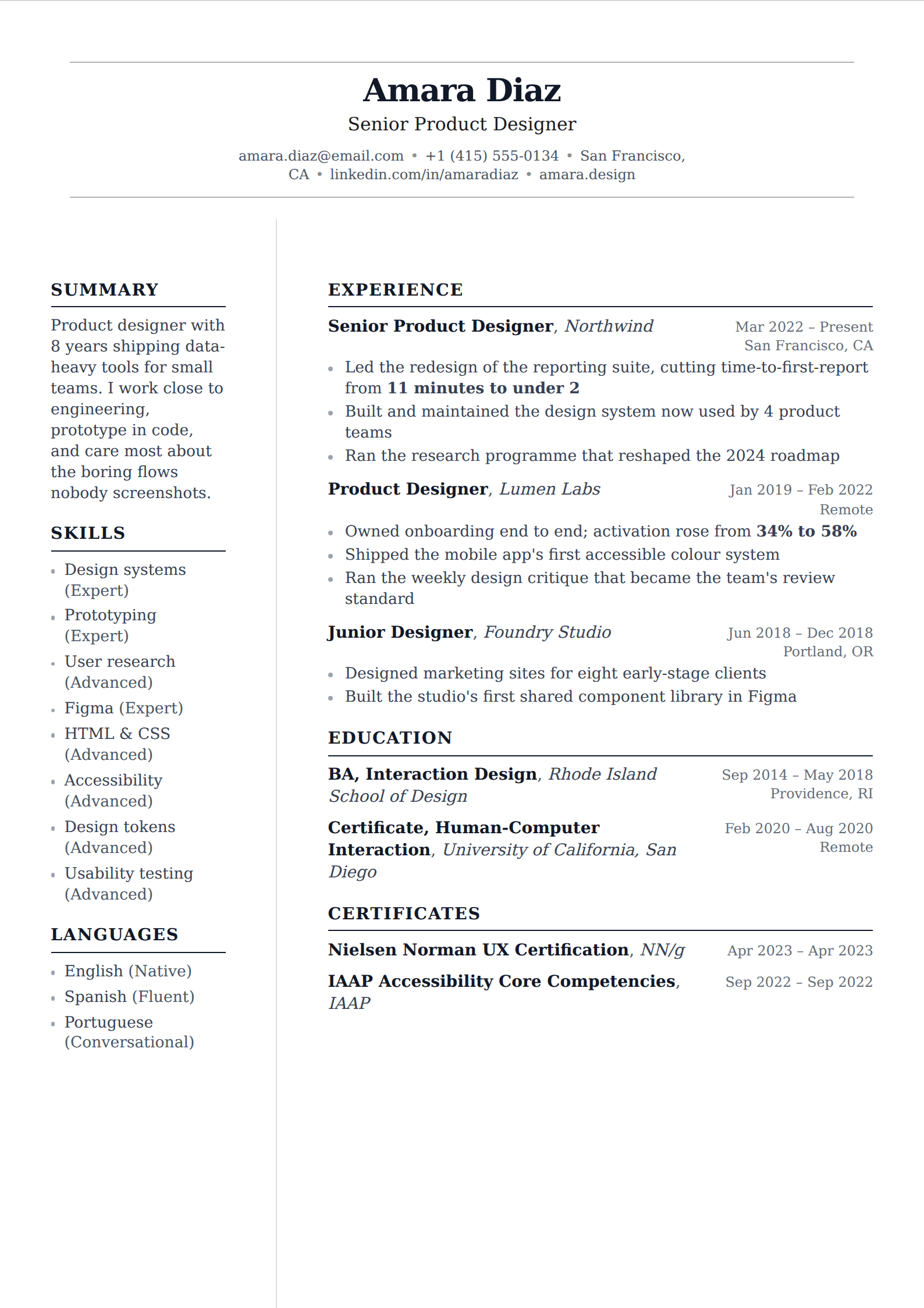
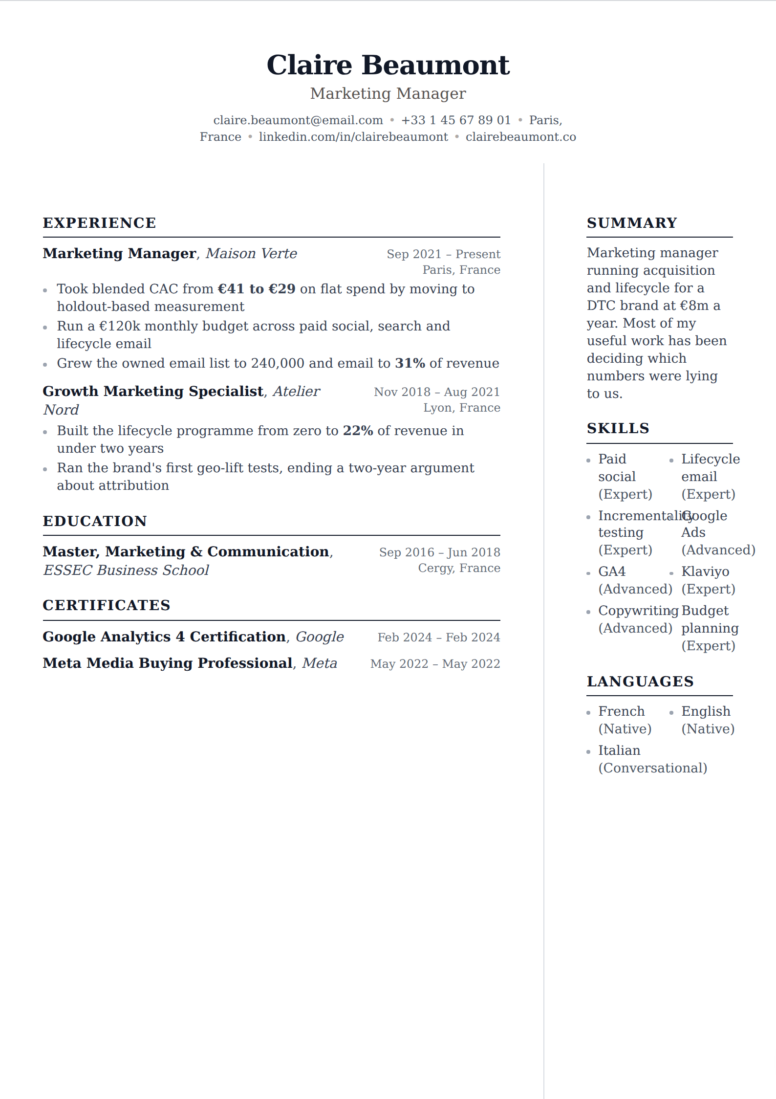
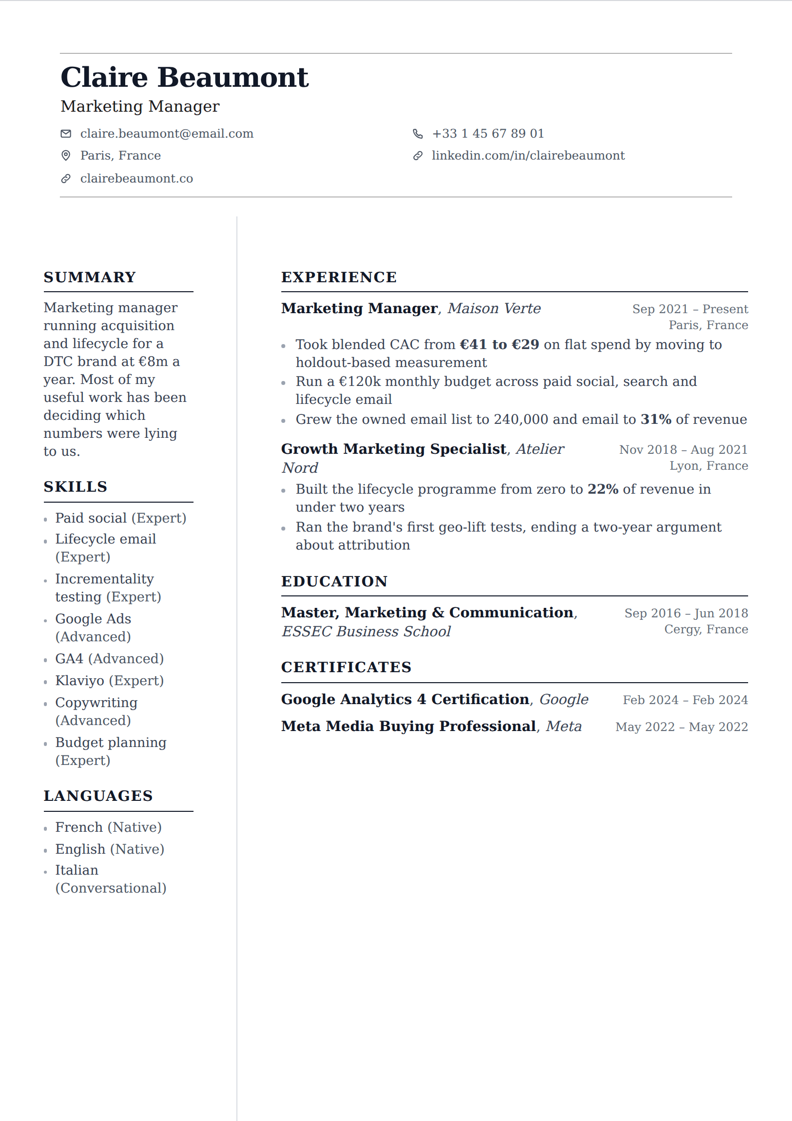
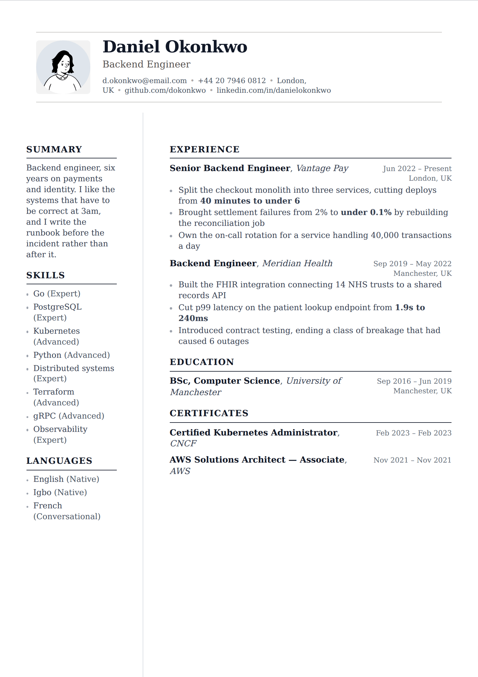
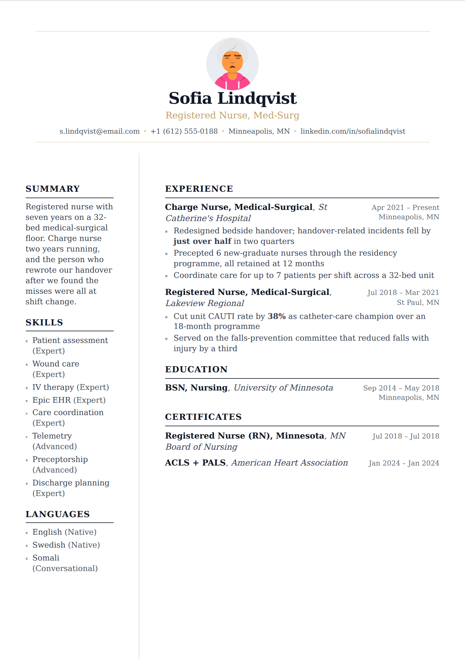
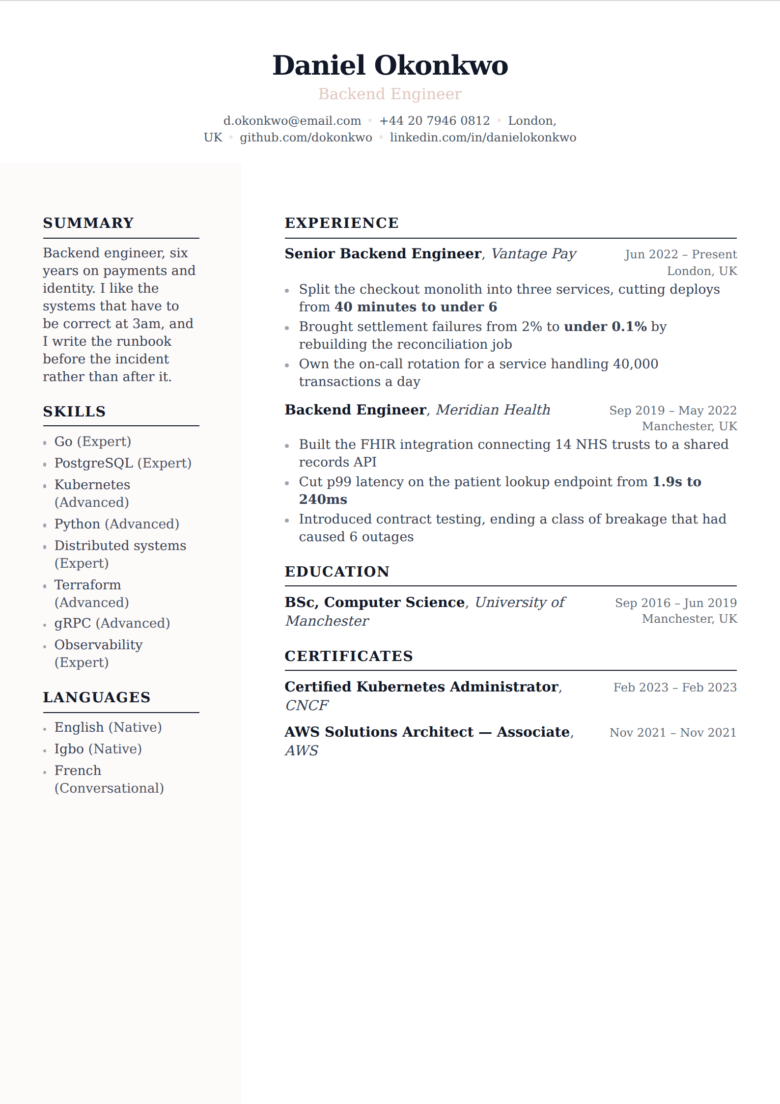
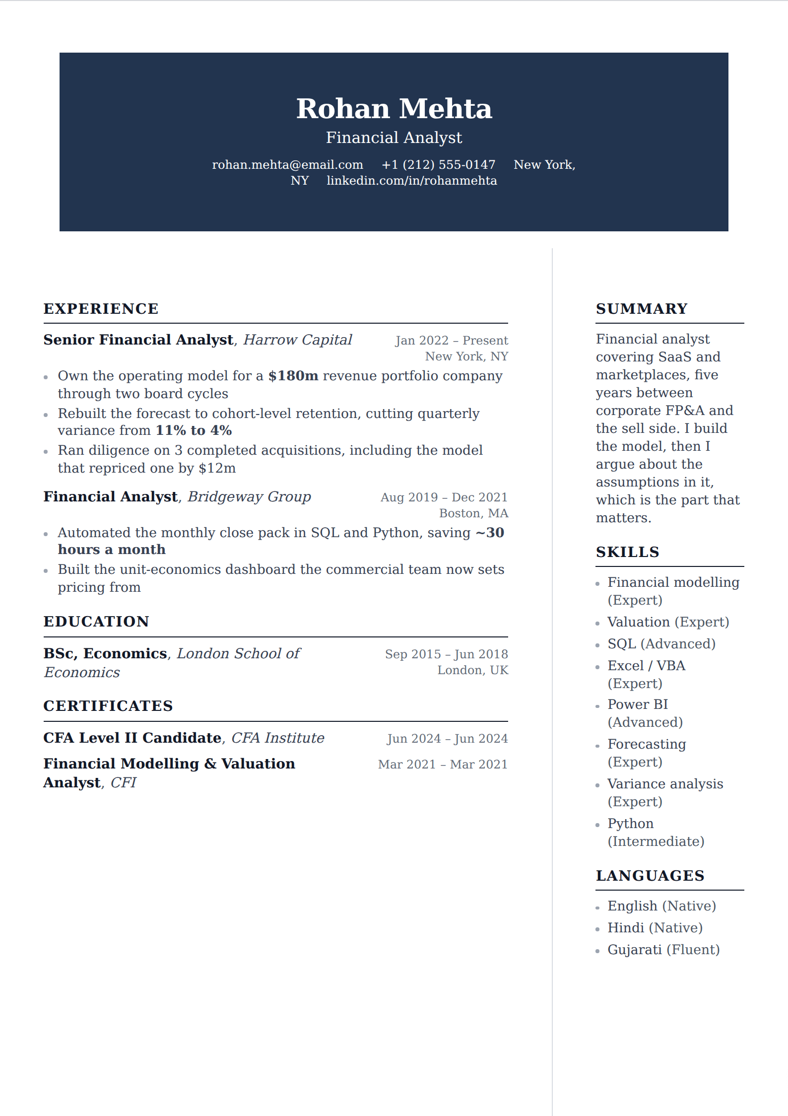
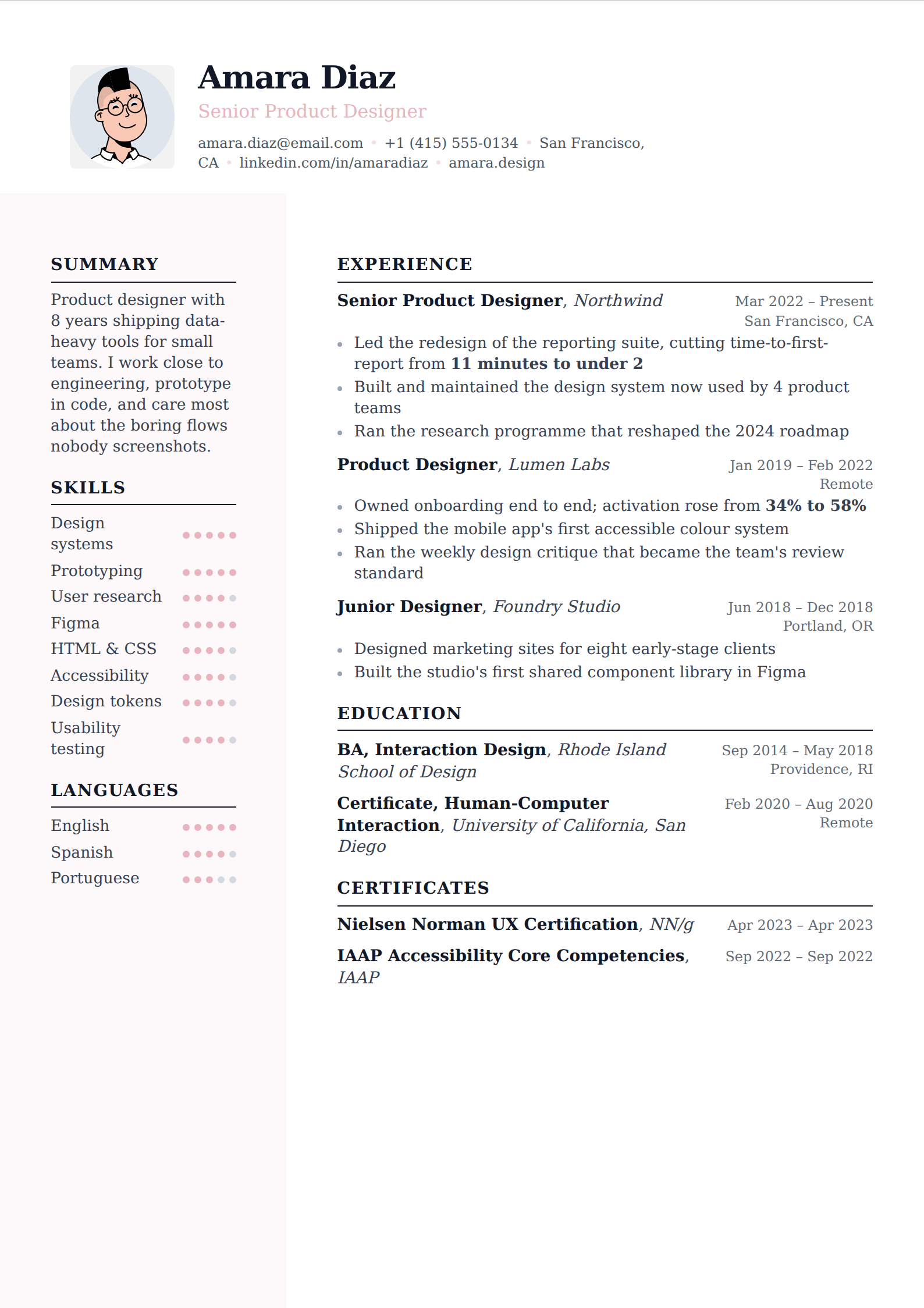
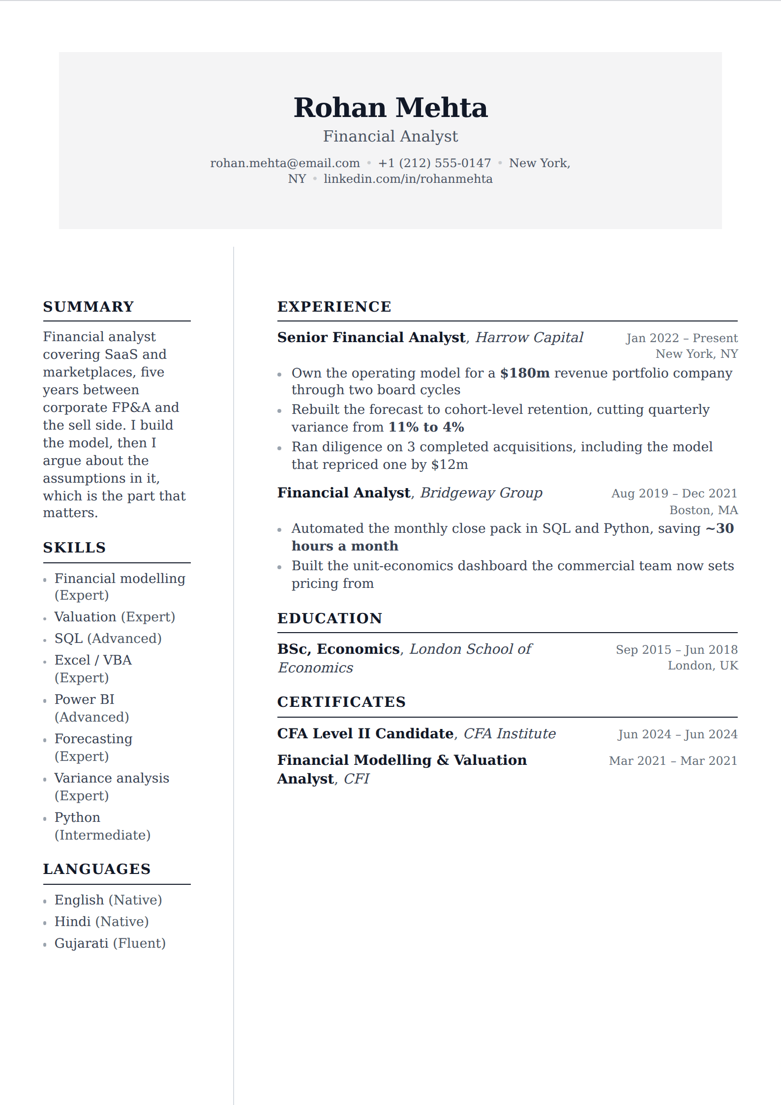
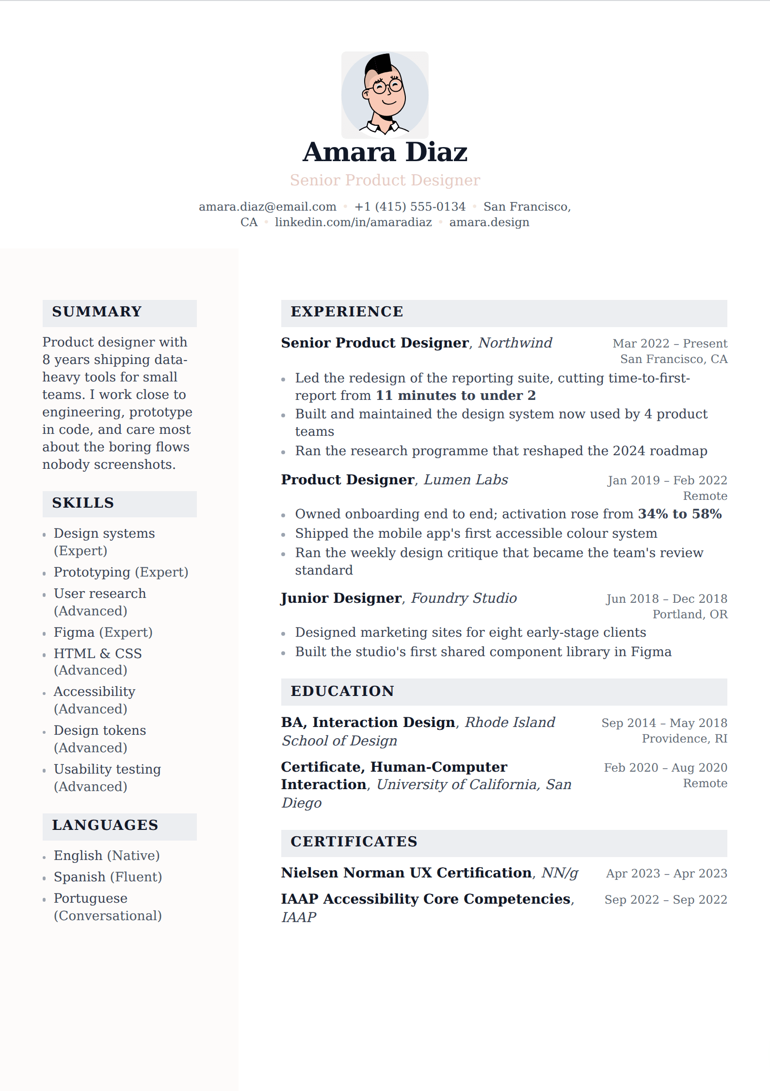
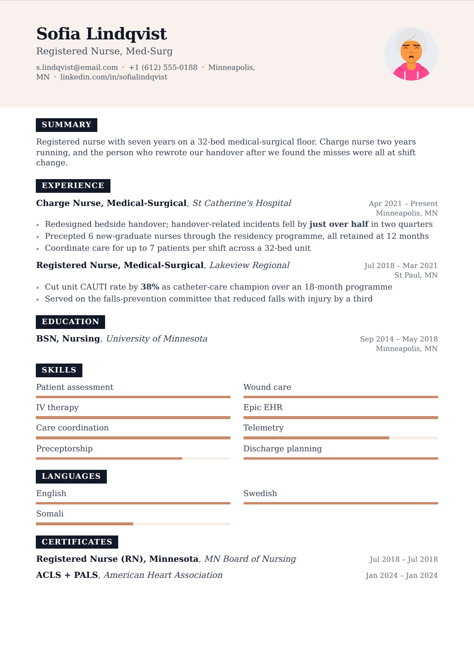
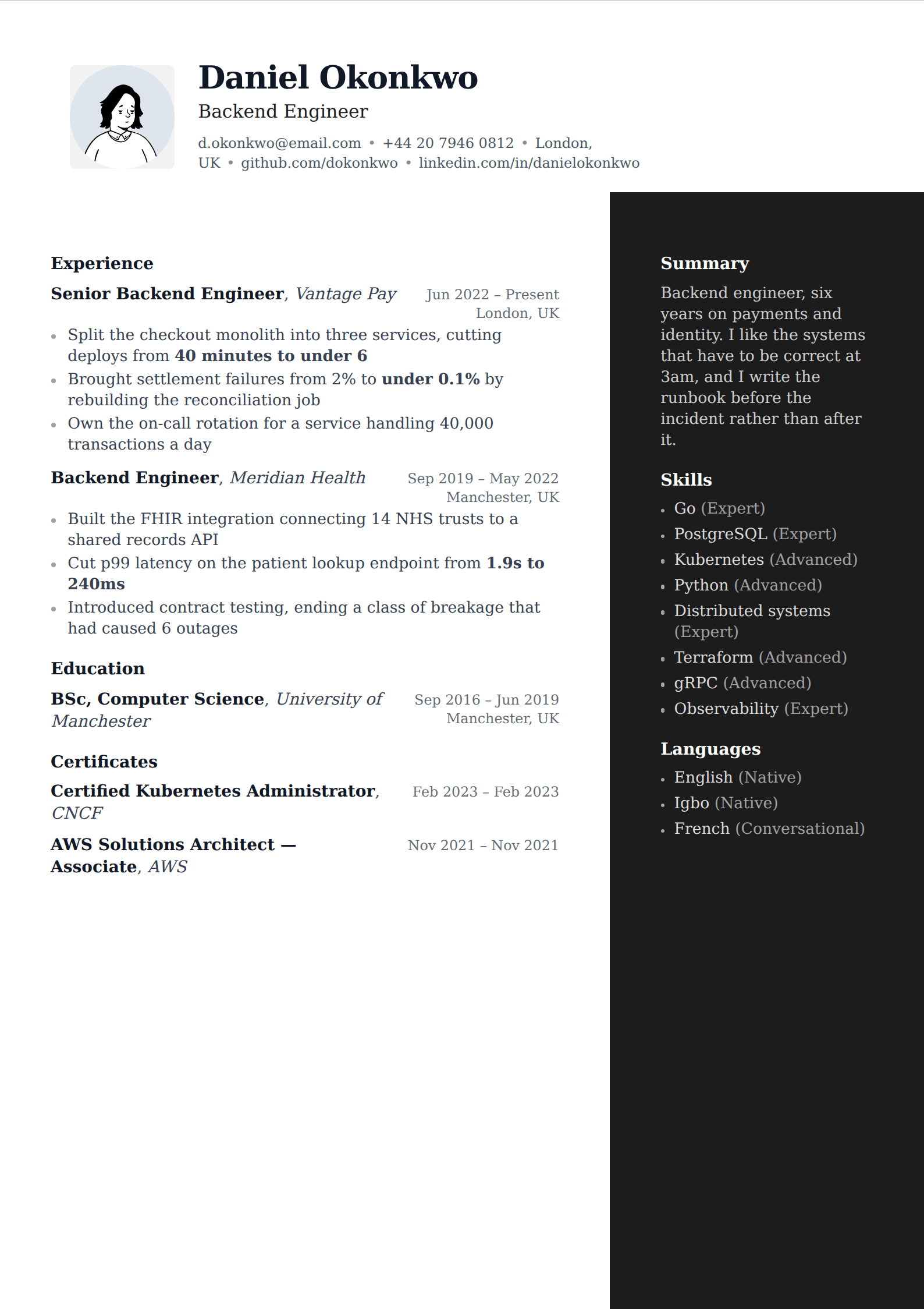
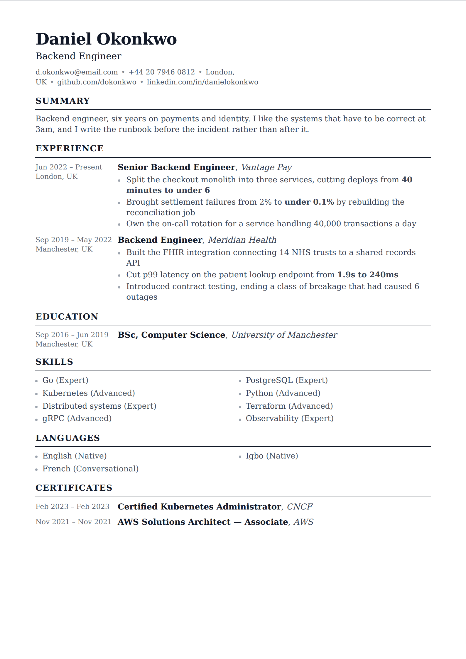
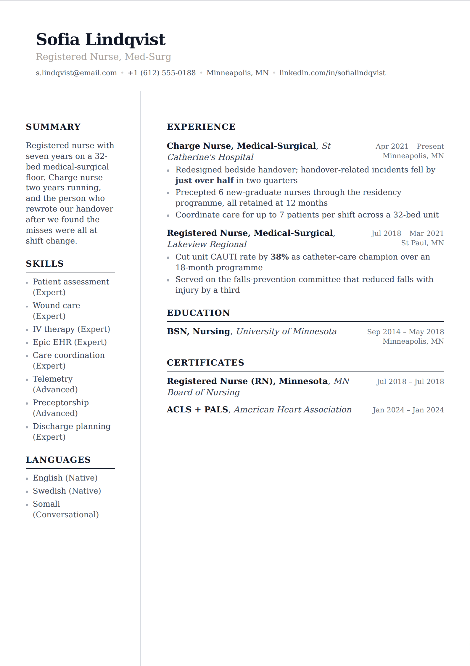
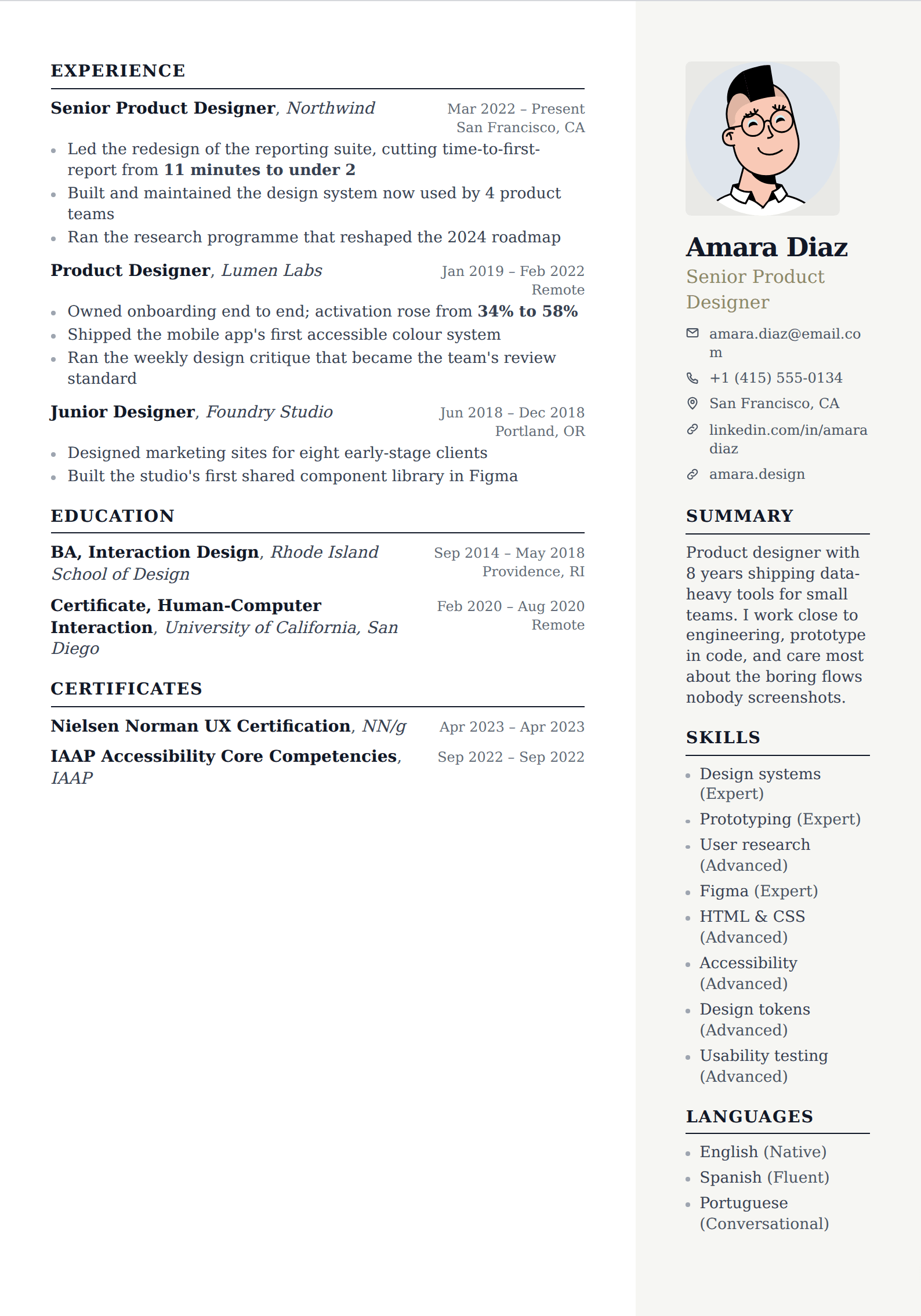
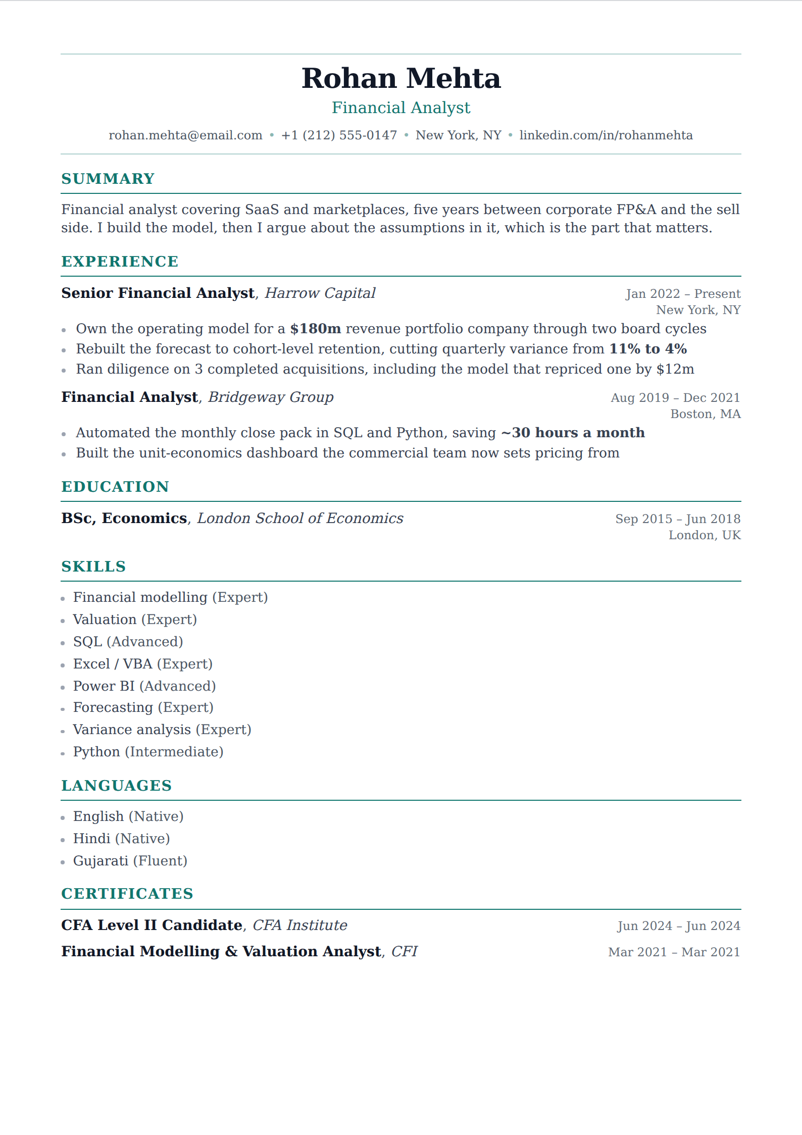
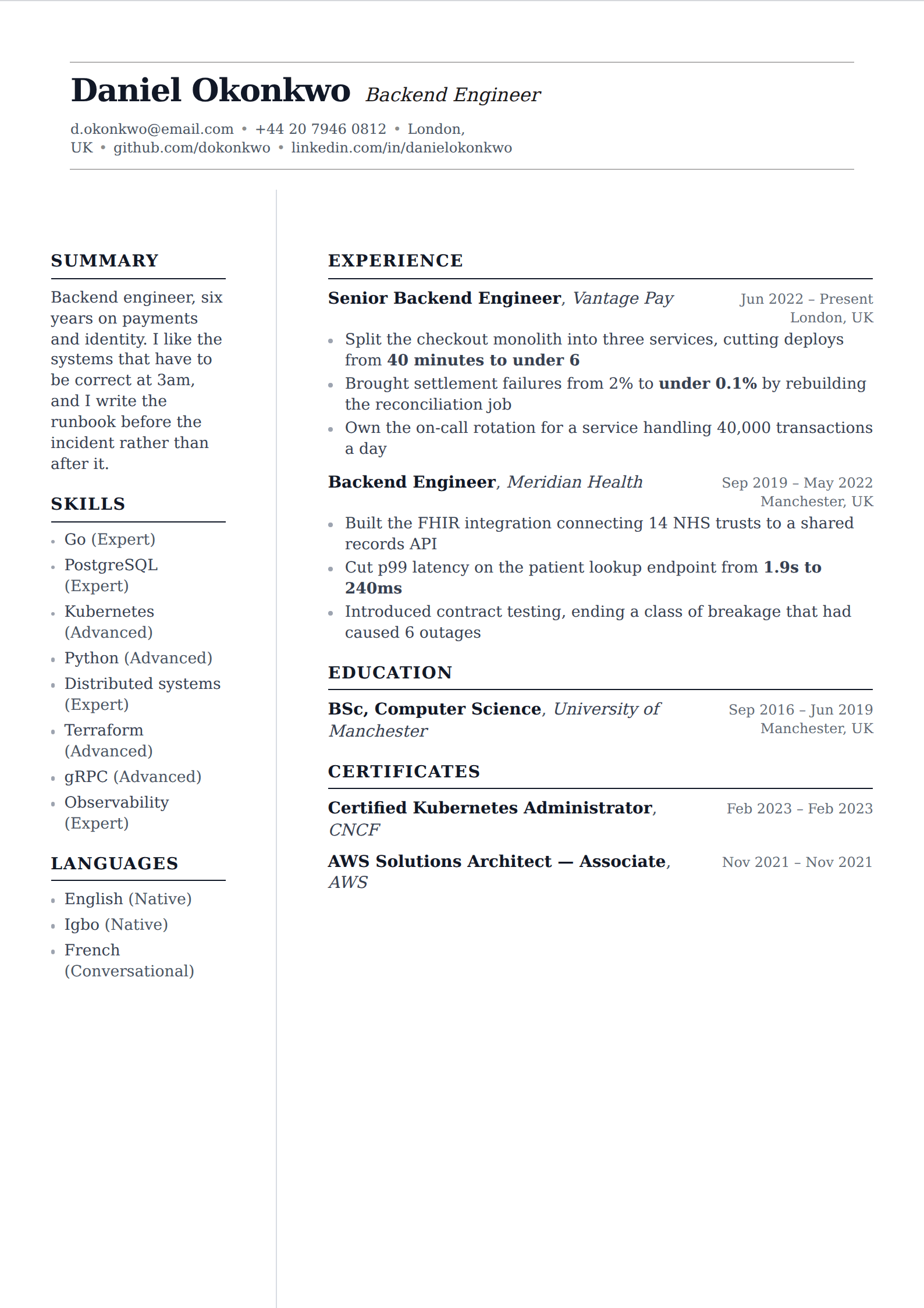
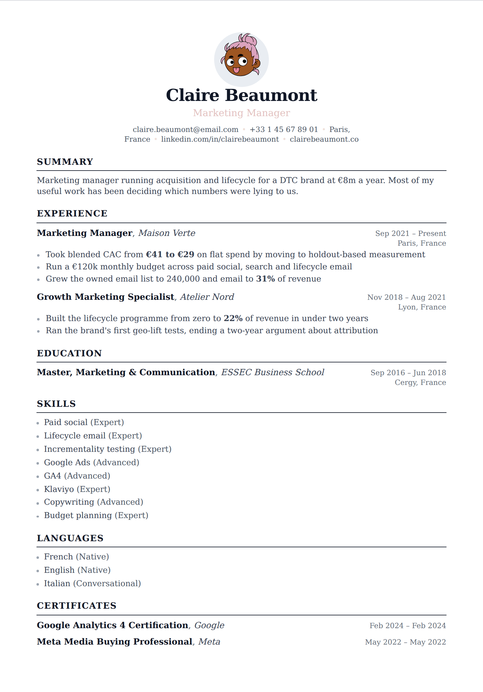
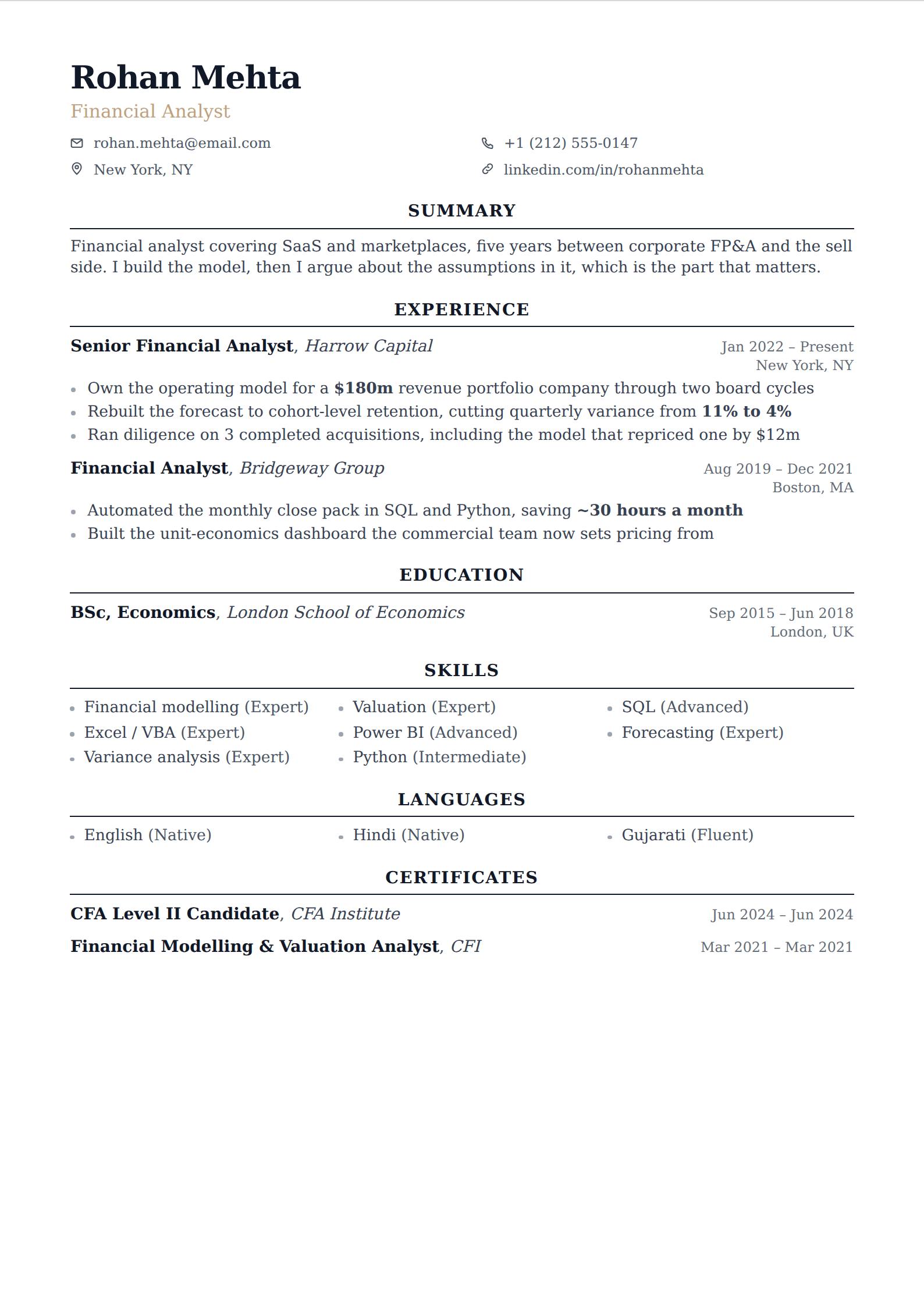
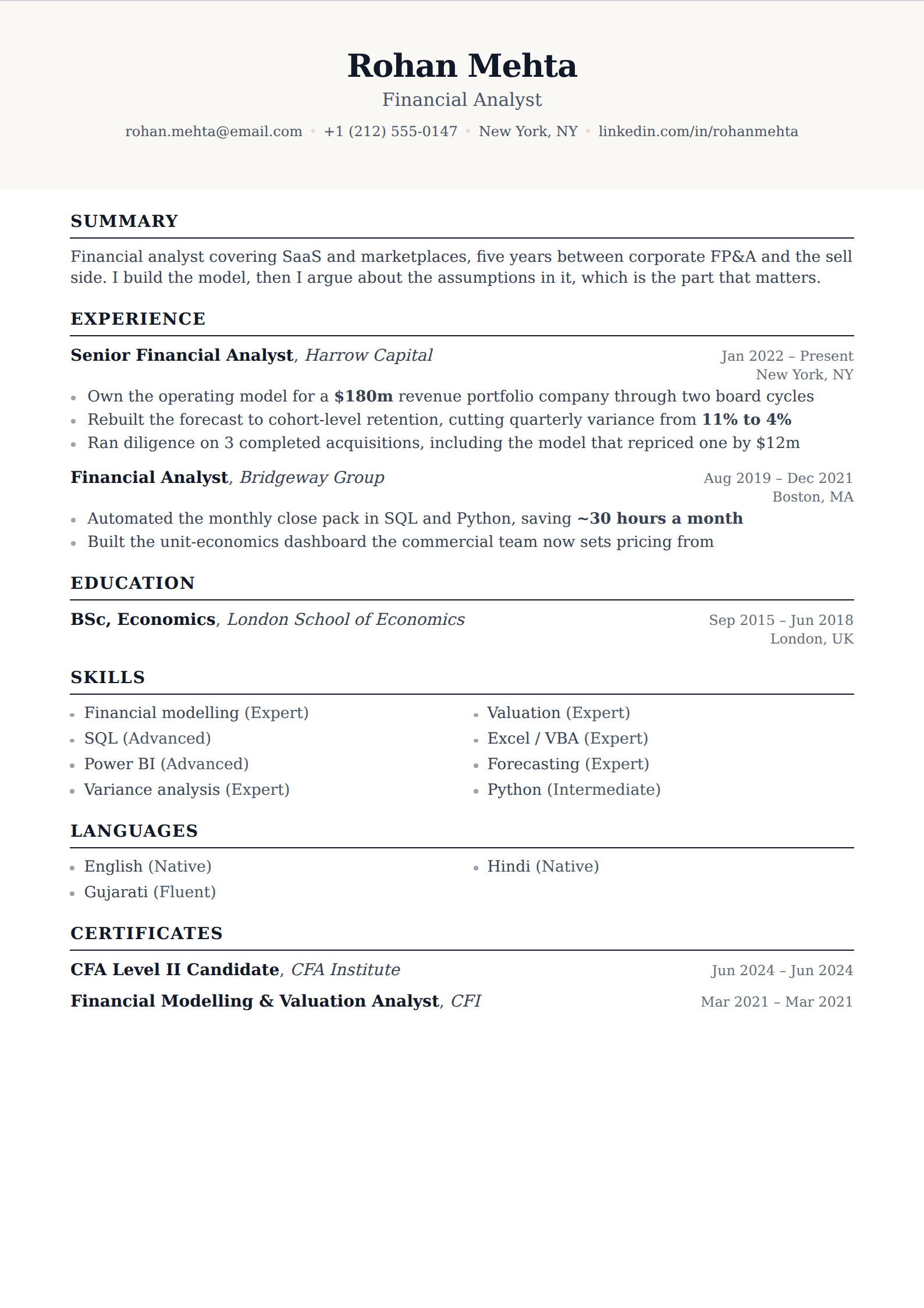
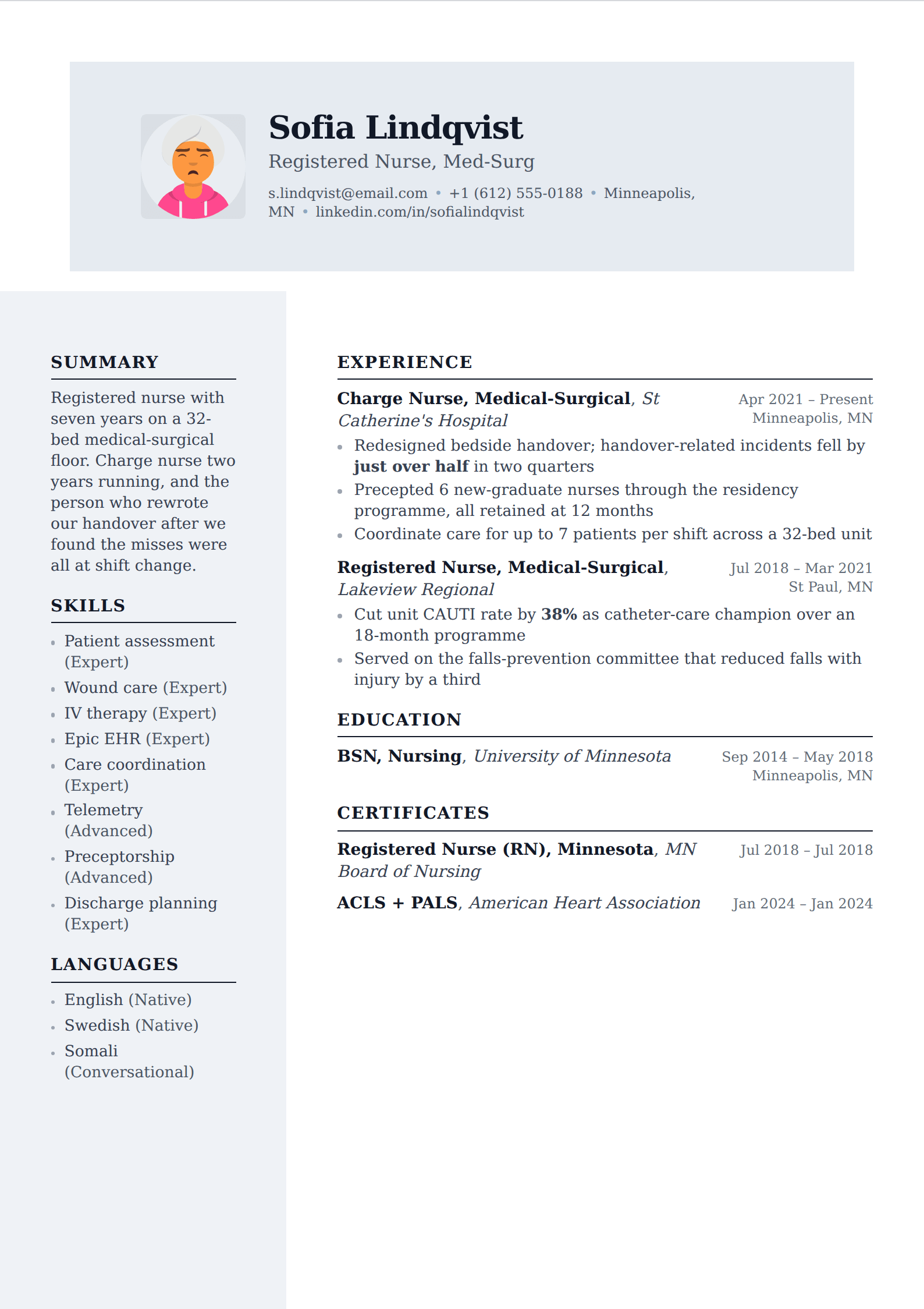
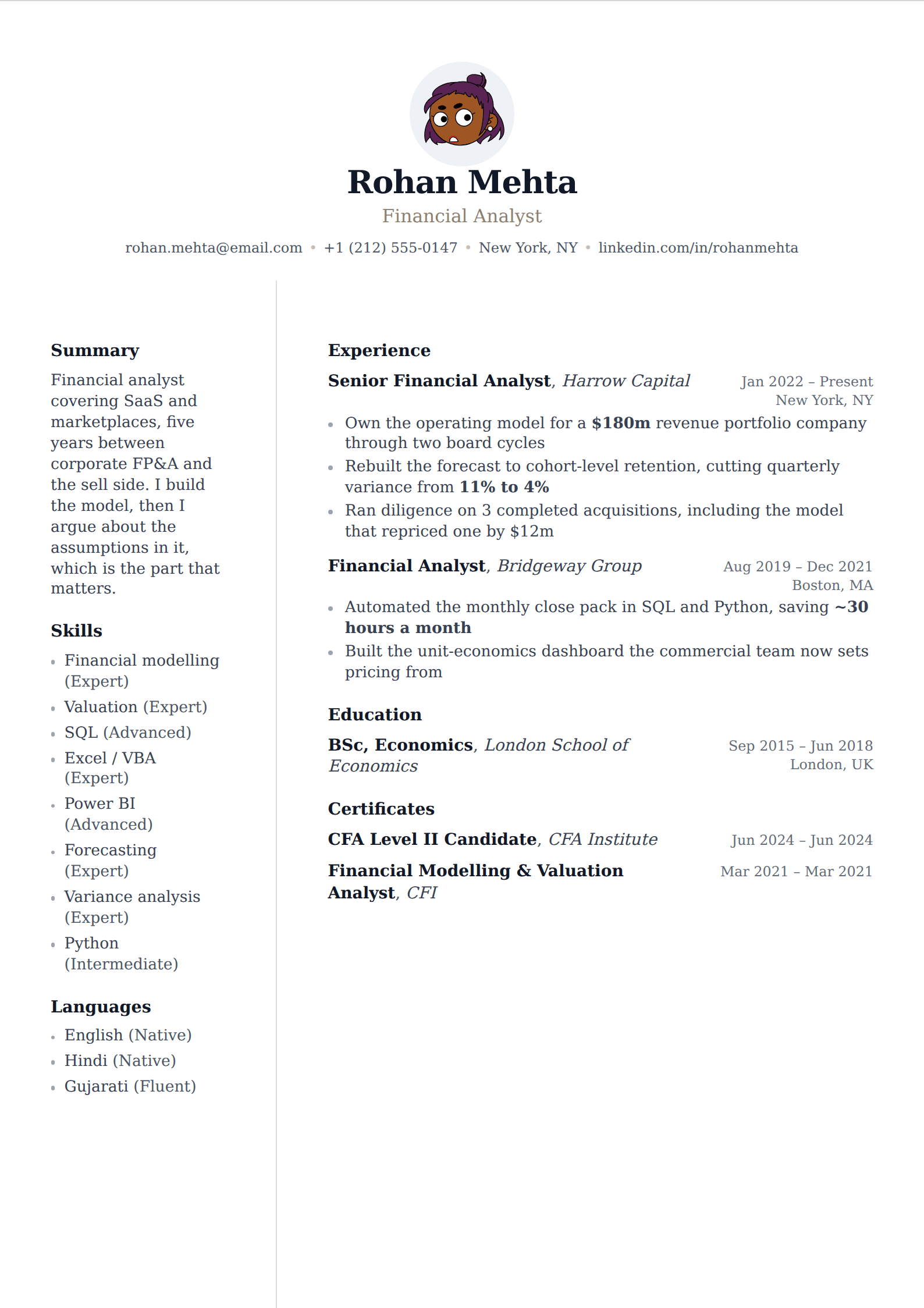
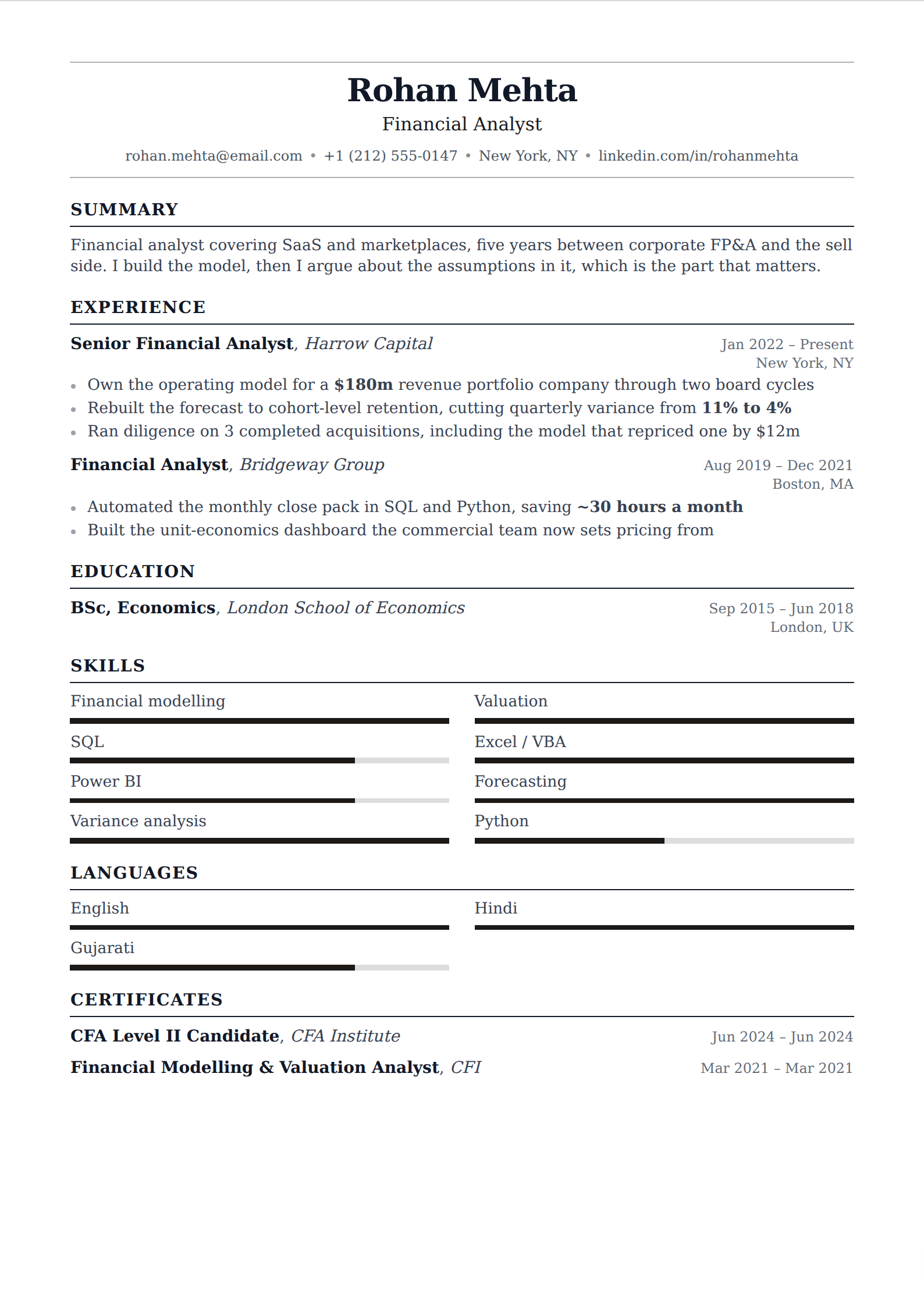
Serif typefaces and conventional structure — the register that finance, law, academia, healthcare and government hiring still expect. Formal, unfashionable on purpose, and none the worse for it.
63 of our templates match this. Every one is free to use, with unlimited watermark-free PDF downloads.
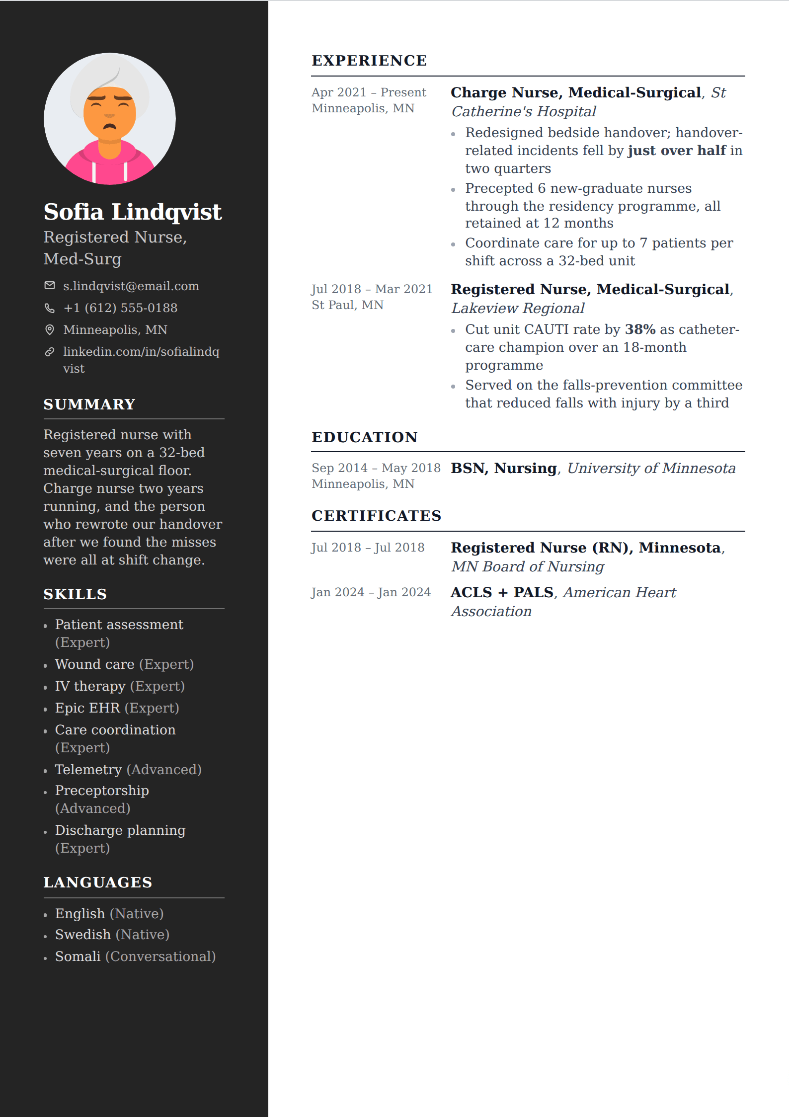
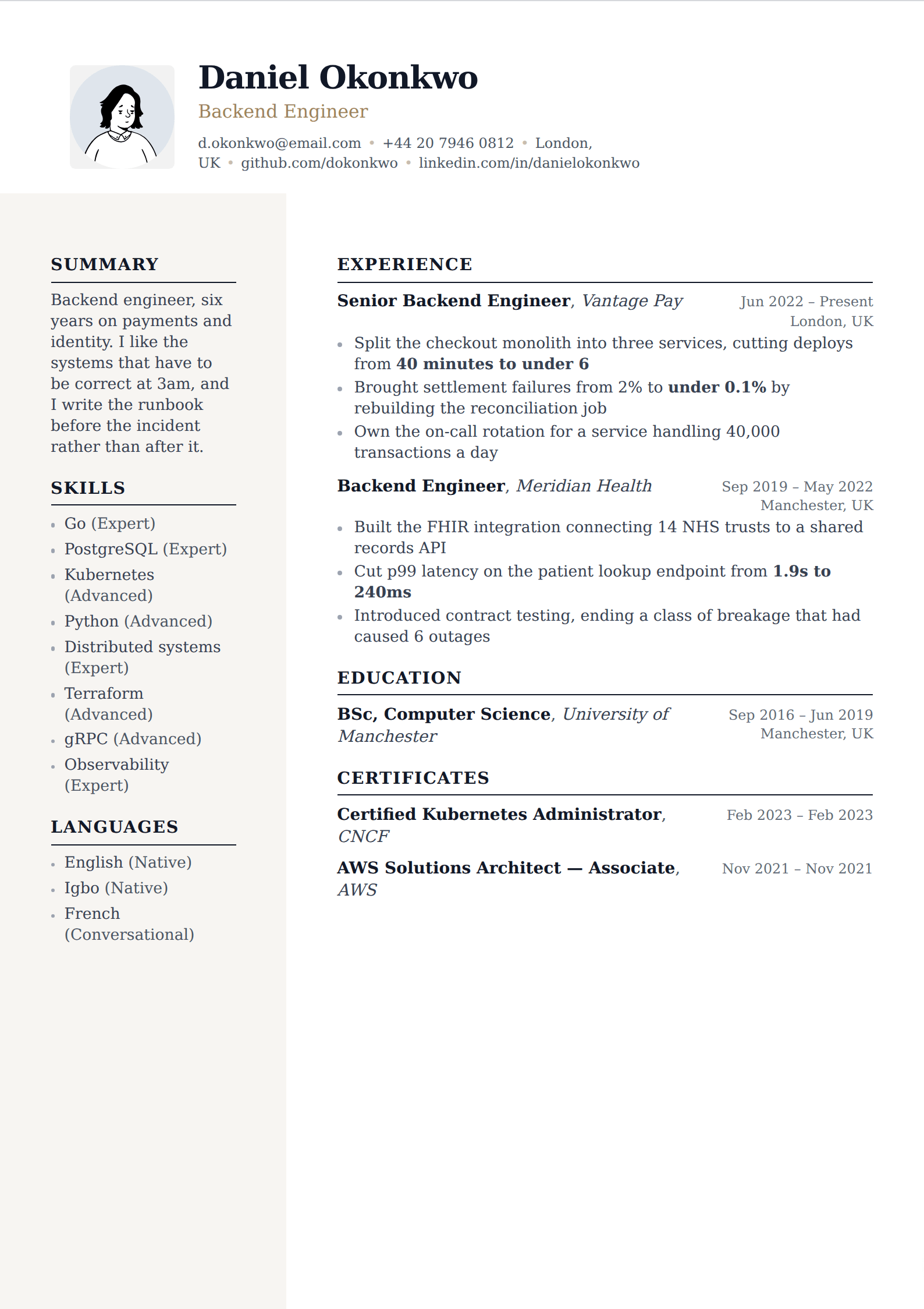
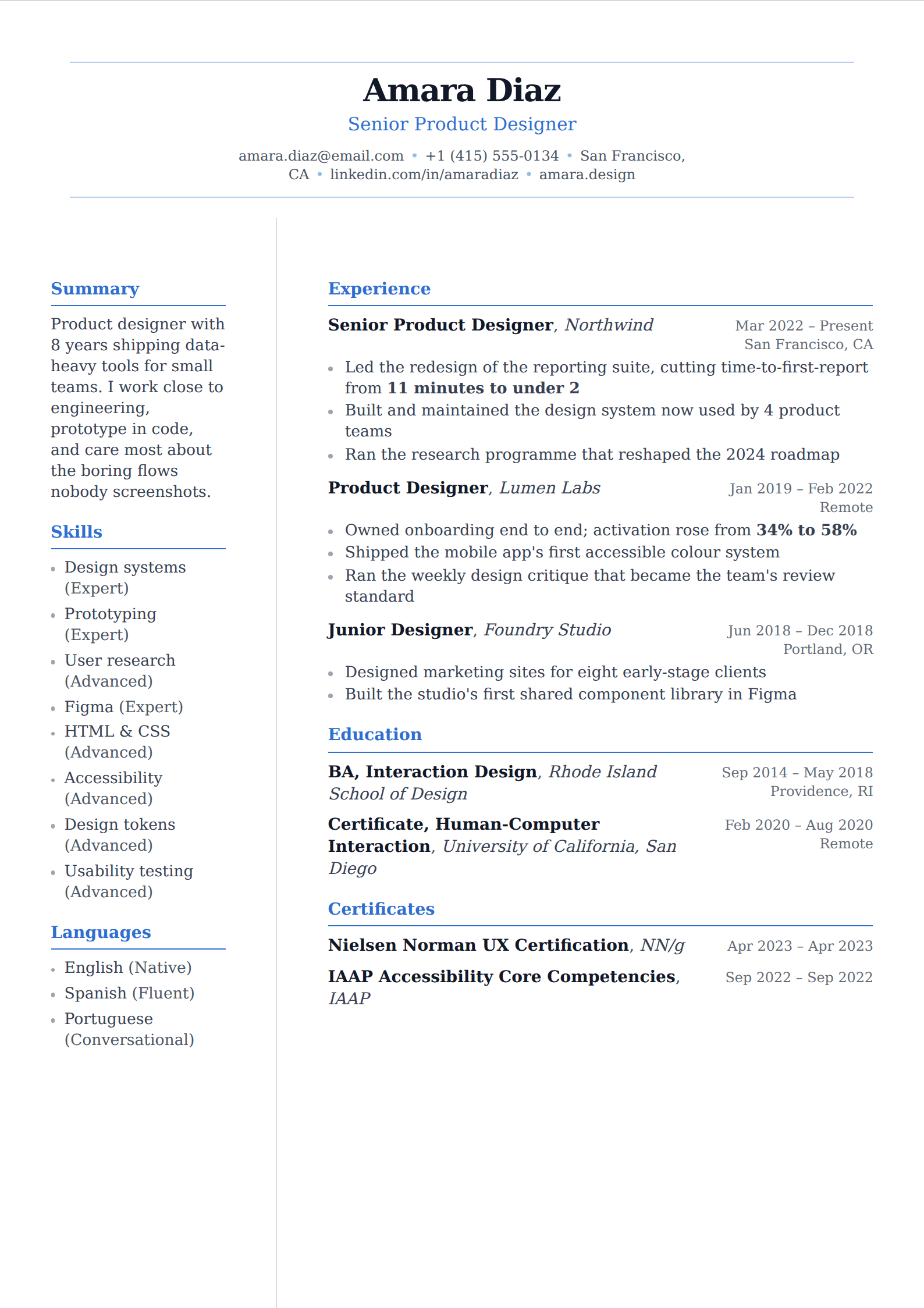
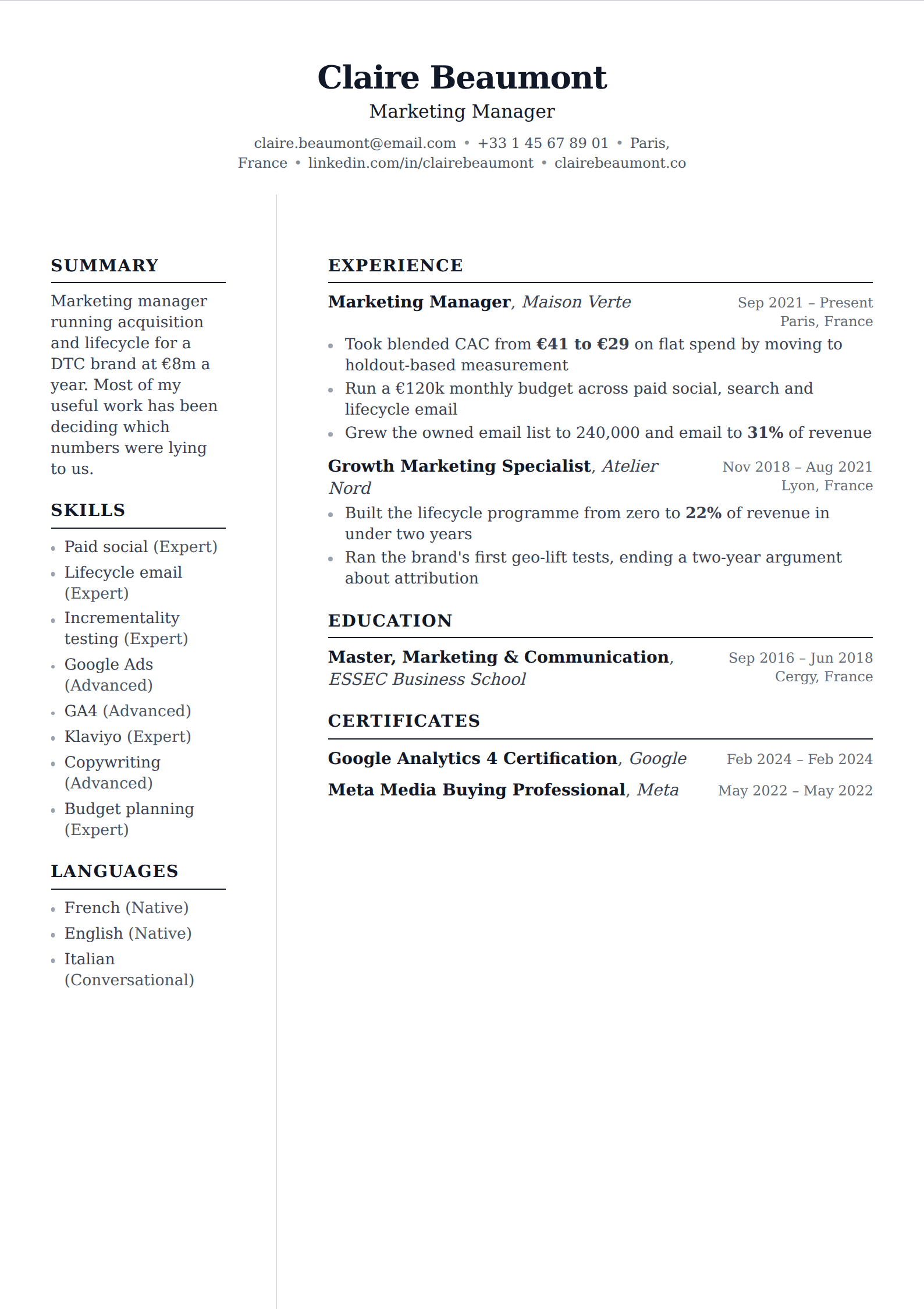
Where formality is still the right call
There are fields where a contemporary layout reads as not understanding the field. Law firms, academic departments, hospital systems, government agencies and much of finance have a house style that has not moved in twenty years, and matching it is a signal of fit rather than a lack of imagination. A serif face, standard headings and no colour is the correct answer to a question those readers are genuinely asking.
It also ages well. A resume you will update over a decade is better set in something that was not fashionable in any particular year, because the alternative is a document that reads as dated the moment its style cycles out.
Formal is not the same as crowded
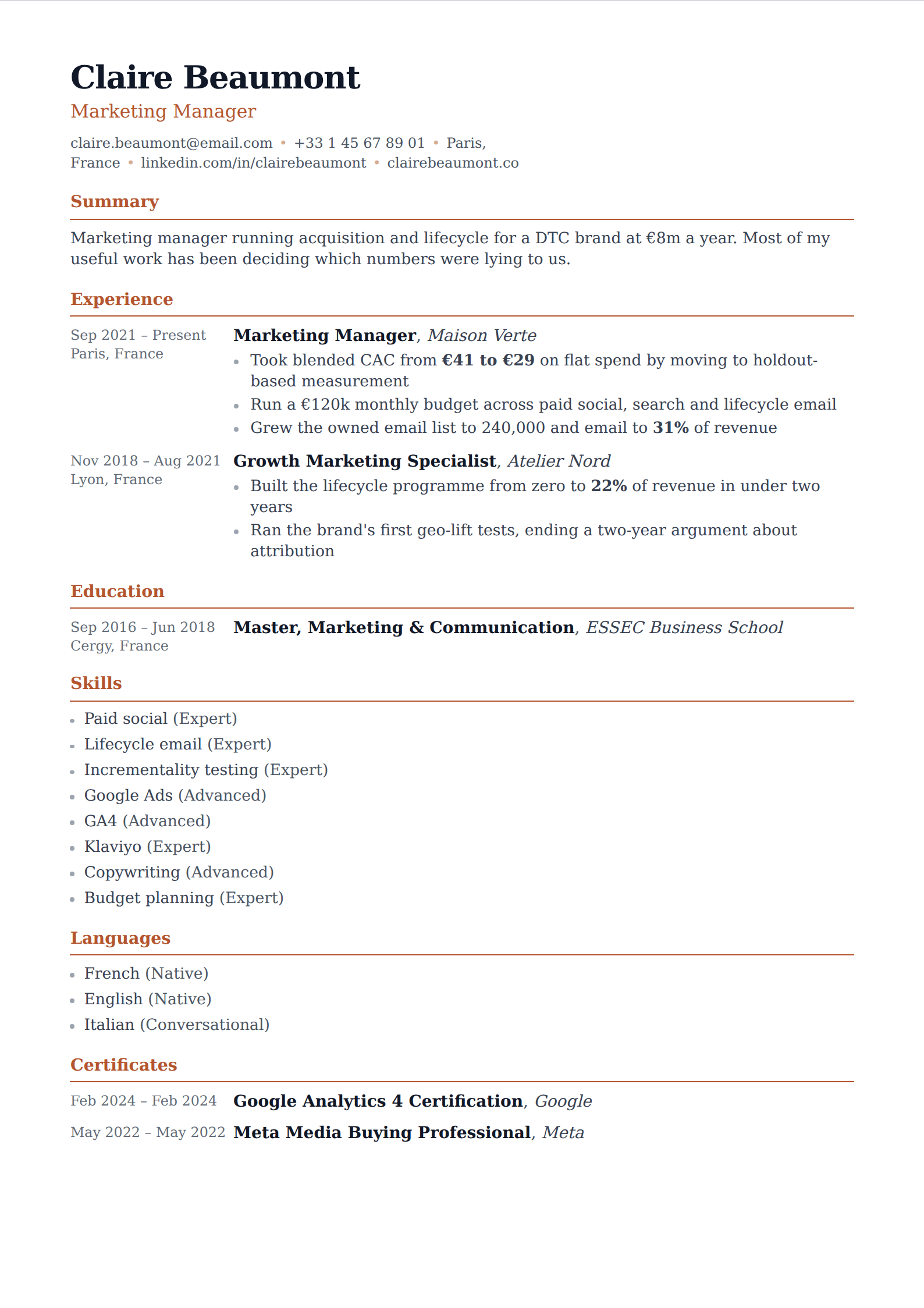
The failure mode of a professional resume is not being too plain — it is being too dense. Conventional structure invites people to keep adding, and a two-page wall of nine-point type with quarter-inch margins is harder to read than any design choice could make it. The margins and line height on these templates are set where they are deliberately.
If your field expects two pages, take them. Nursing, academia and senior technical roles routinely run to two. What should not happen is a second page created by shrinking the type on the first.
Common questions
What is the most professional resume format?
- Reverse-chronological, single column, standard section headings, and a serif or restrained sans-serif face. That is what nearly every conservative field expects and what every applicant tracking system parses most reliably. Functional and skills-based formats raise questions about what is being left out.
Should a professional resume have a photo?
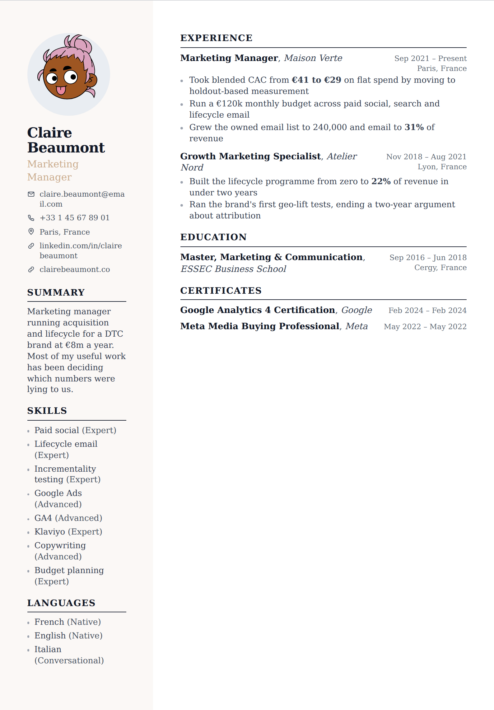
- In the US, UK, Canada and Australia, no — many employers prefer resumes without one for bias reasons, and some systems strip them. Across much of continental Europe, and in parts of Asia and Latin America, a photo is conventional and its absence is noticed. Follow the norm where you are applying.
One page or two?
- One page up to roughly eight to ten years of experience, two once the second page carries substance rather than padding. Academia, nursing and senior technical roles are the usual exceptions and run longer without penalty. Early-career resumes almost never justify a second page.
Other collections
Build it in the editor
Live preview, AI writing help, and an ATS-ready PDF. Free to start, and no card at any point.
Start your resume