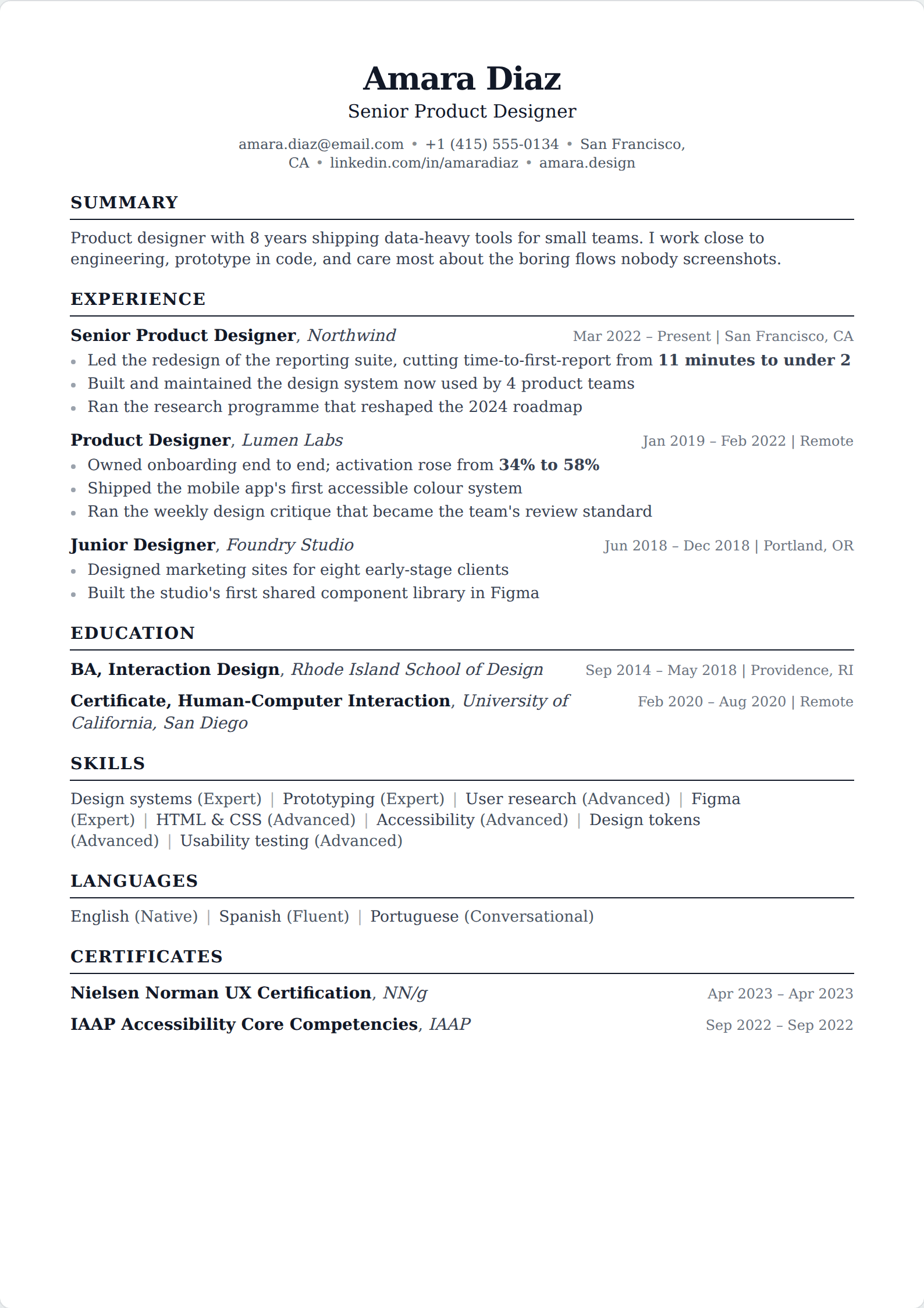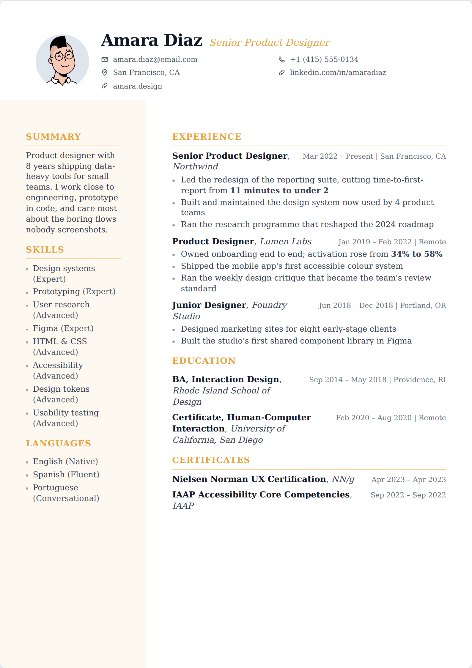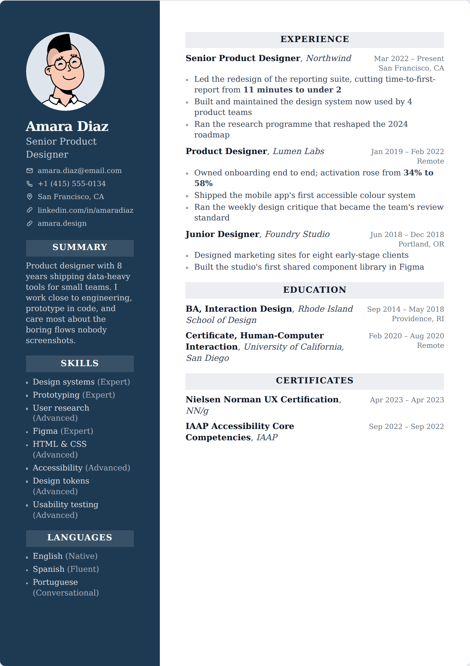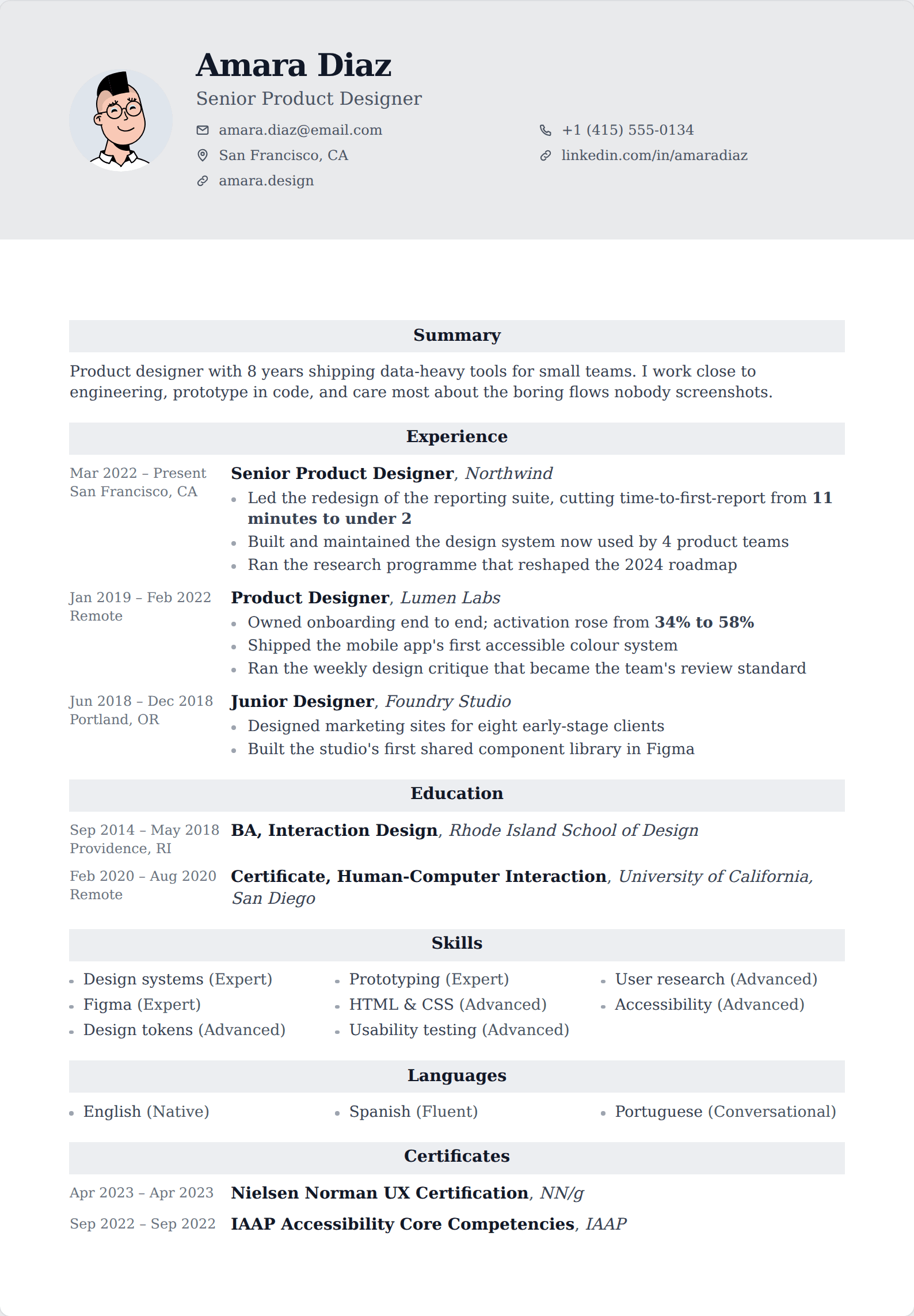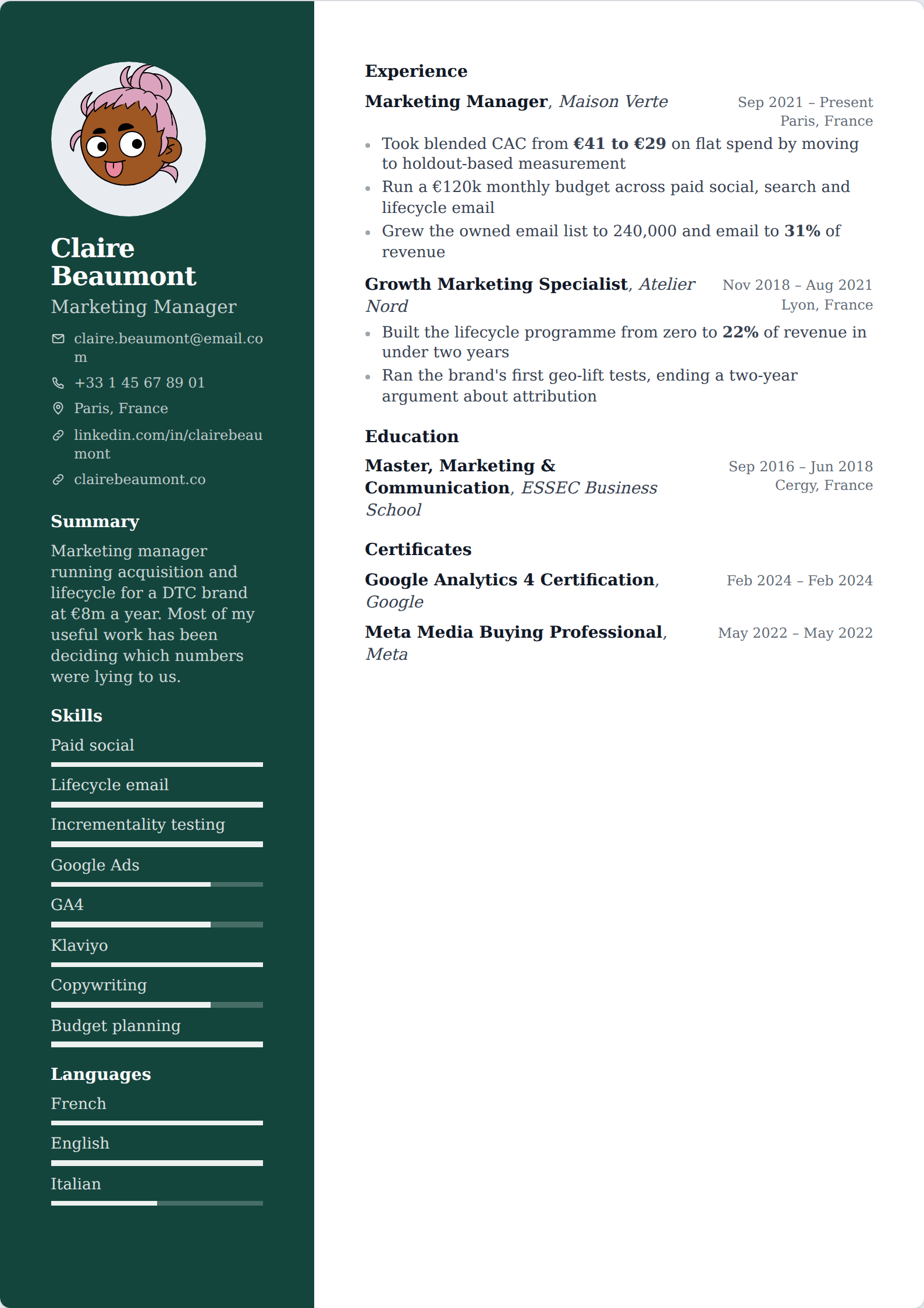

The fonts that work
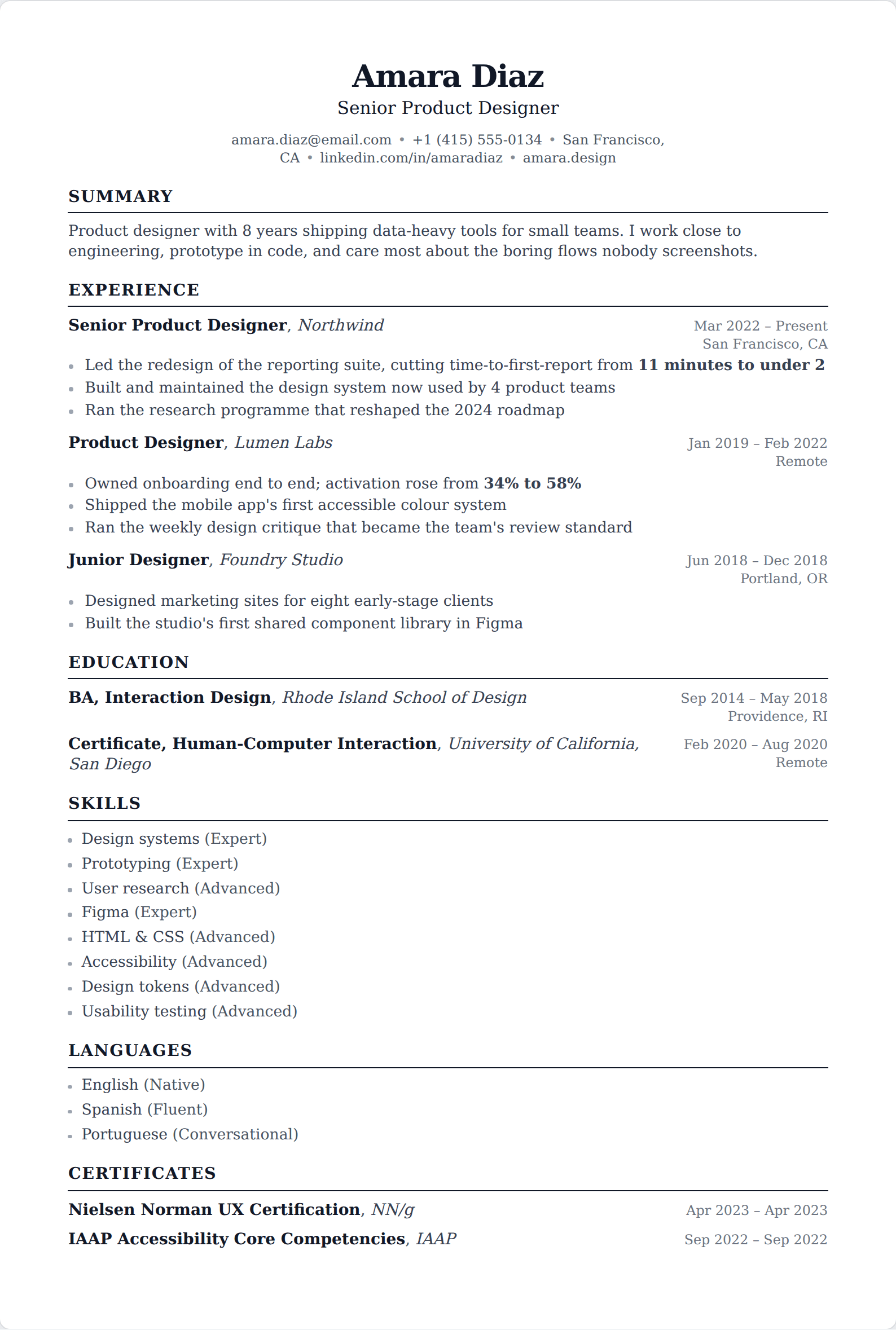
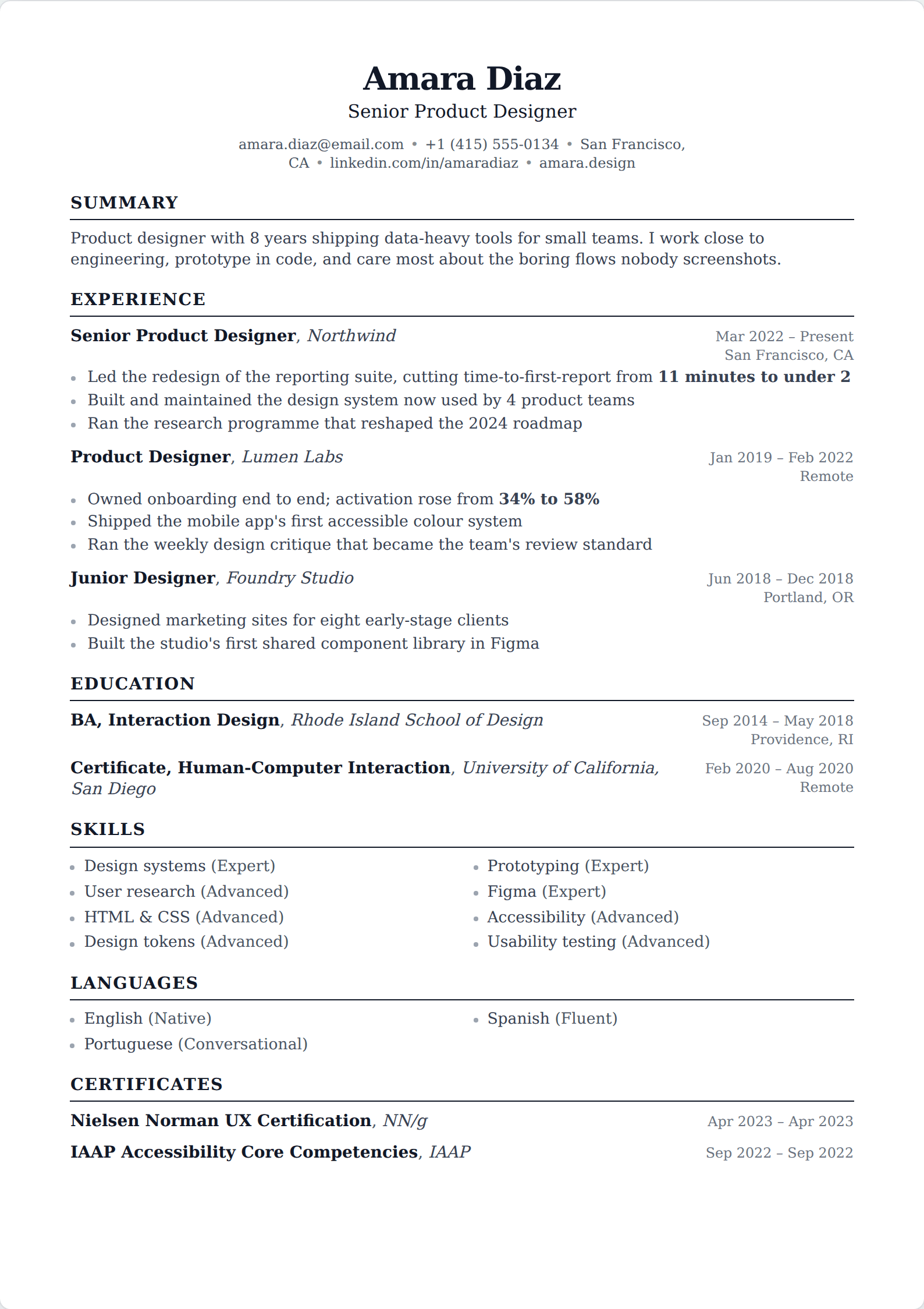
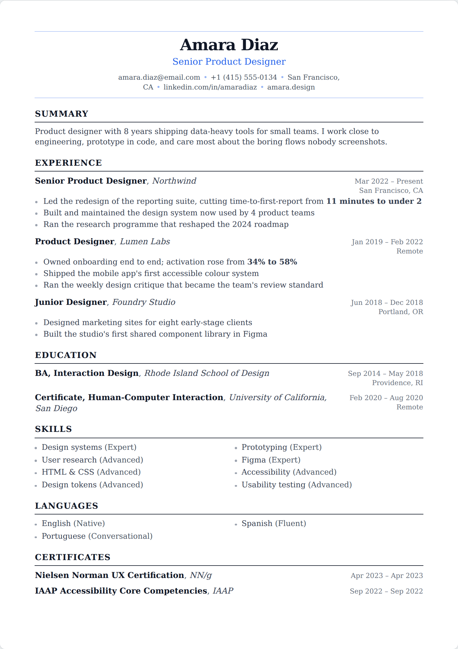
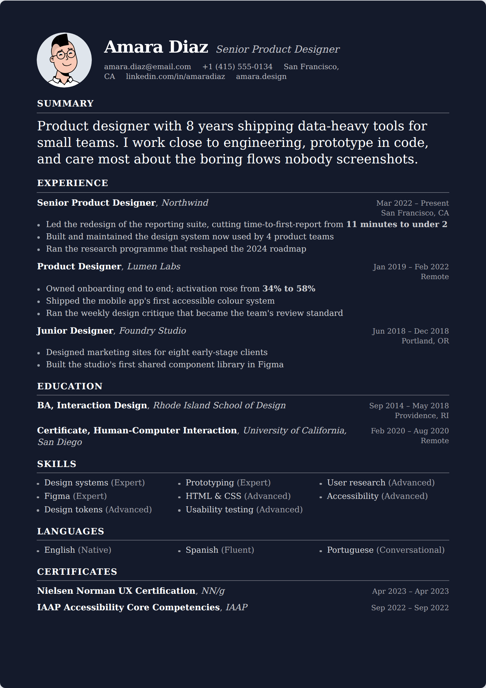
Any well-drawn typeface with a full character set, real bold and italic weights, and comfortable letterforms at eleven point. That is a wide field, and within it the differences are aesthetic rather than functional.
- Sans-serif: Helvetica, Arial, Calibri, Lato, Source Sans, Inter, Open Sans, Roboto, Verdana. Reads as contemporary; the default for technology, product and startup hiring.
- Serif: Georgia, Garamond, Cambria, Charter, Source Serif, Times New Roman. Reads as formal; the safer register for law, finance, academia and government.
- Either is correct almost everywhere. Pick one family and use it for the whole document — a serif for headings and a sans for body is a design decision that needs to be made well or not at all.
The ones to avoid, and why
Comic Sans and Papyrus are the jokes, and nobody reading this needs telling. The genuinely common mistakes are less obvious.
Anything condensed or narrow — Arial Narrow, condensed variants — because it is almost always chosen to fit more text onto a page. It works, and it makes the page harder to read, which trades a real cost against an imaginary benefit. If the content does not fit at a normal width, cut the content.
Script and display faces, at any size, for any role including creative ones. A designer demonstrates typographic judgement by setting a resume beautifully in a workhorse face, not by using a decorative one.
And any font you installed yourself and are exporting from a desktop application without embedding. An unembedded font is substituted on the reader's machine, which can reflow your entire page. Exporting a PDF from a tool that embeds fonts removes this problem entirely, which is most of the reason to send a PDF at all.
Size, spacing and margins
Body text at ten to twelve point, and eleven is the answer if you do not want to think about it. Below ten it stops being comfortable for a reader scanning quickly on a screen; above twelve you are spending the page on air.
Your name at eighteen to twenty-four point, section headings at thirteen to sixteen. That is three sizes total, and three is enough — the hierarchy on a resume is name, section, body, and adding a fourth or fifth size makes the page busier without making it clearer.
Line height between 1.15 and 1.5. Margins between half an inch and one inch on every side. Half an inch is the floor; below it the page reads as crowded and some printers will clip.
- Body: 10–12pt, 11pt if unsure.
- Name: 18–24pt. Section headings: 13–16pt.
- Line height: 1.15–1.5.
- Margins: 0.5–1 inch, never below 0.5.
- Bold for emphasis, sparingly. Underlining is for links only.
The trap: shrinking type to fit
The single most common font mistake is not choosing the wrong face. It is setting a perfectly good face at nine point with quarter-inch margins to force two pages of content onto one. The result is a page that is technically one page and practically unreadable, and every reader recognises what happened.
The fix is editorial, not typographic. If it does not fit at eleven point with half-inch margins, there is too much on it — usually an old job that could be a single line, bullets that run to three lines each, or a skills section carrying twelve items nobody needed. Cutting is the answer, and it improves the resume twice over.
The exception is that two pages is fine past roughly a decade of experience. People compress to one page because they believe a rule that does not exist at senior levels, and the compression deletes evidence.
Does the font affect ATS parsing?
No, with one qualification. Applicant tracking systems extract characters from the PDF, and the character stream is identical whether it was set in Garamond or Arial. Serif versus sans is invisible to a parser.
The qualification is that the text must be text. A resume exported as an image, scanned, or with the name rendered inside a graphic contributes nothing to the parse regardless of how it was typeset. Check by selecting the text in your exported PDF: if you can highlight it, a parser can read it.
What genuinely affects parsing is column count, not typography. That is worth the attention people spend on fonts.