
Modern resume templates
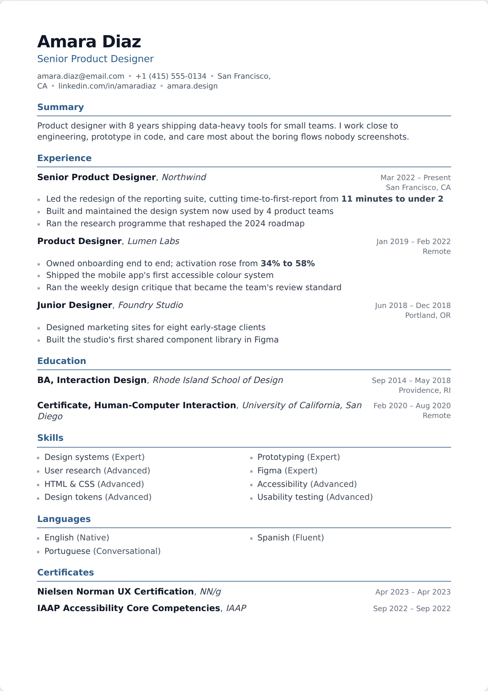
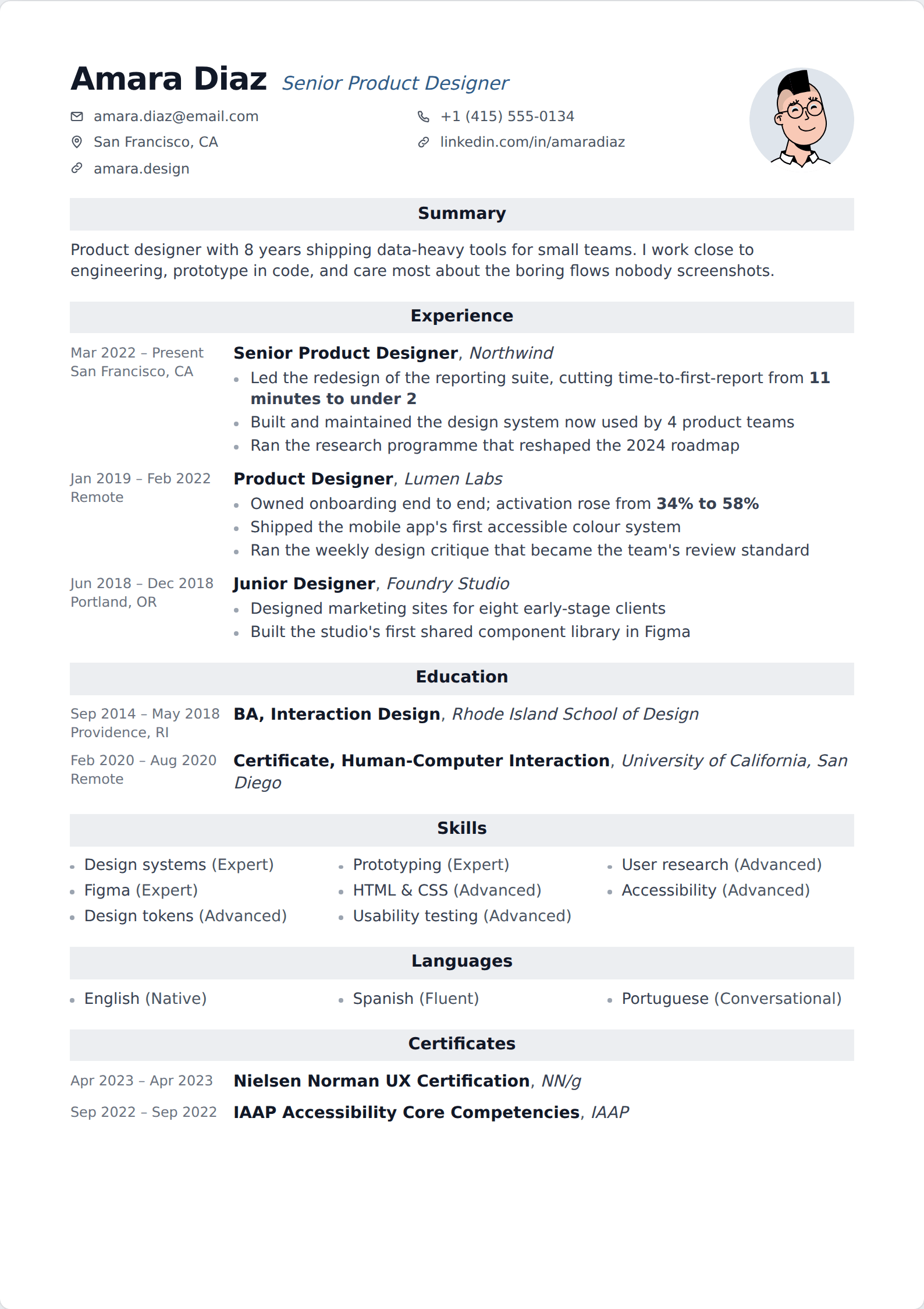
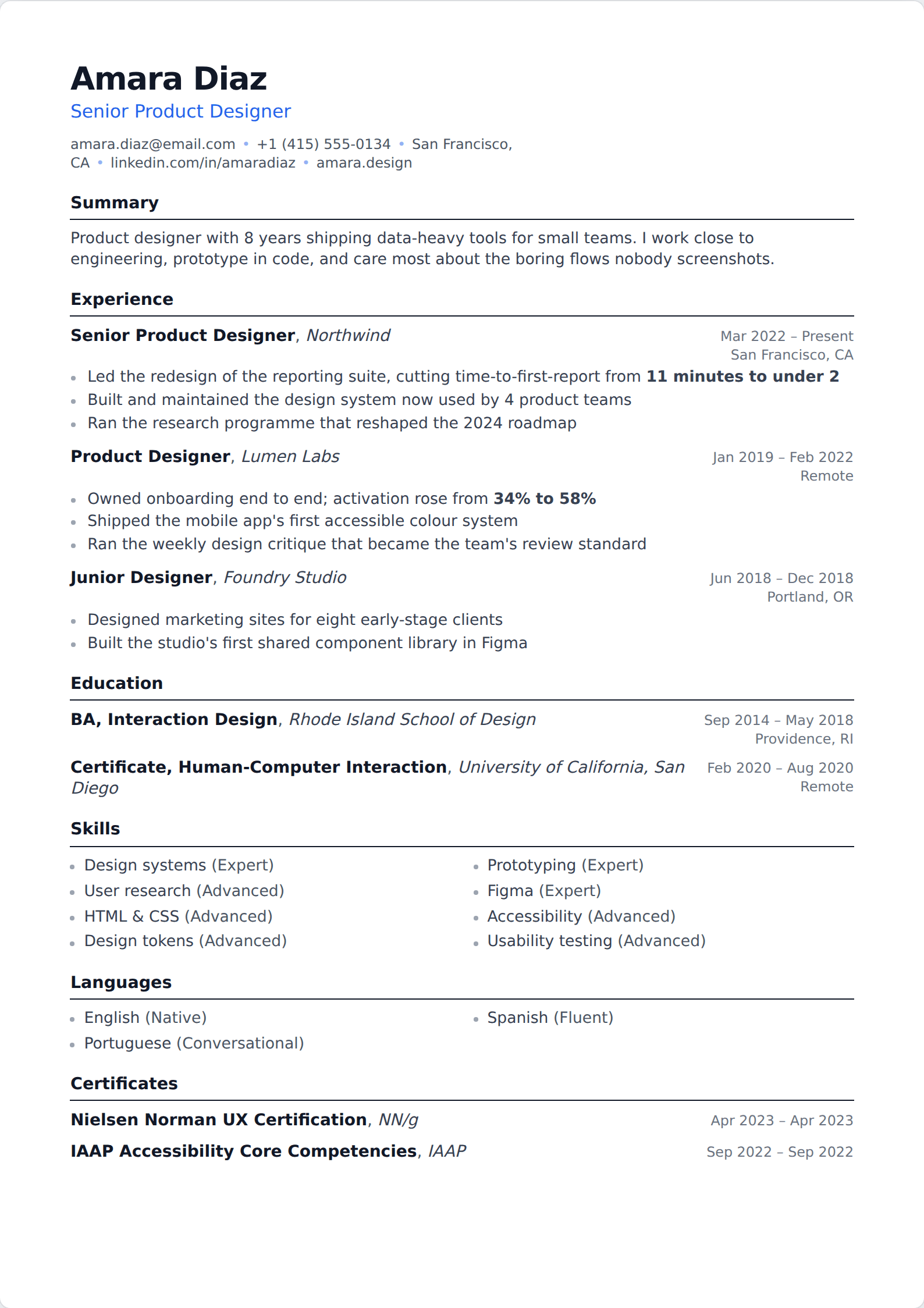
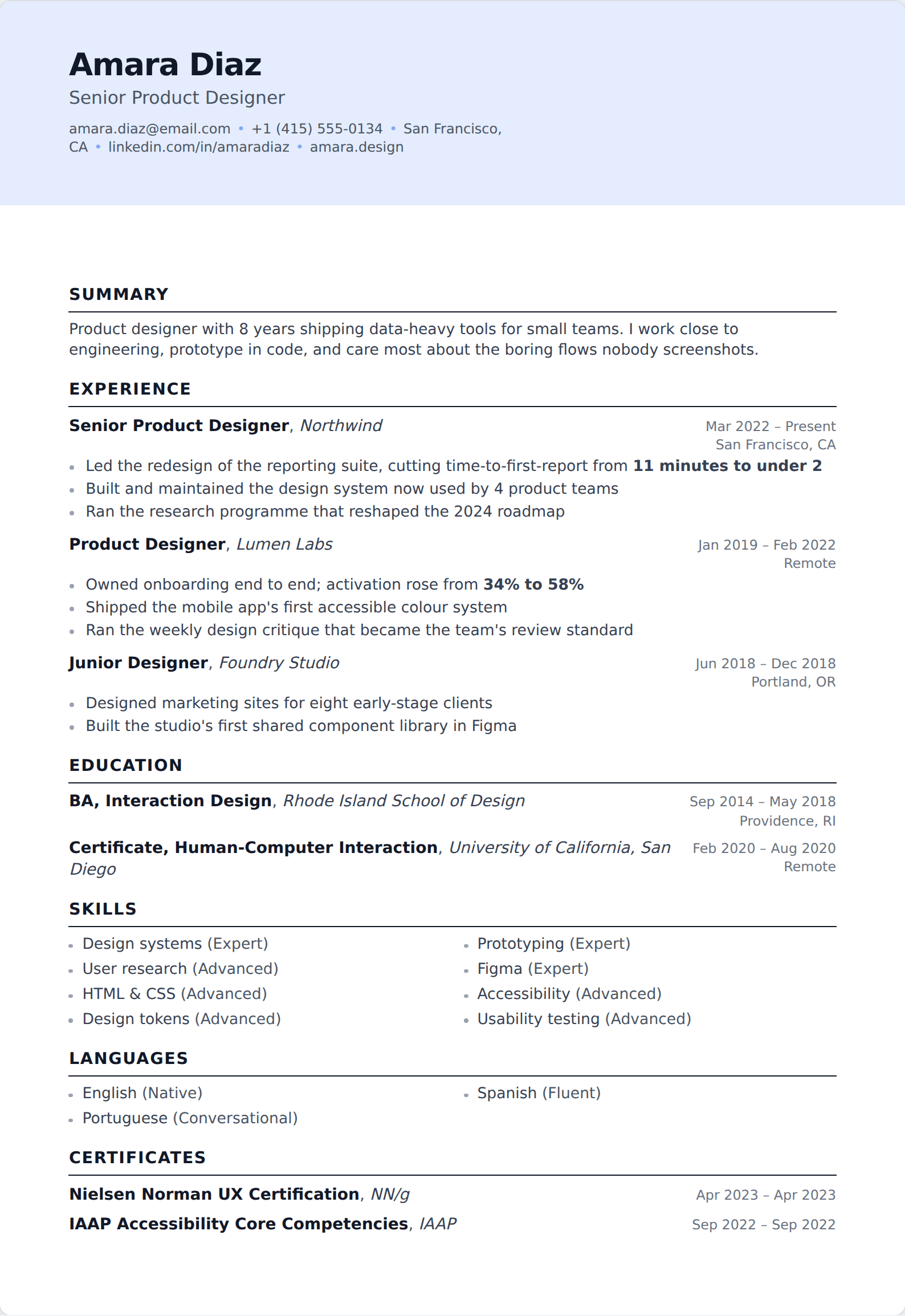
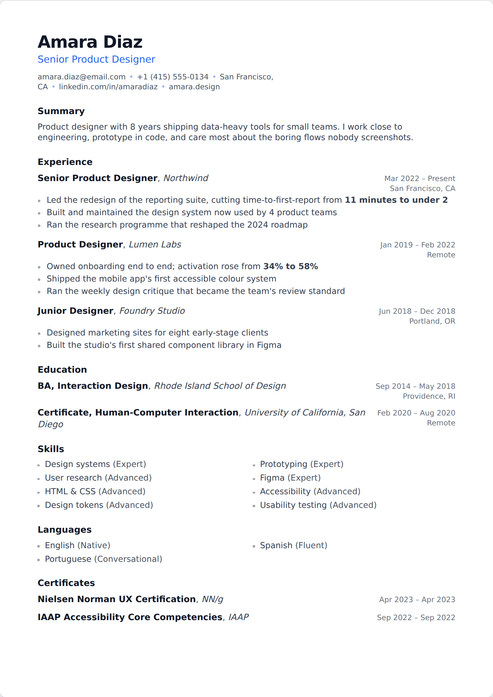
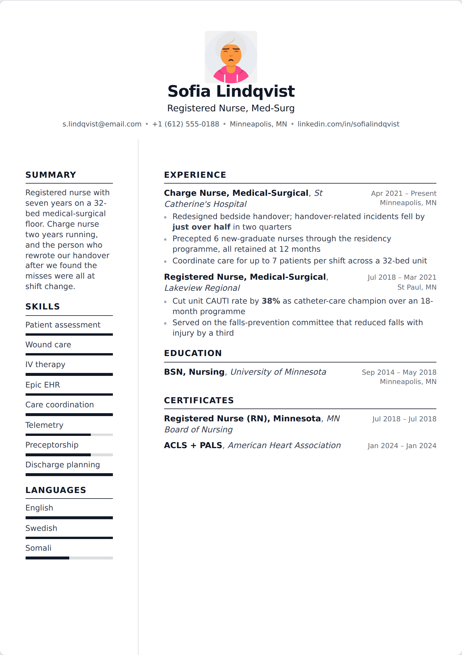
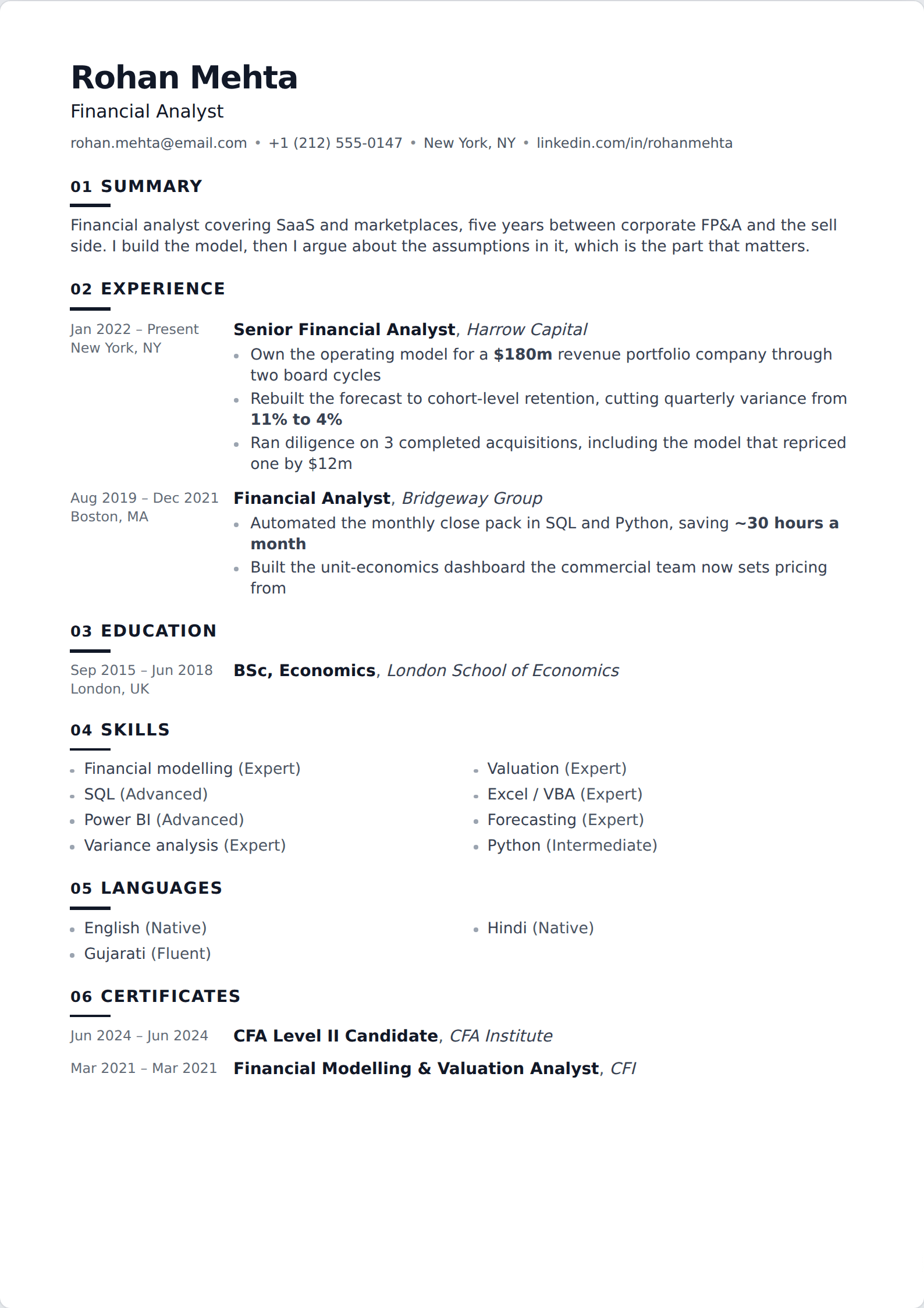
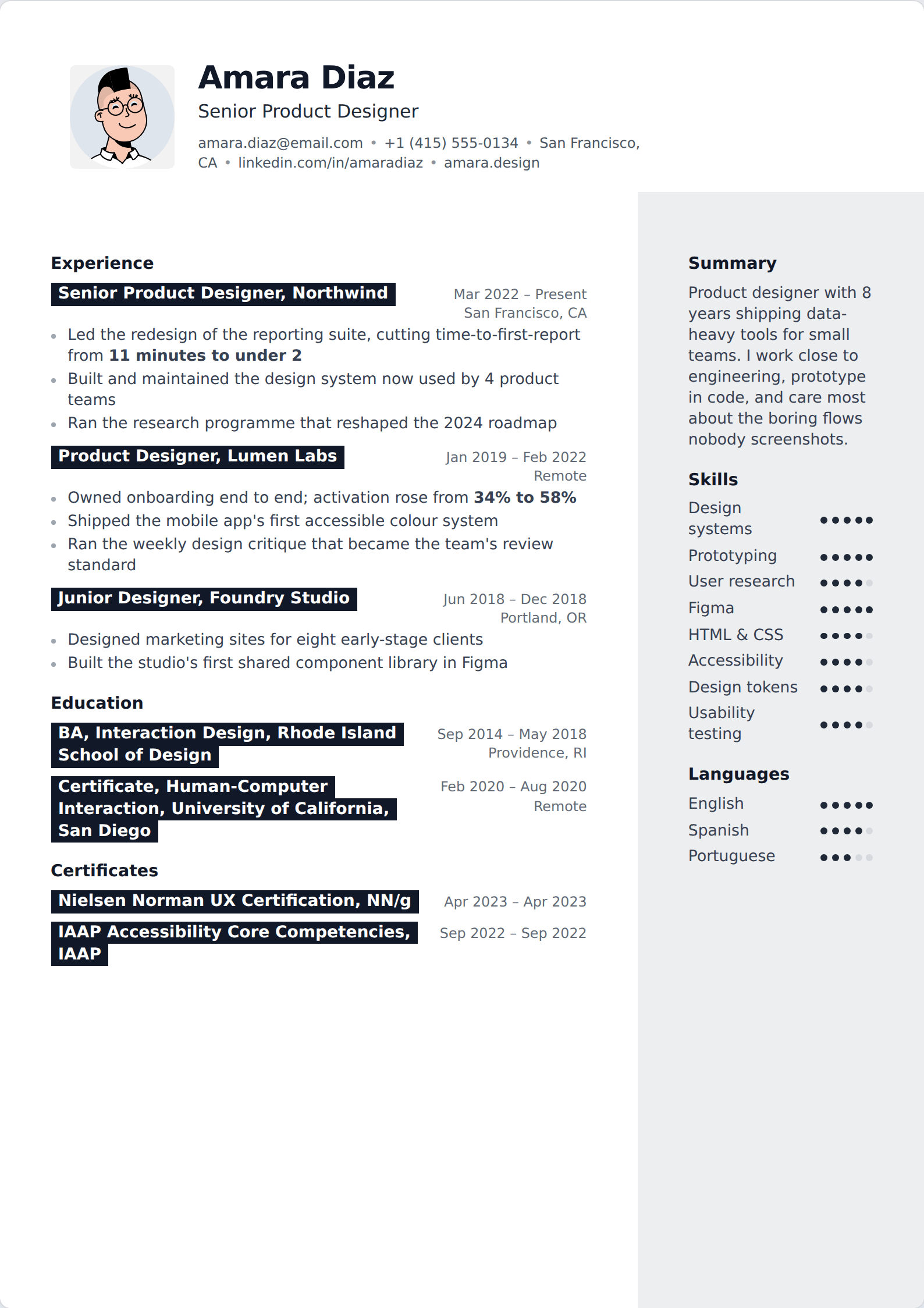
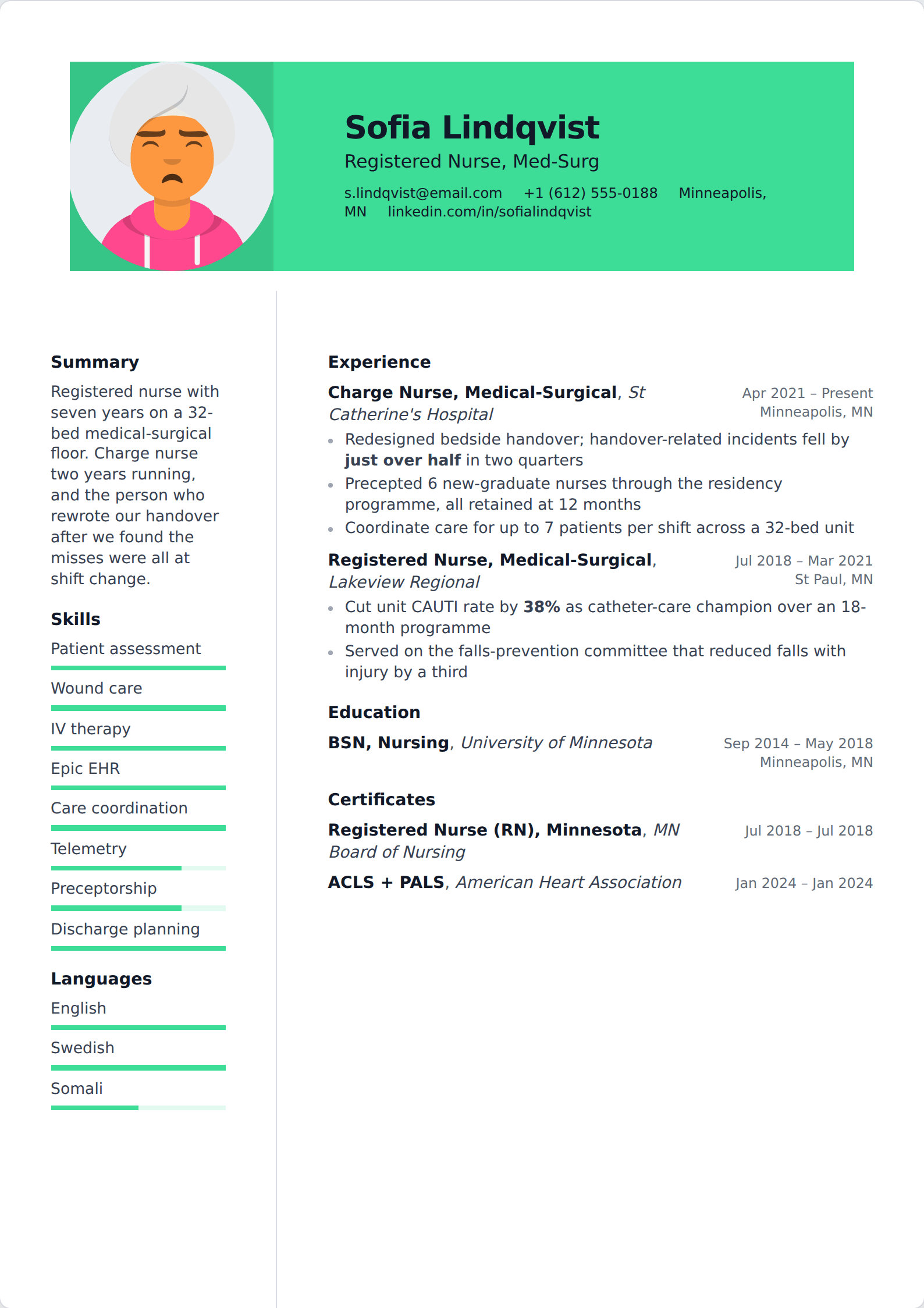
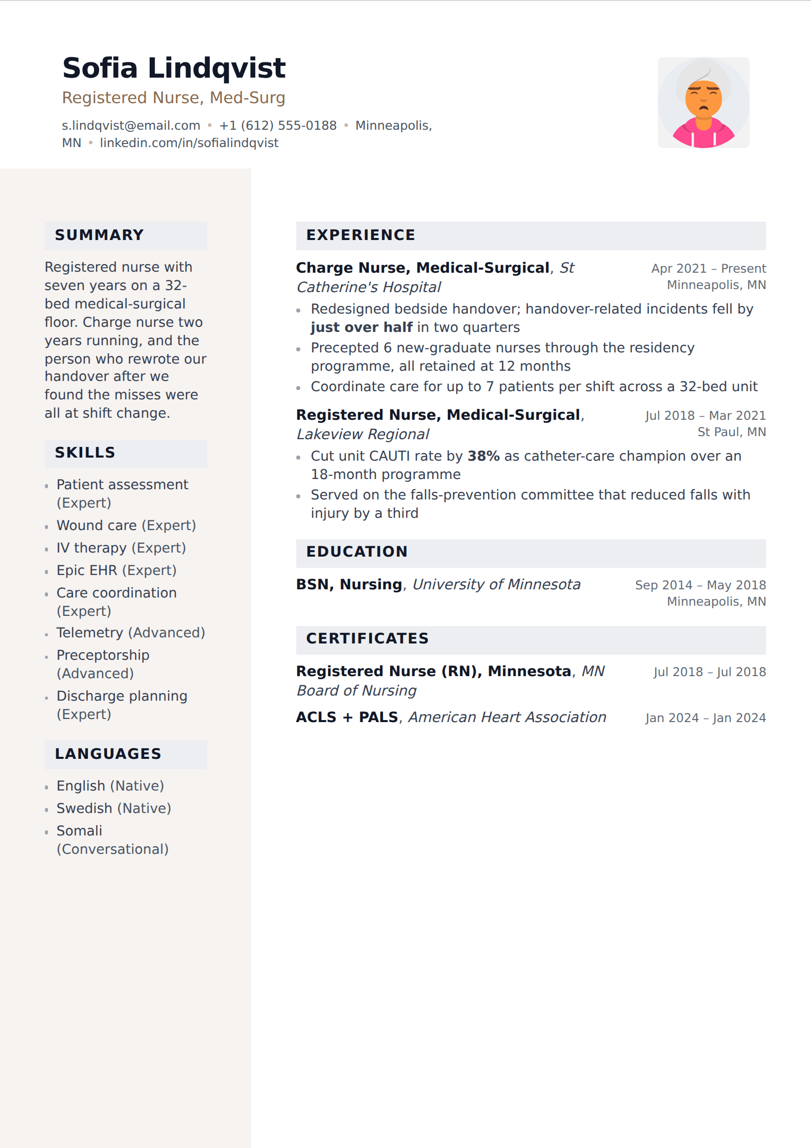
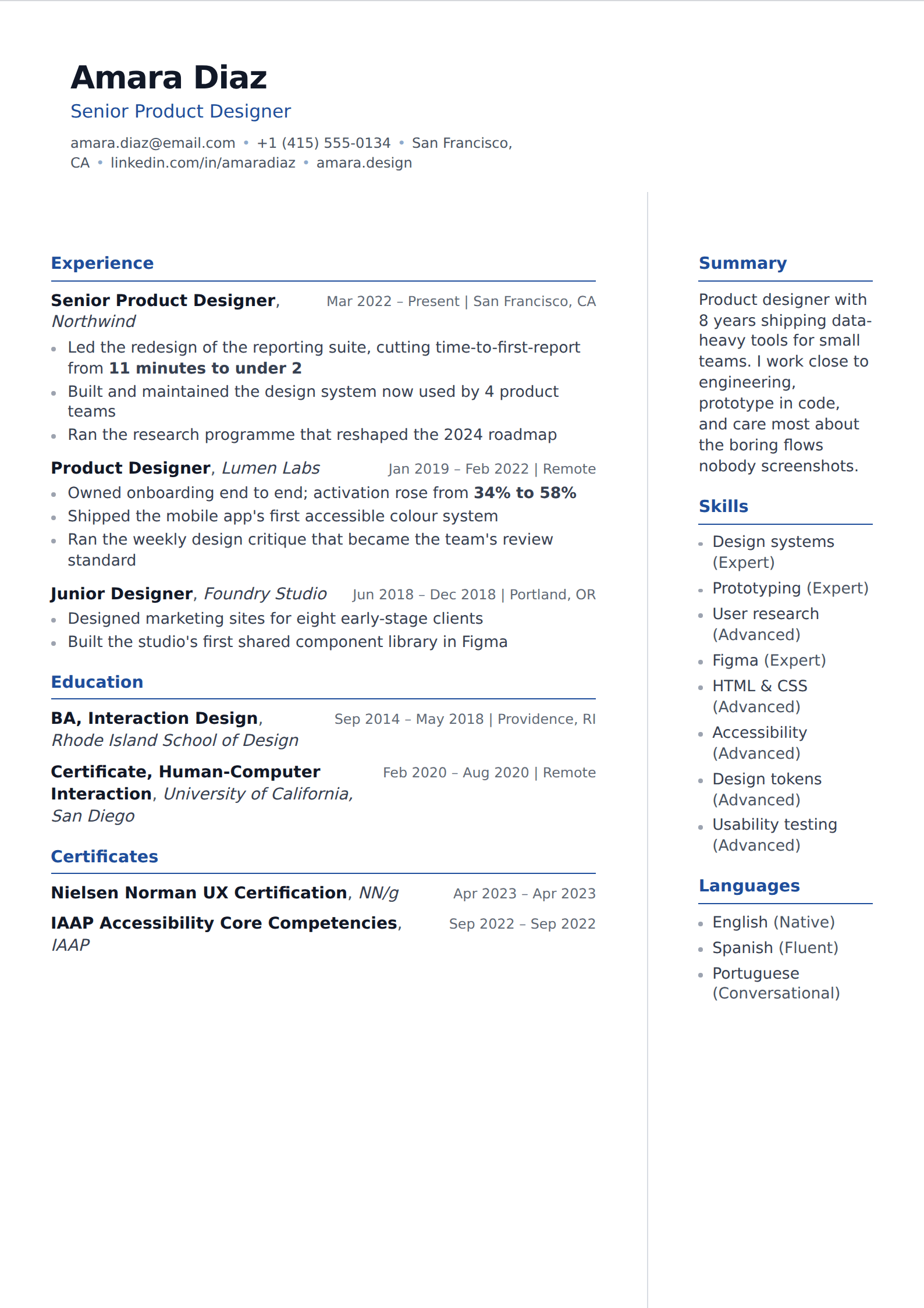
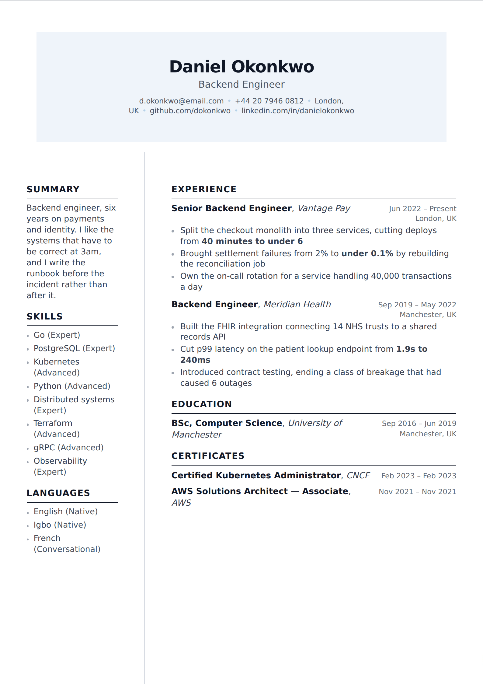
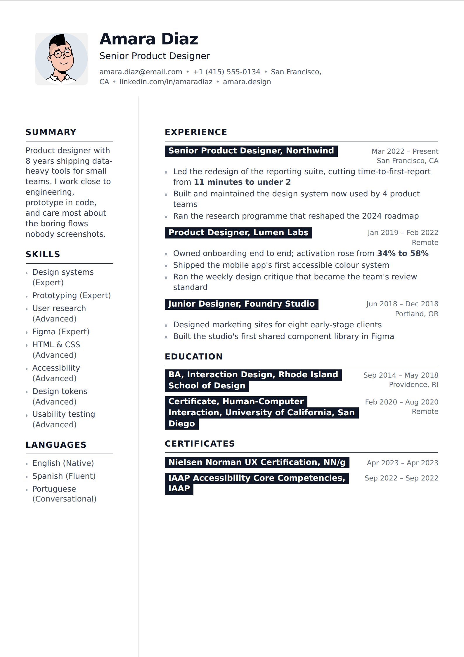
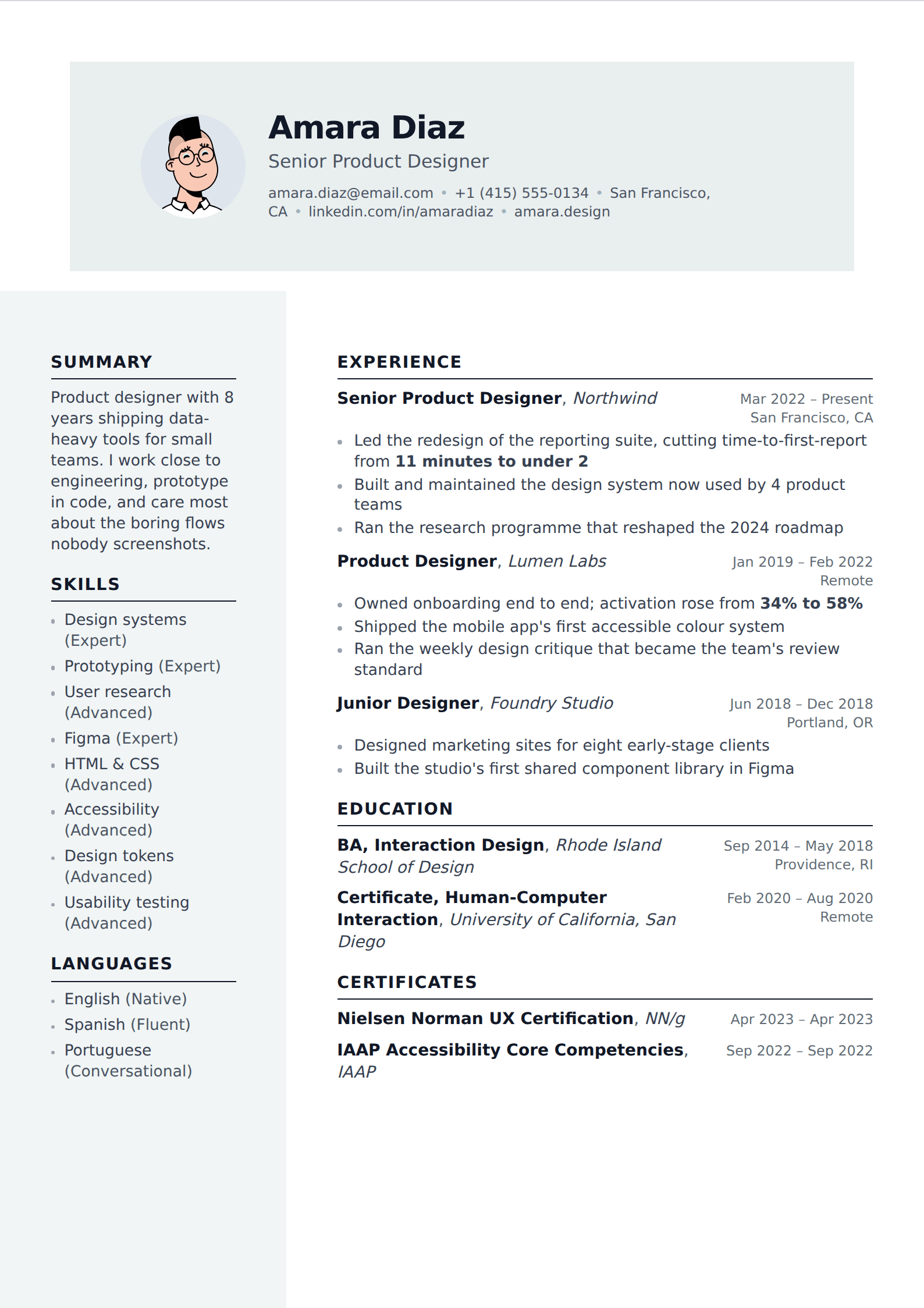
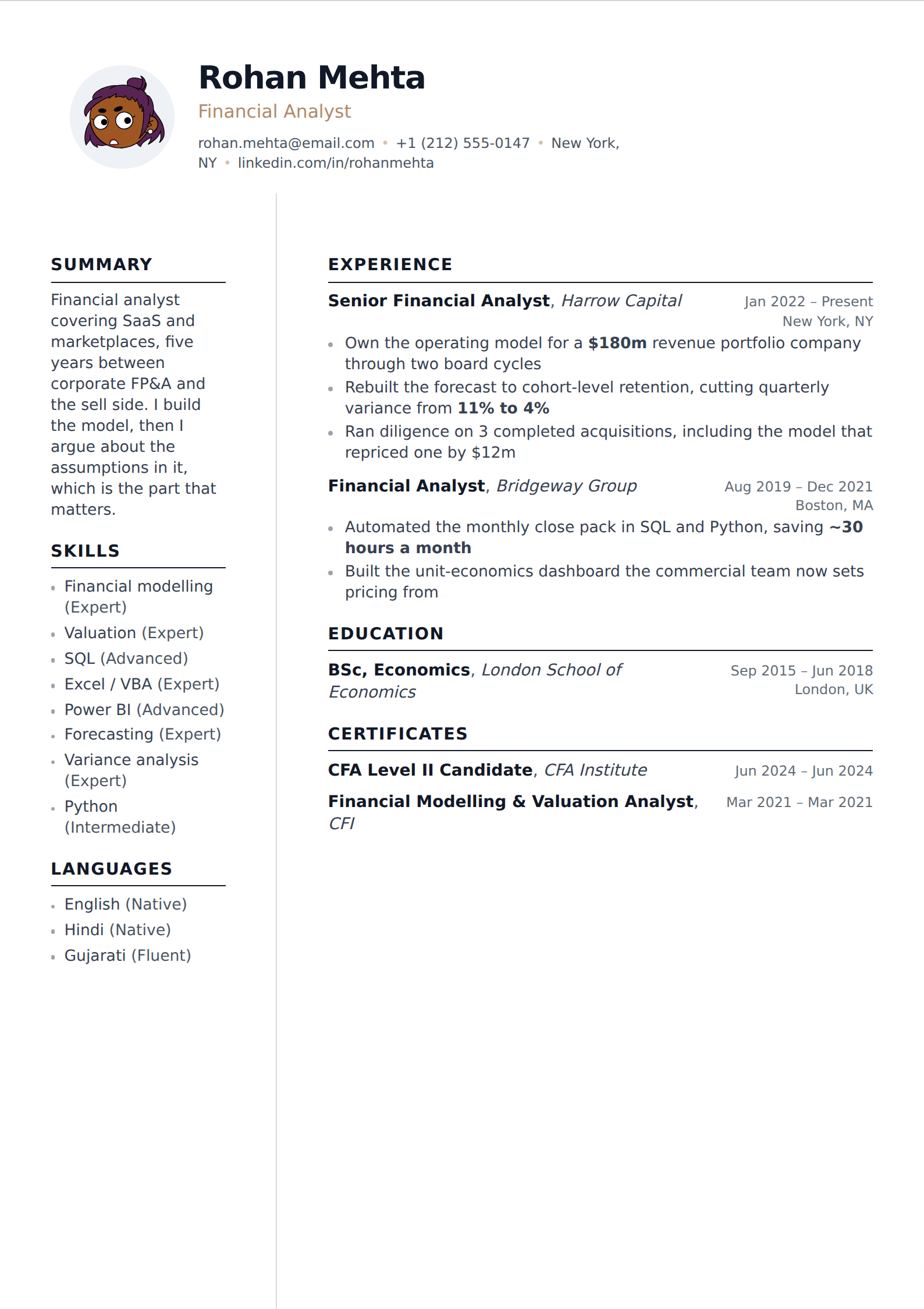
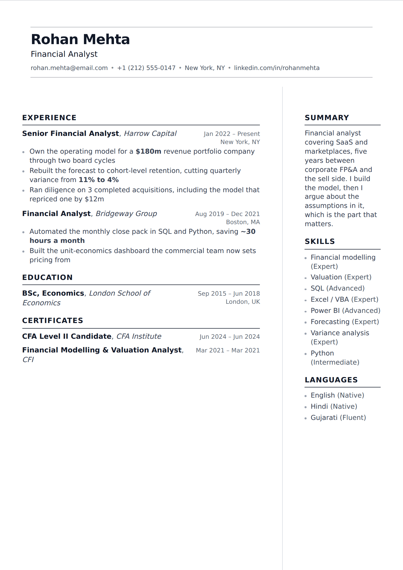
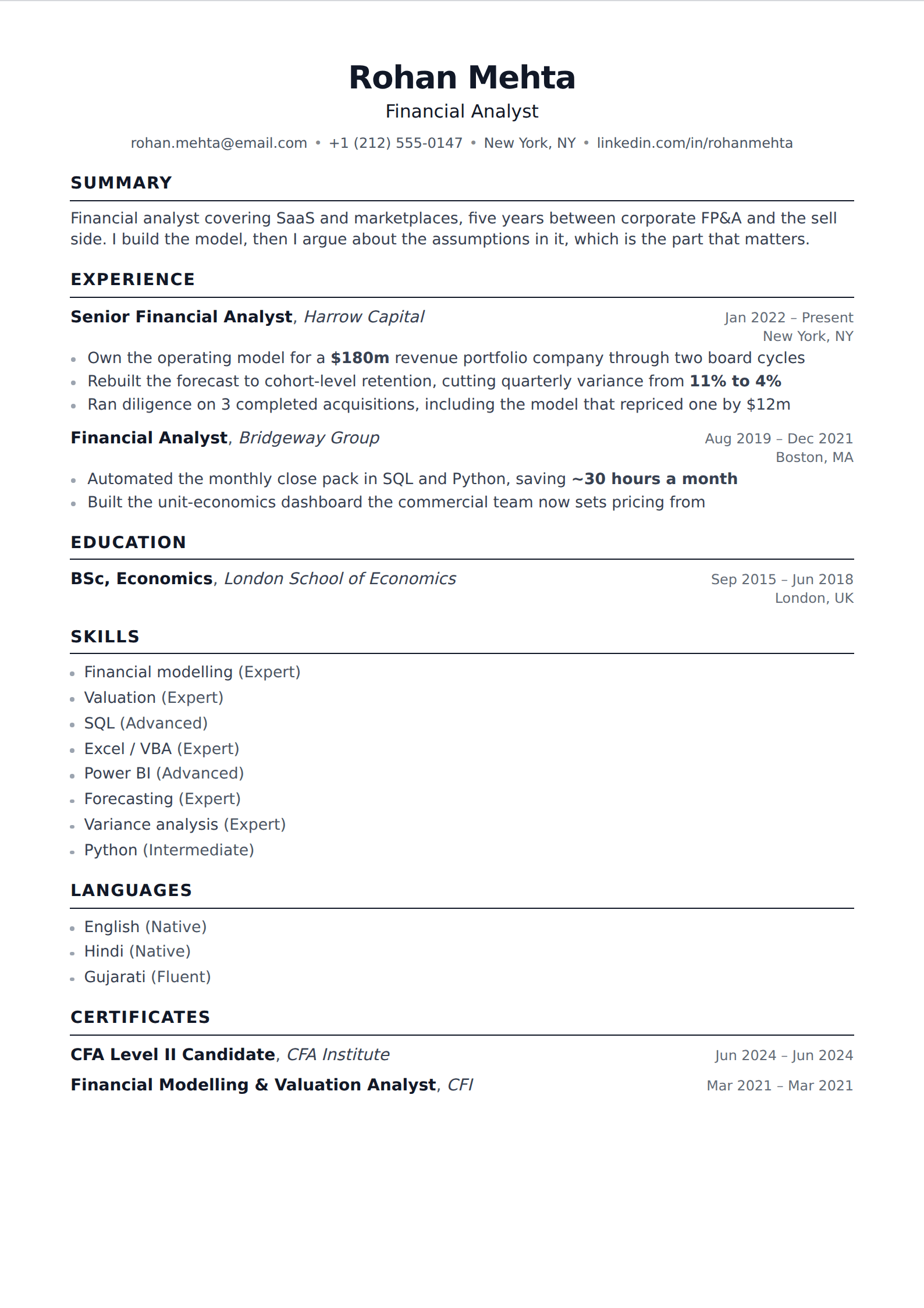
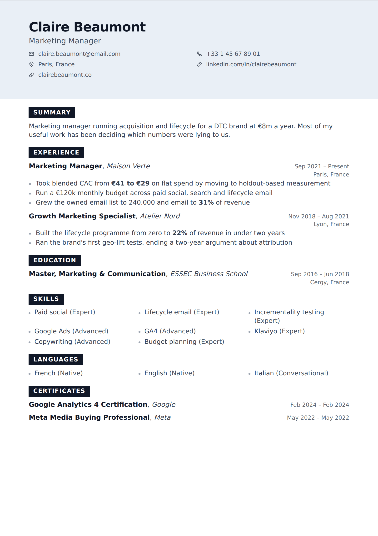
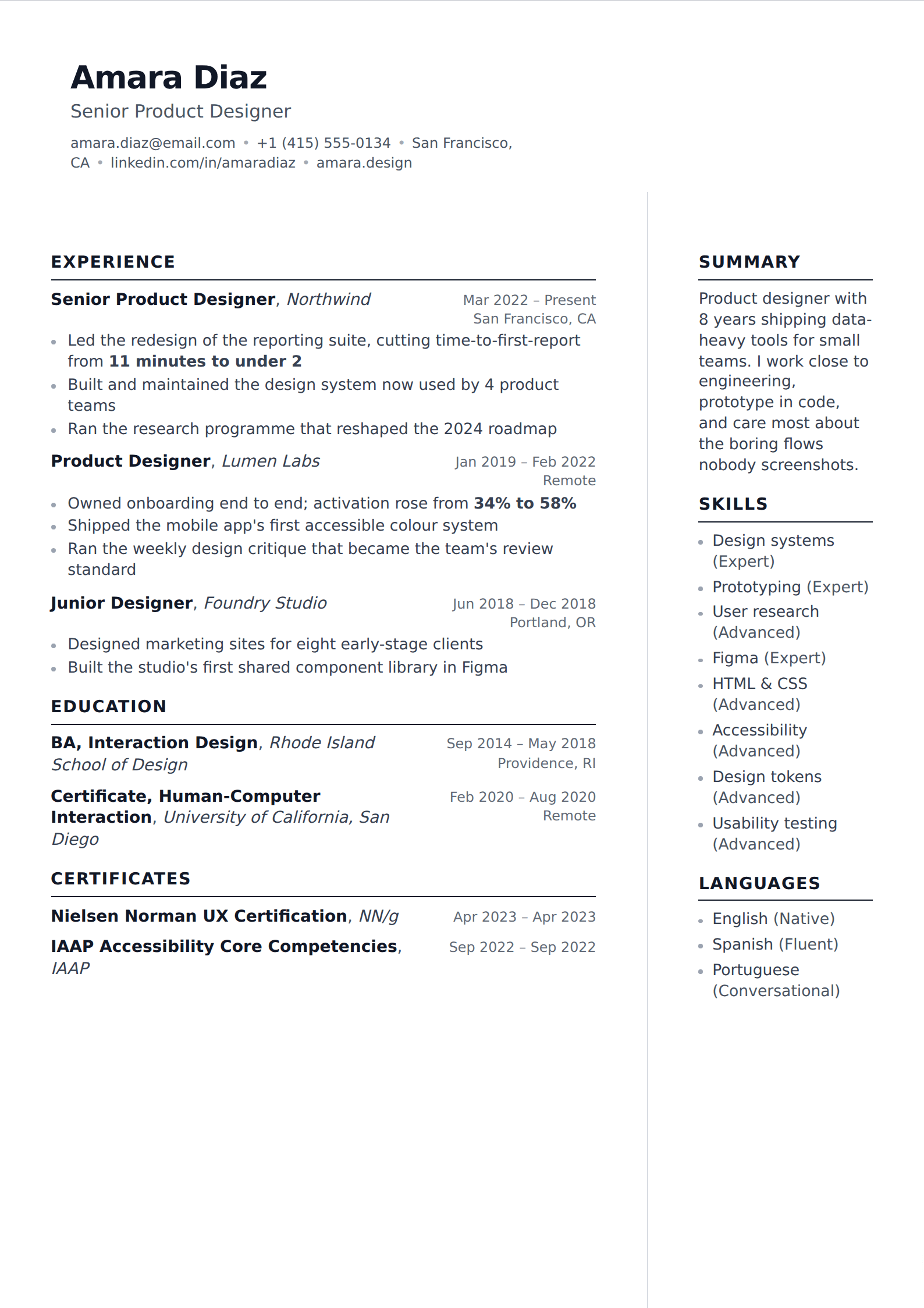
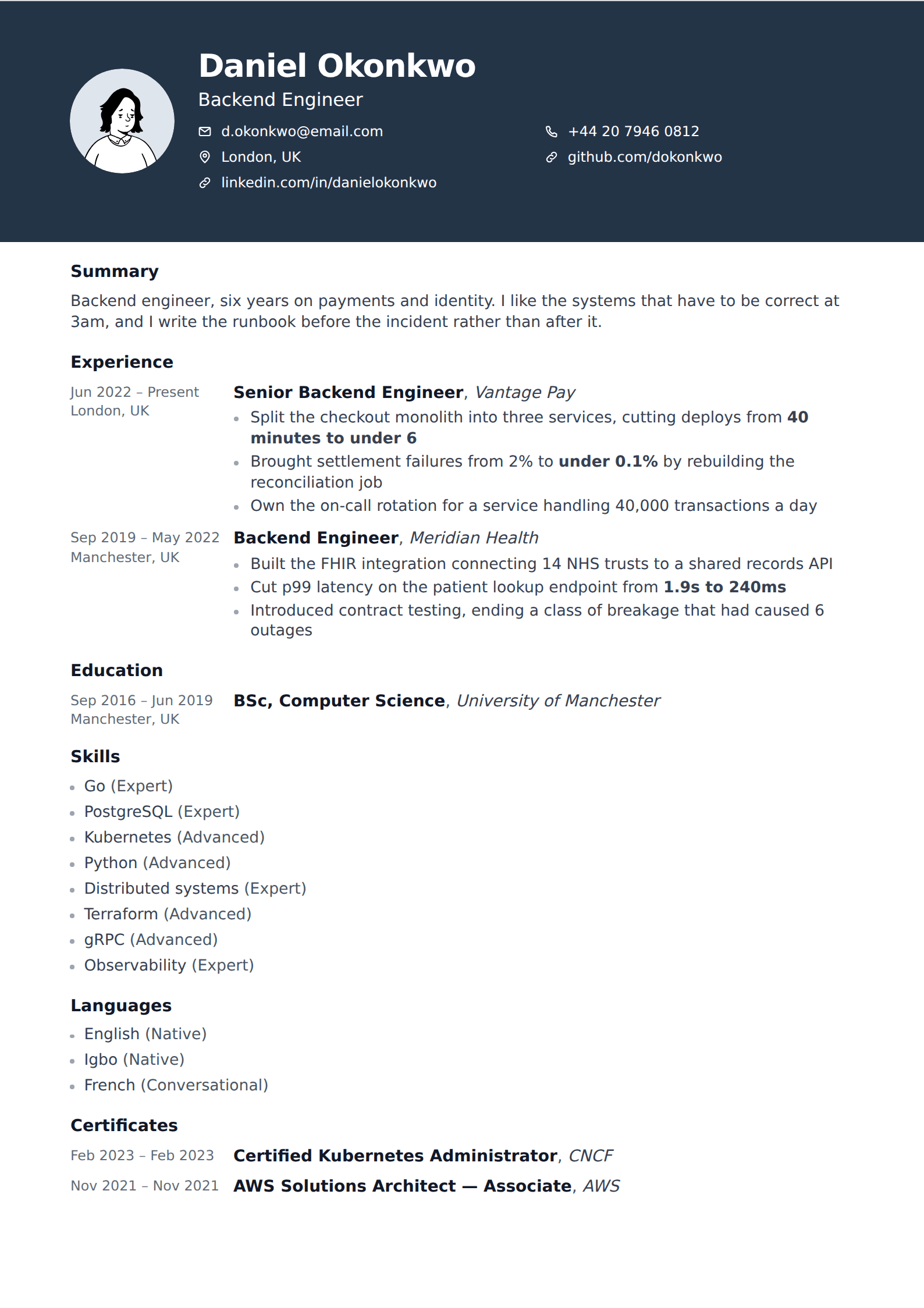
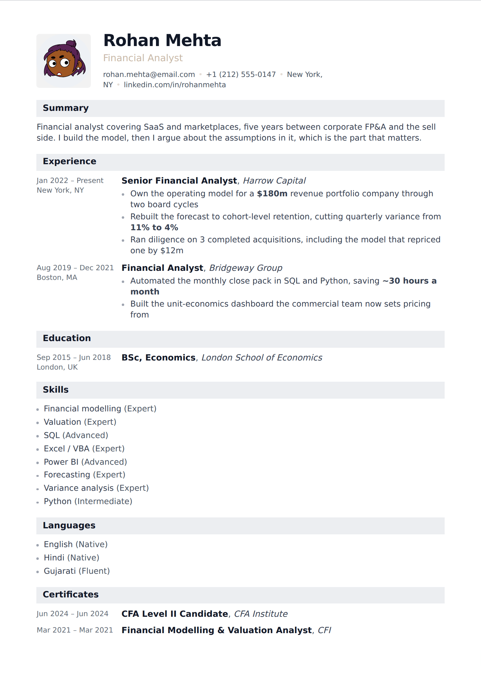
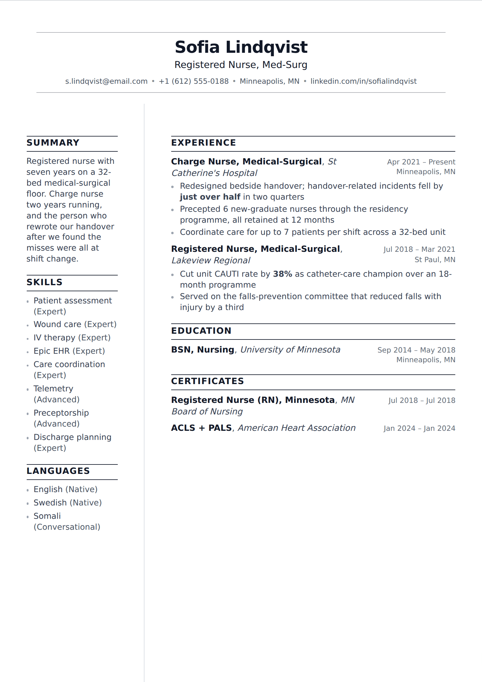
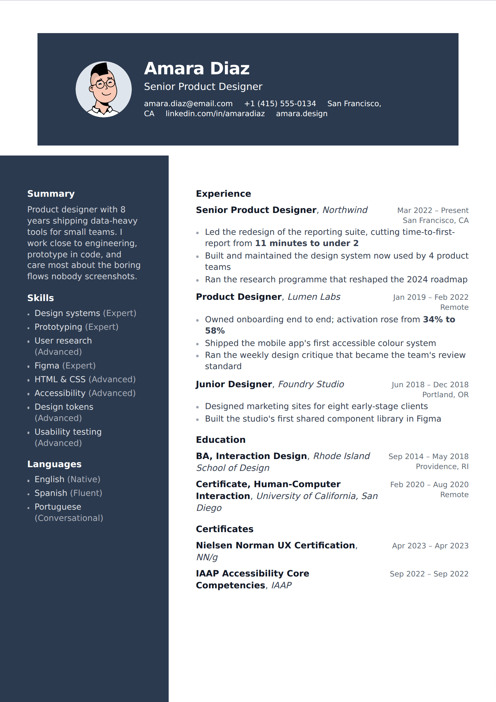
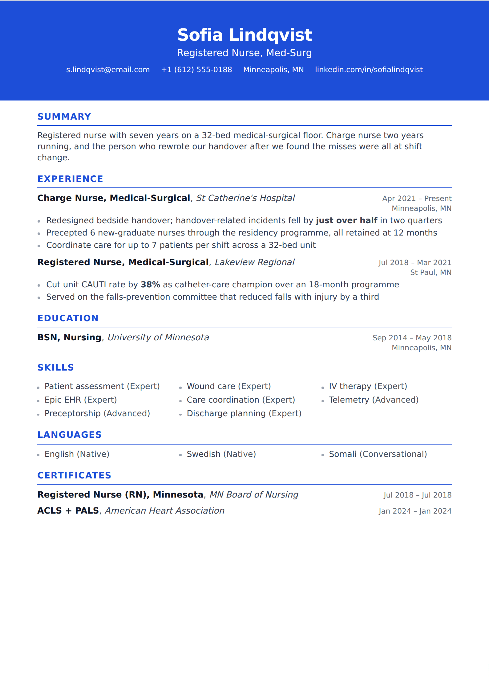
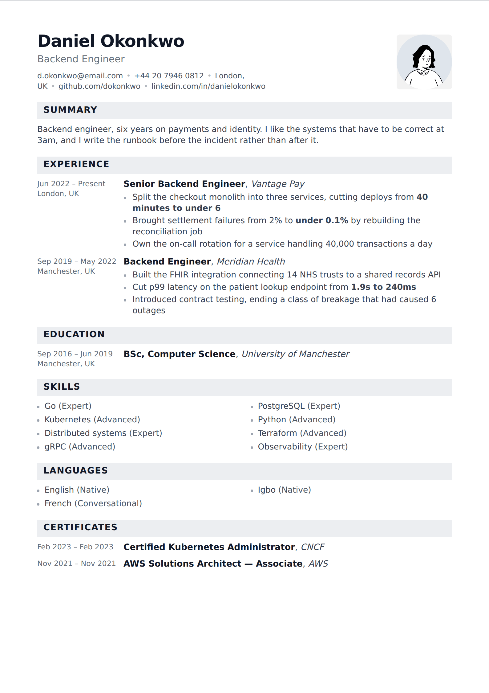
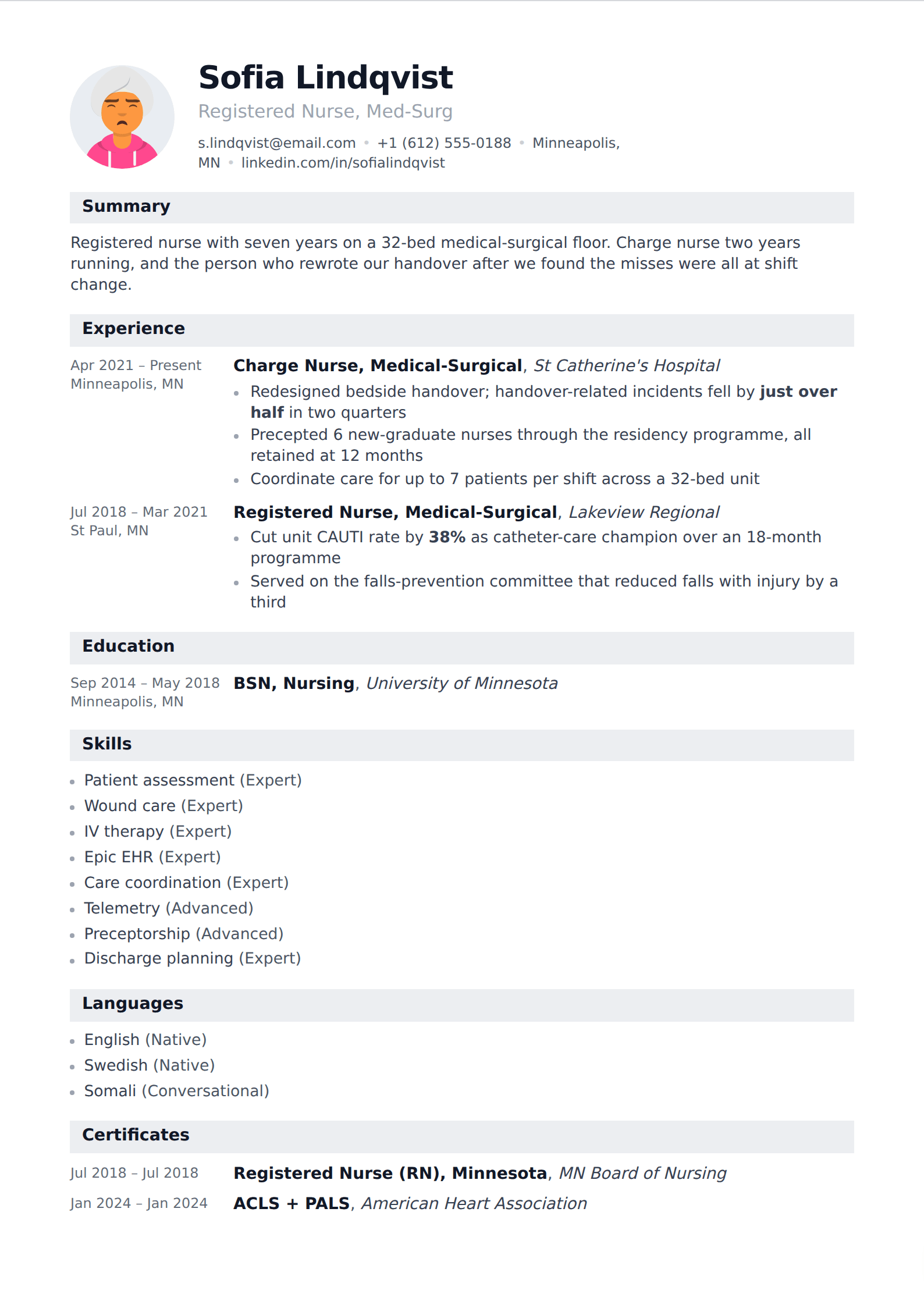
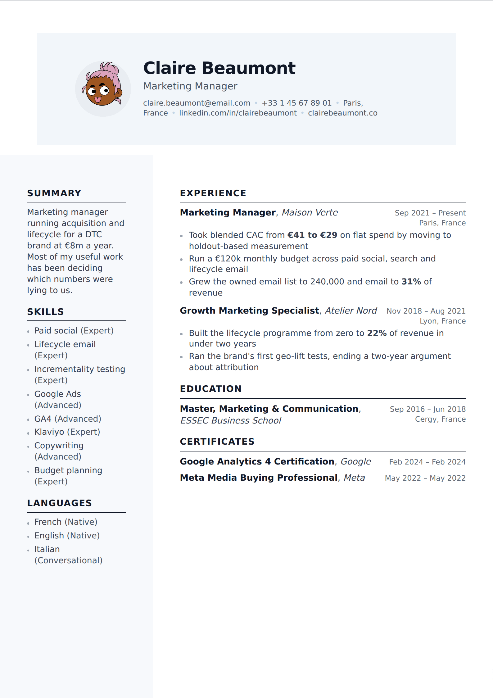
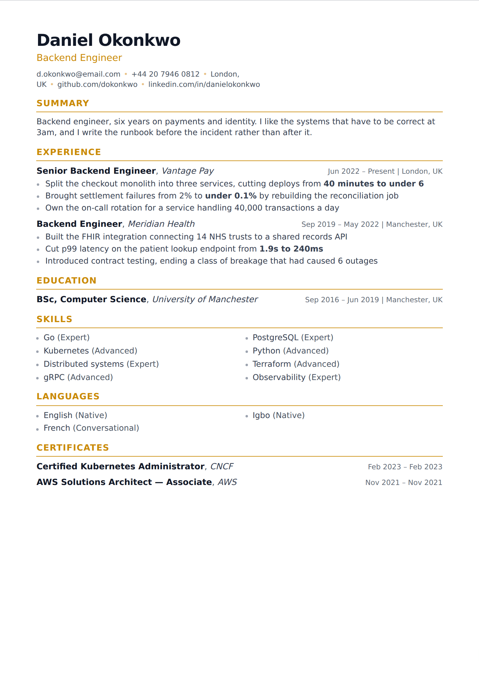
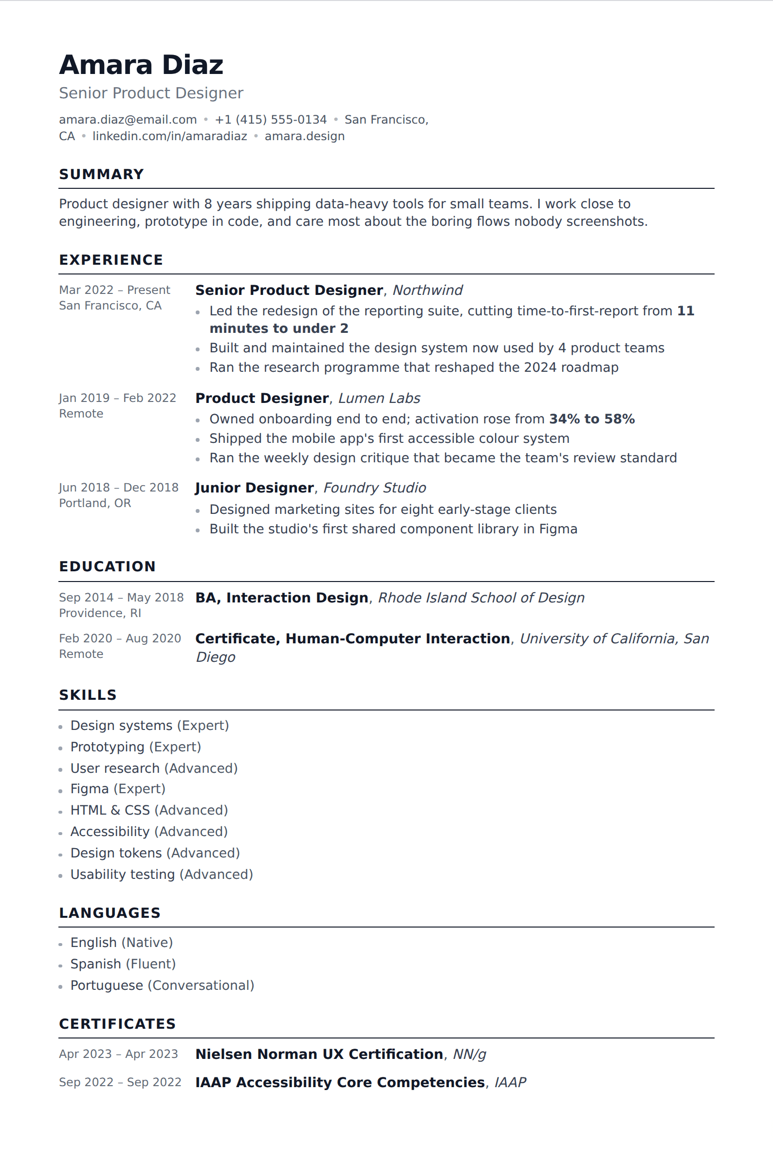
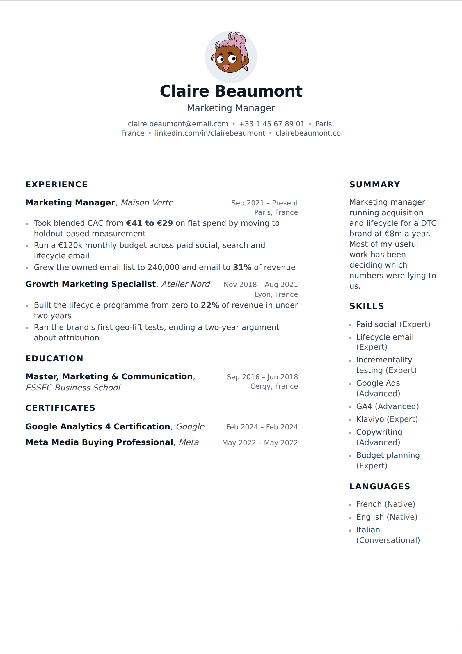
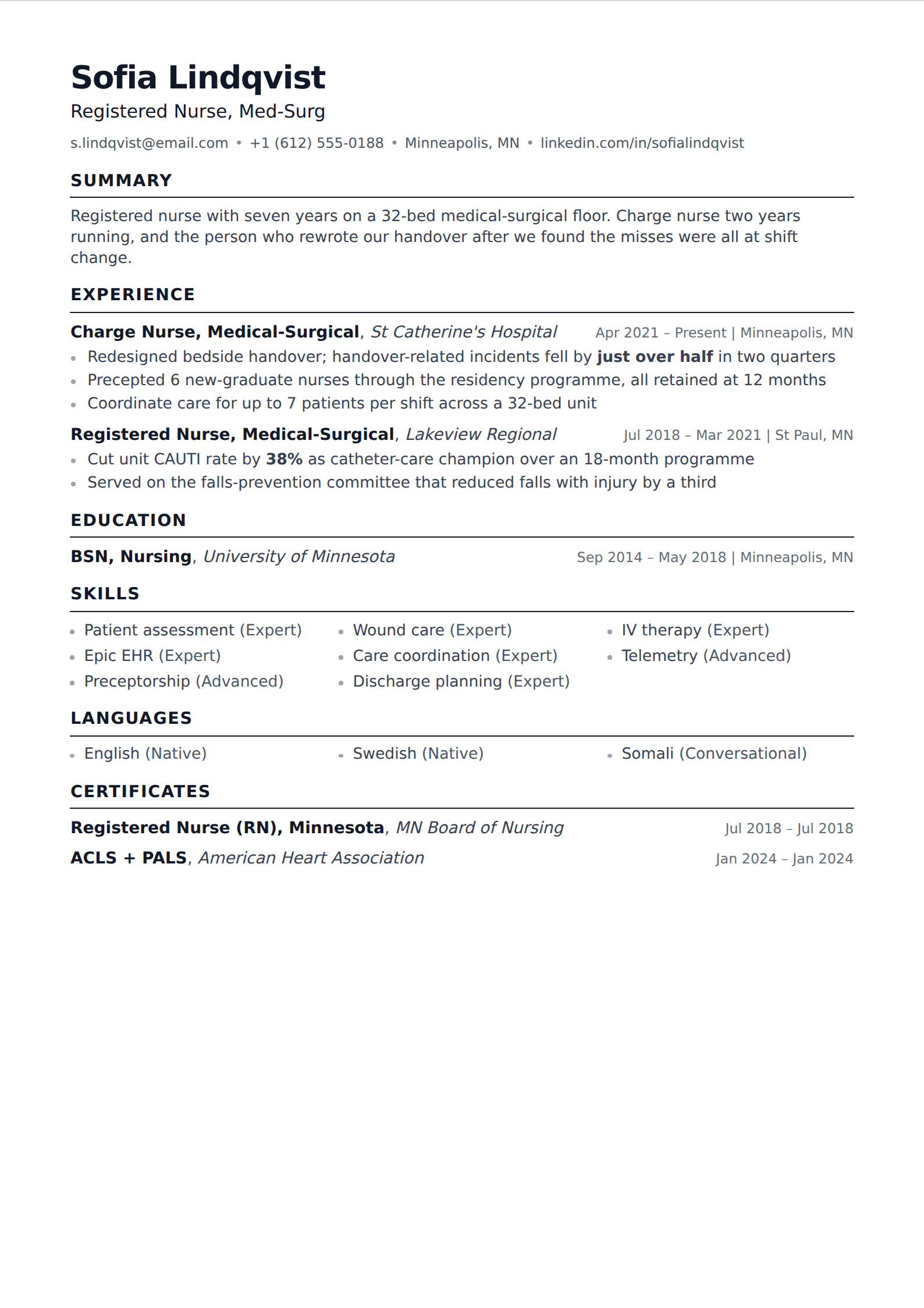
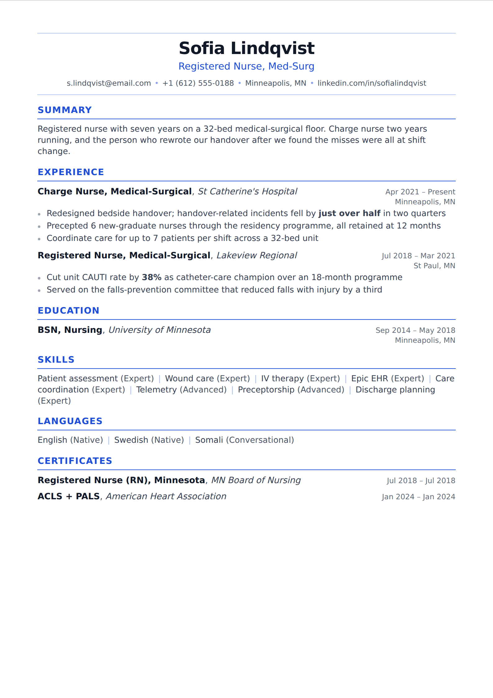
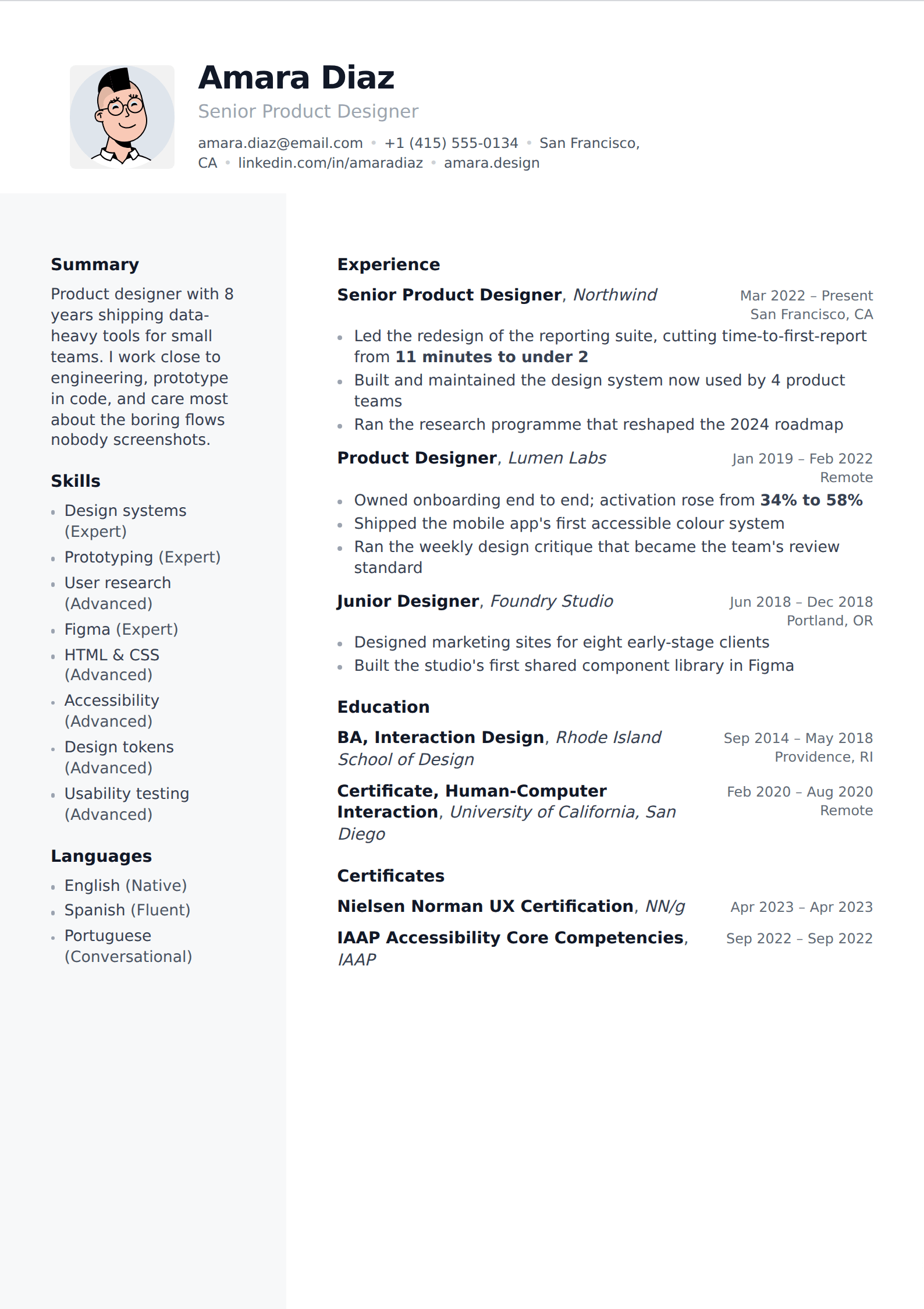
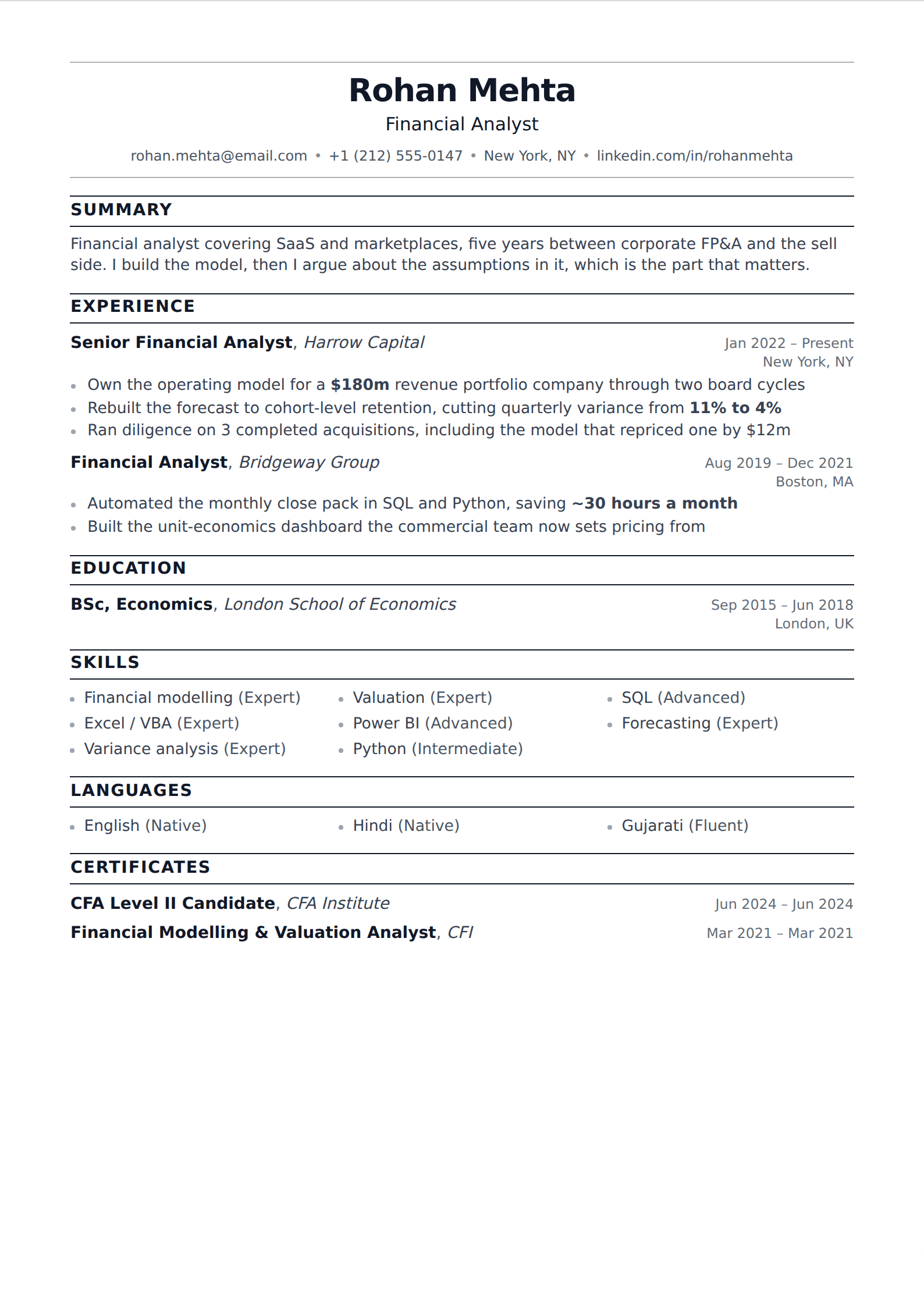
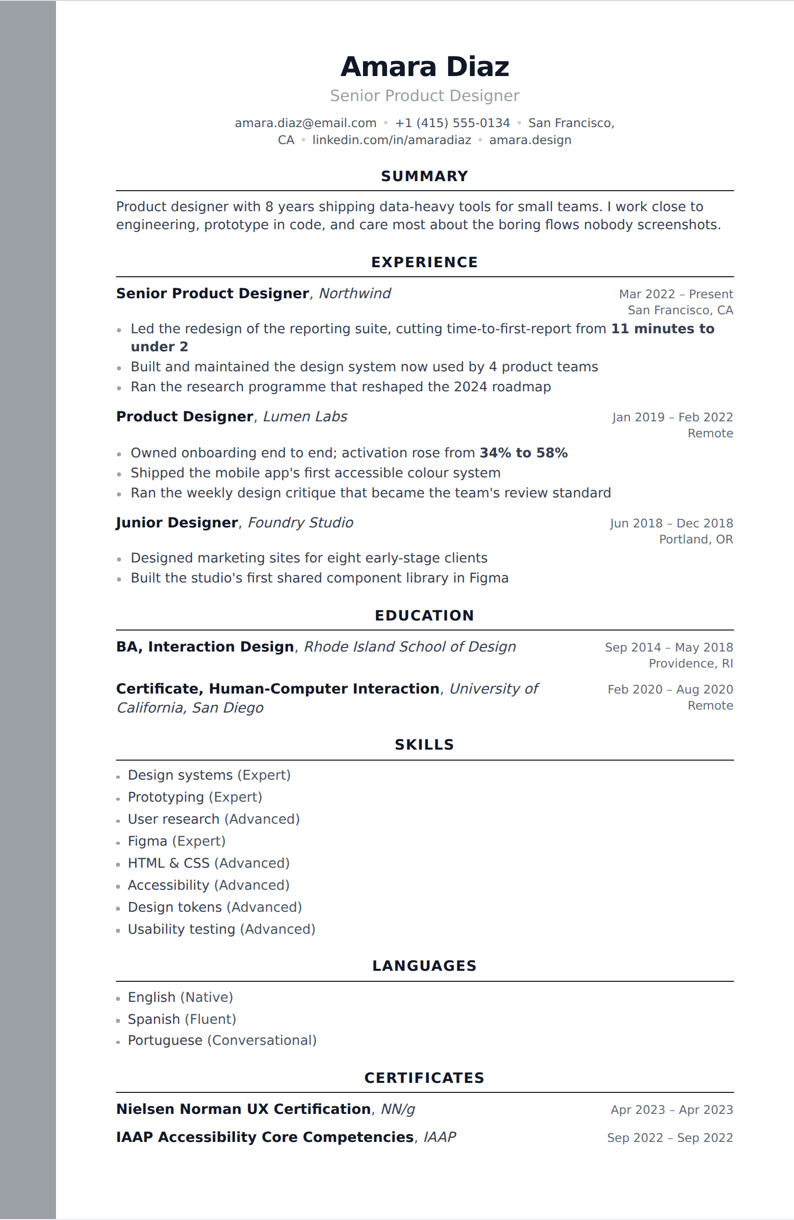
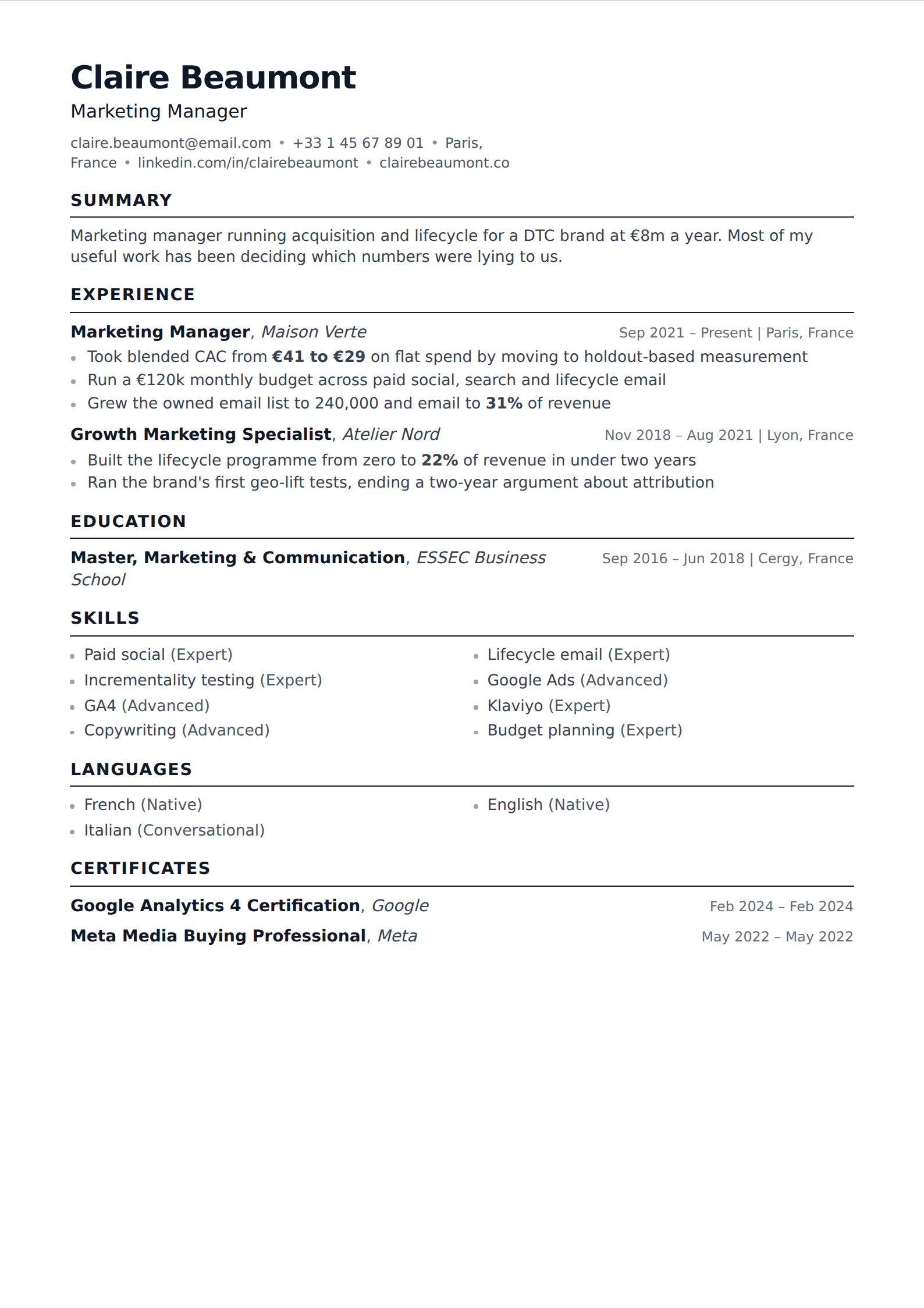
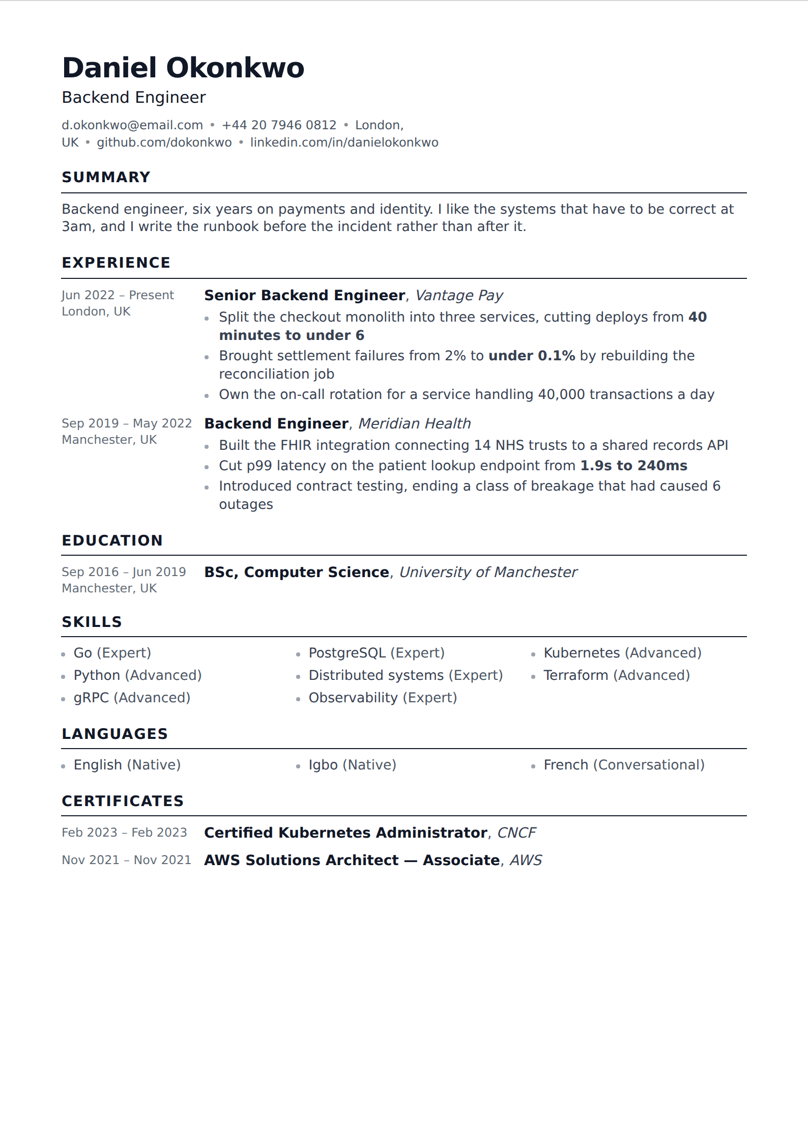
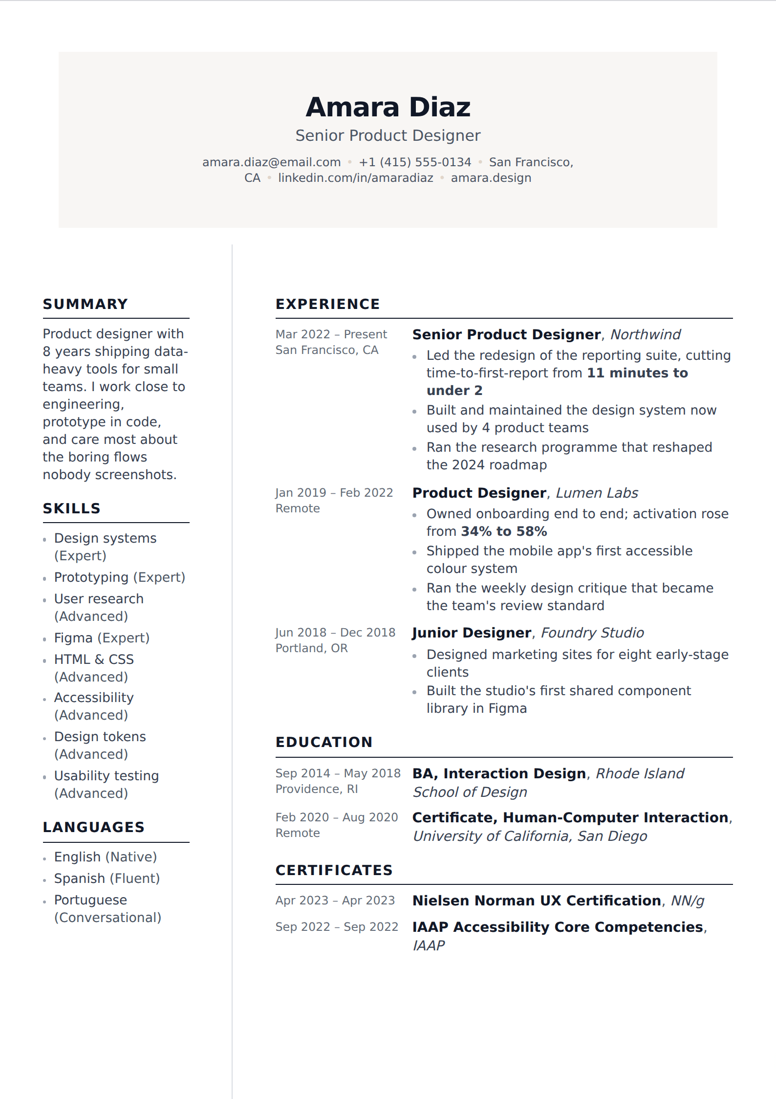
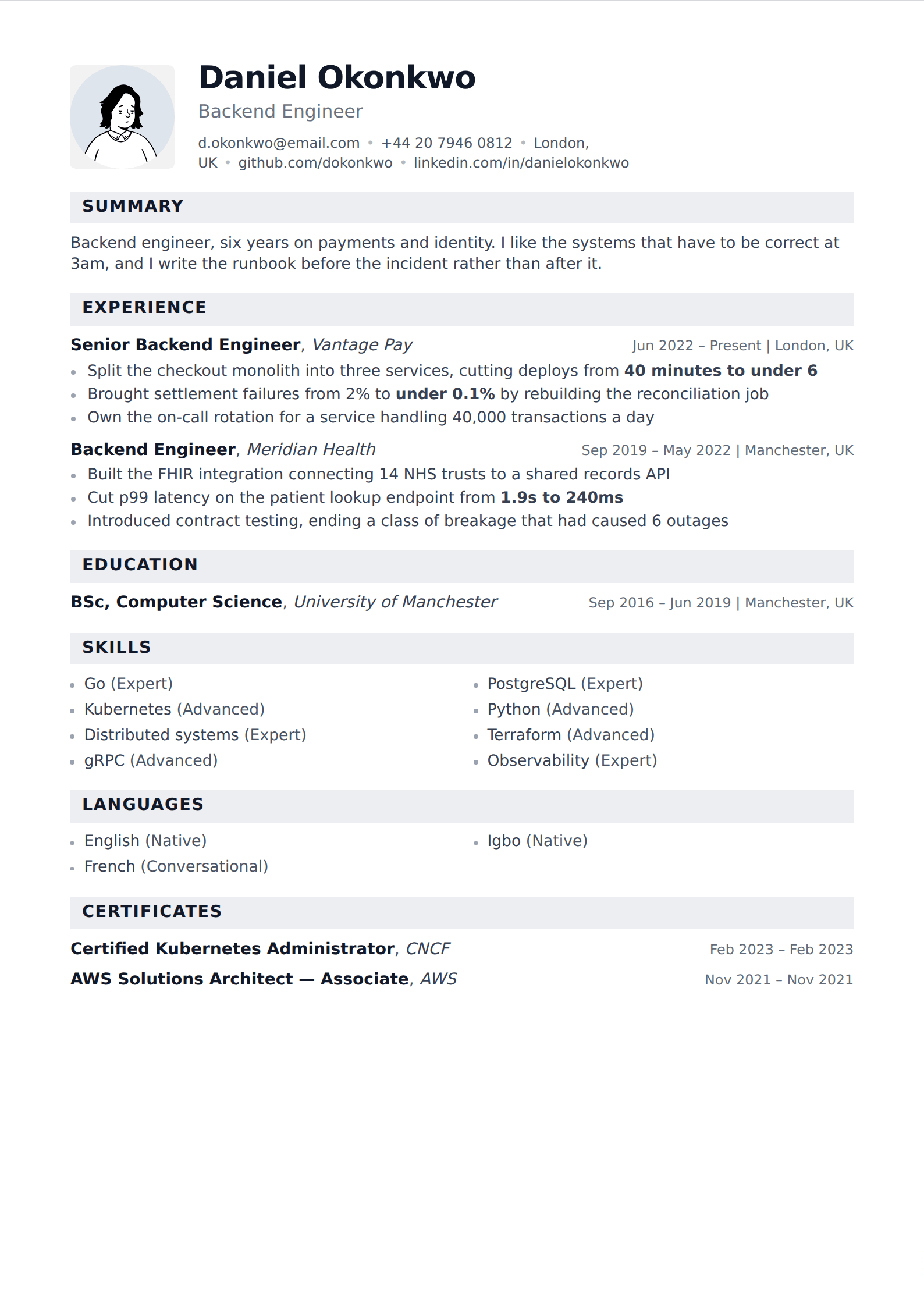
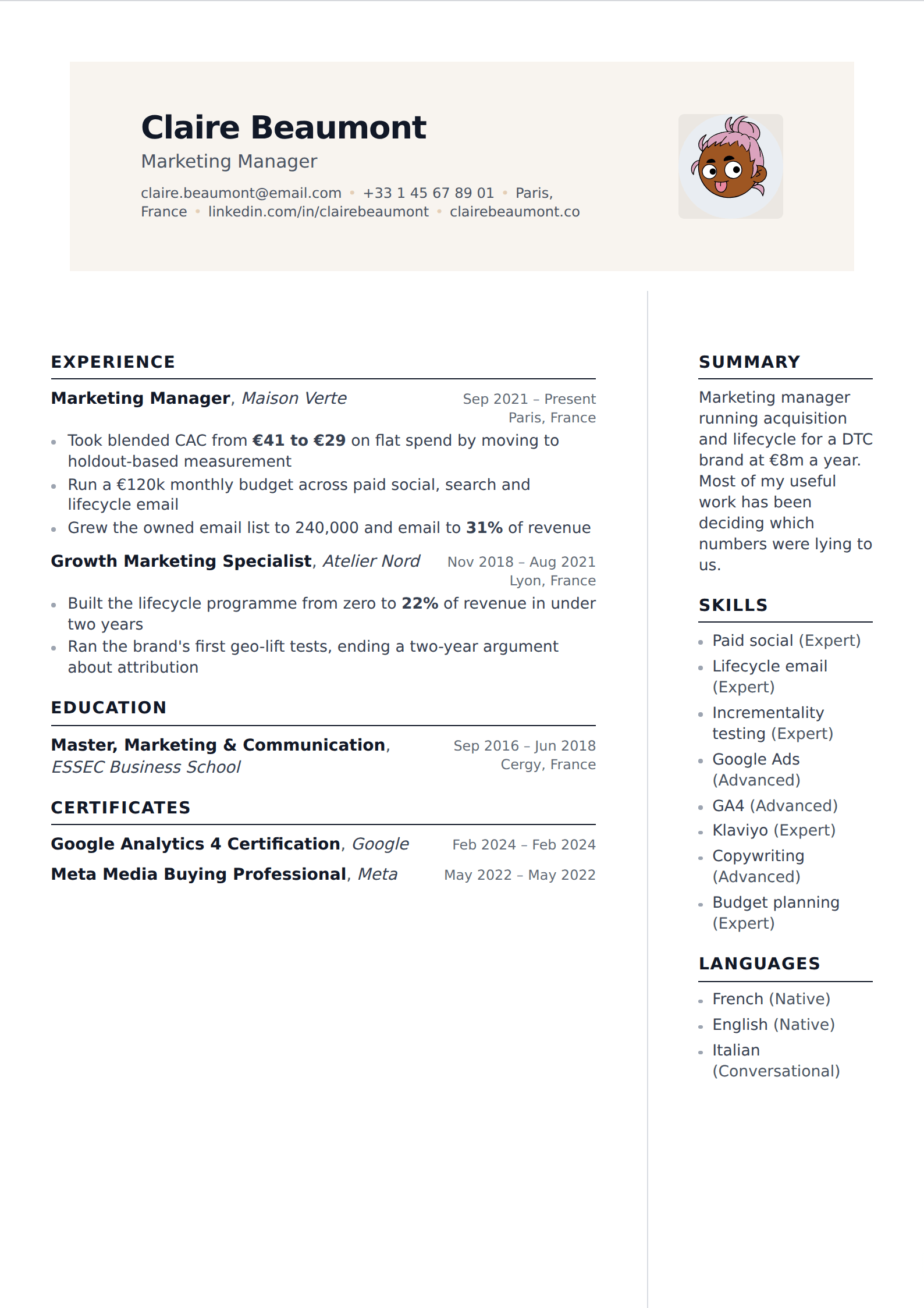
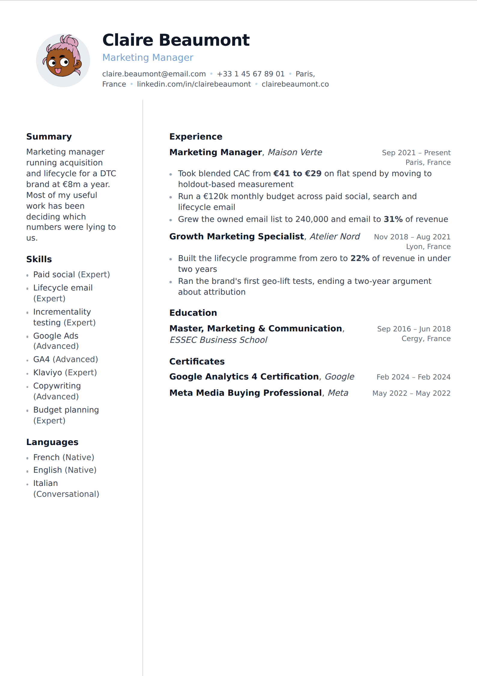
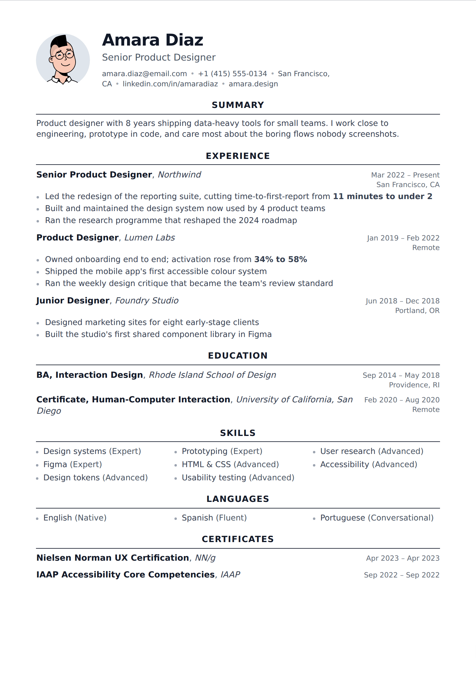
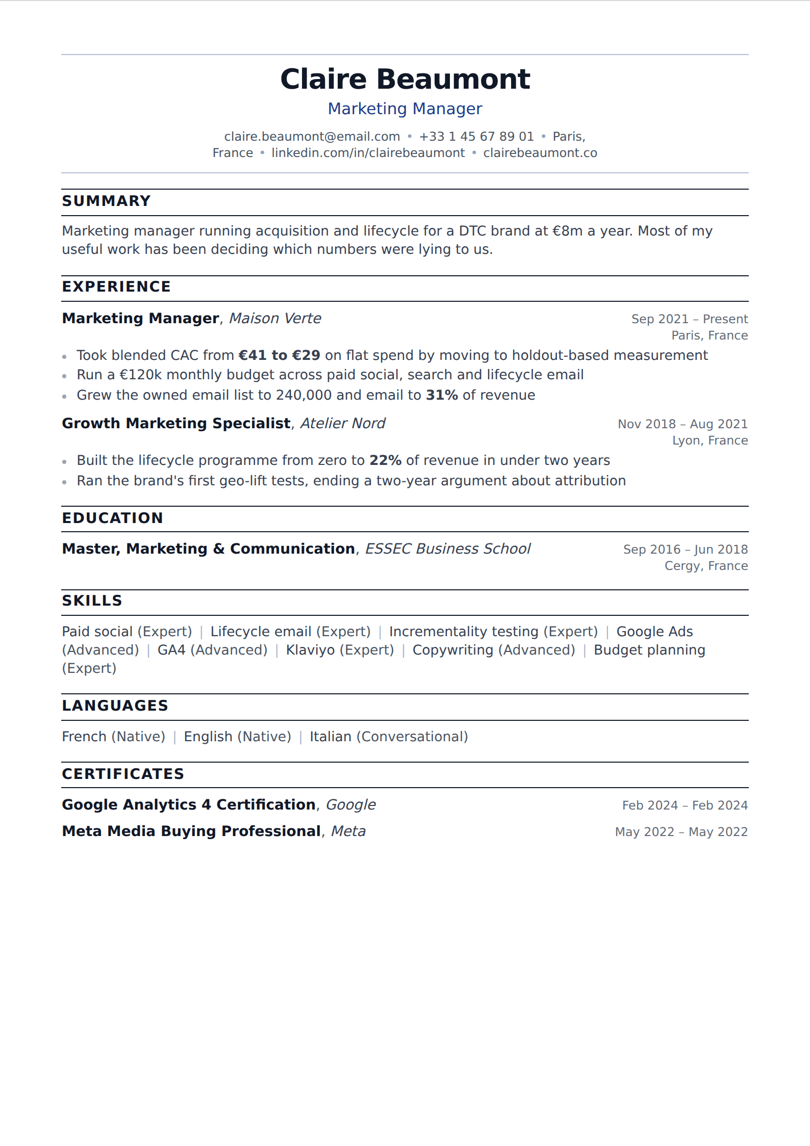
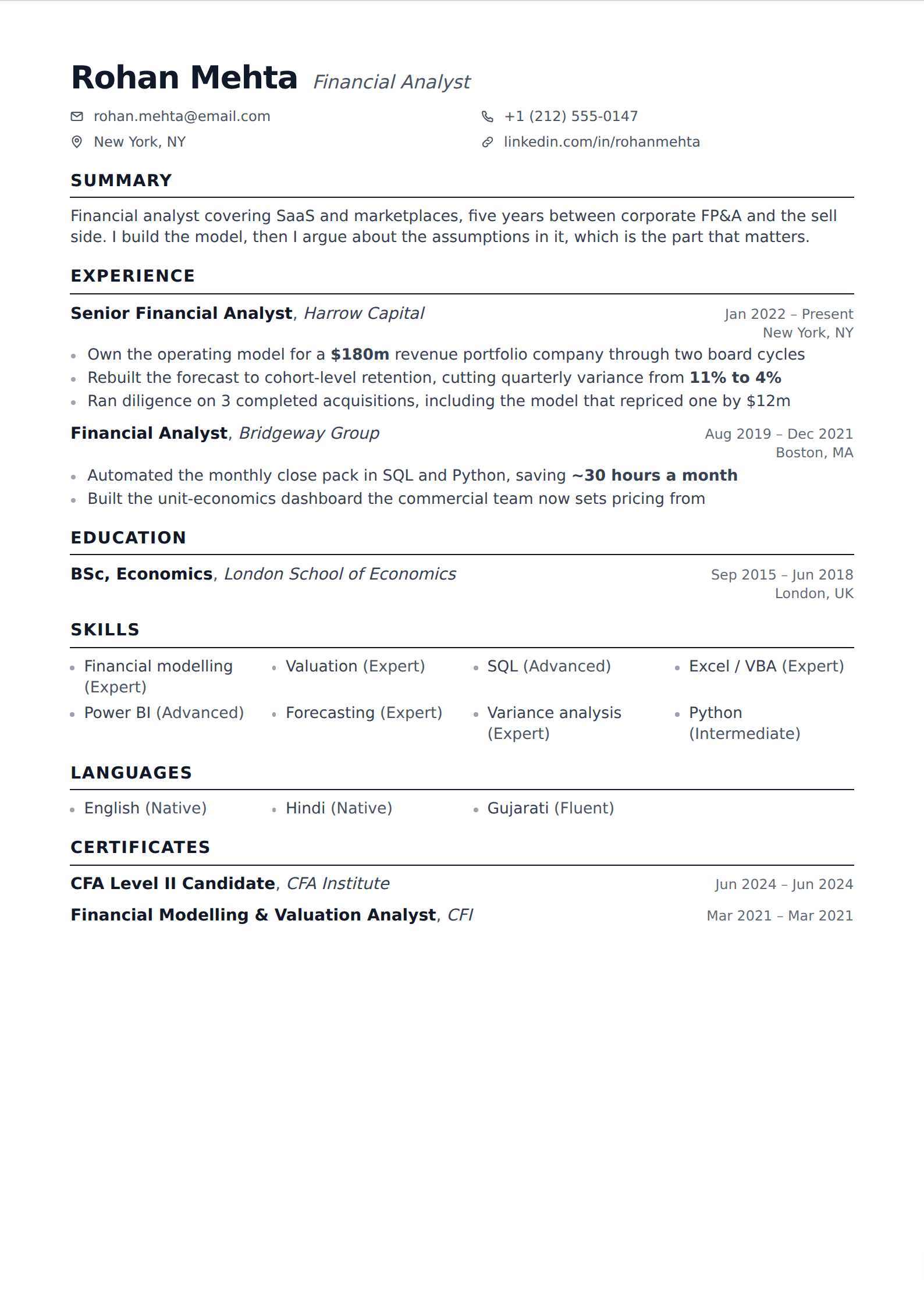
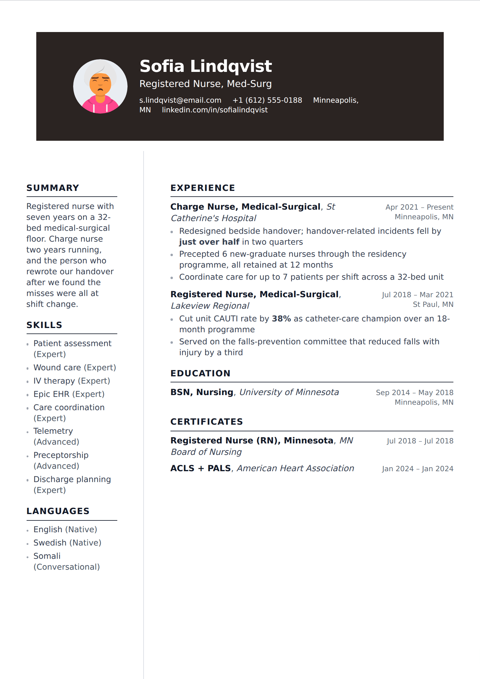
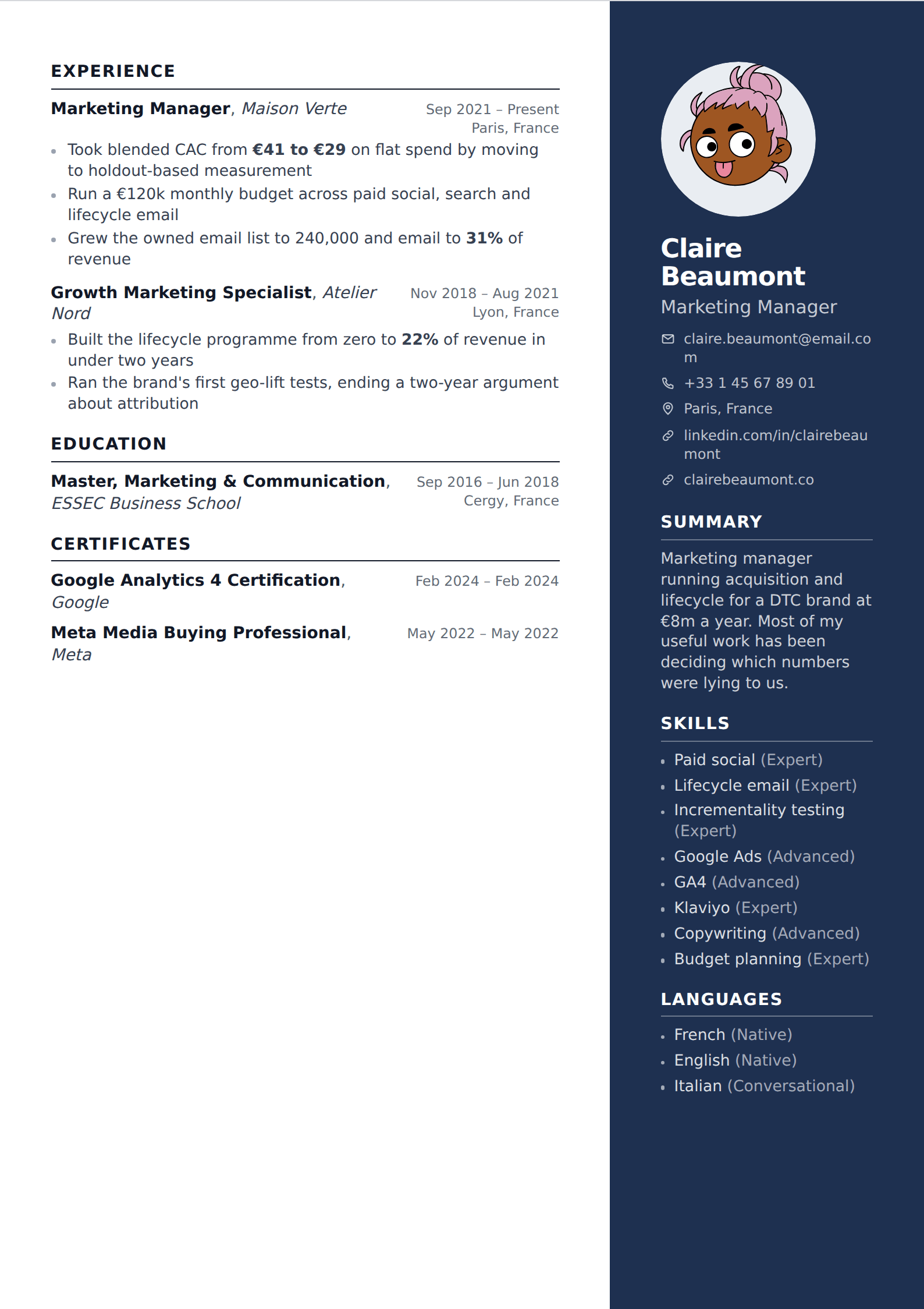
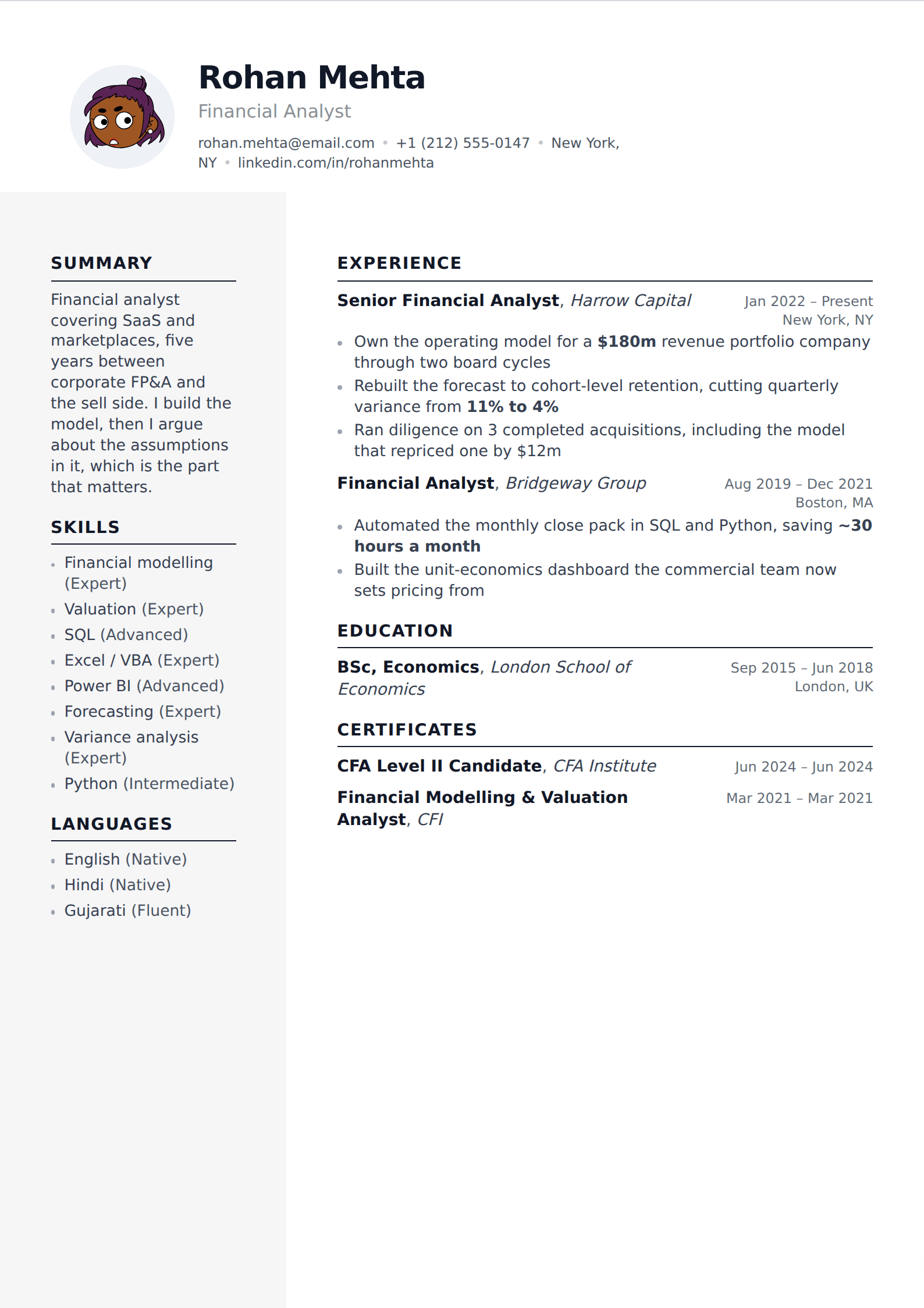
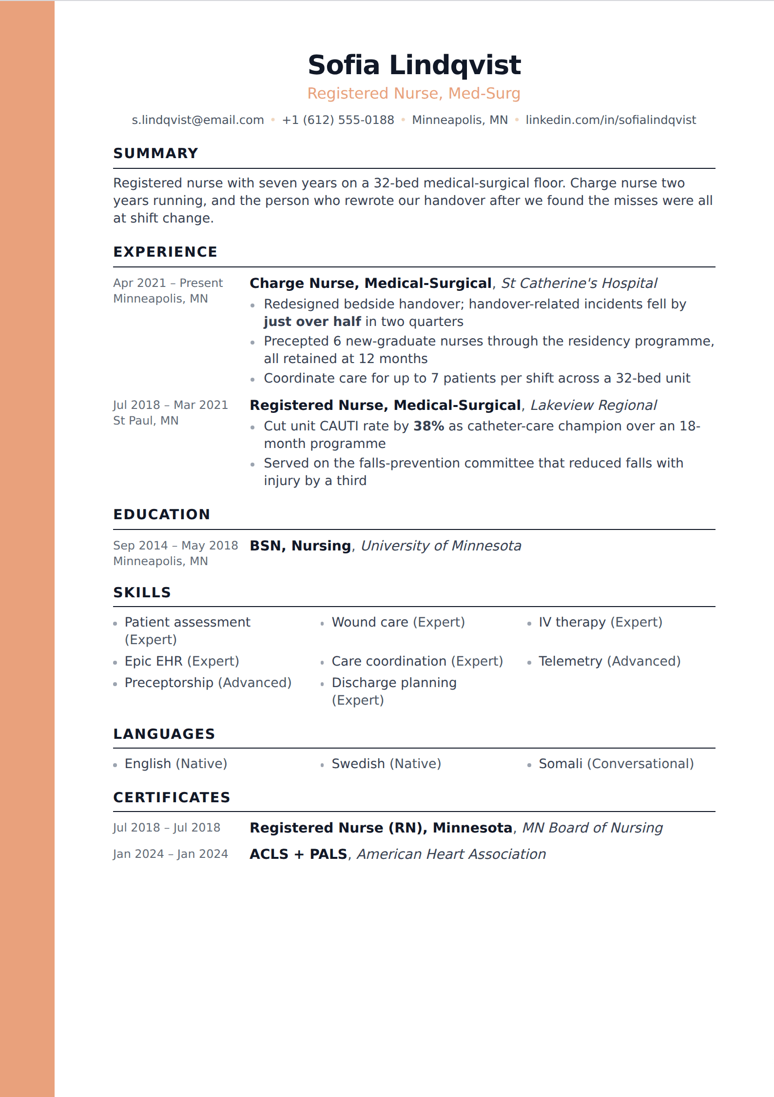
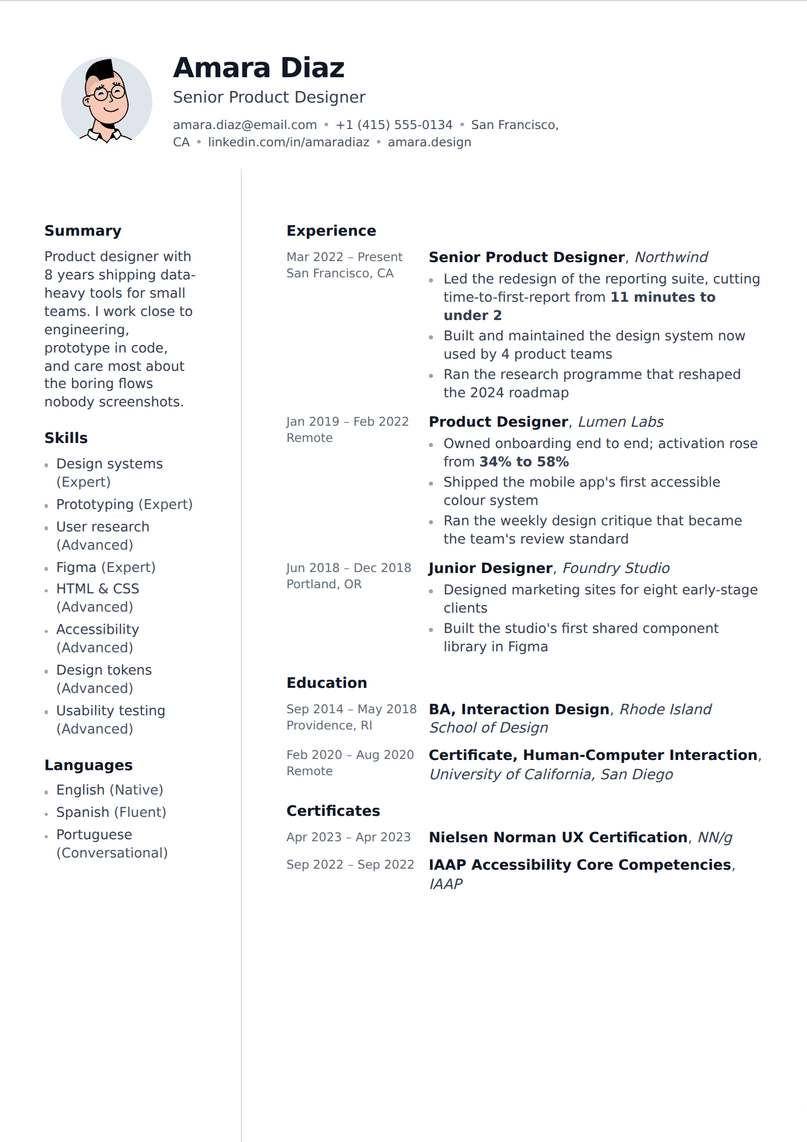
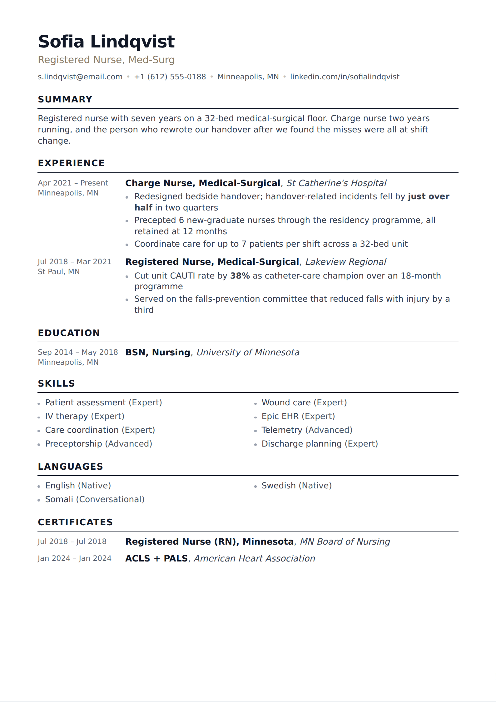
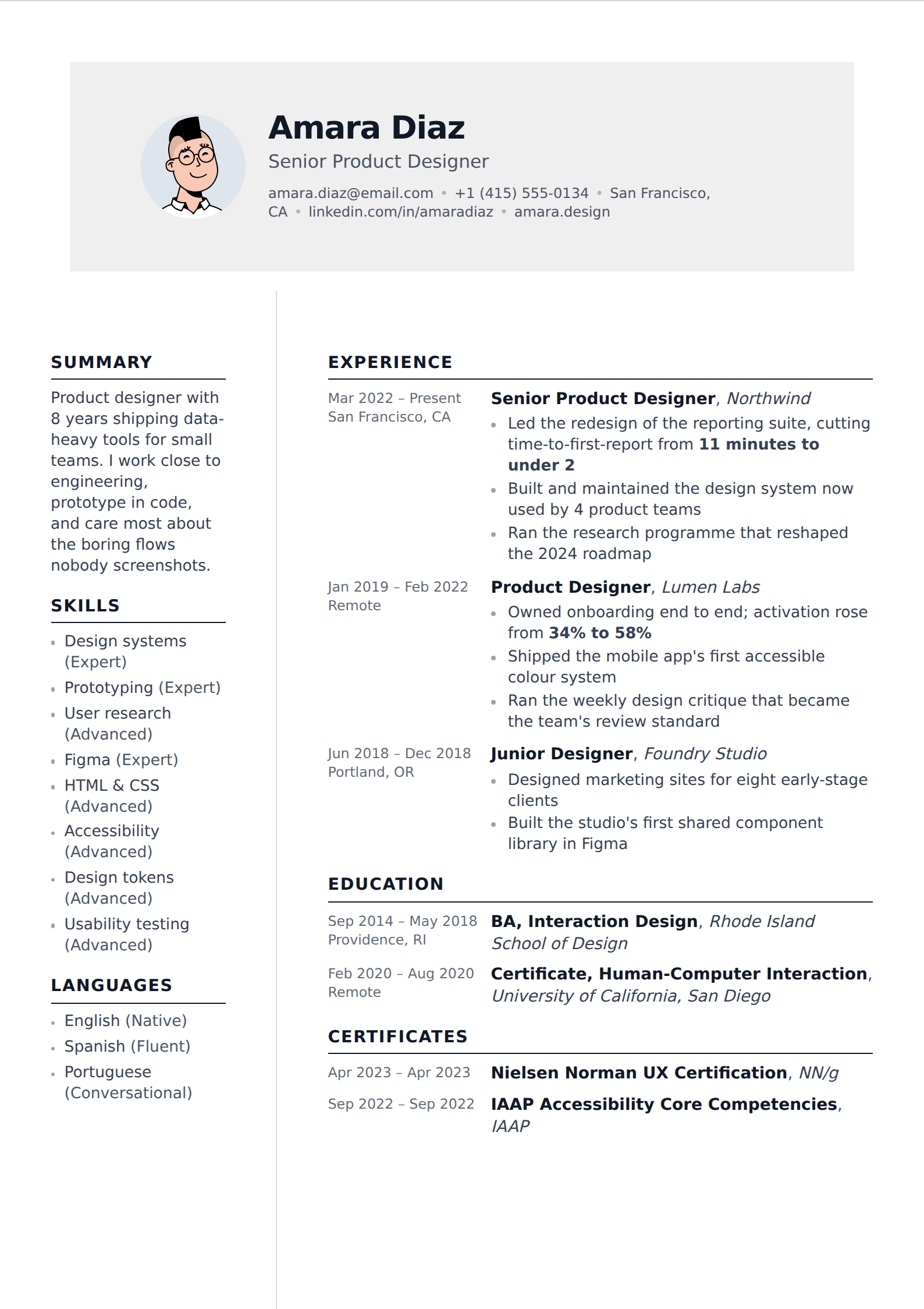
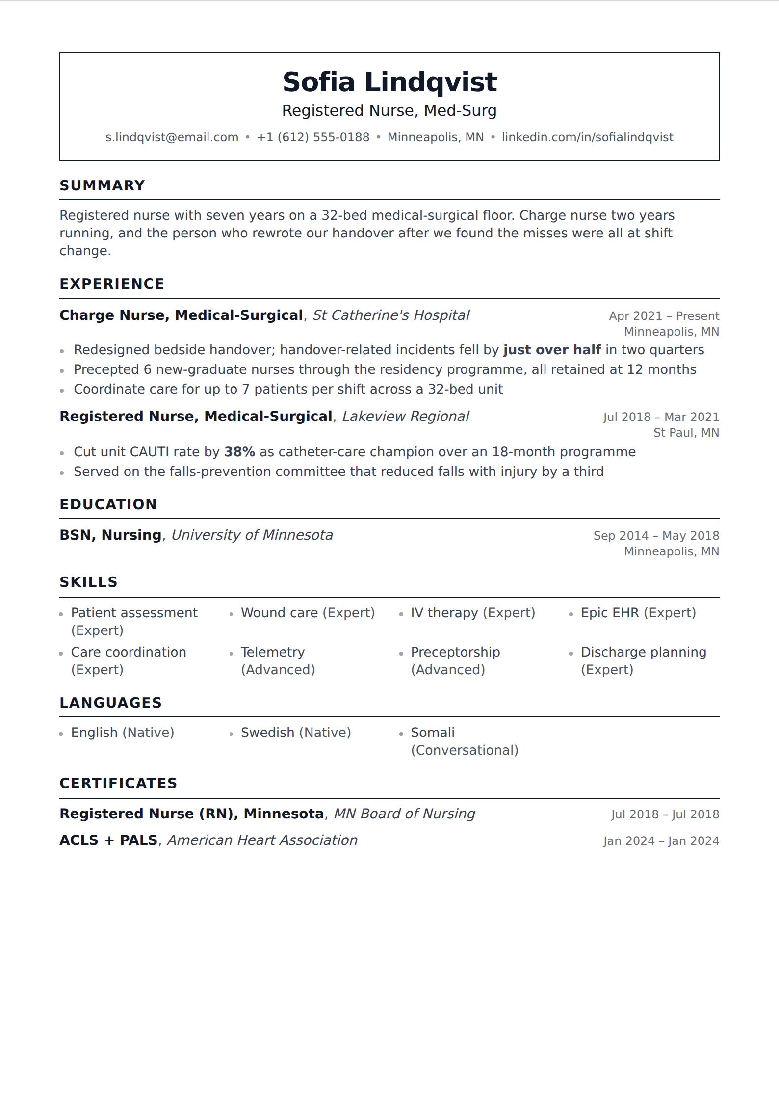
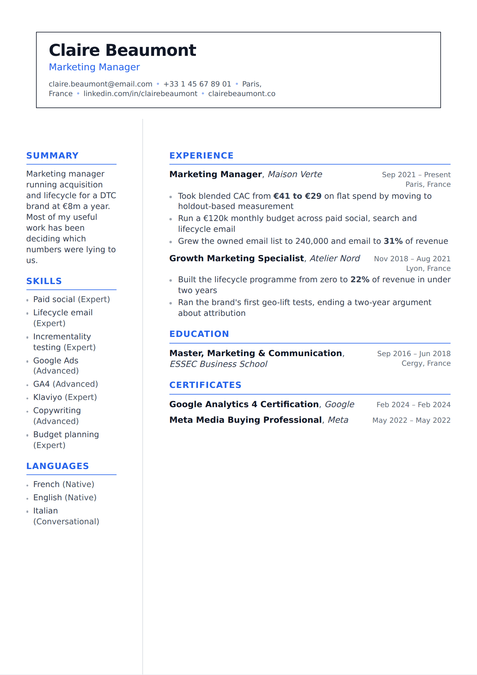
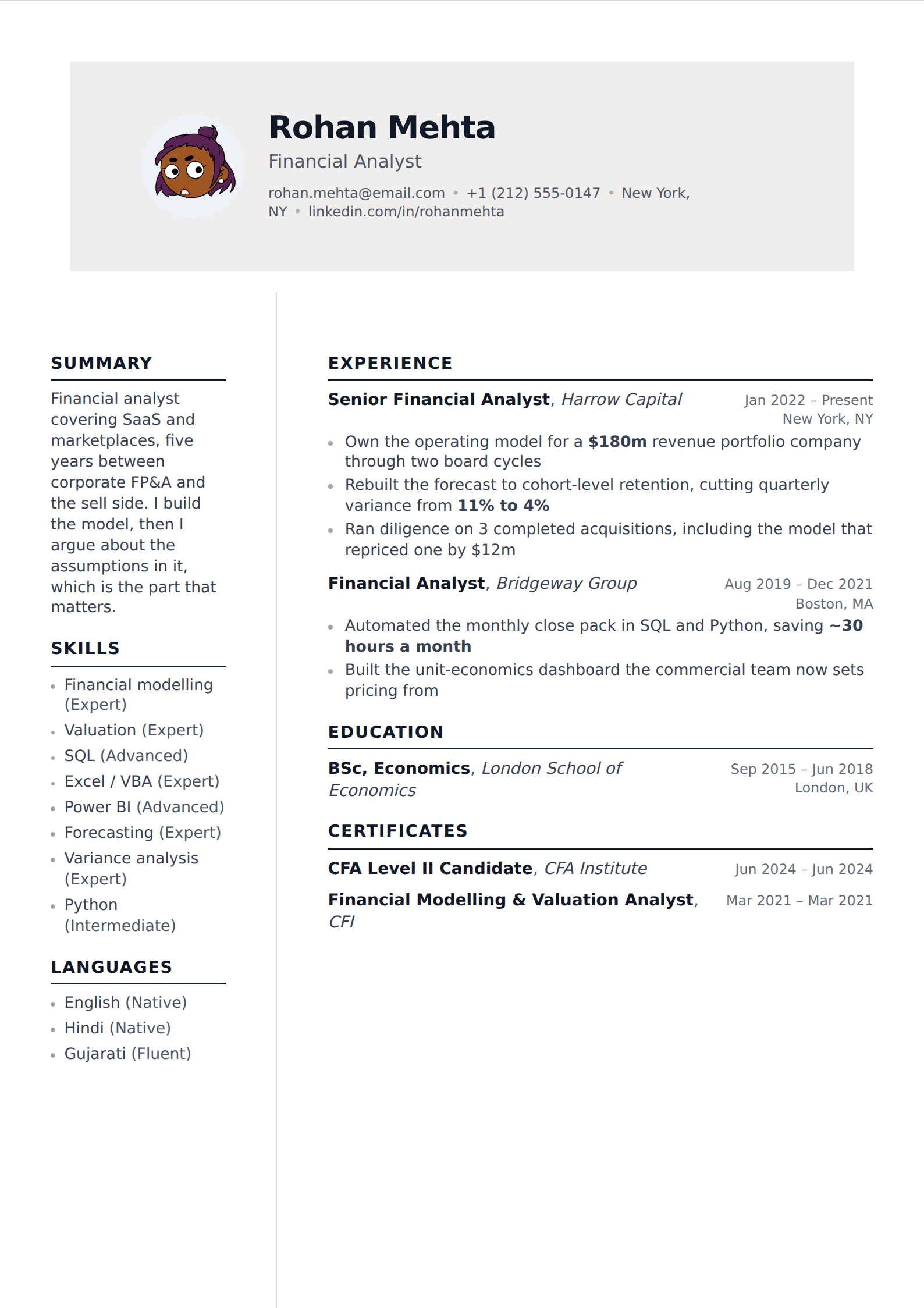
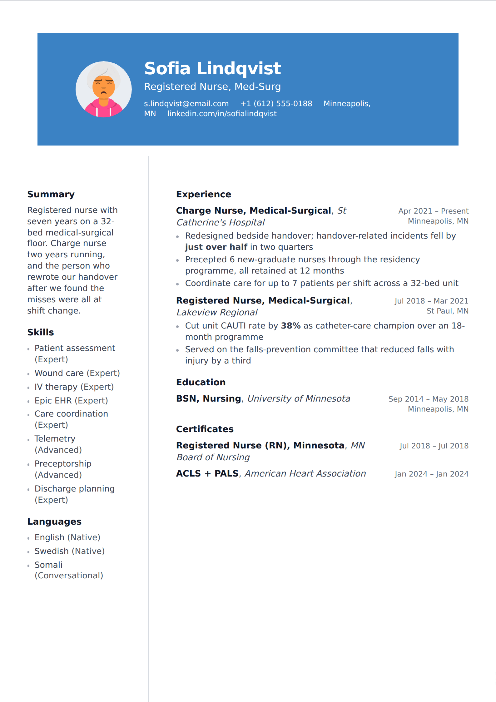
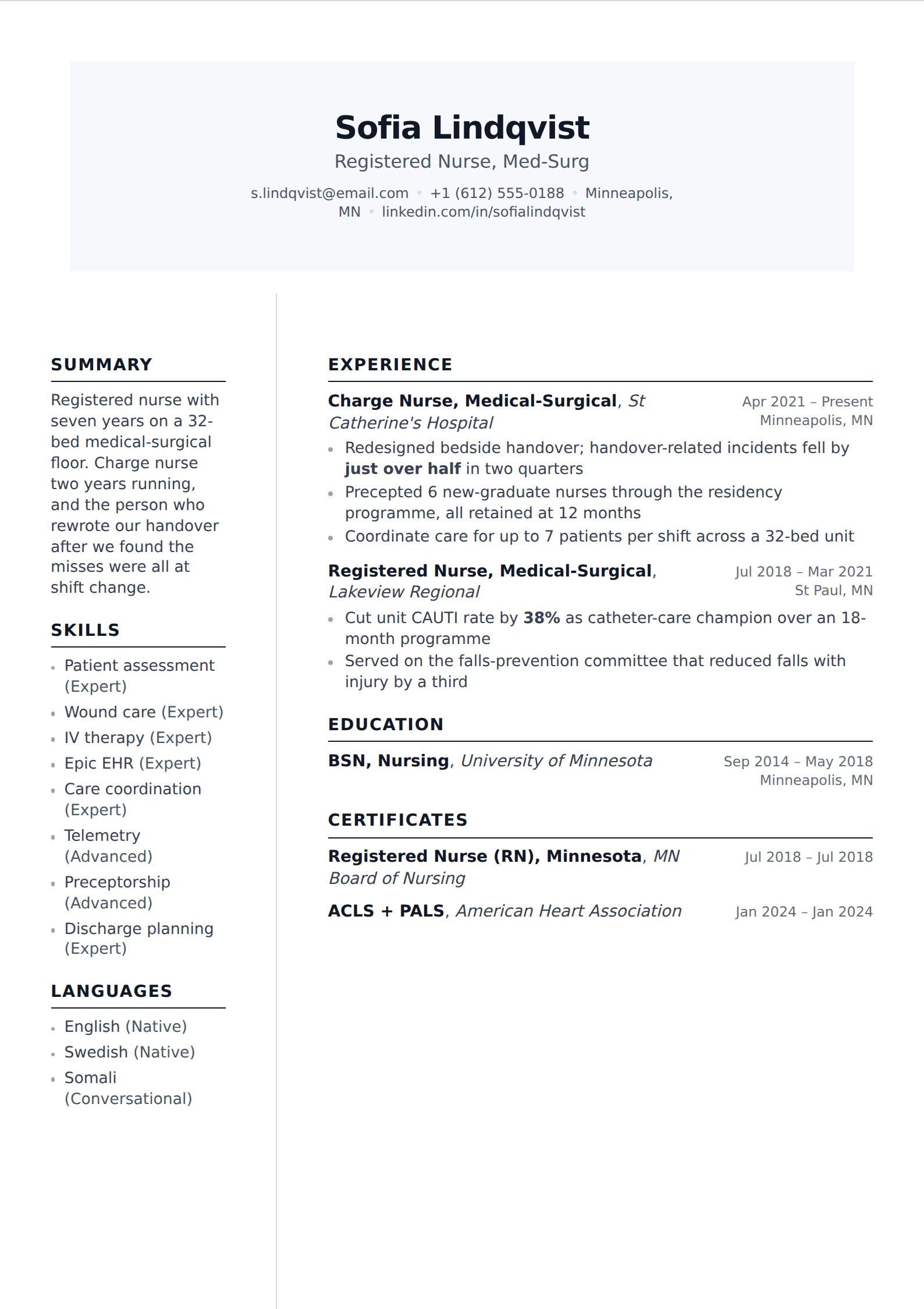
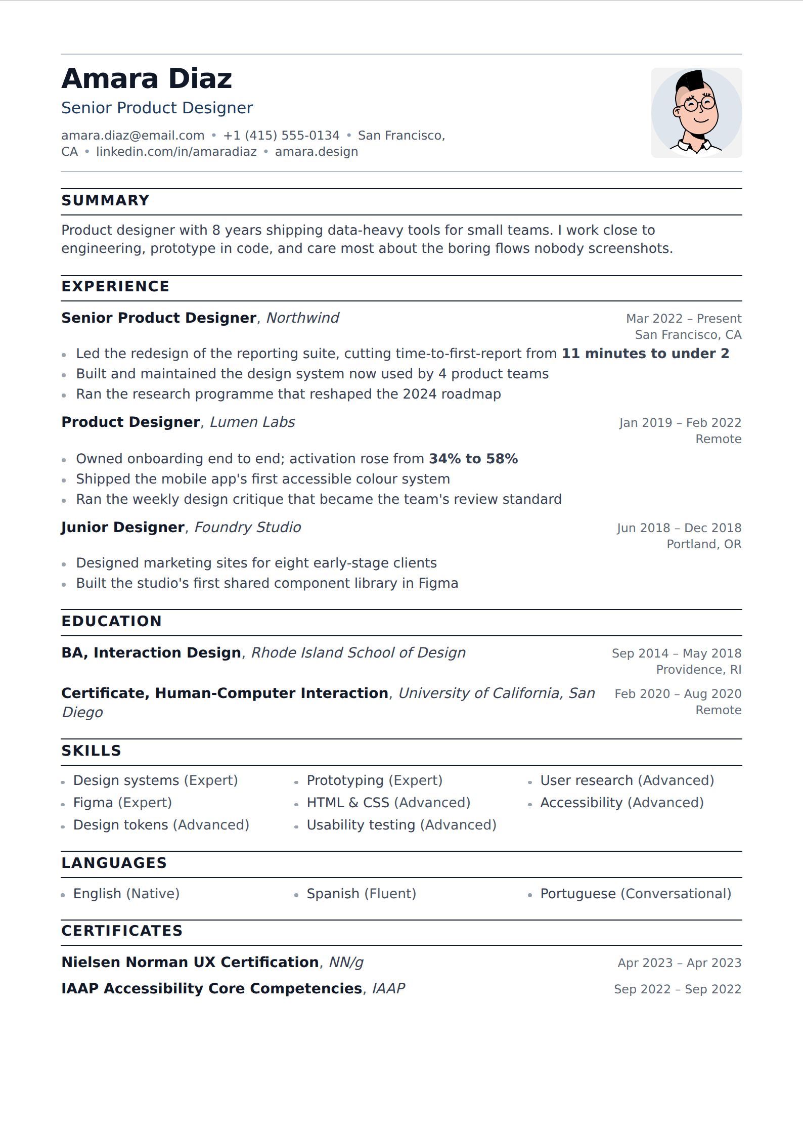
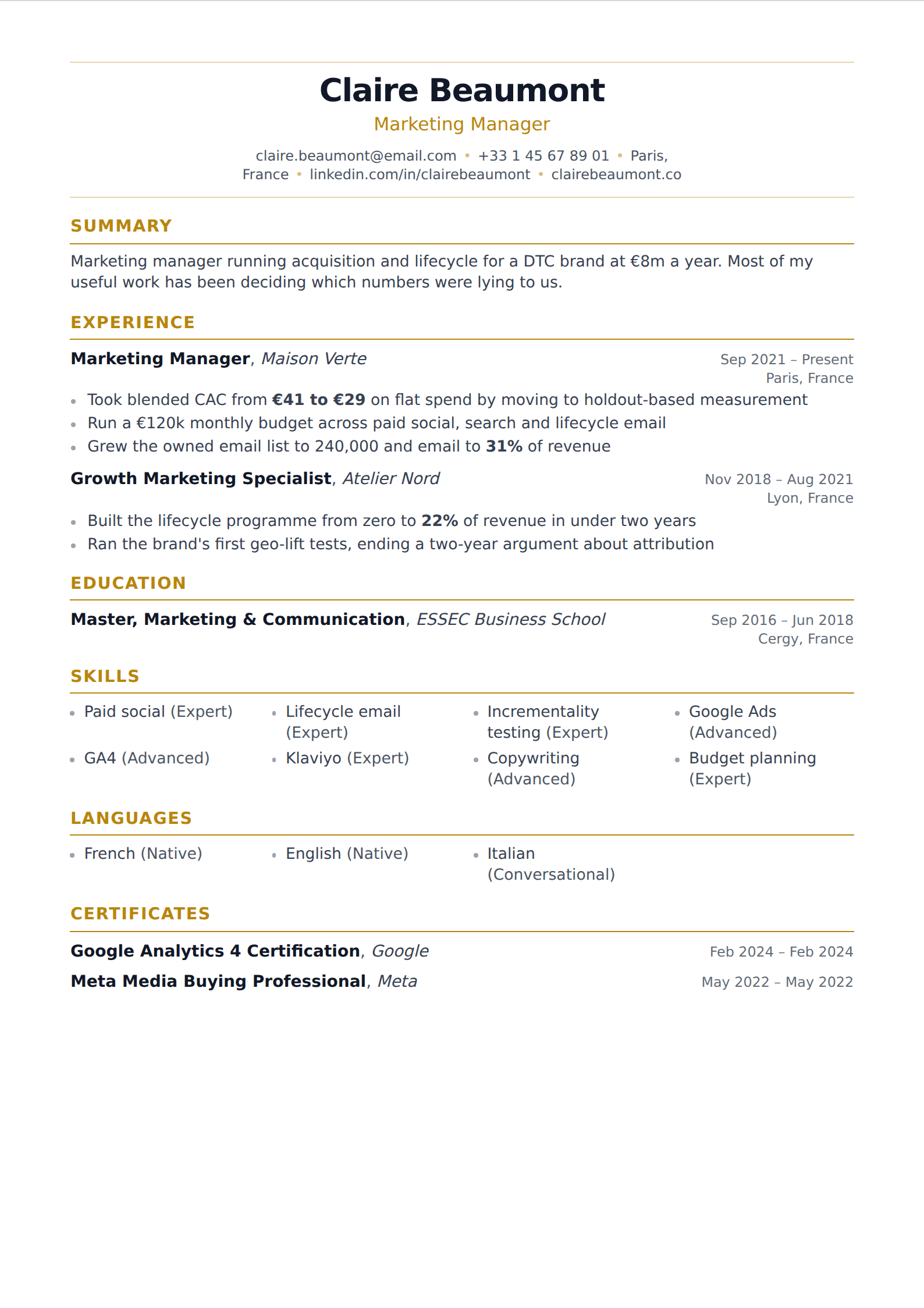
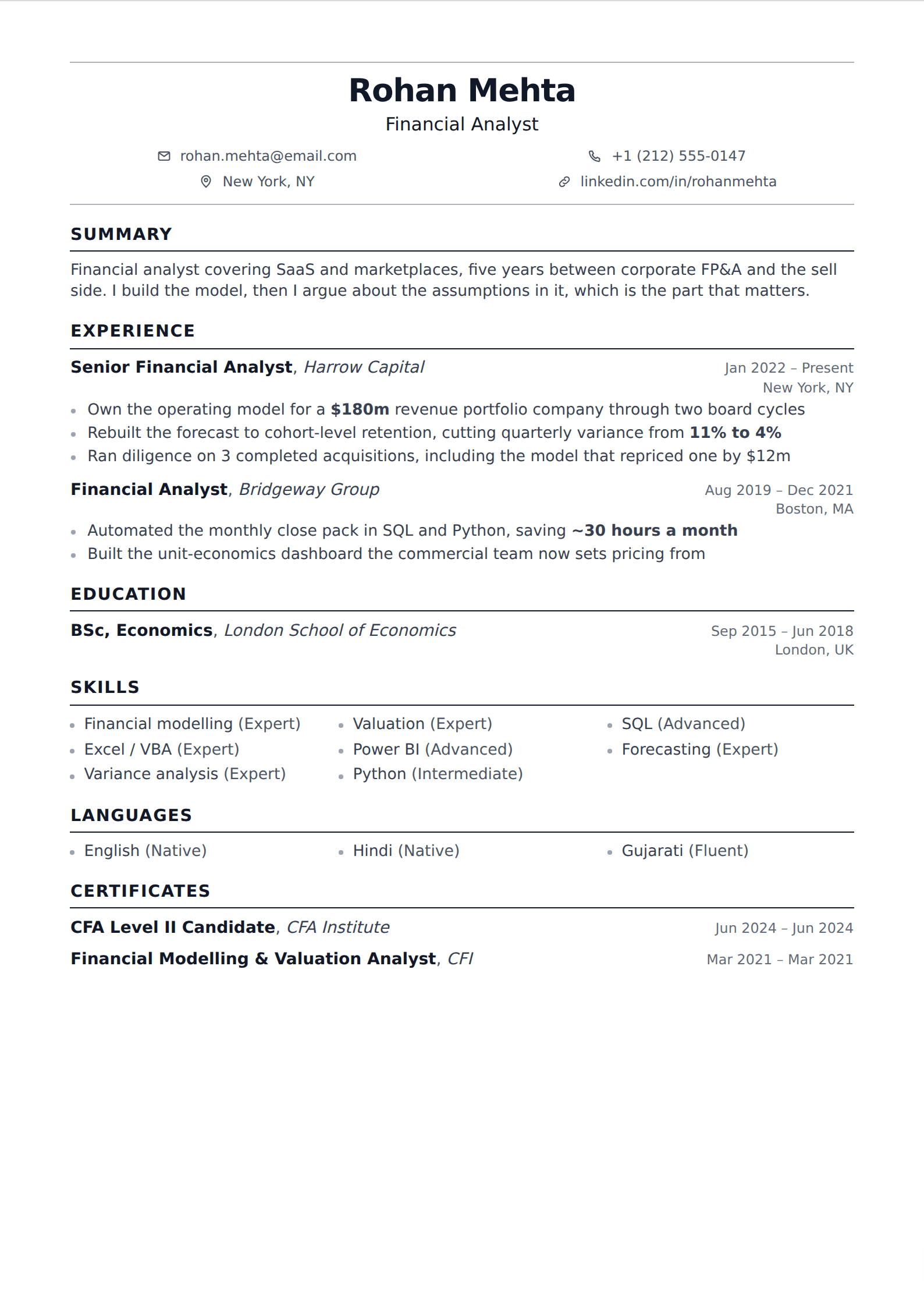
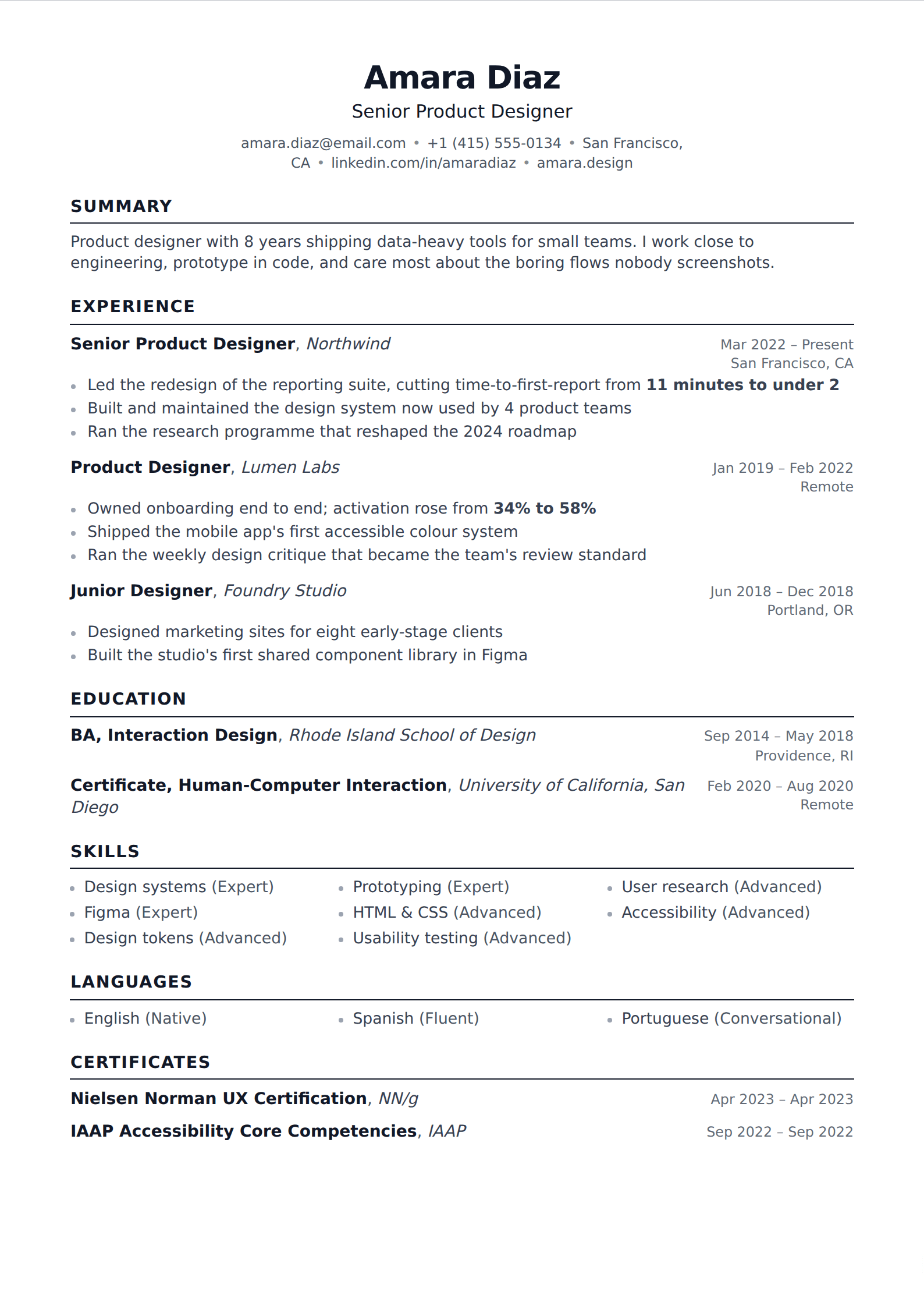
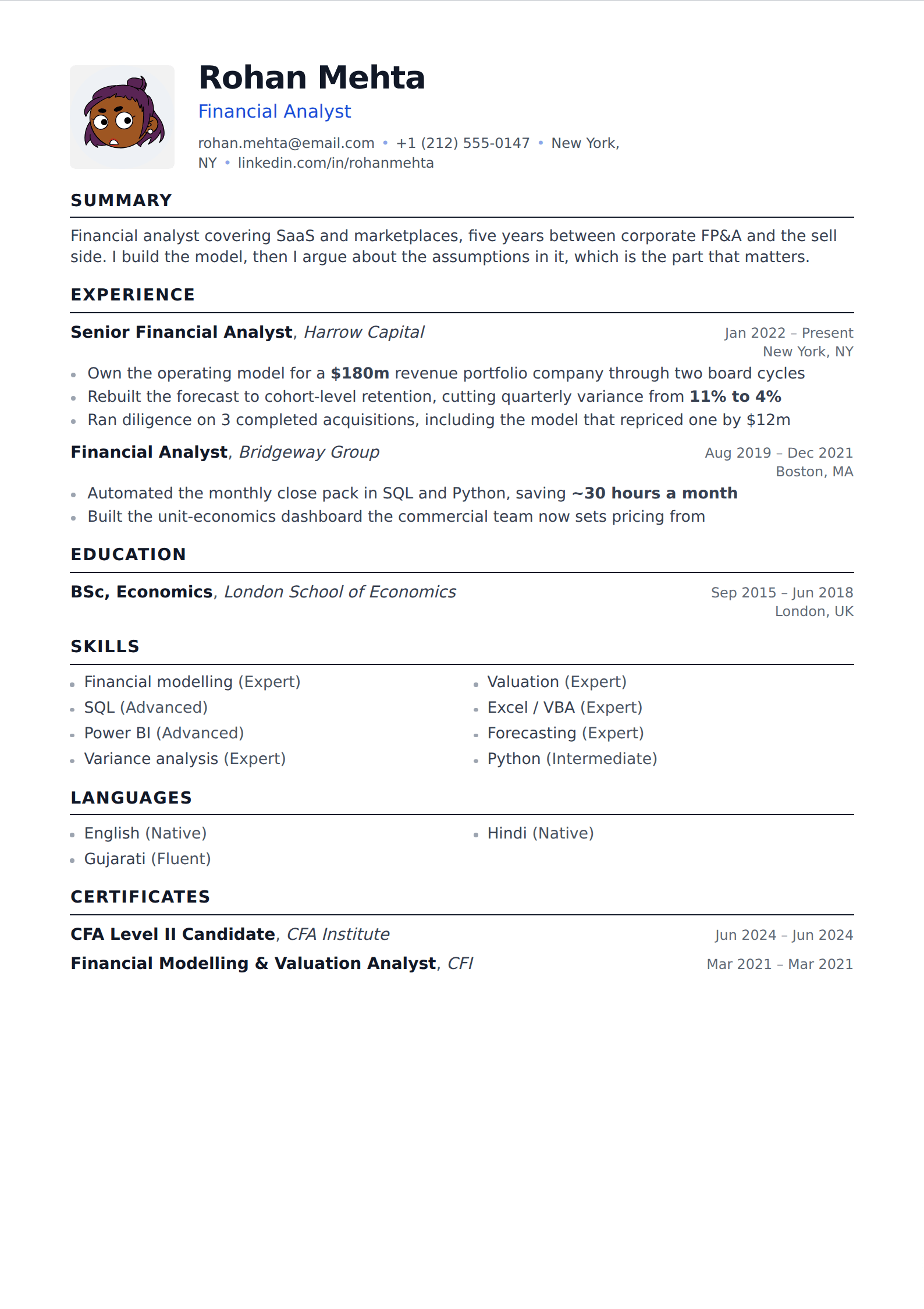
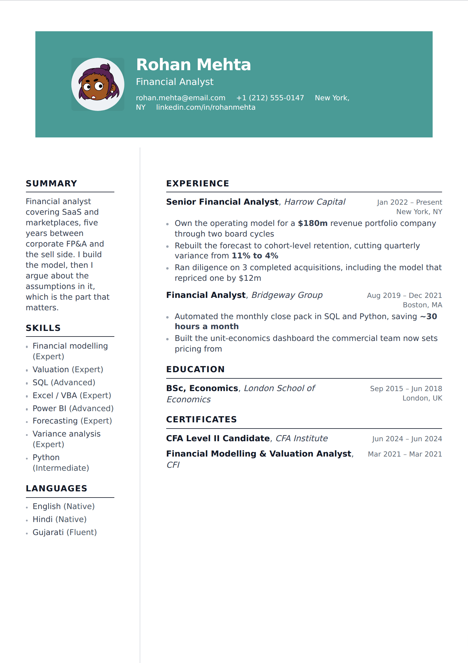
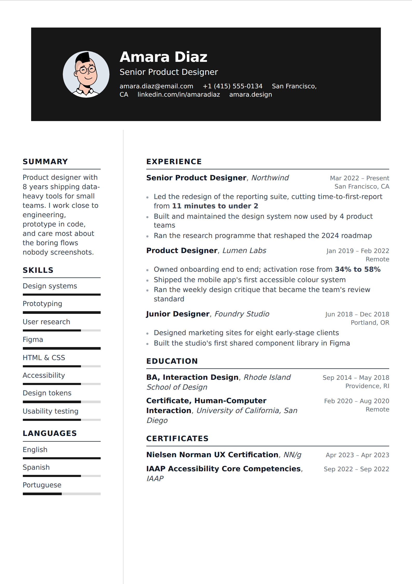
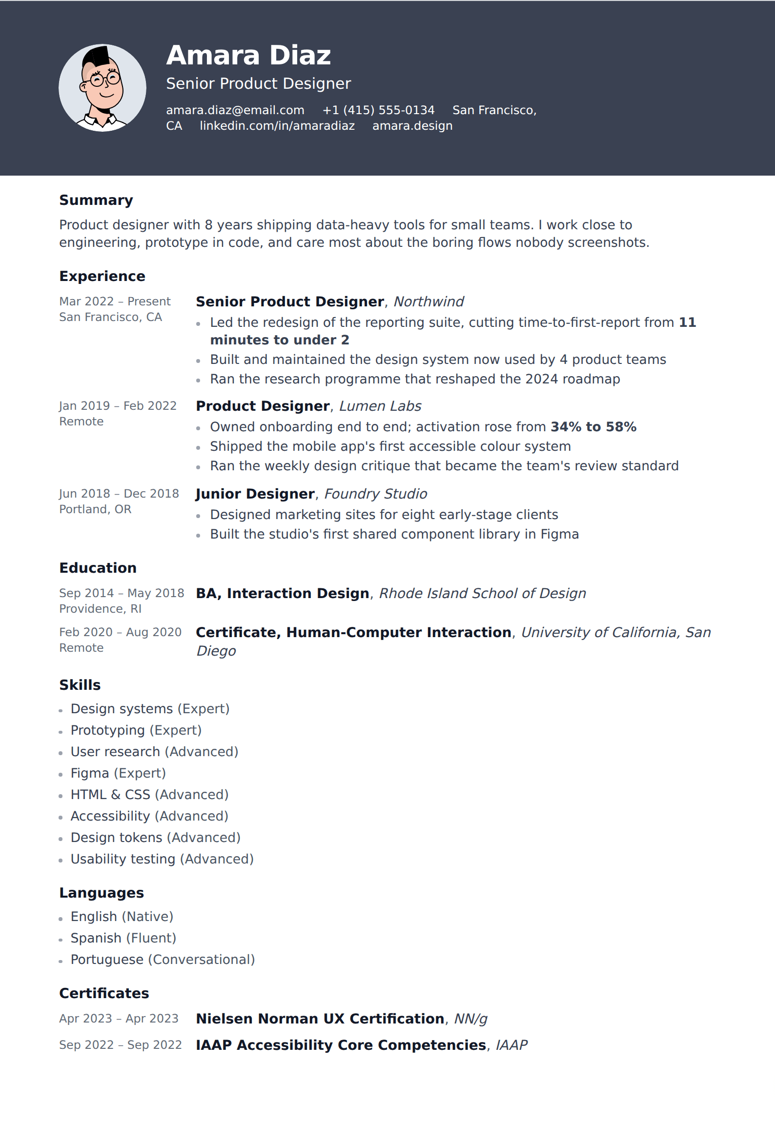
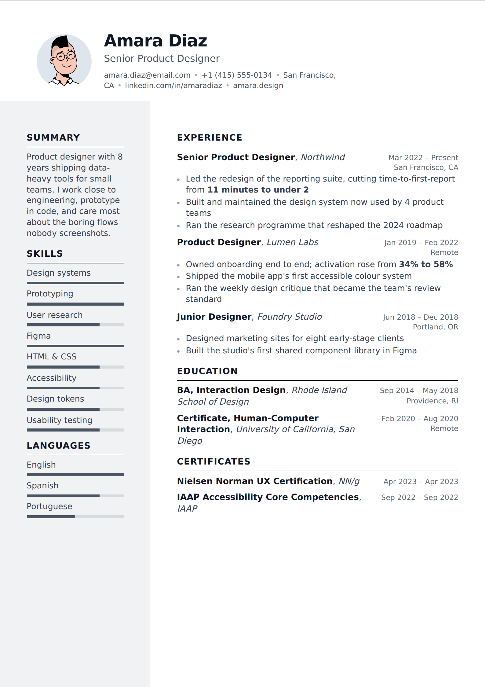
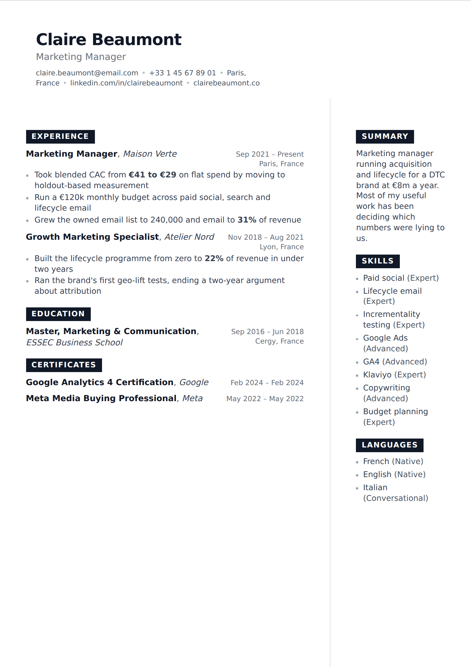
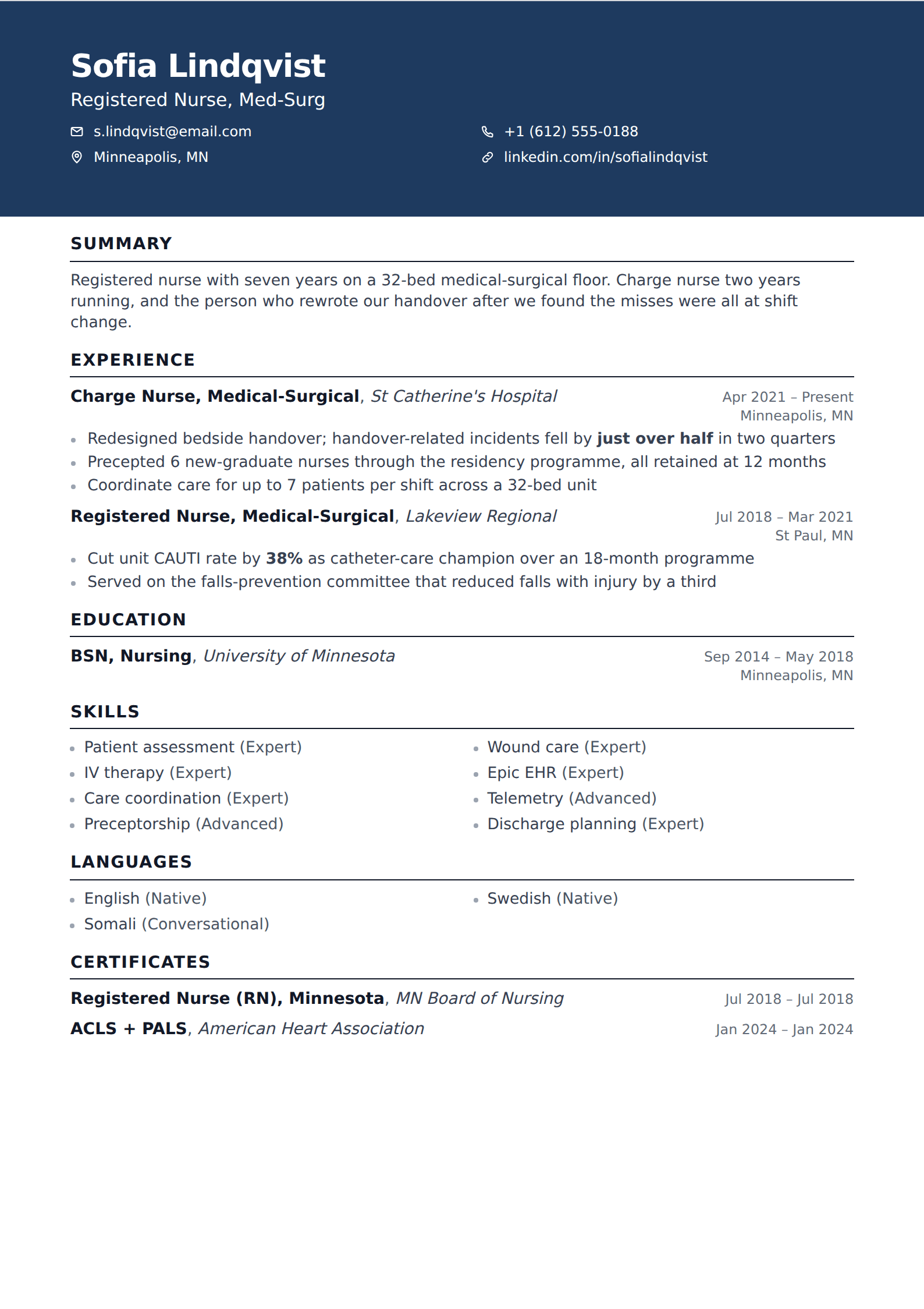
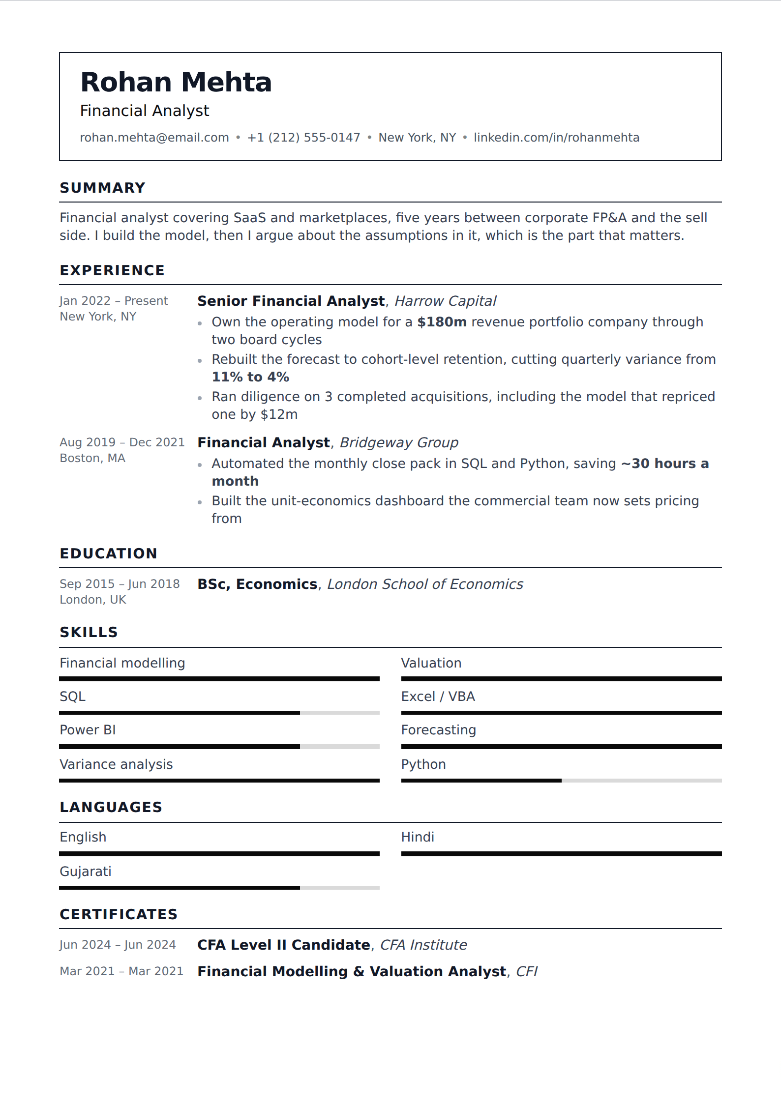
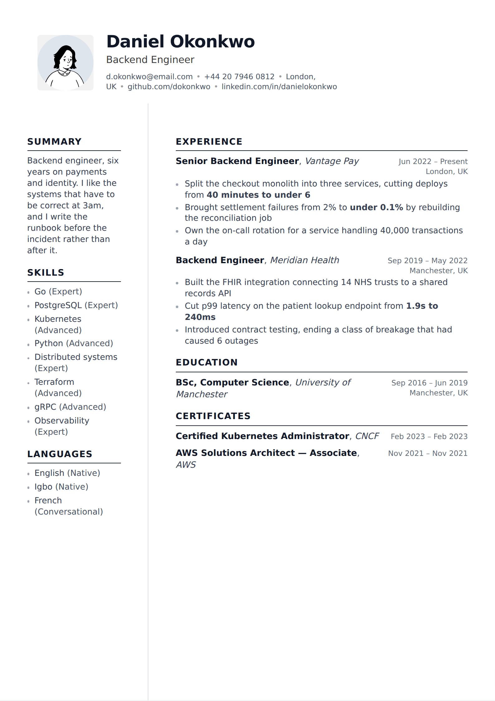
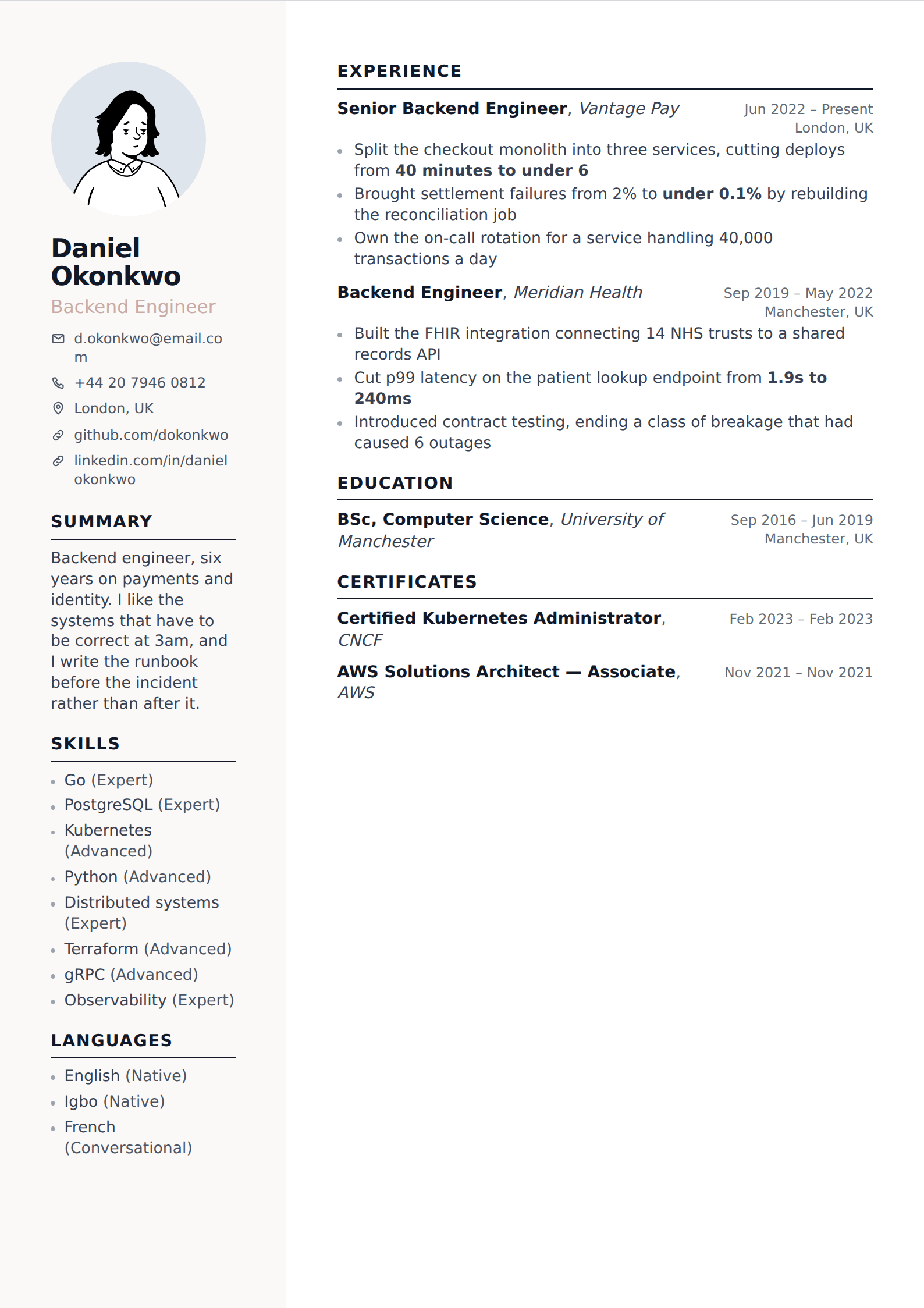
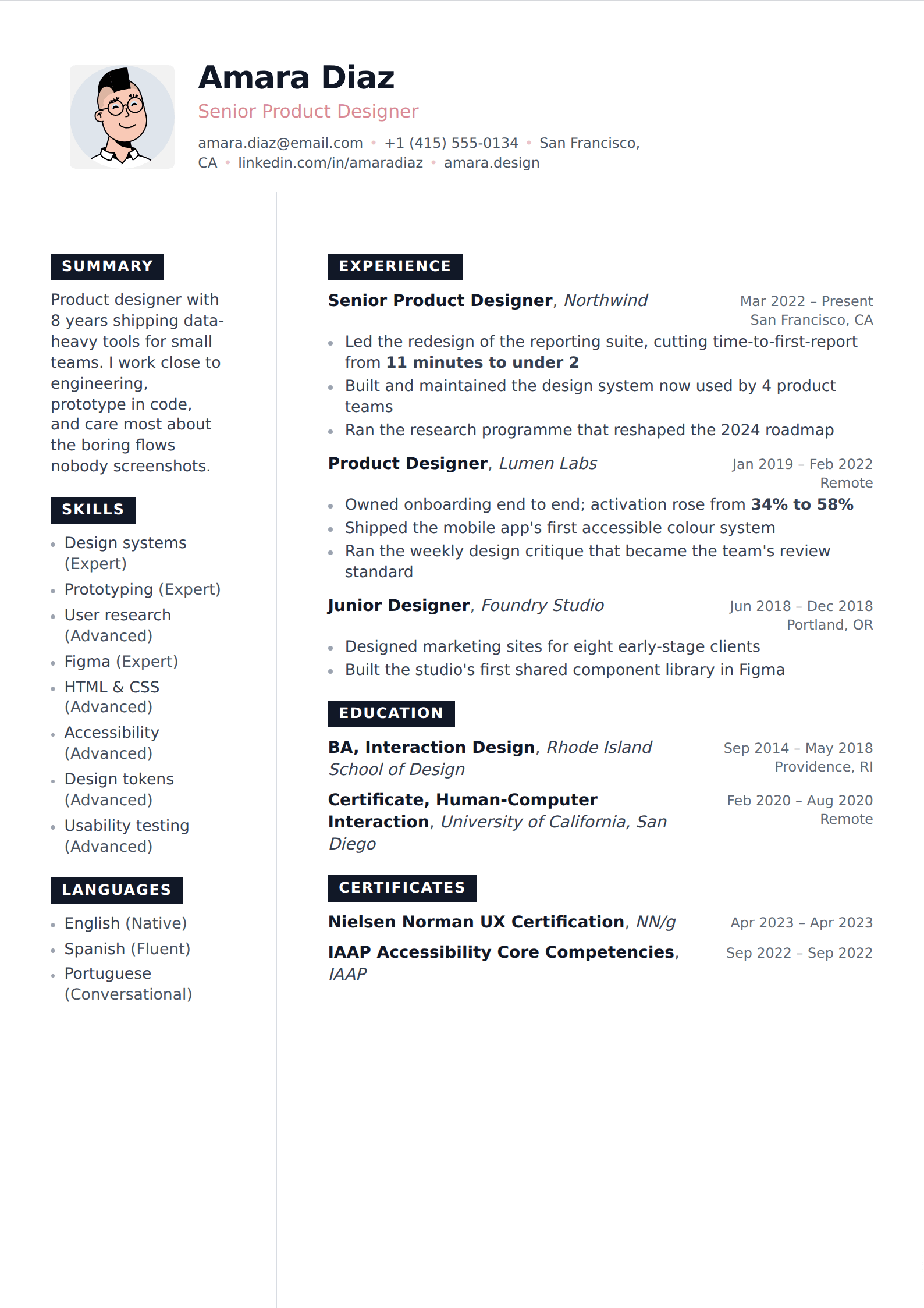
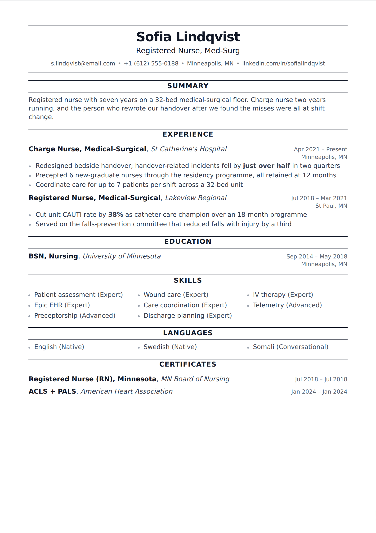
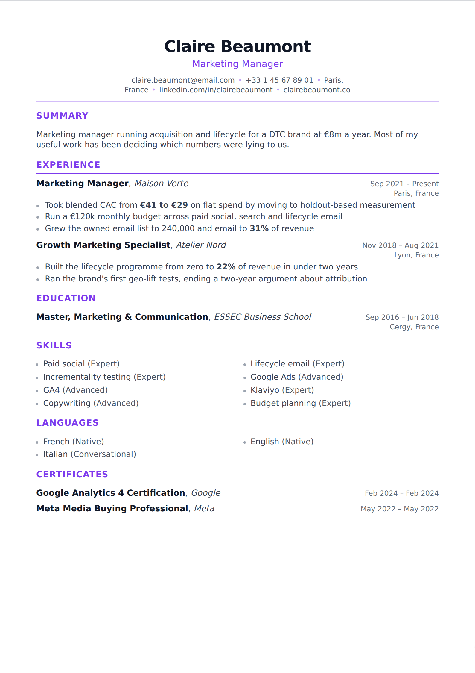
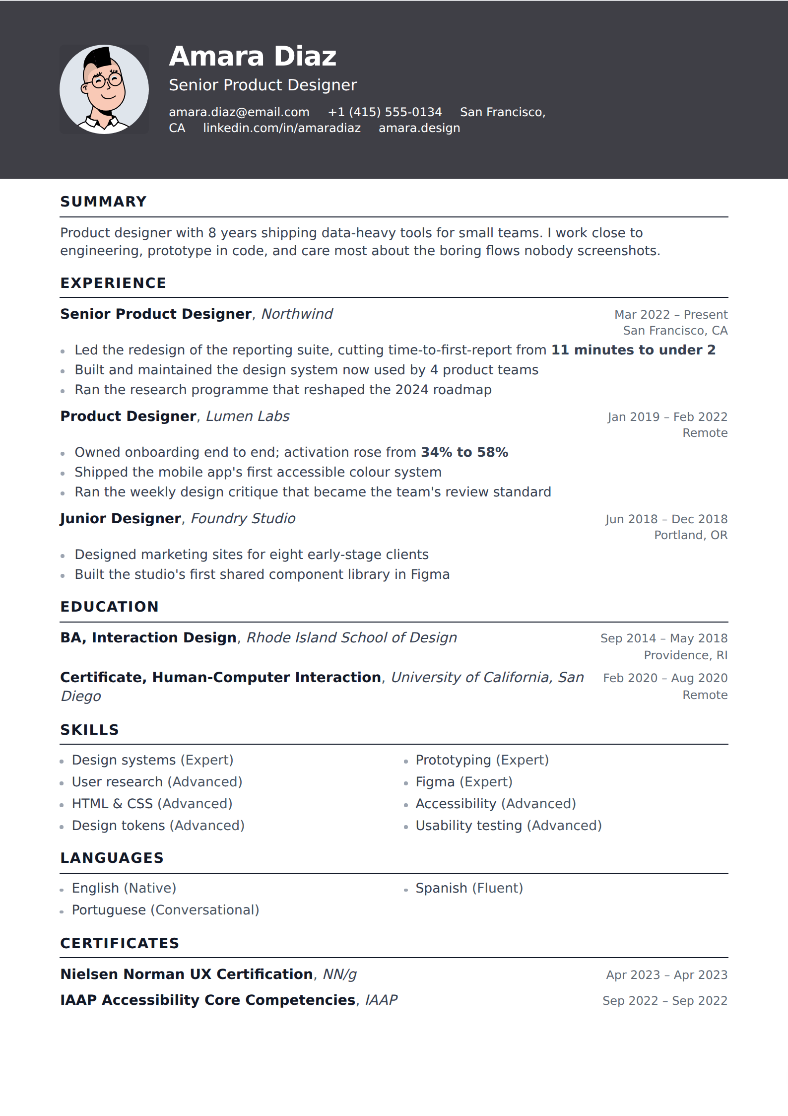
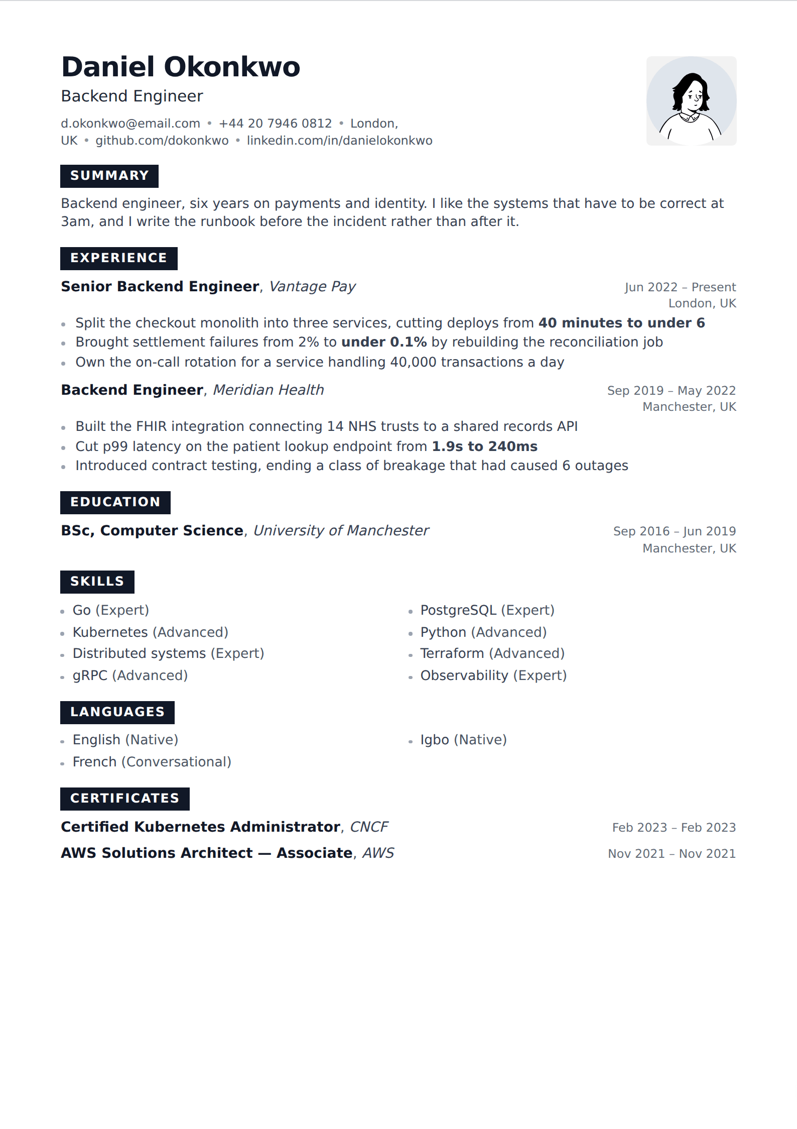
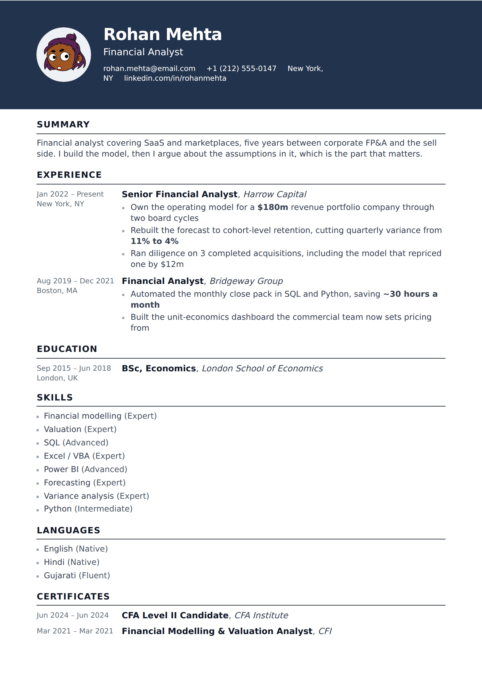
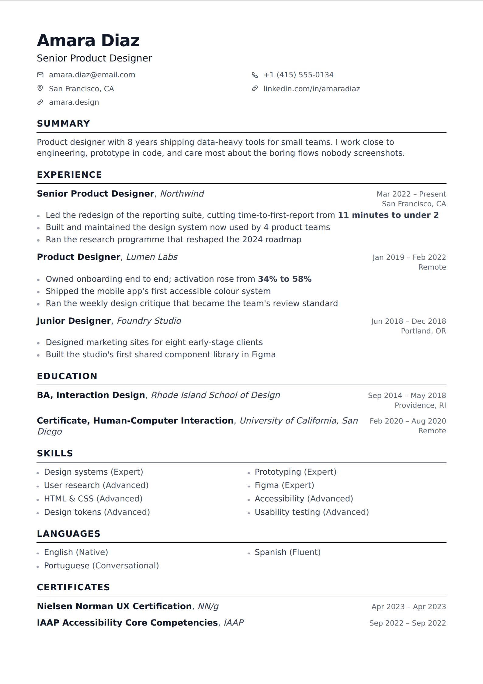
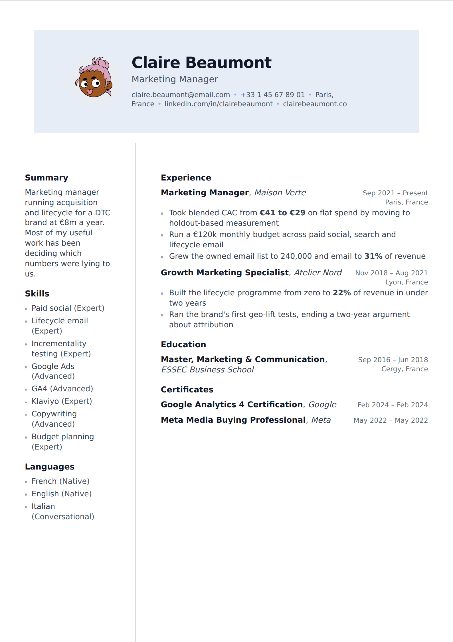
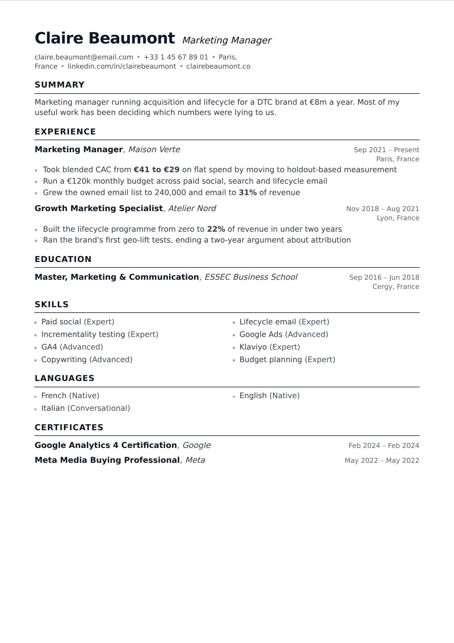
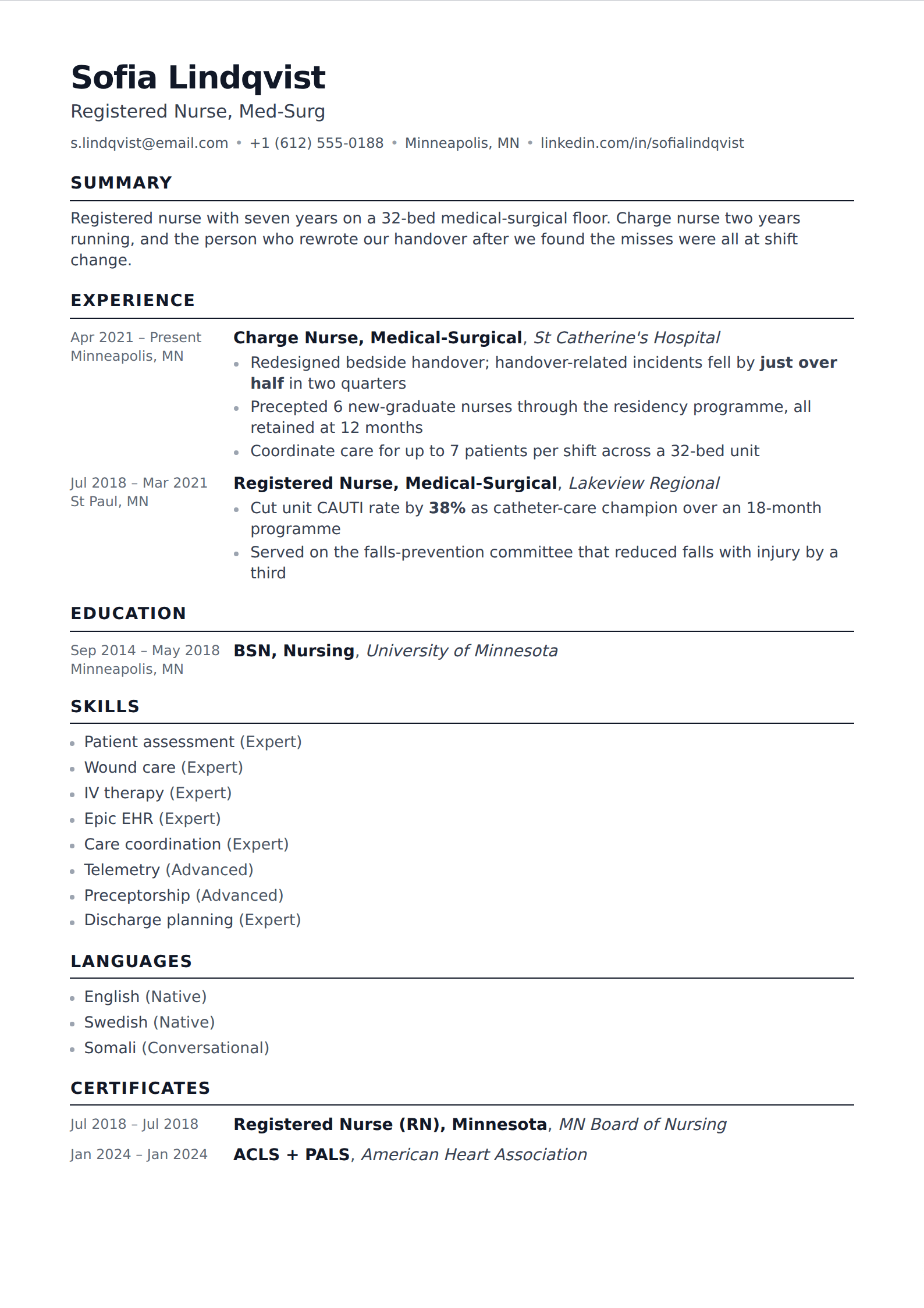
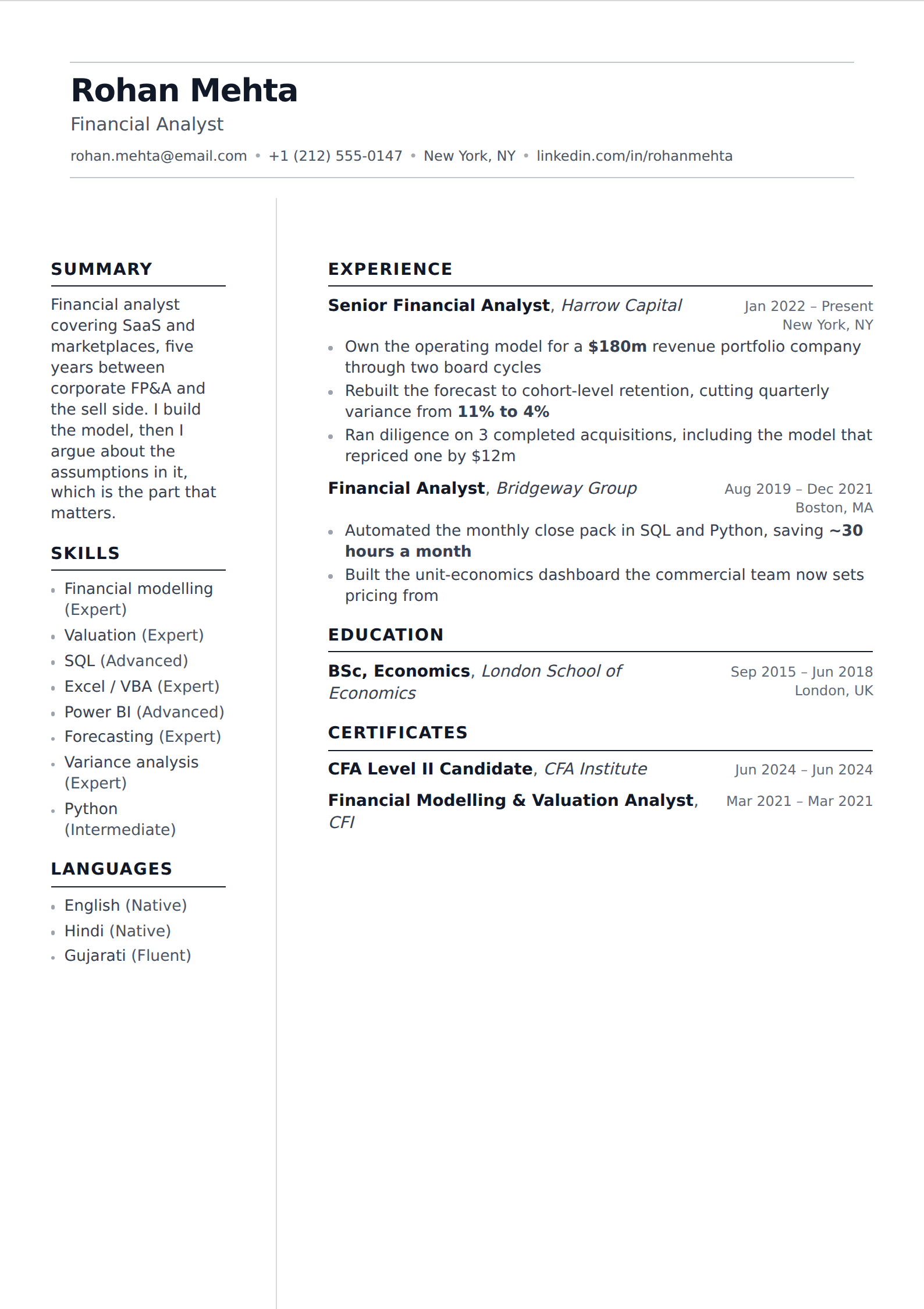
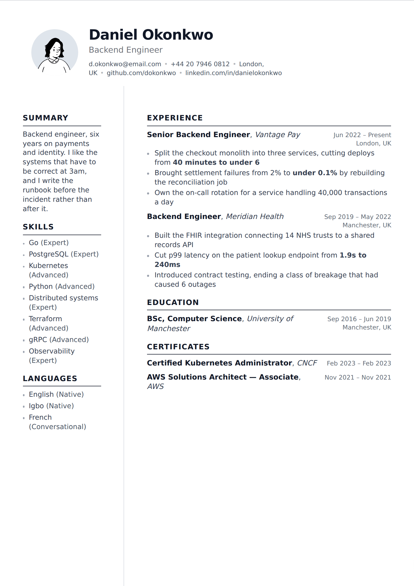
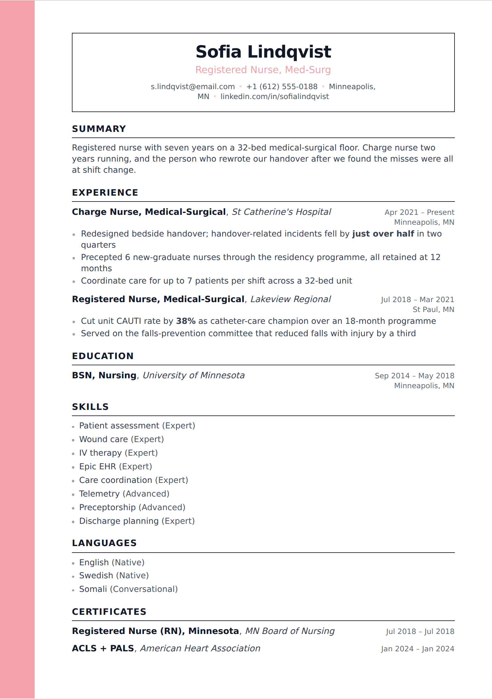
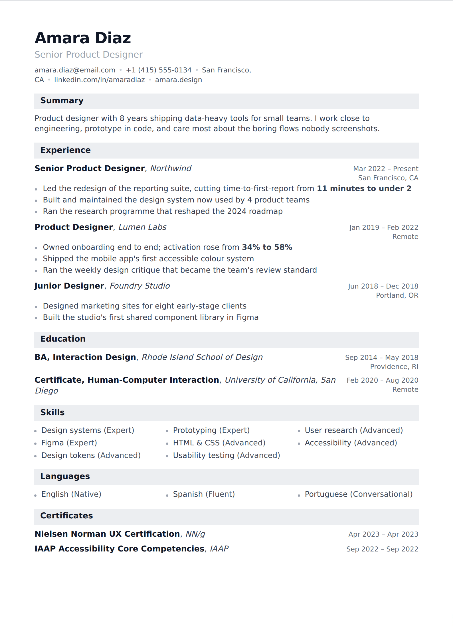
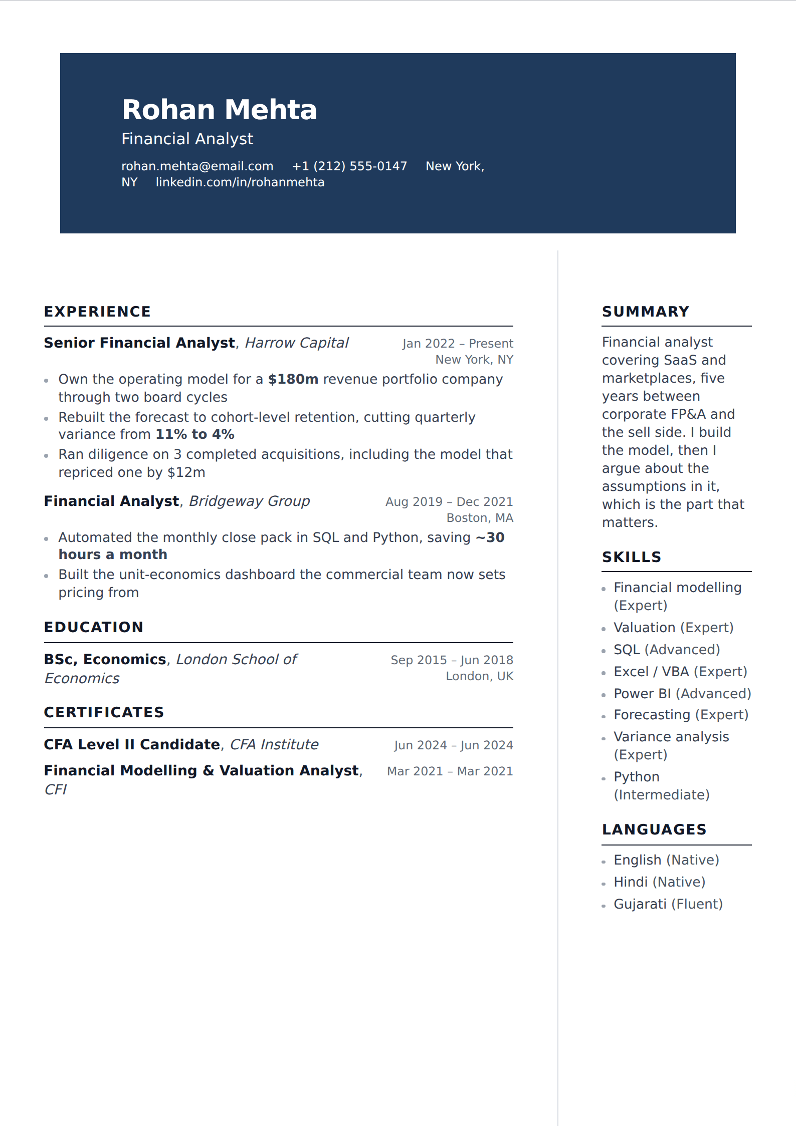
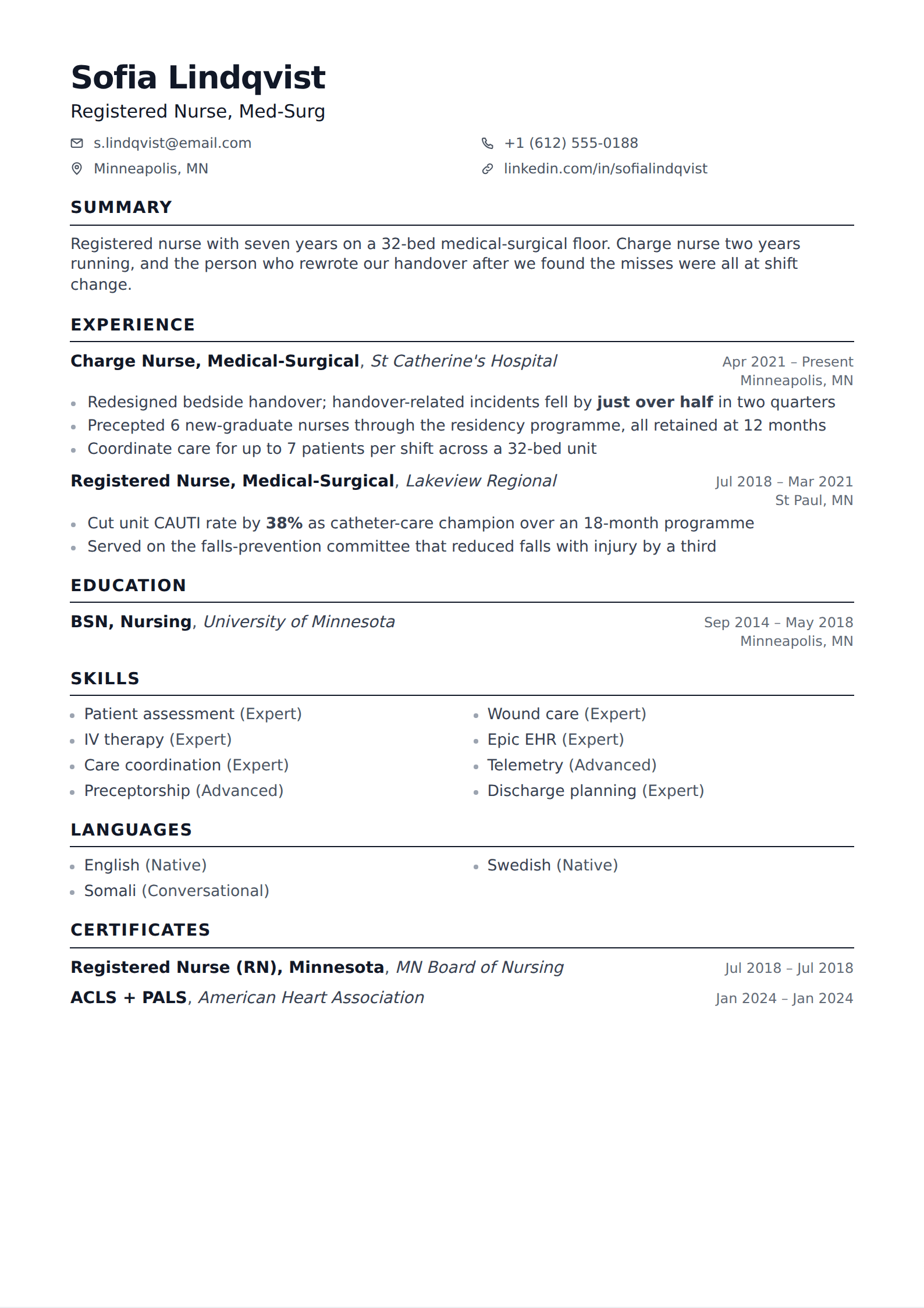
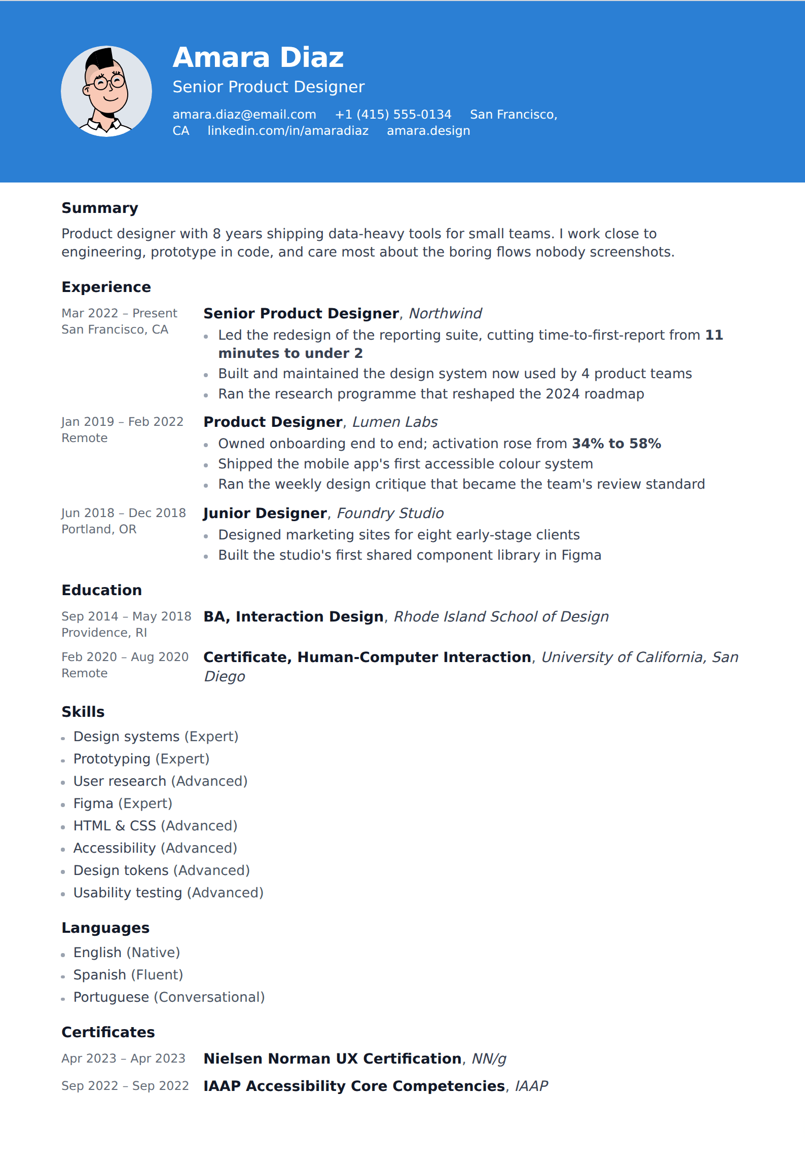
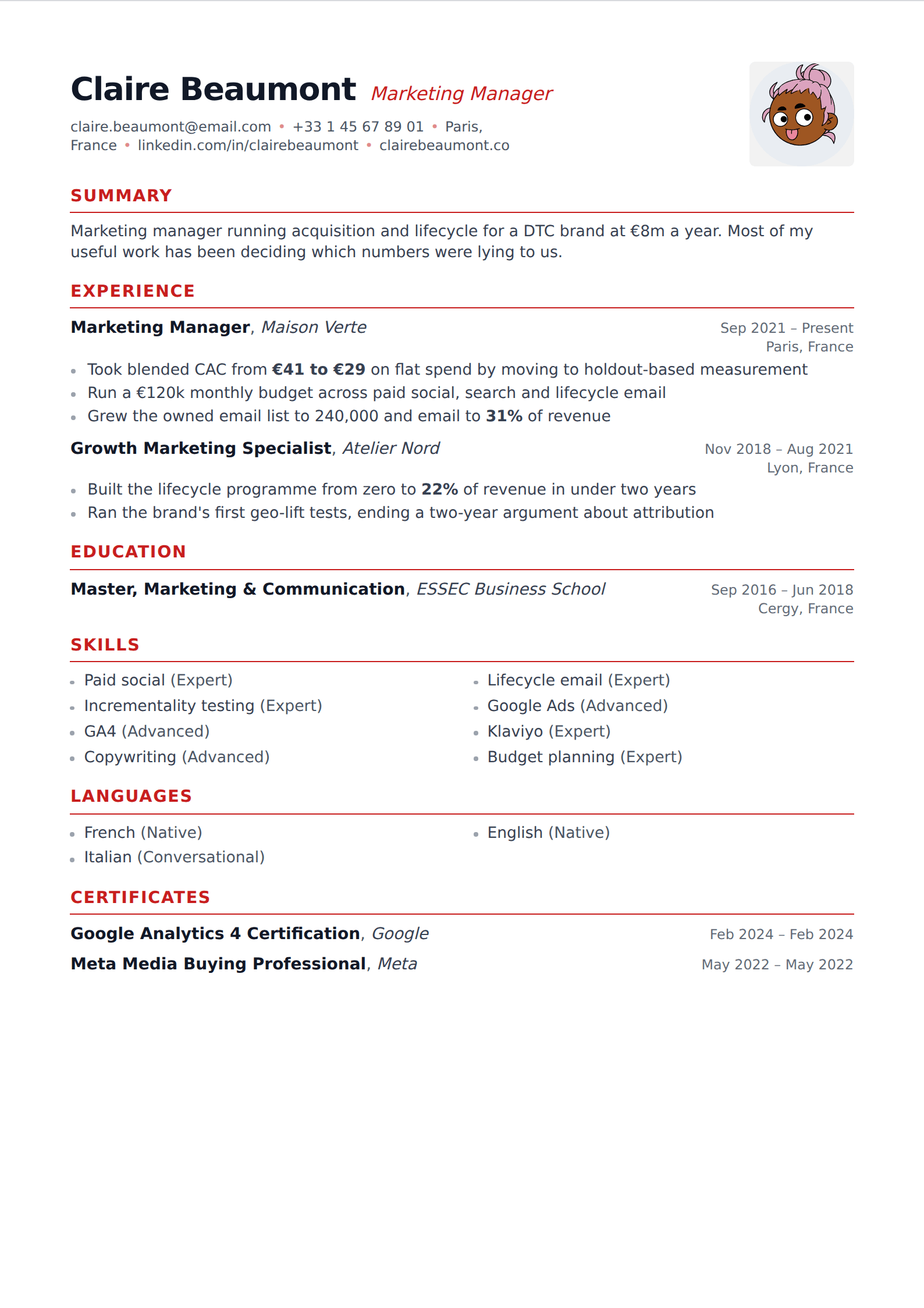
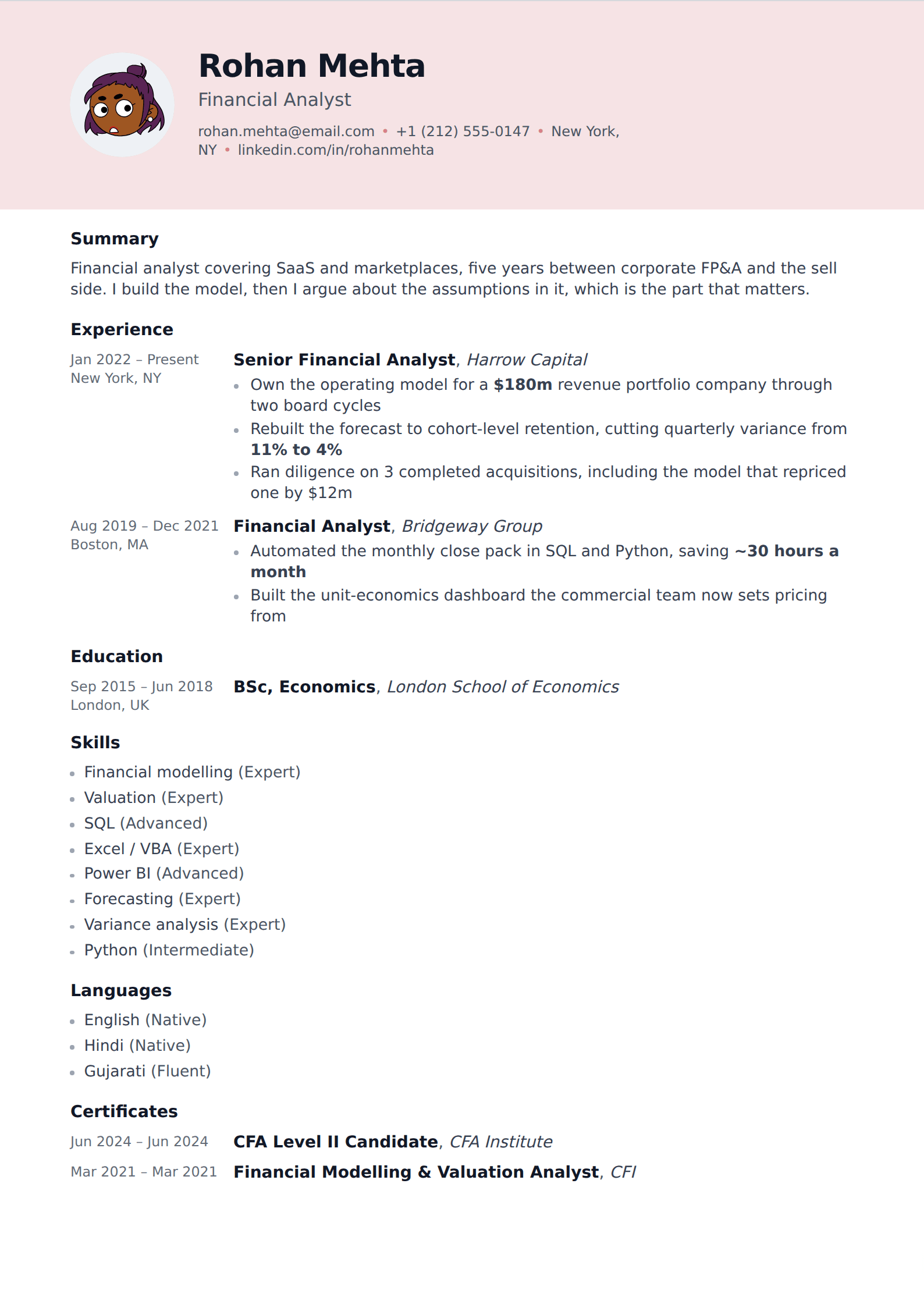
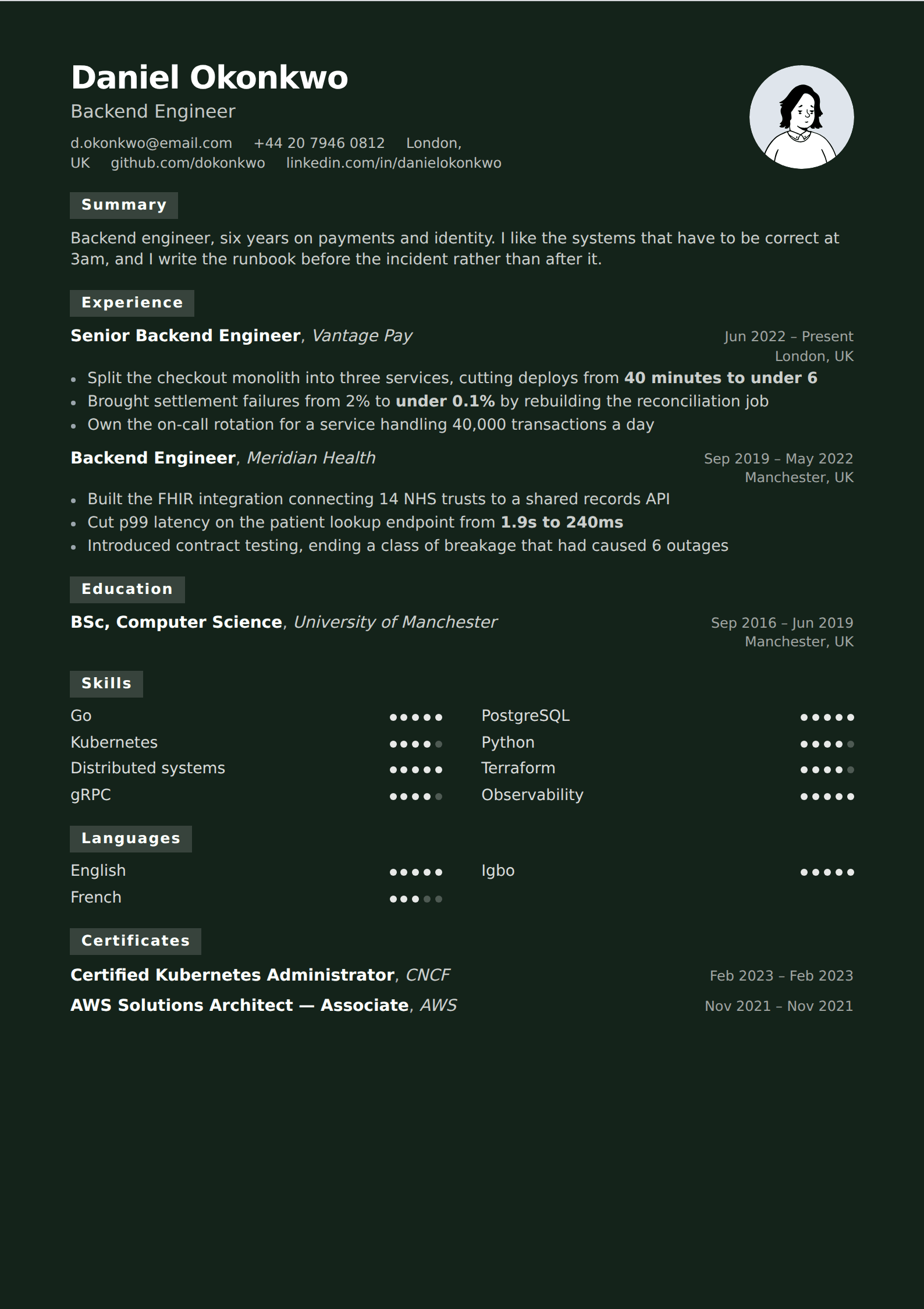
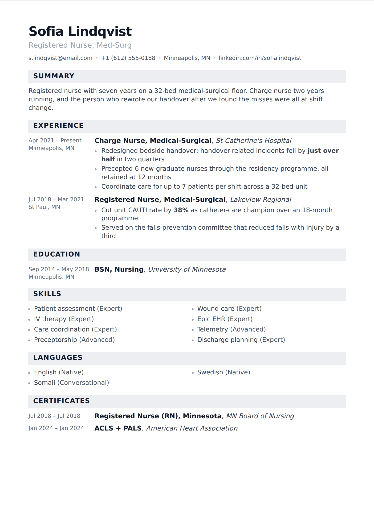
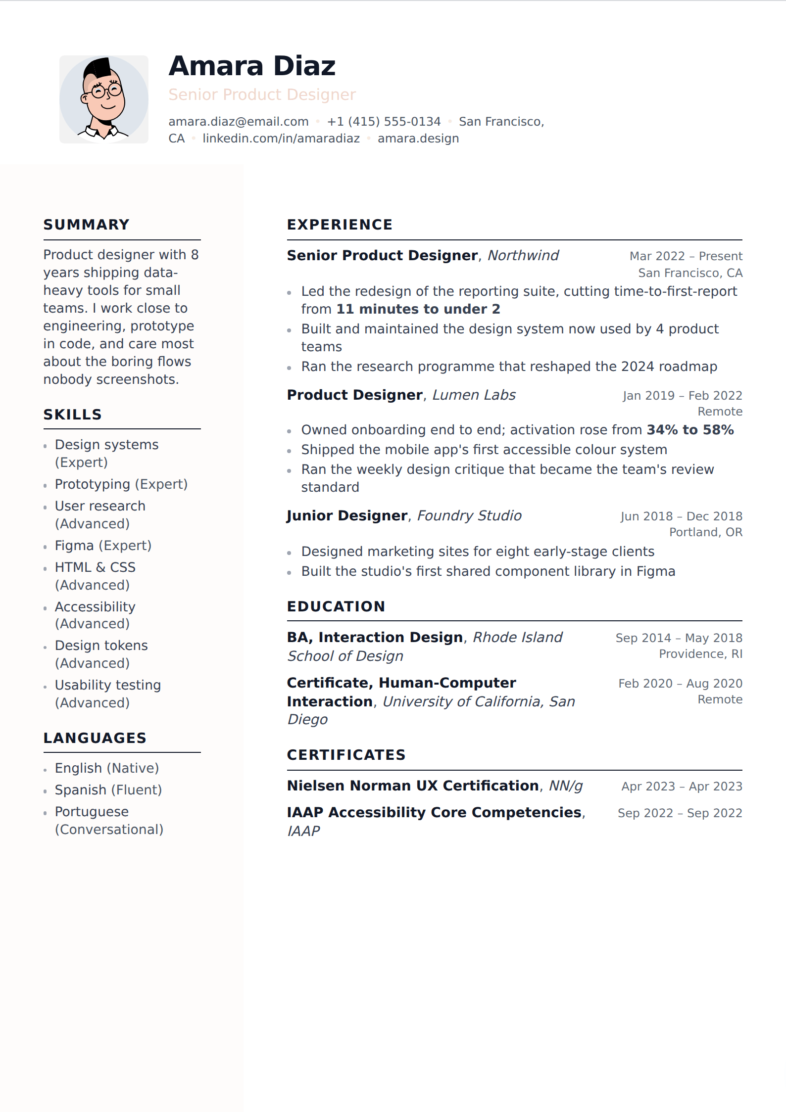
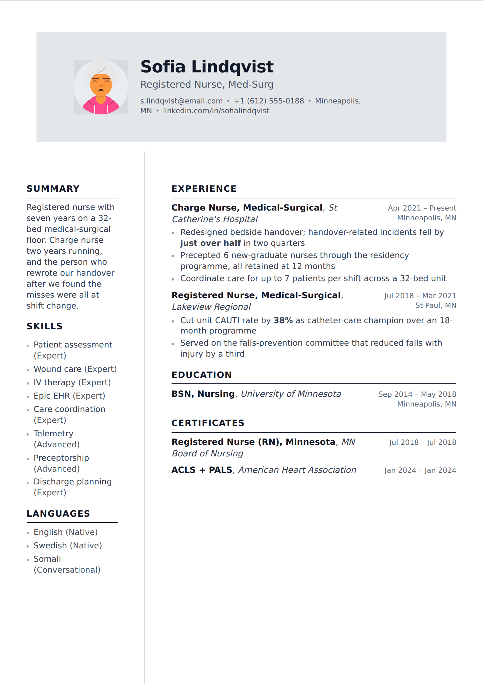
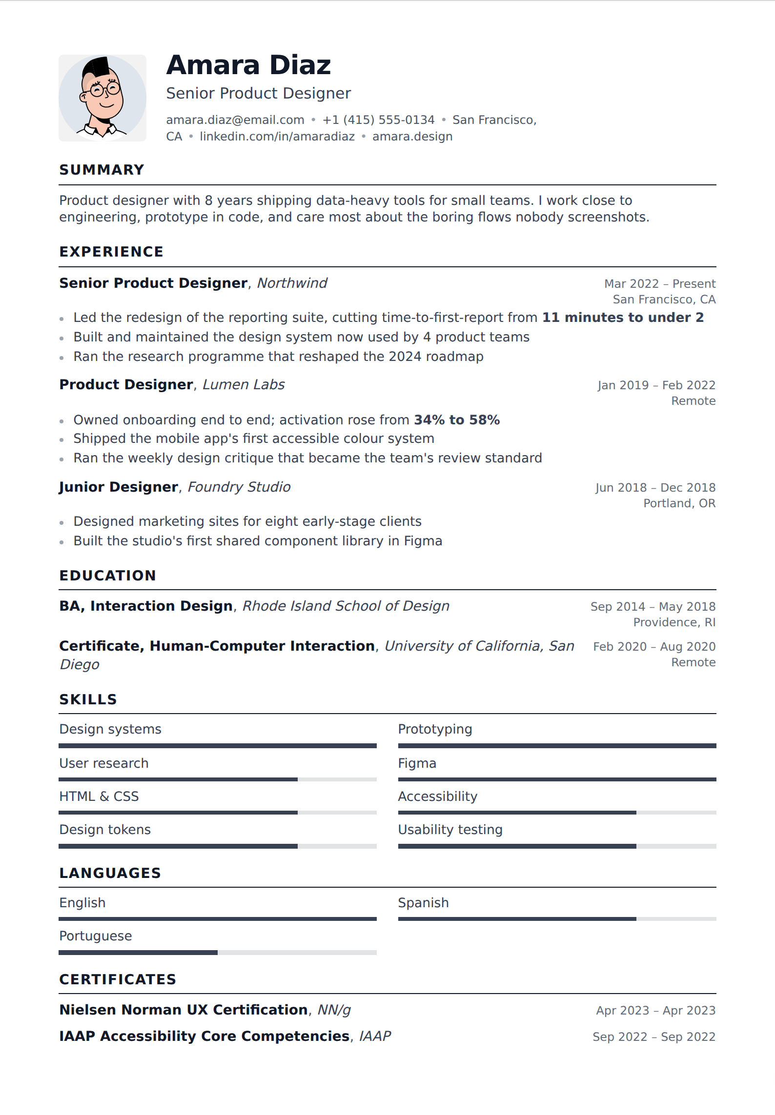
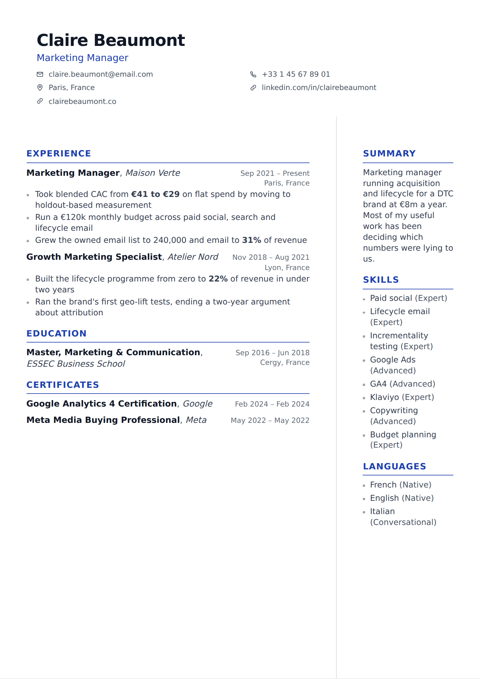
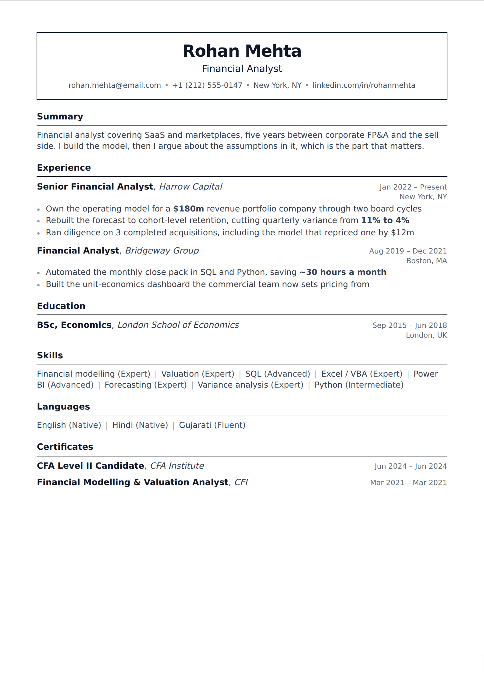
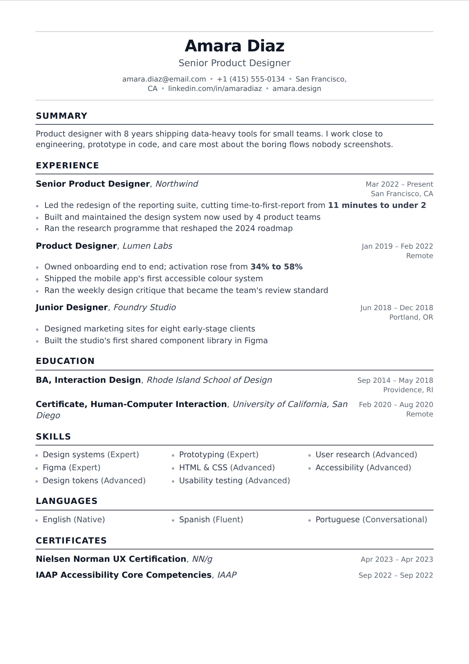
Sans-serif typefaces and contemporary hierarchy — the look most technology, product and startup hiring reads as current. Every one still exports as real text, so modern here is about type and spacing rather than about decoration a parser cannot read.
164 of our templates match this. Every one is free to use, with unlimited watermark-free PDF downloads.

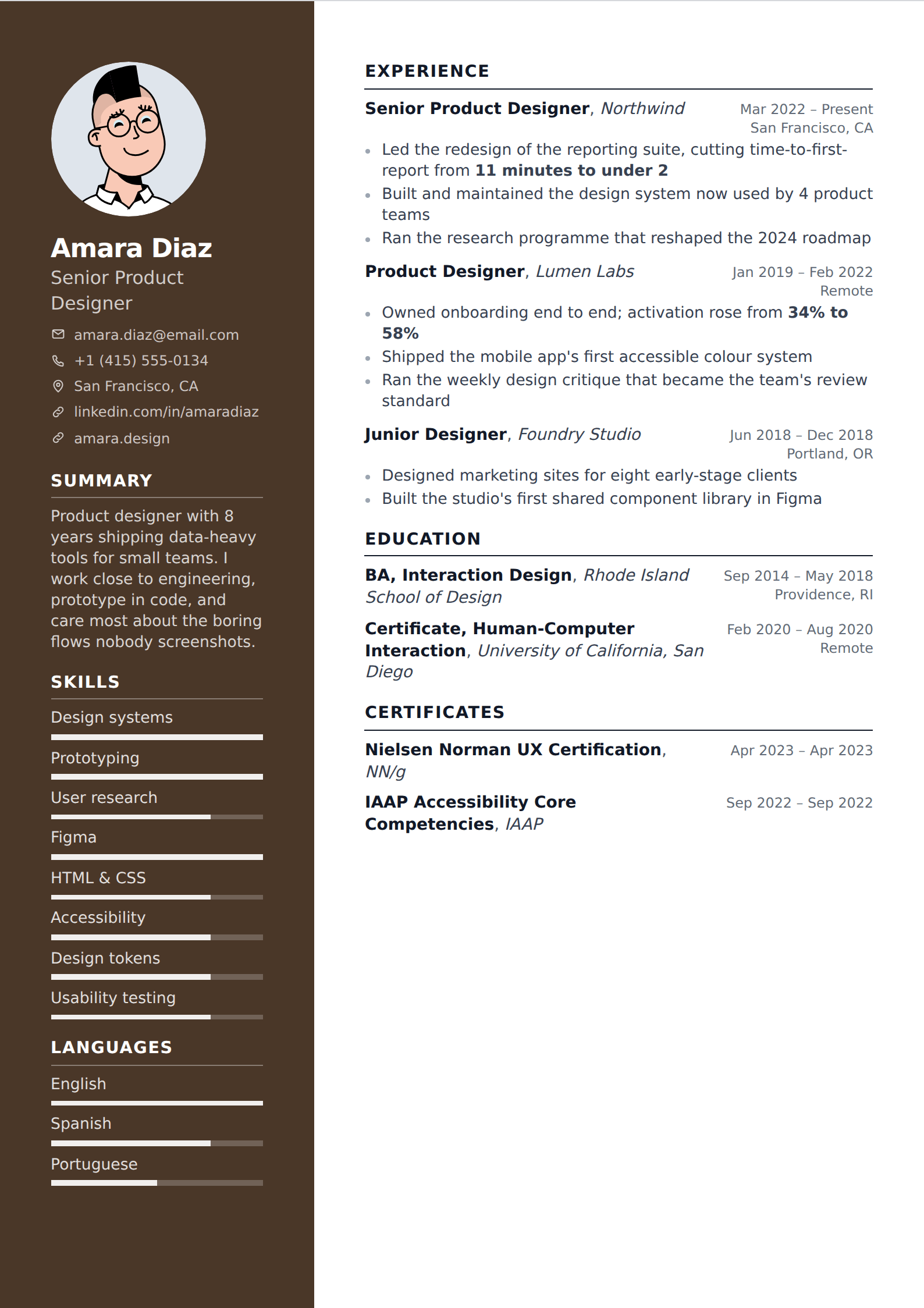
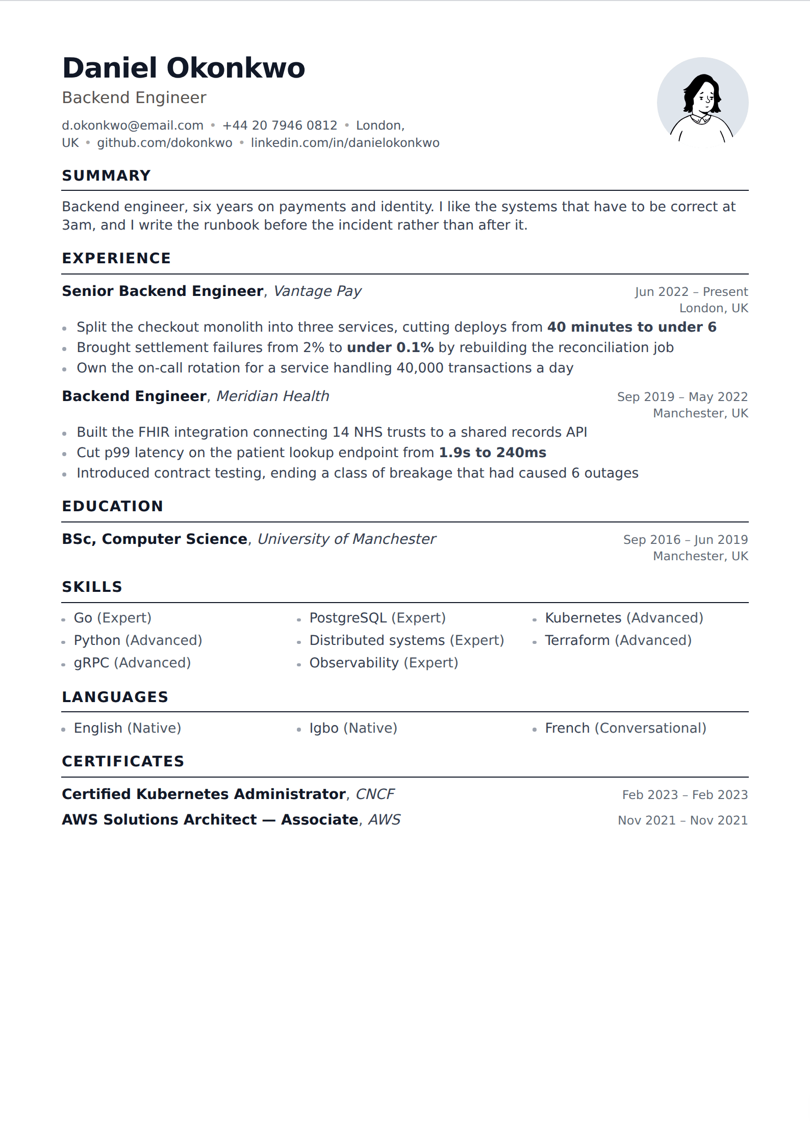
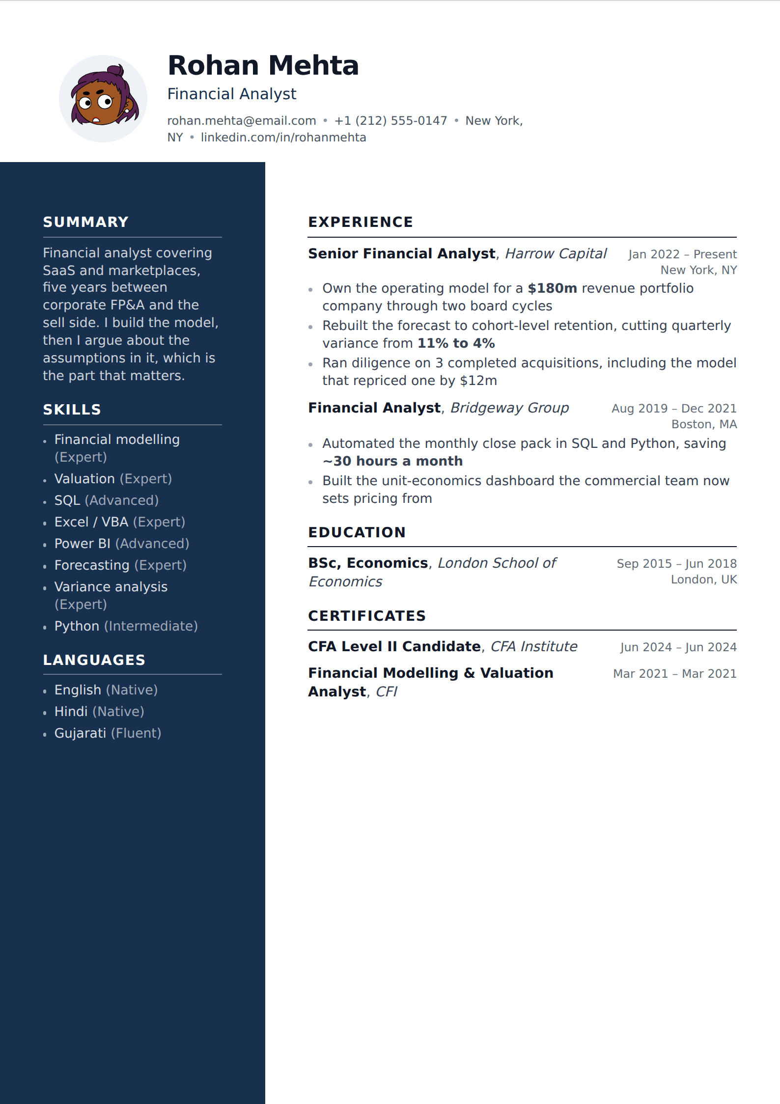
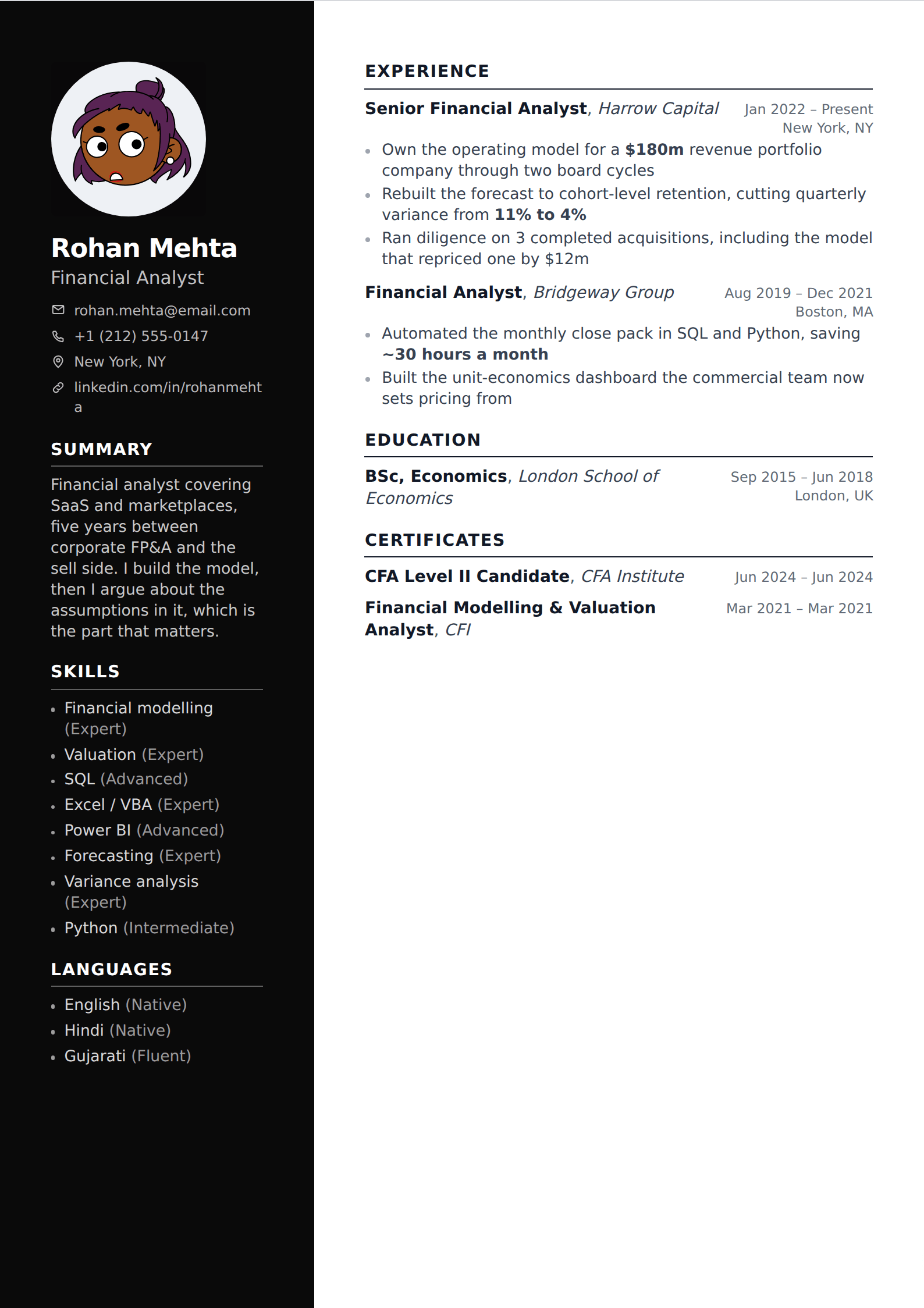
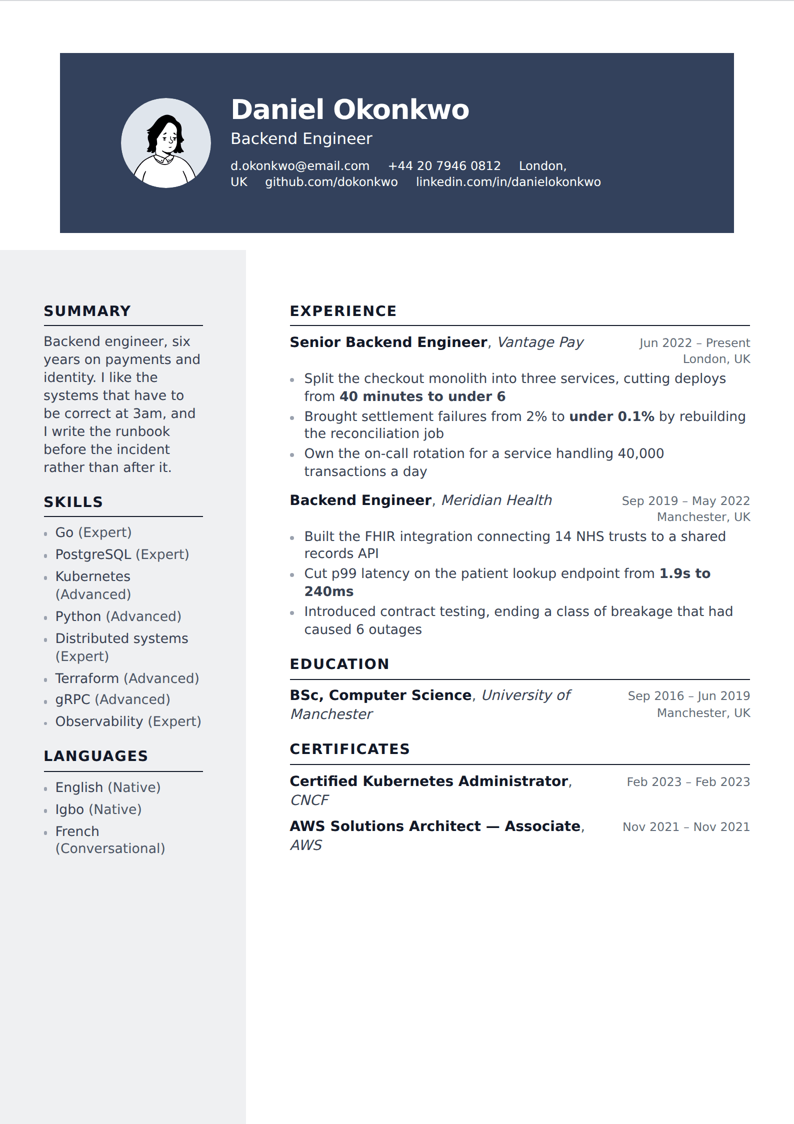
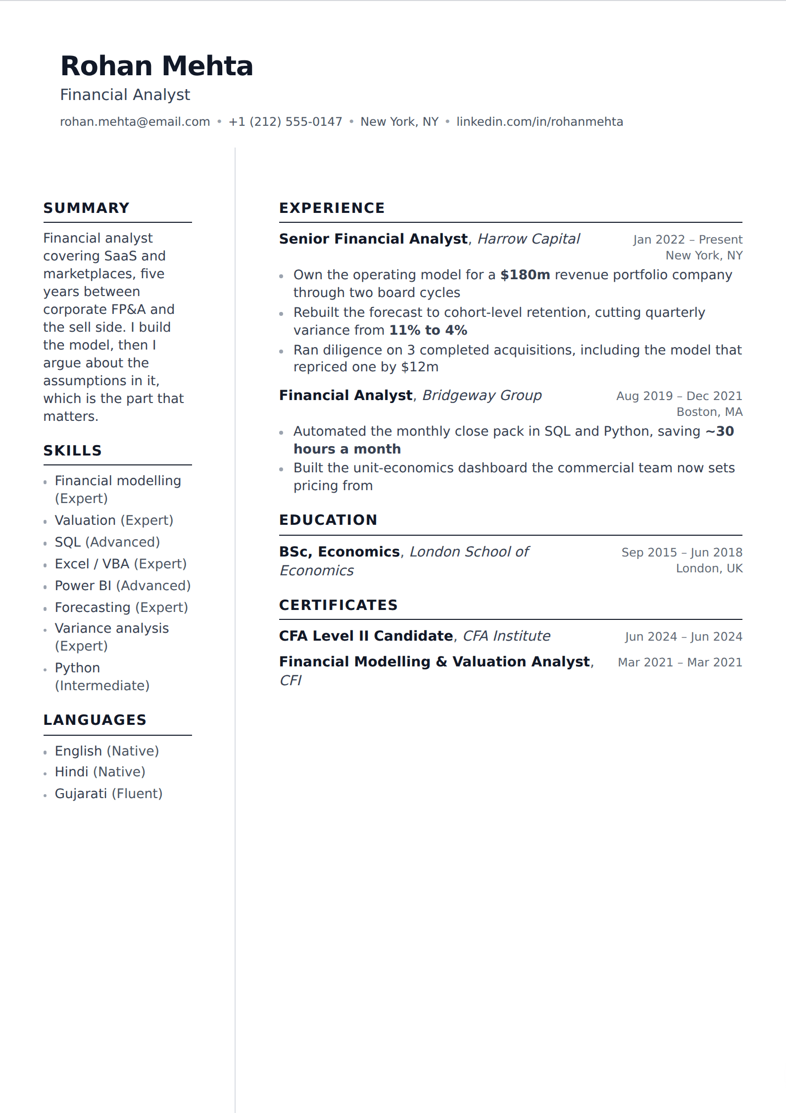
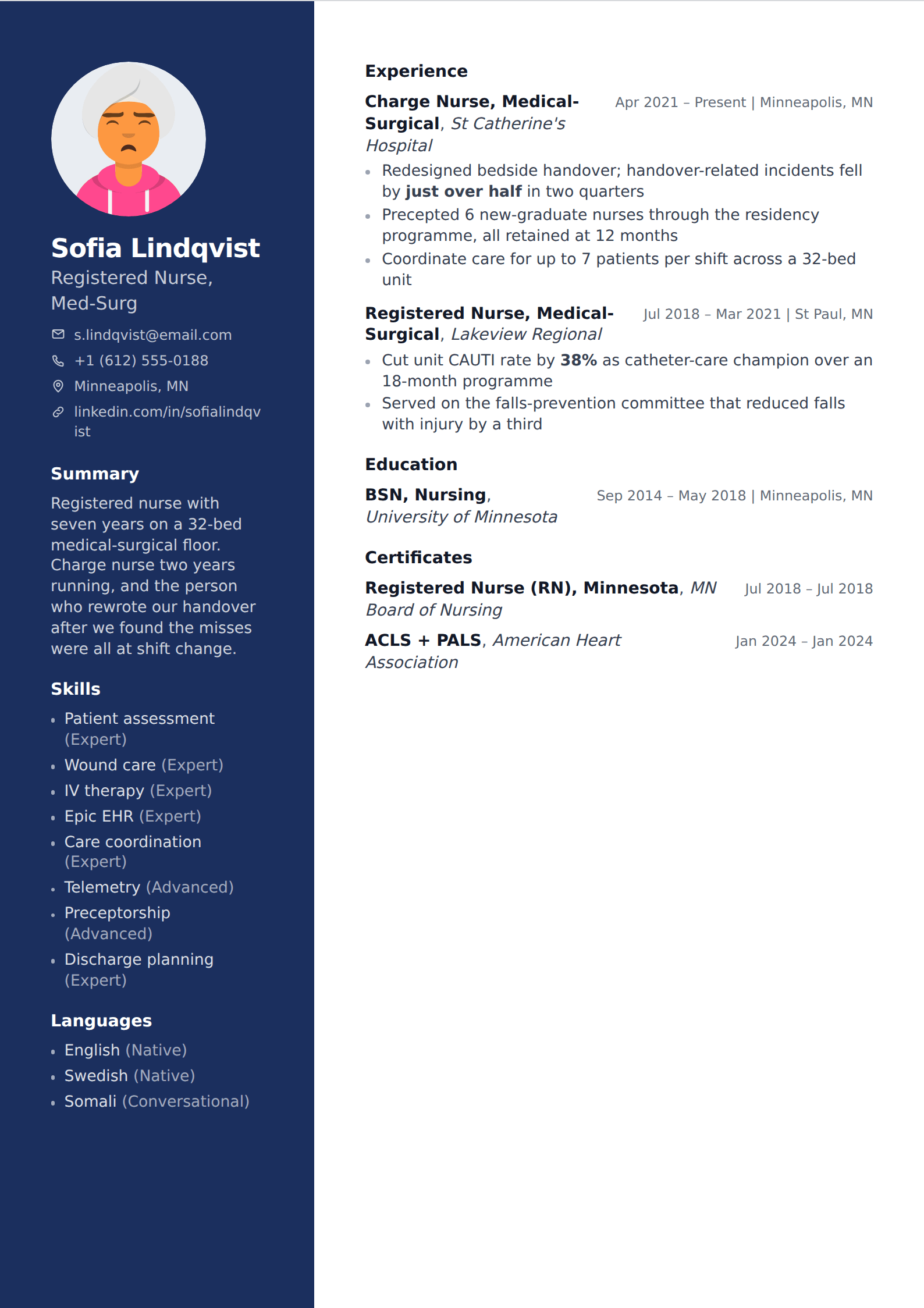
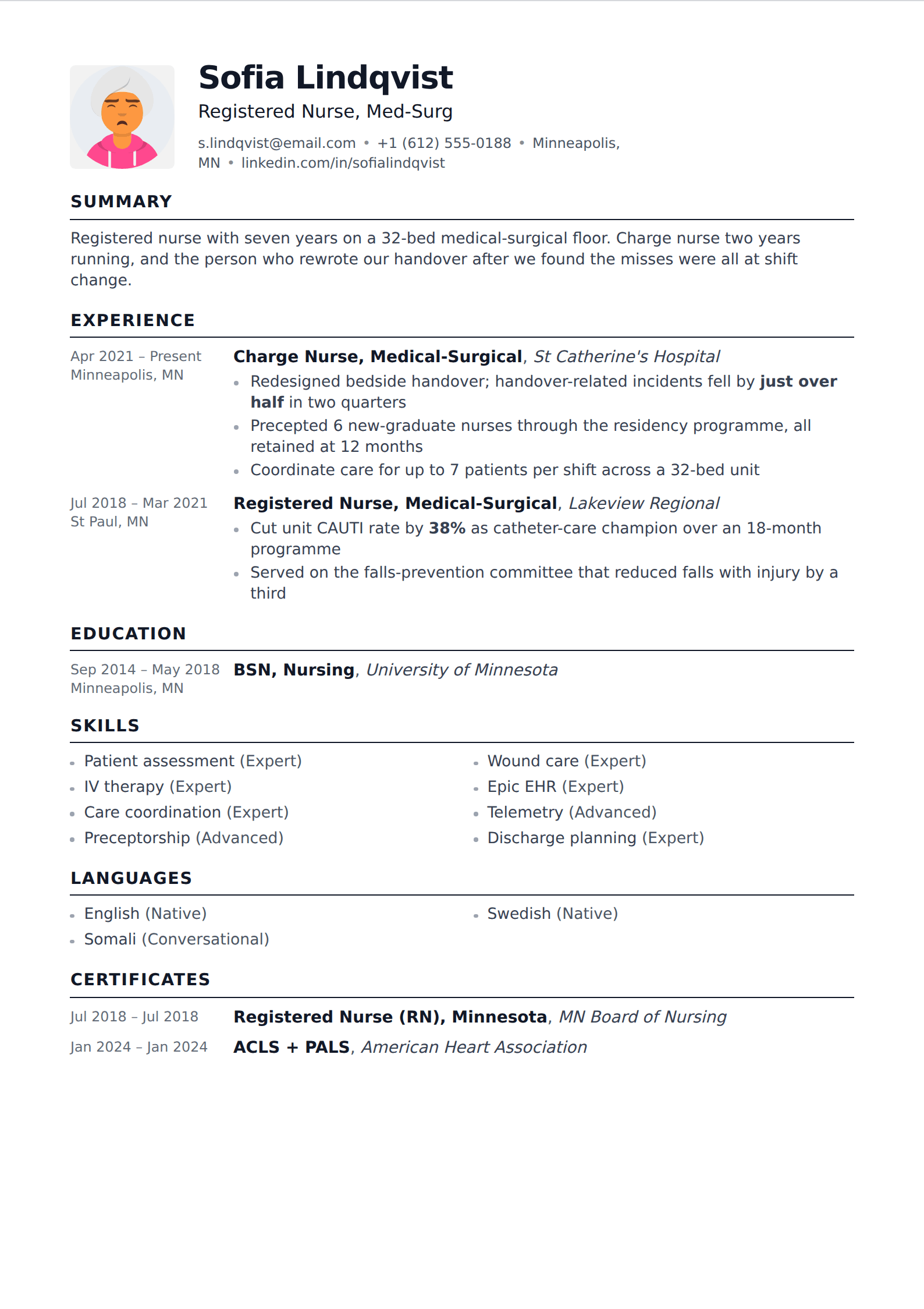
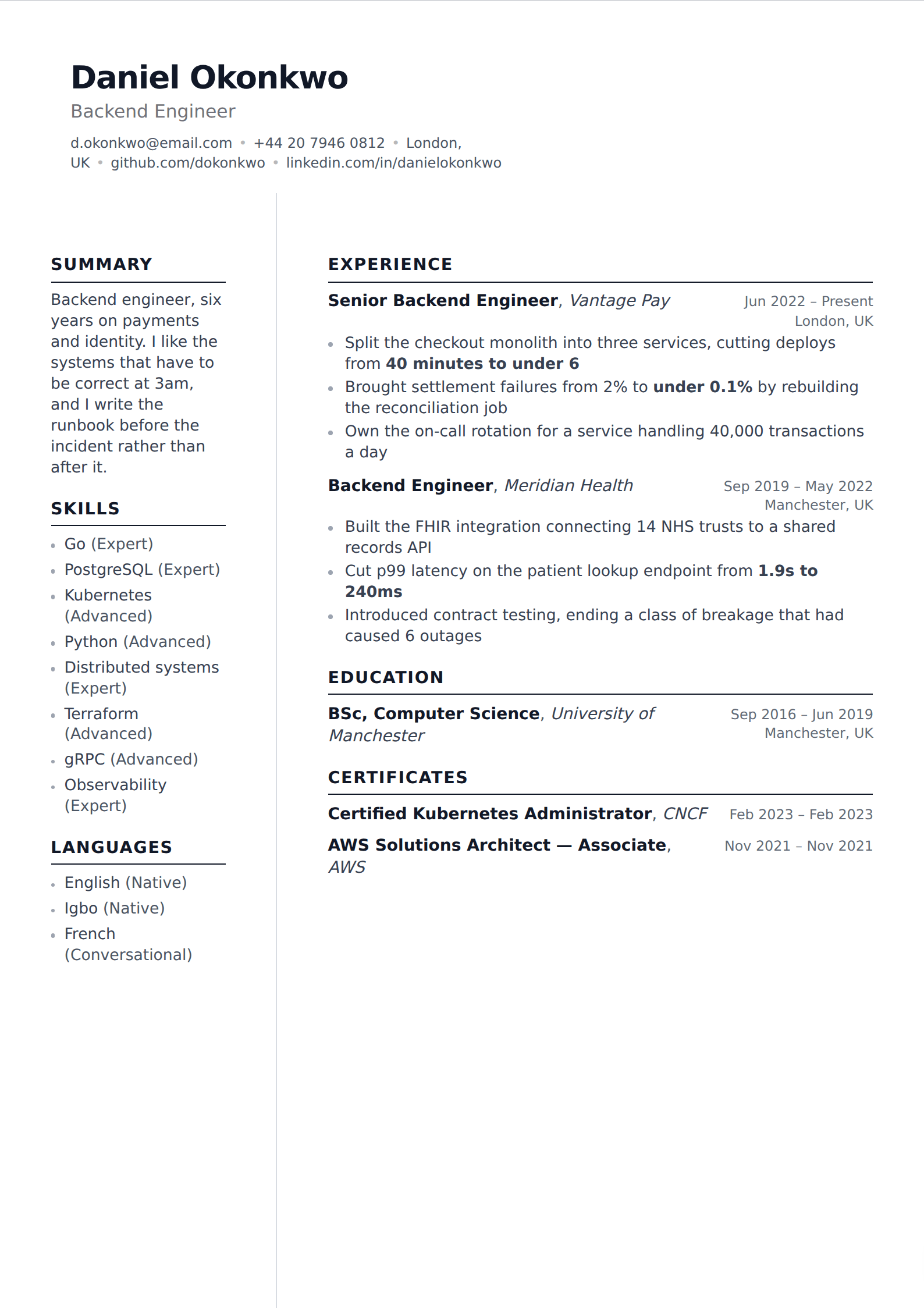
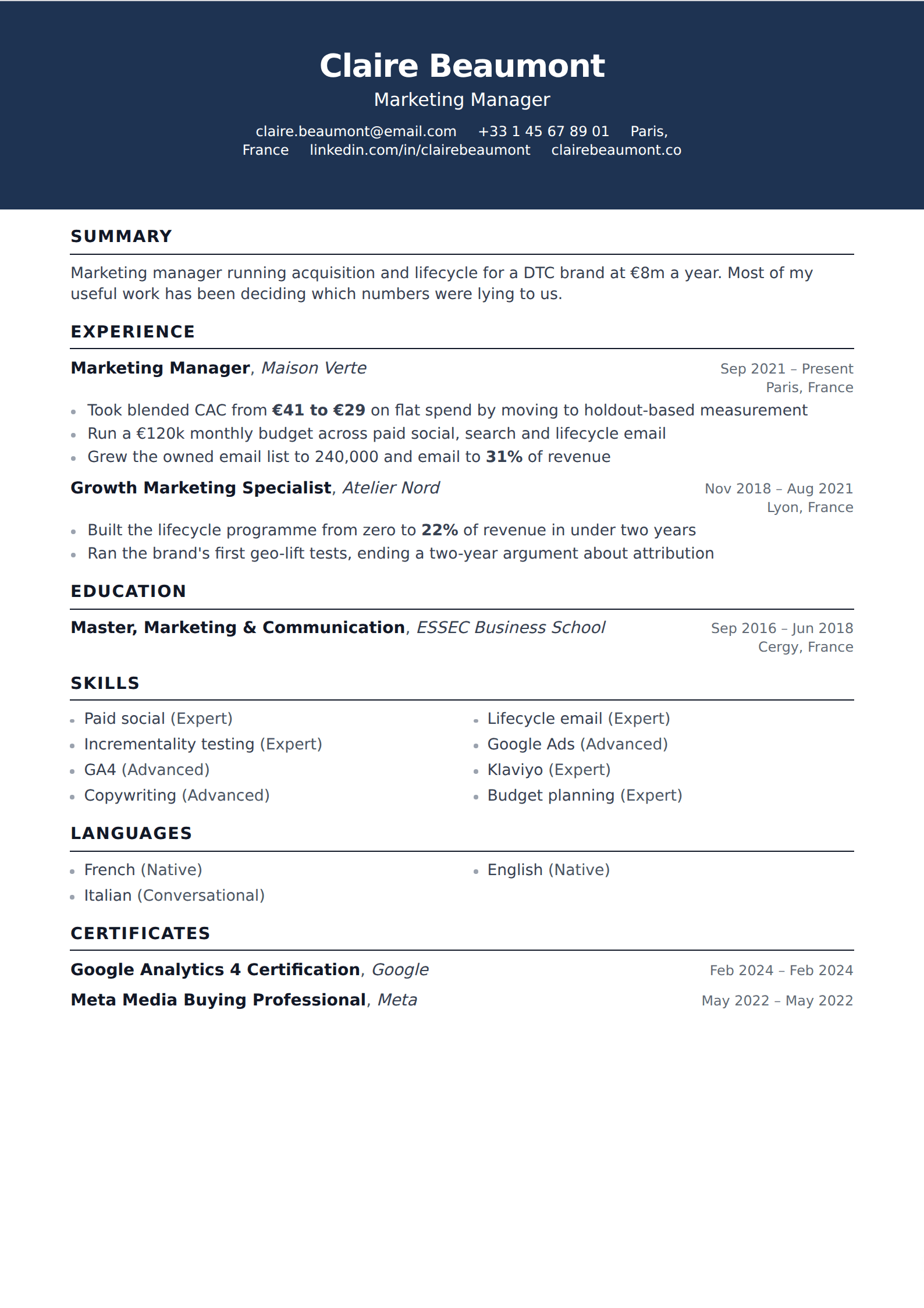
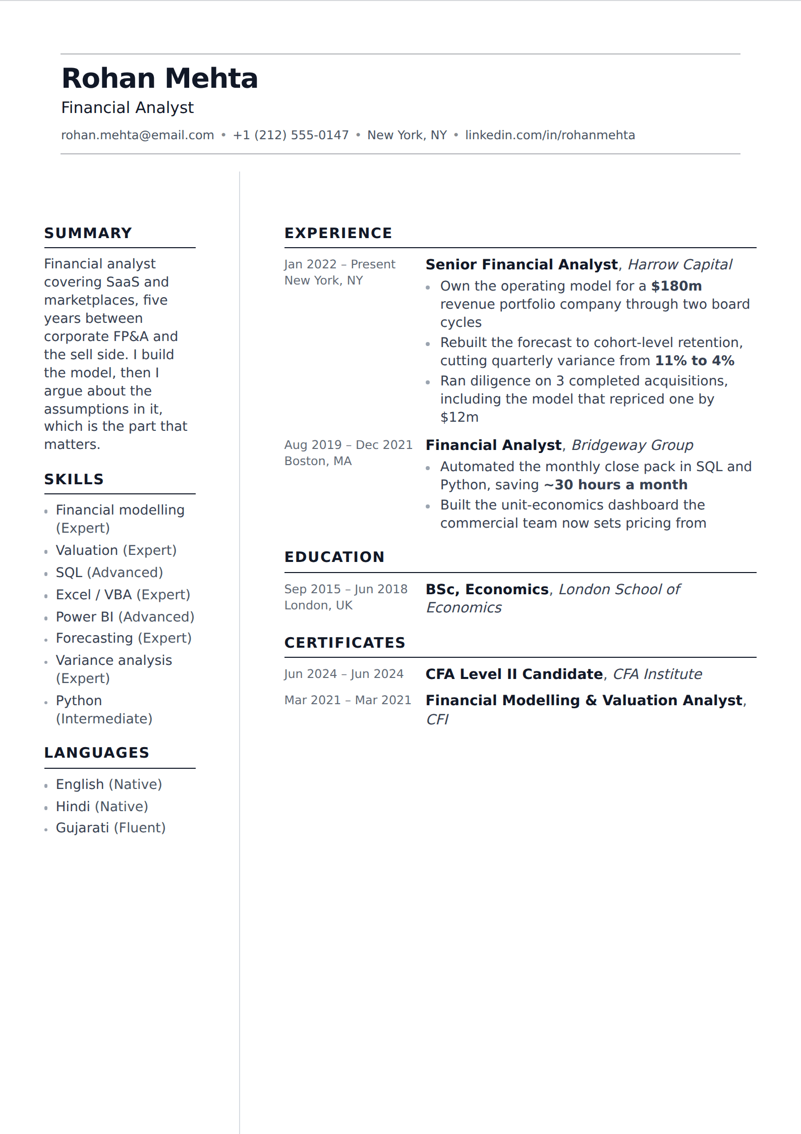
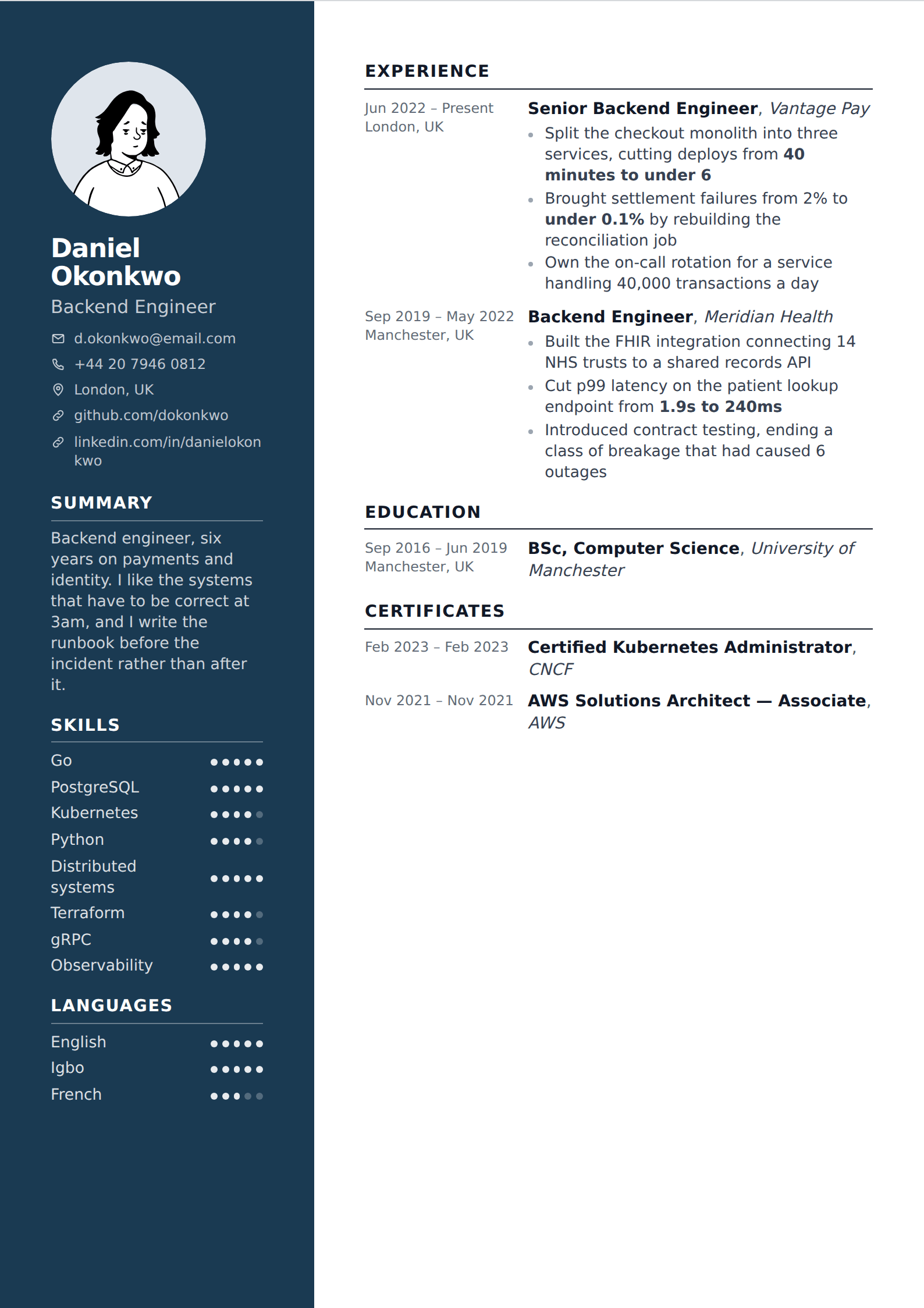
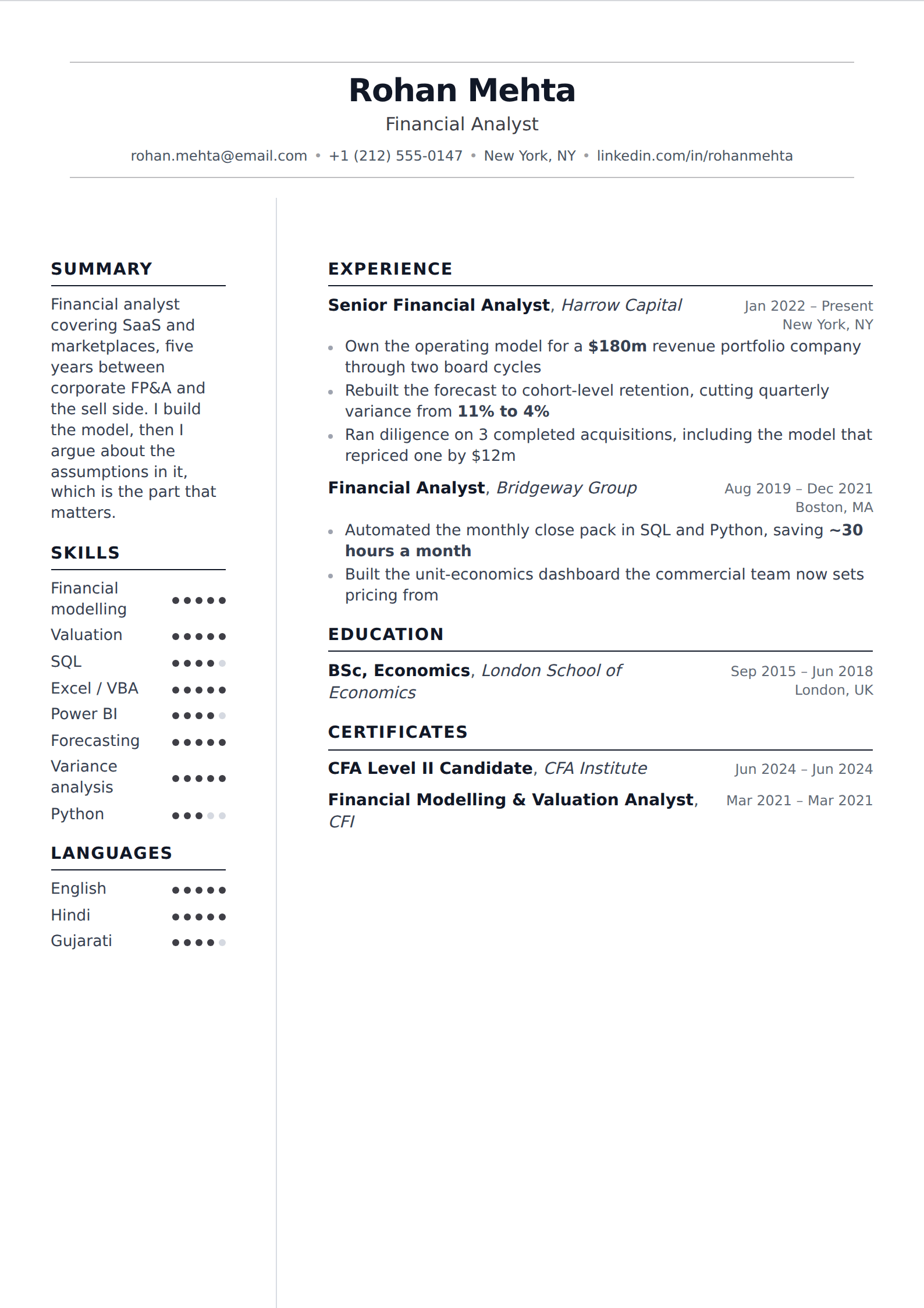
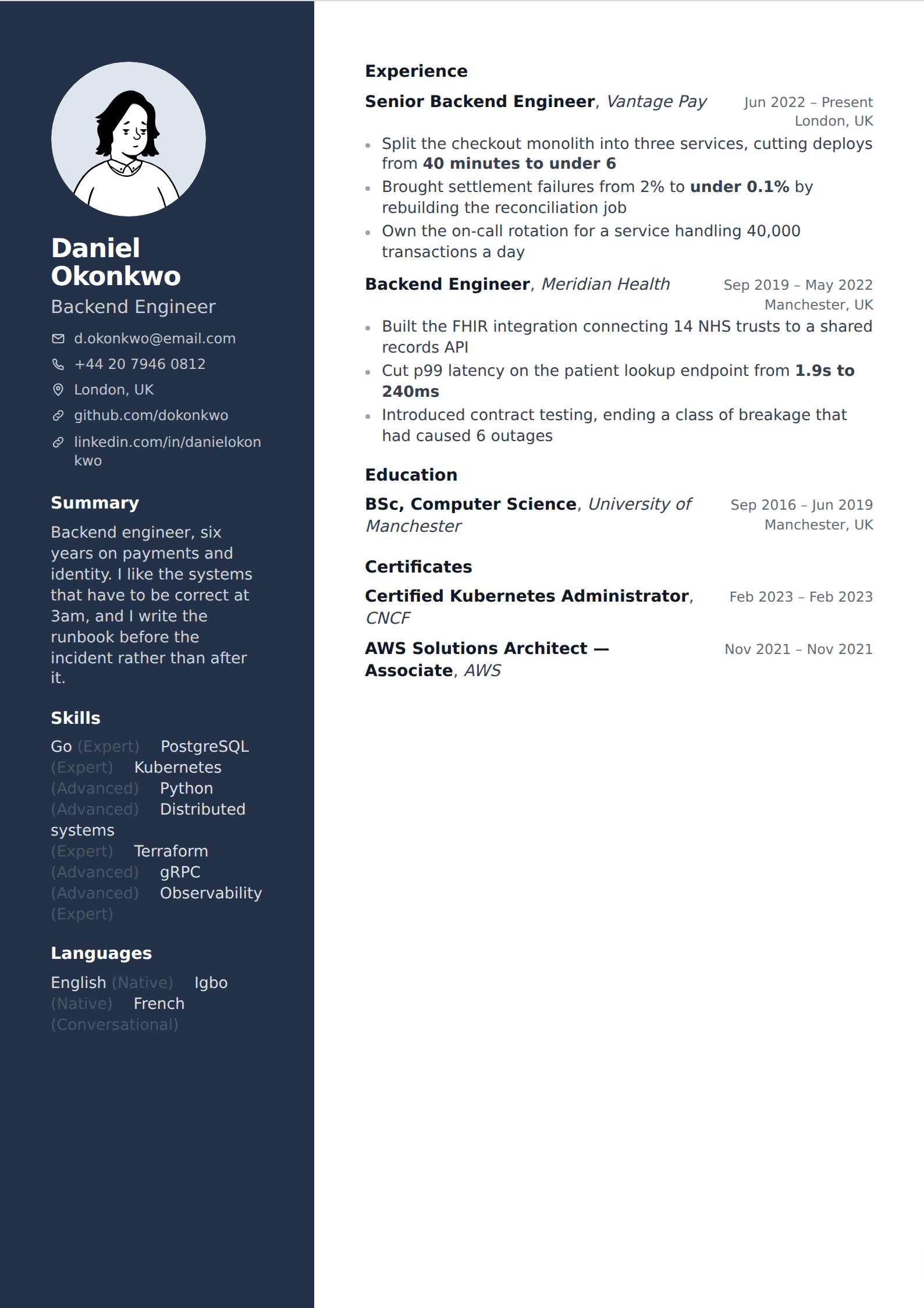
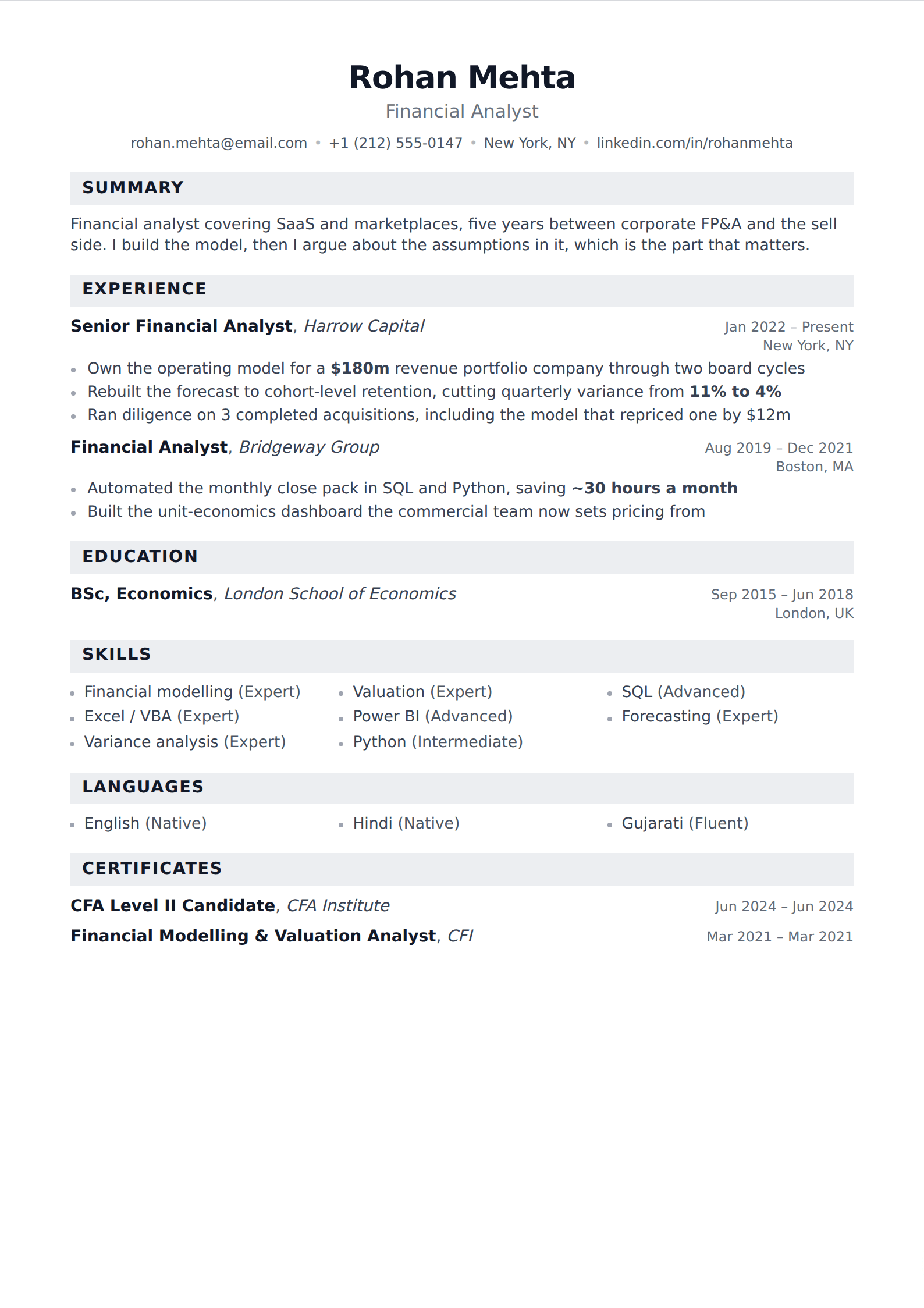
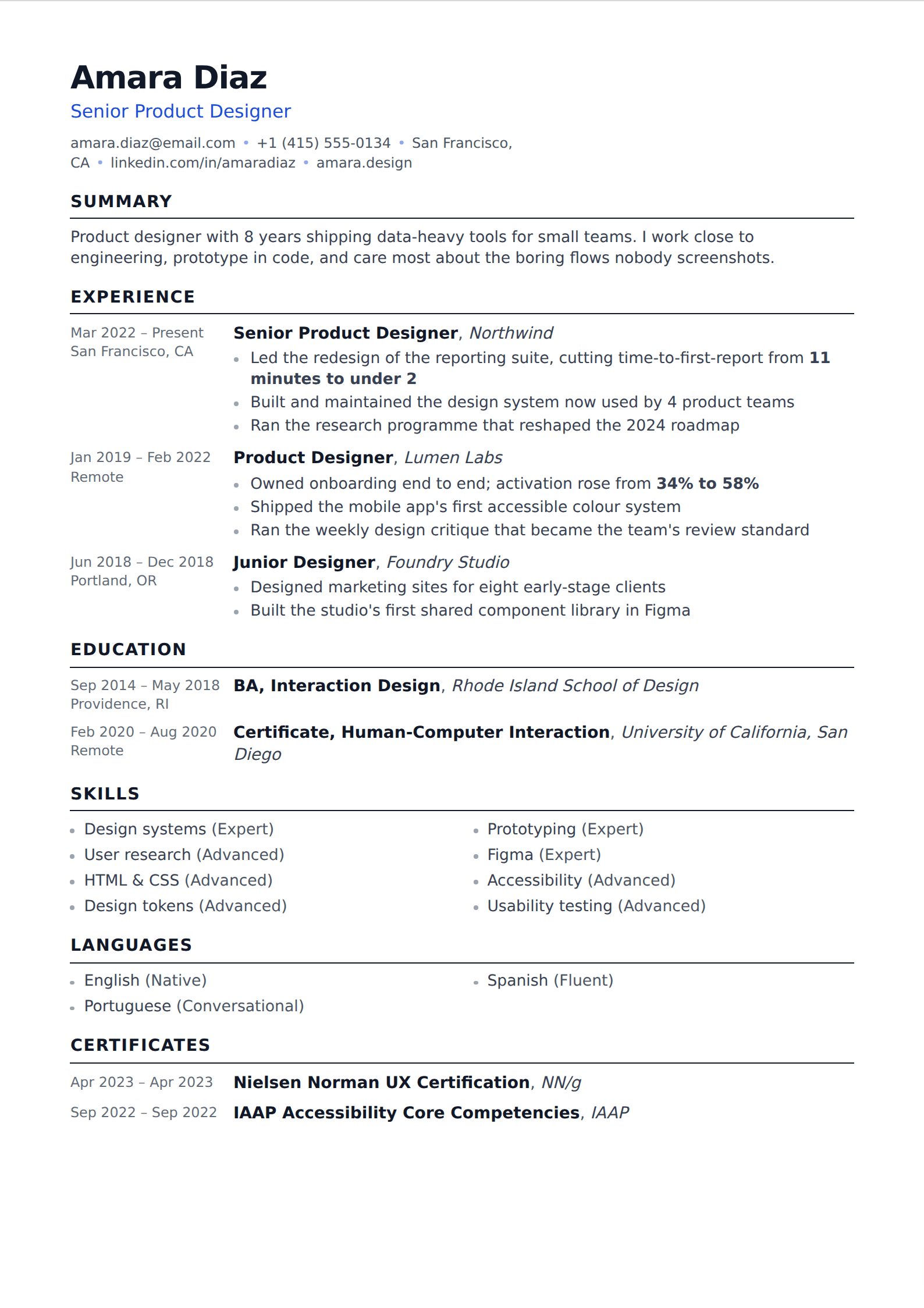
What actually reads as modern
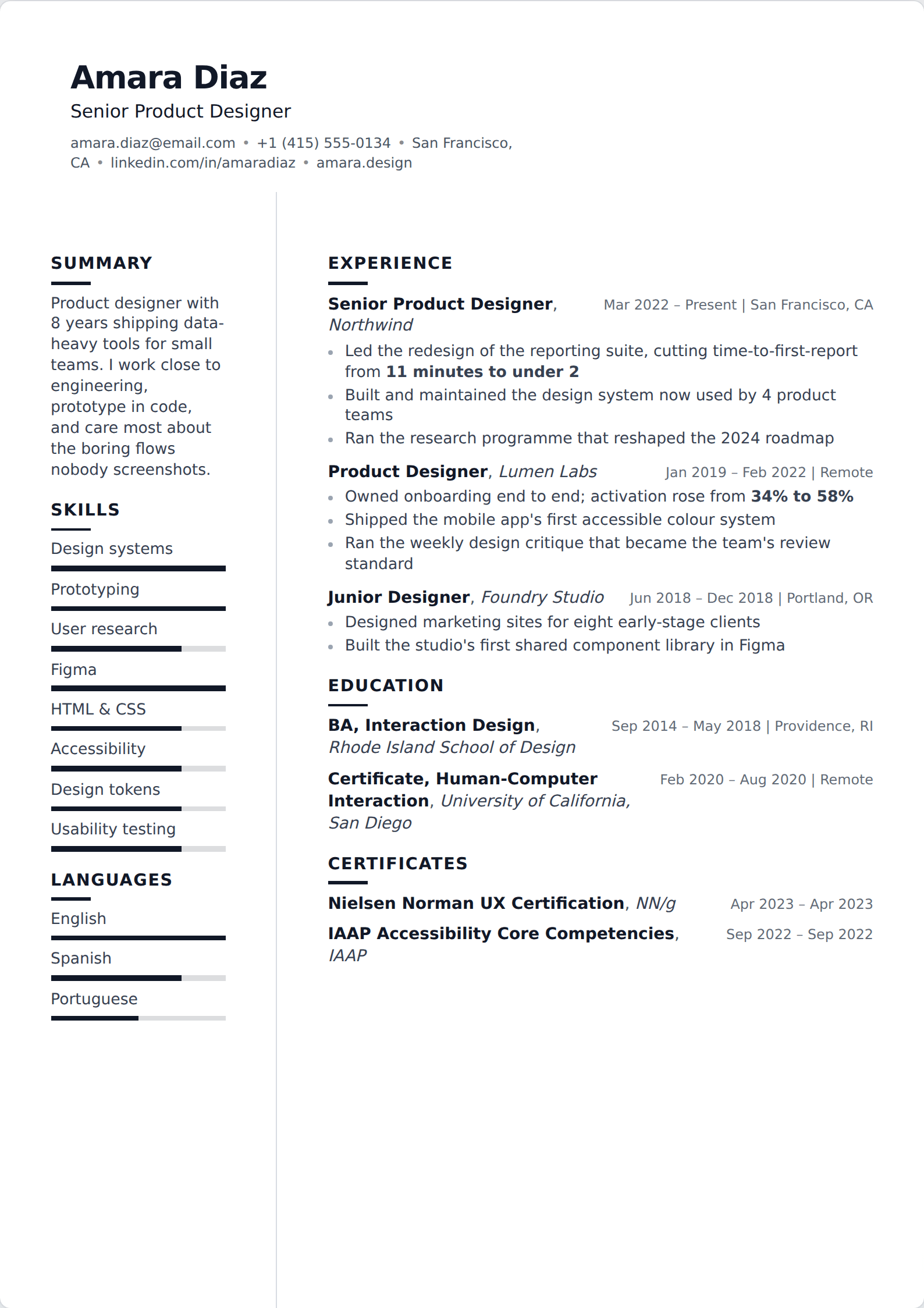
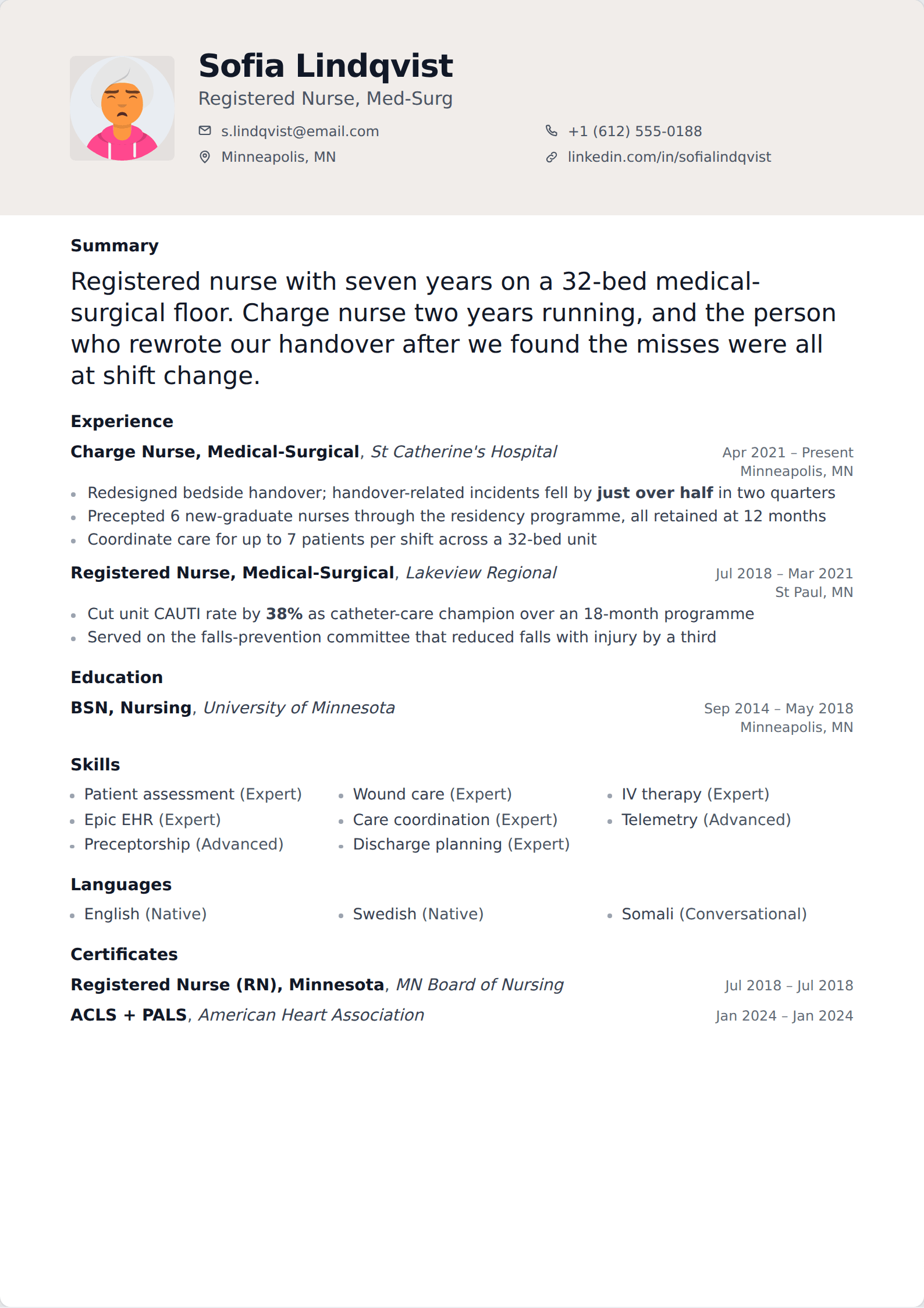
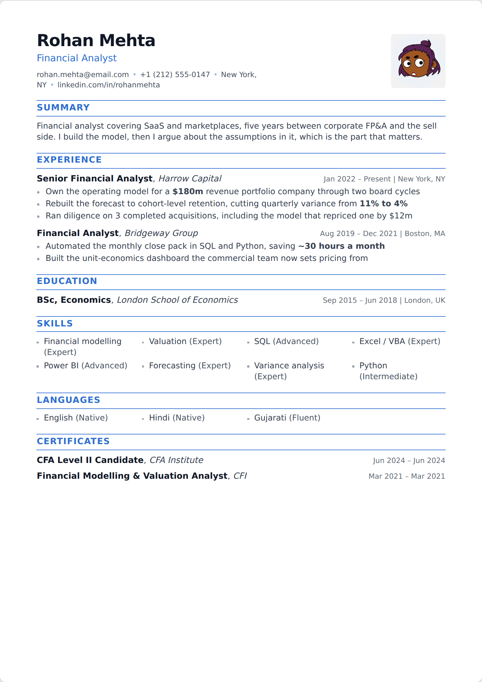
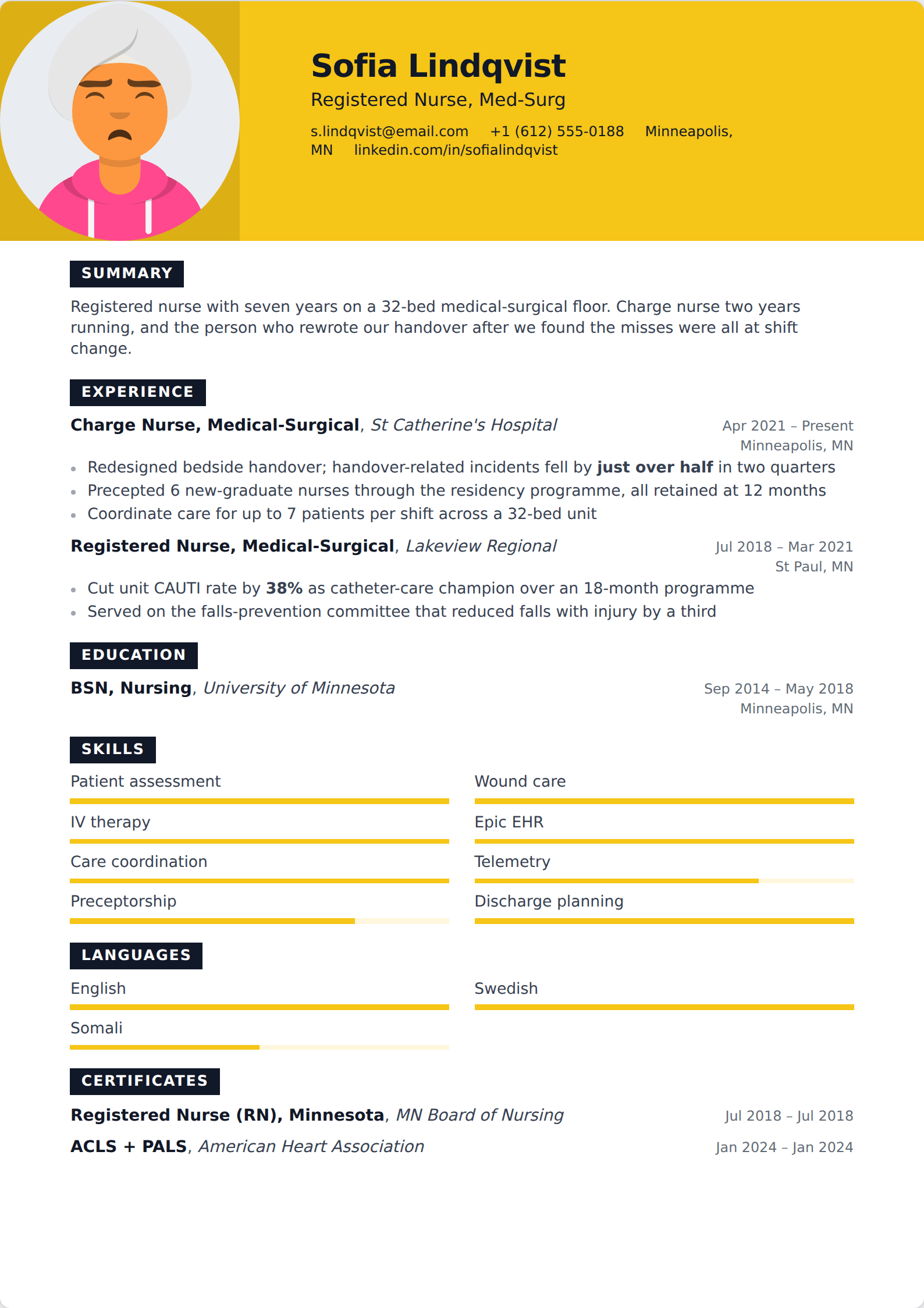
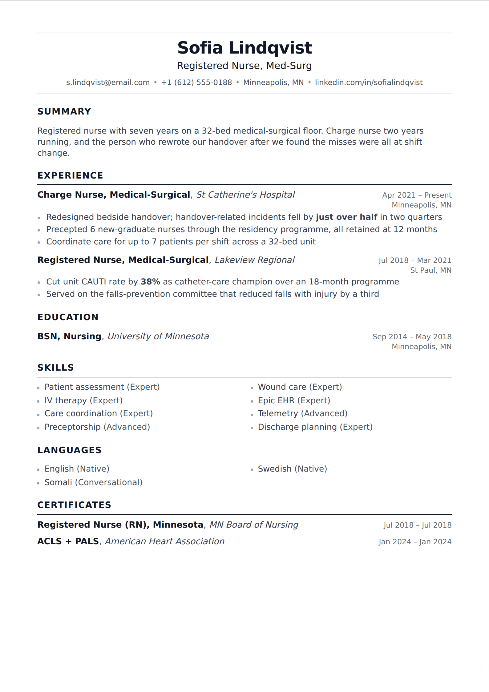
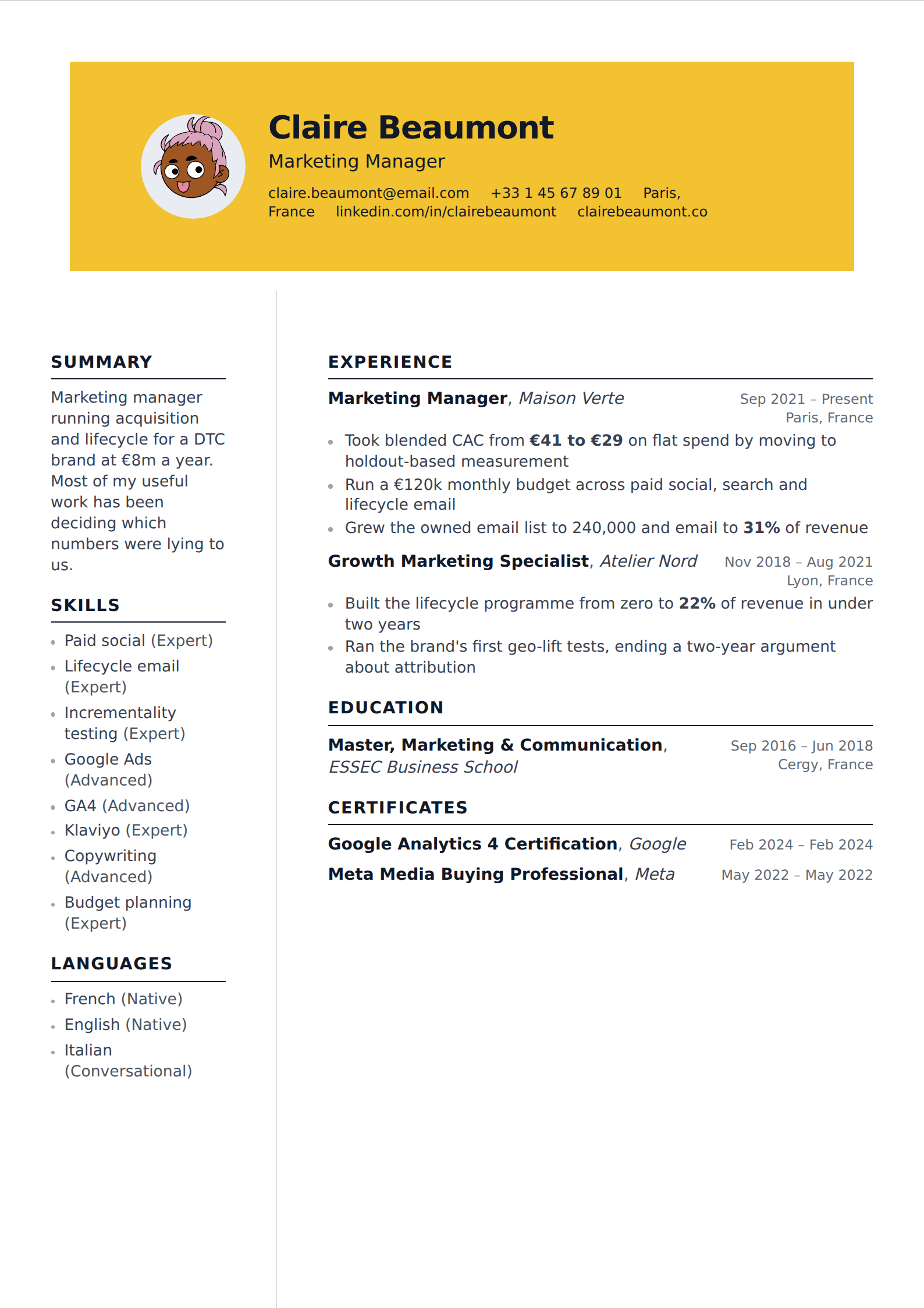
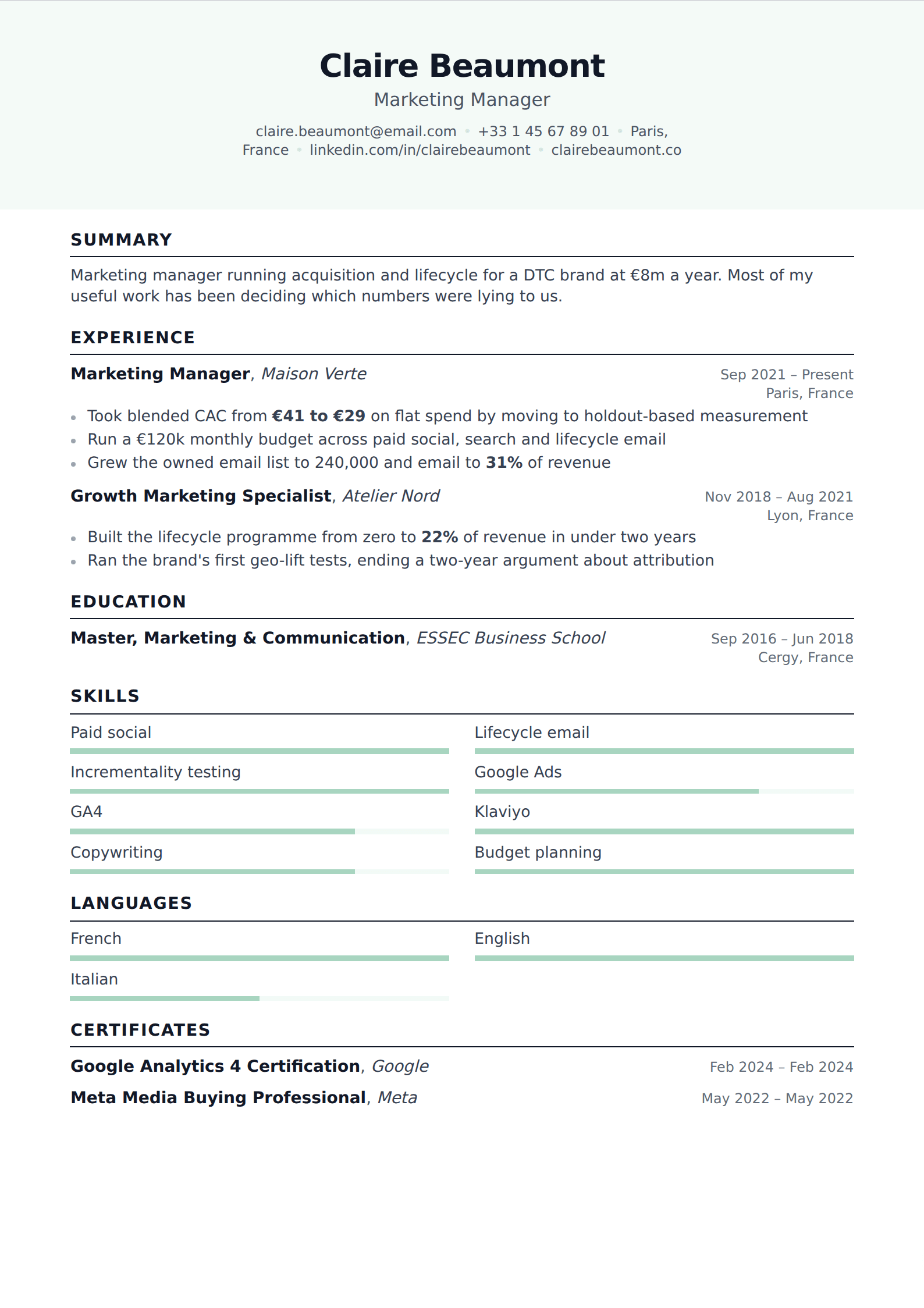
Modern is mostly typeface and spacing, not ornament. A sans-serif face, generous line height, clear separation between sections, and a restrained accent colour will read as current in any industry. A resume that looks dated is usually a serif face set tight with underlined headings — not a resume that lacks a skills chart.
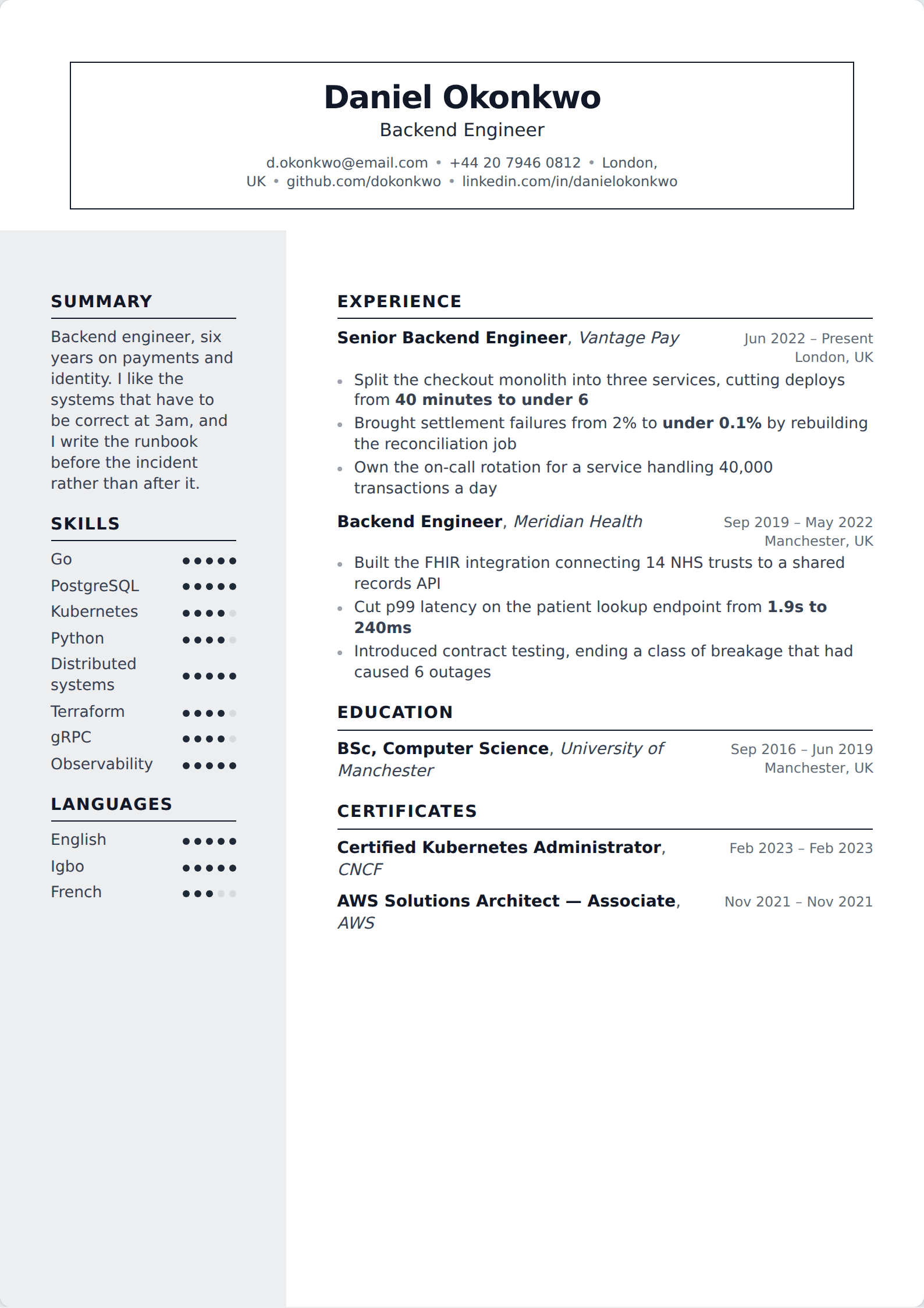
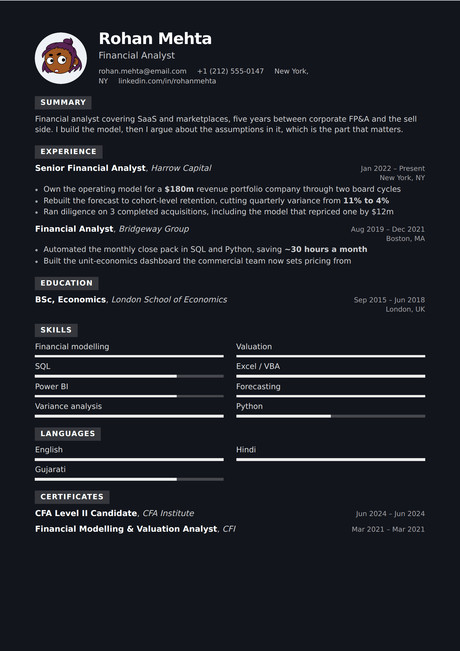
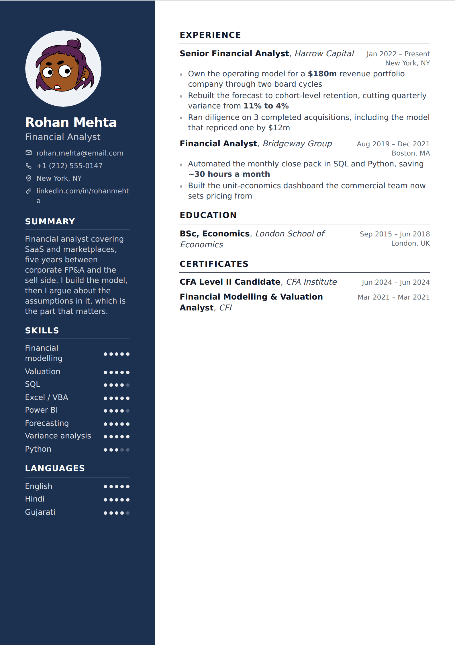
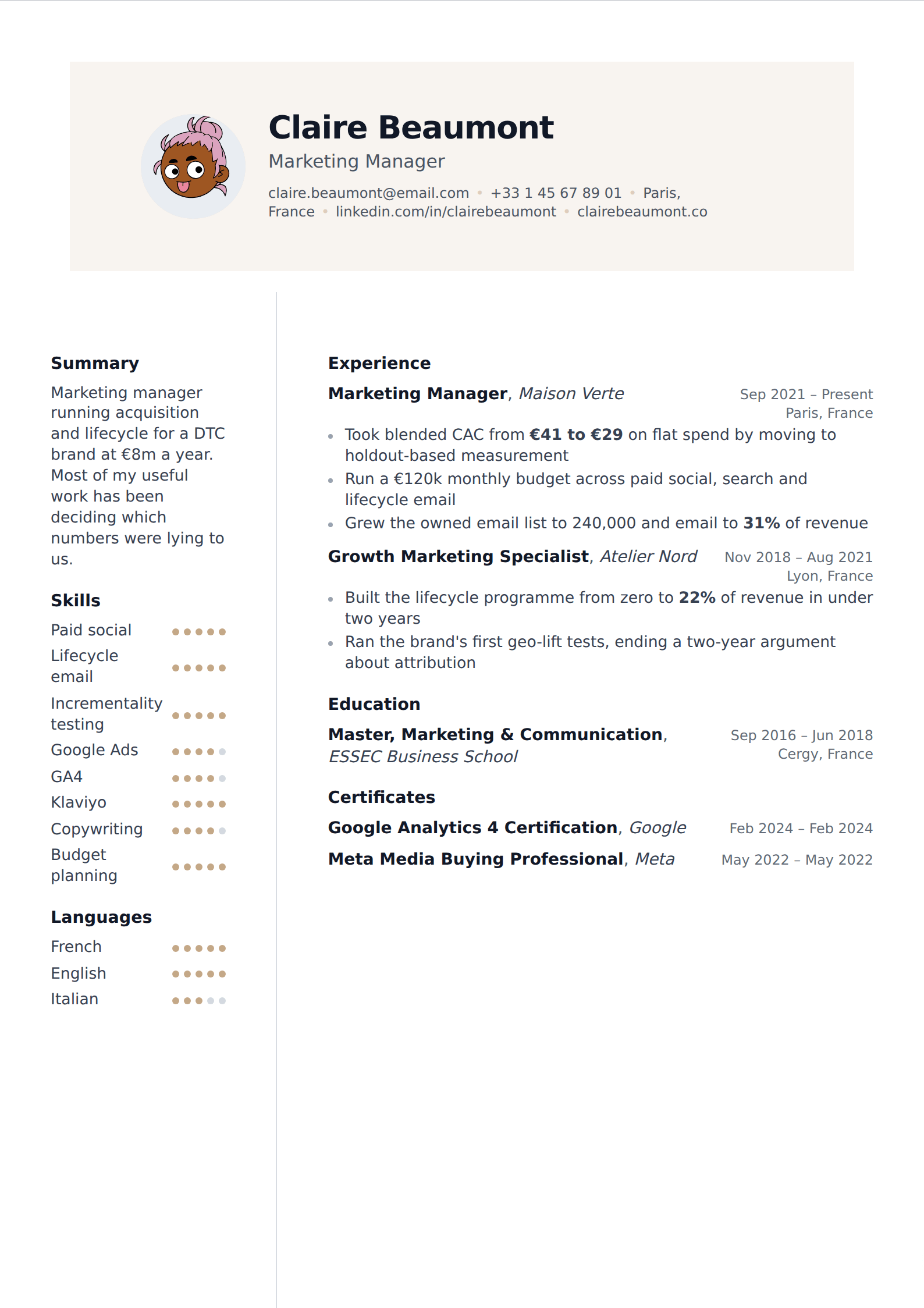
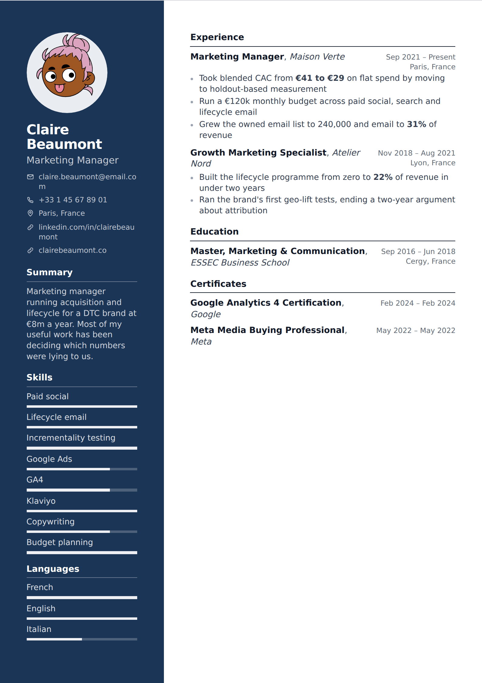
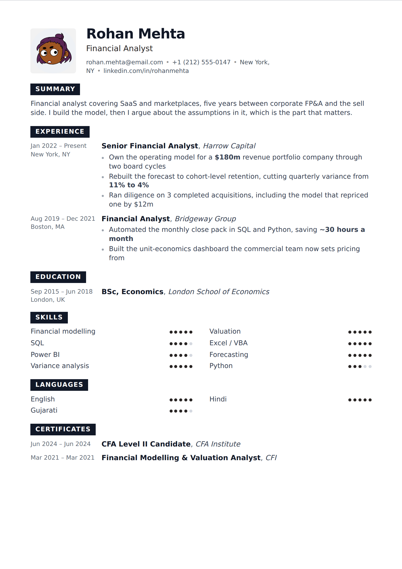
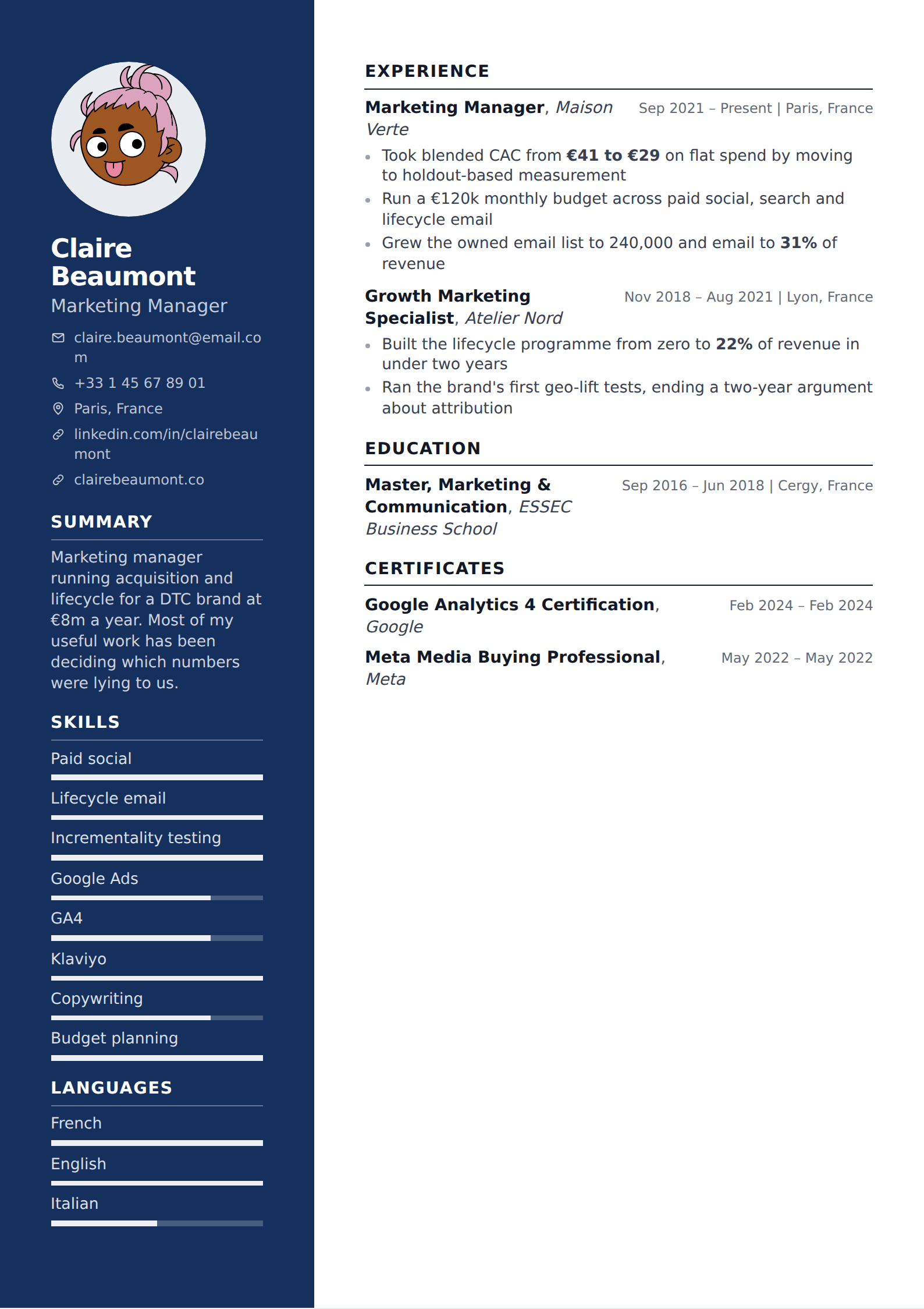
This is worth saying because the templates marketed hardest as modern tend to be the ones carrying infographic elements: proficiency meters, timelines, circular skill ratings. Those are the parts that parse worst and communicate least. A five-dot meter next to "Python" tells a reader nothing they can act on, where one bullet describing what you built with it tells them everything.
Modern without the parsing risk
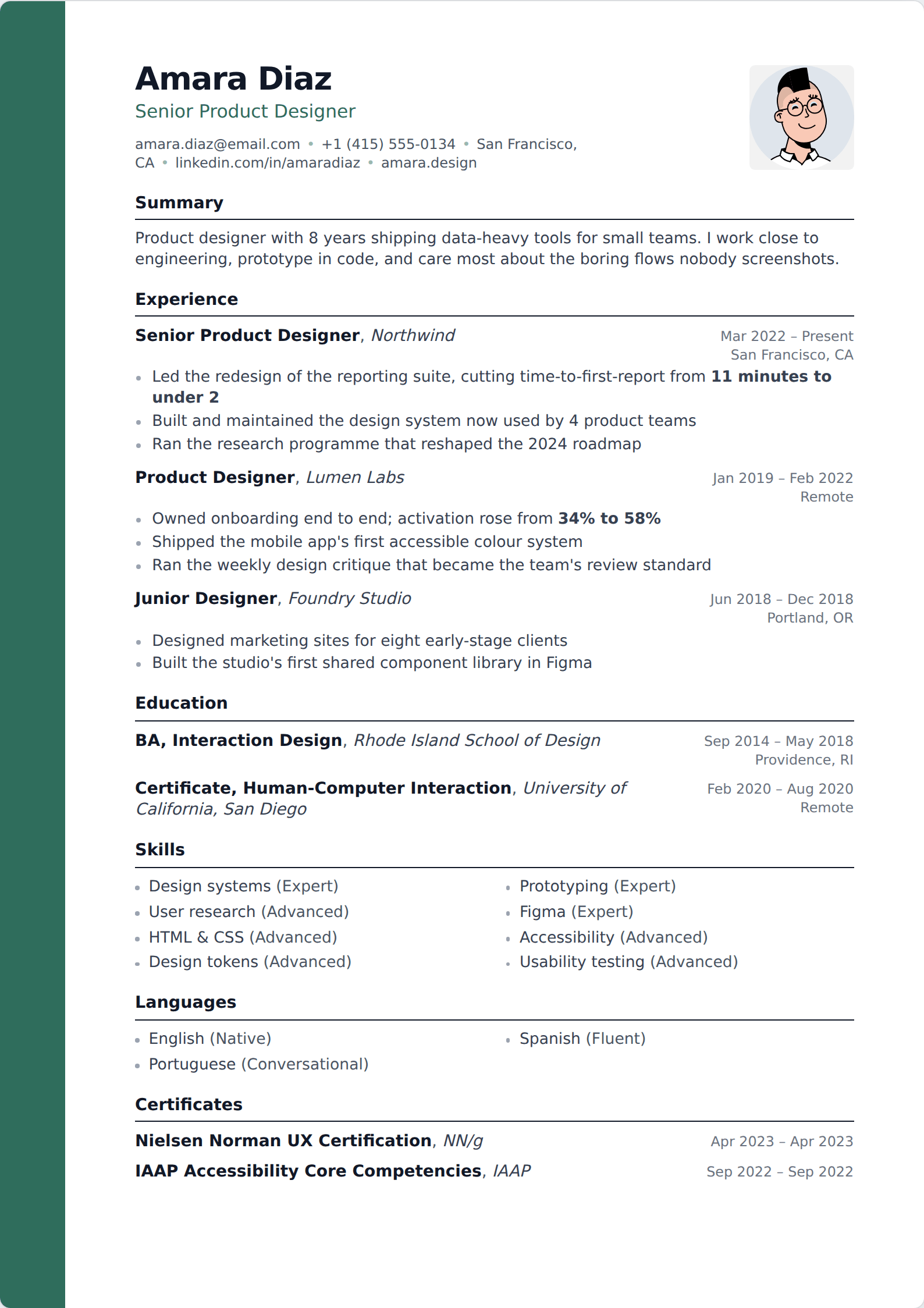
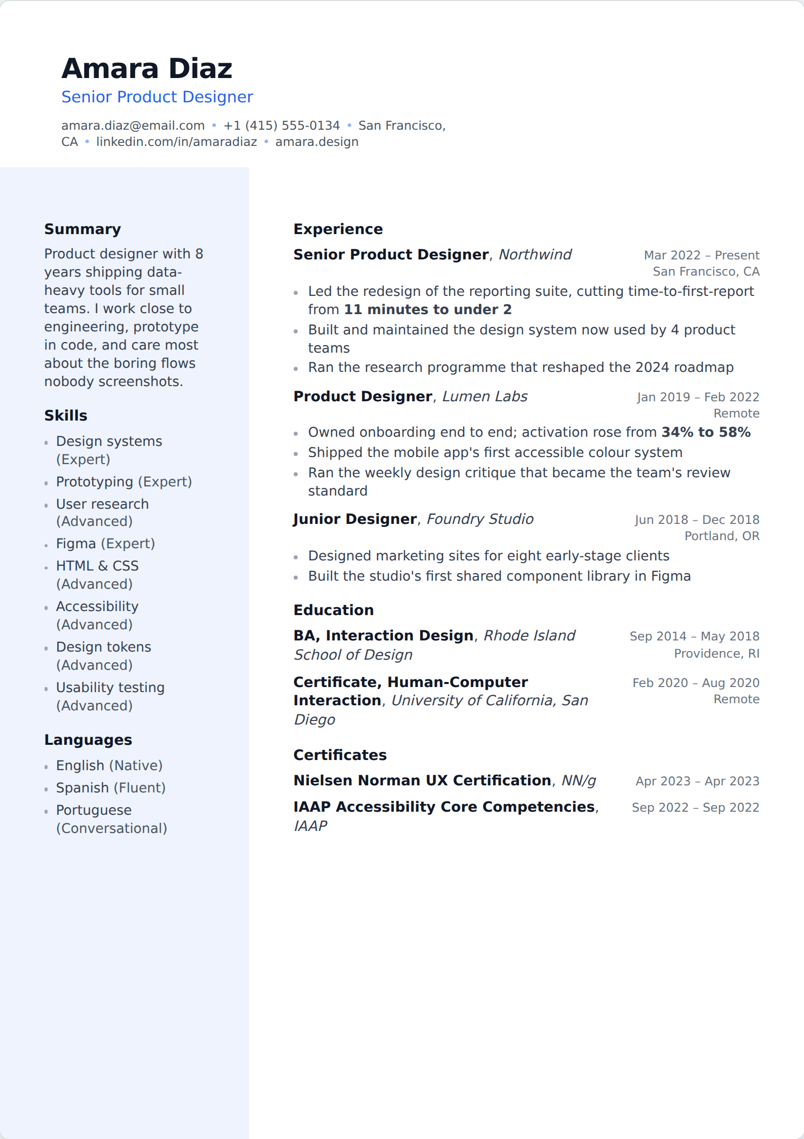
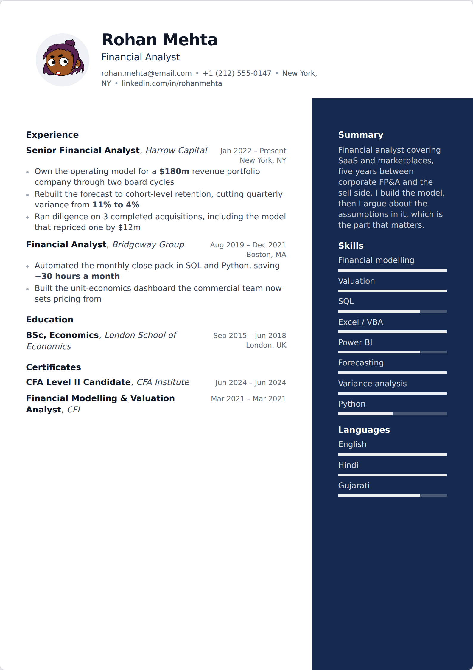
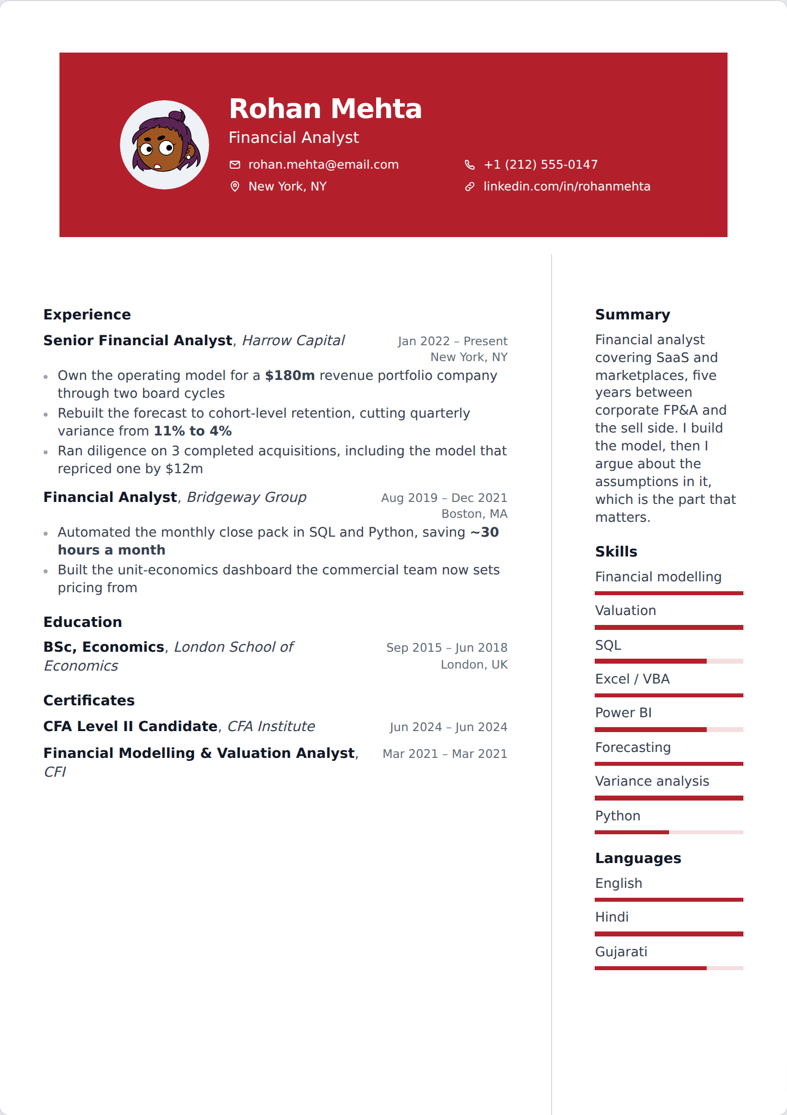
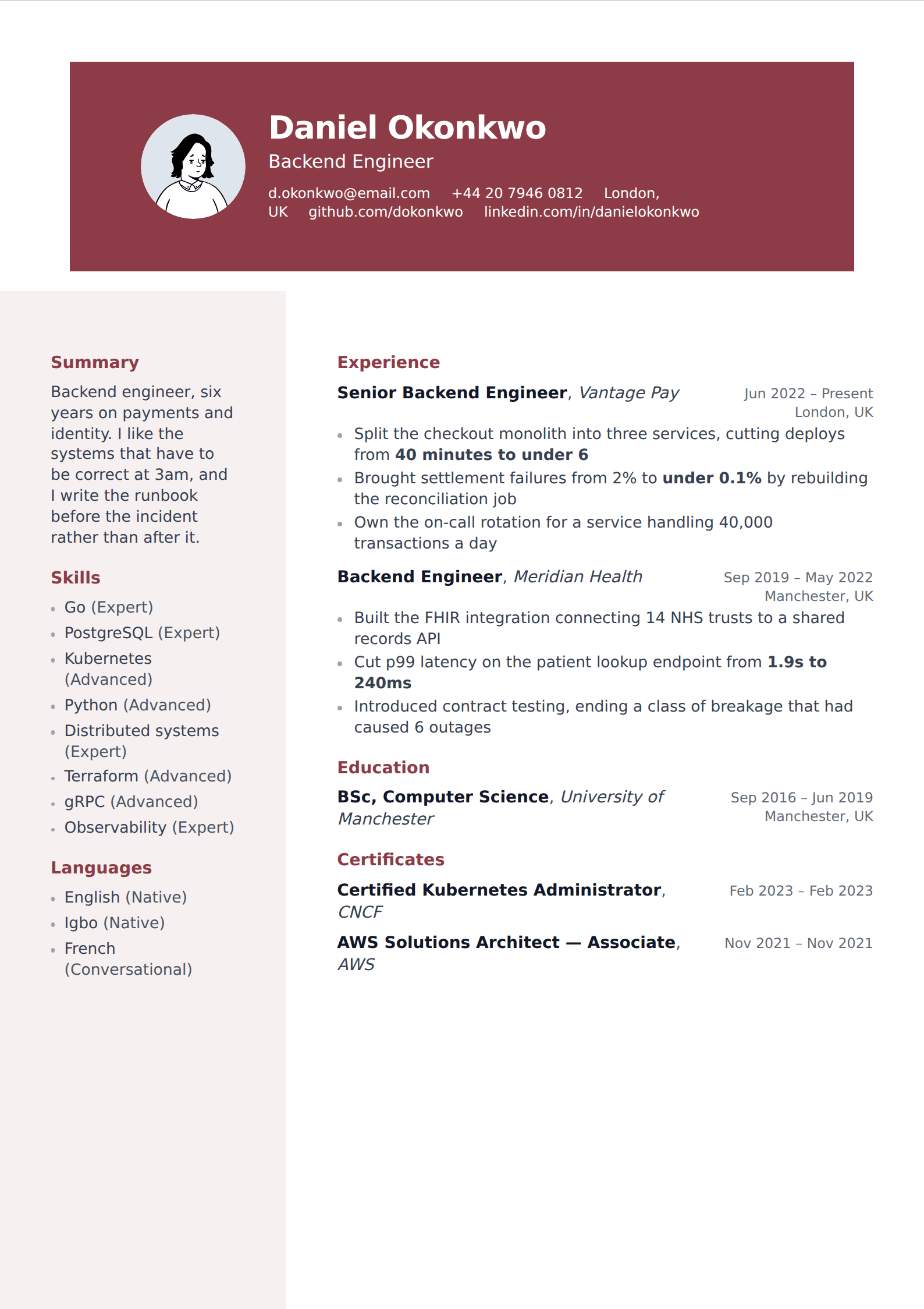
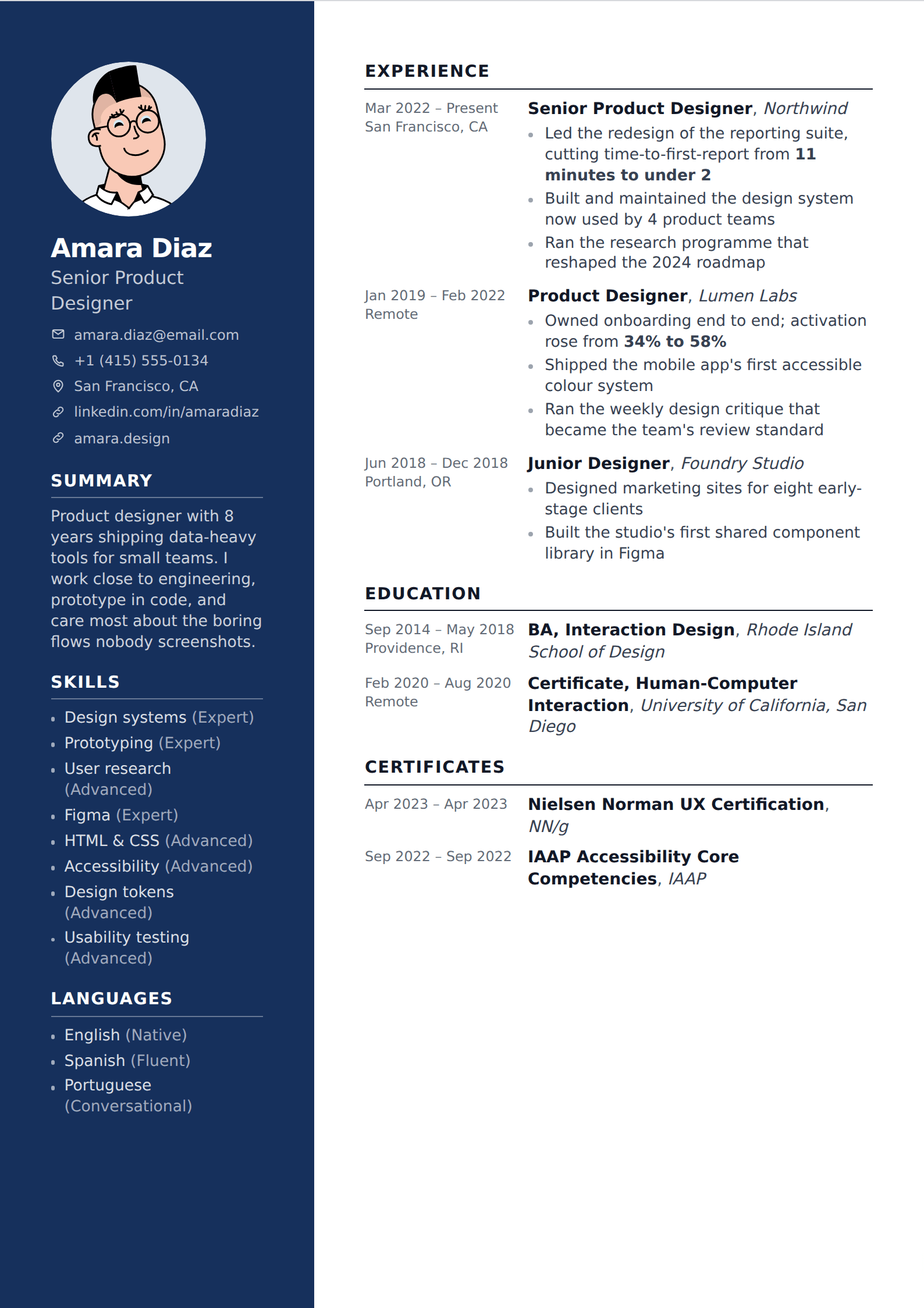
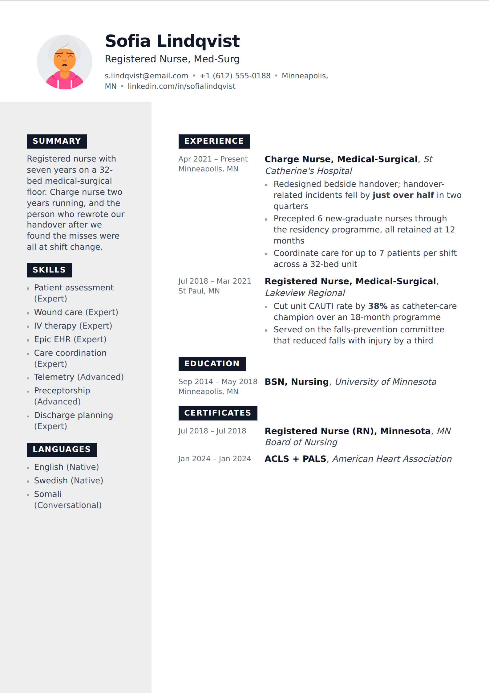
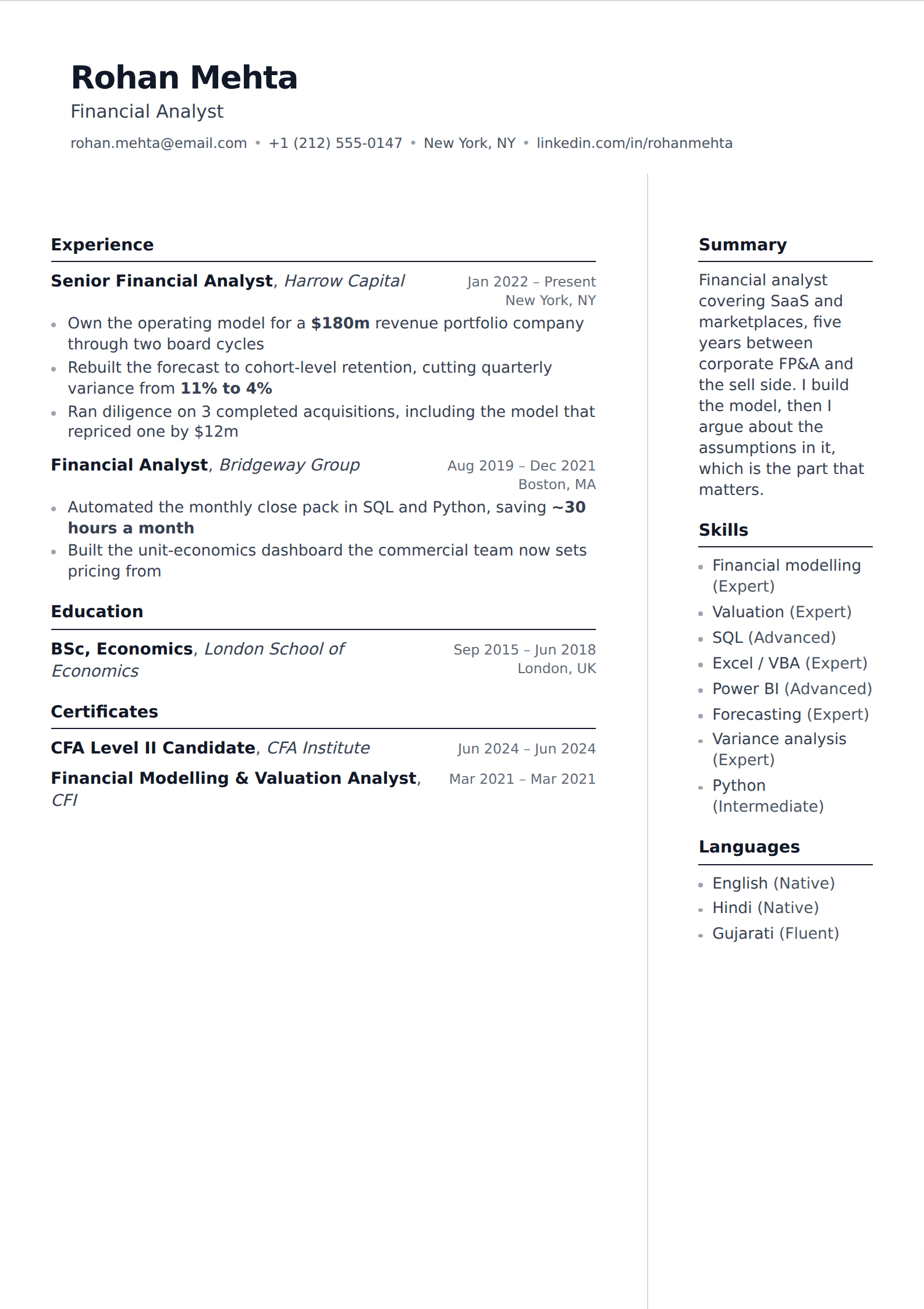
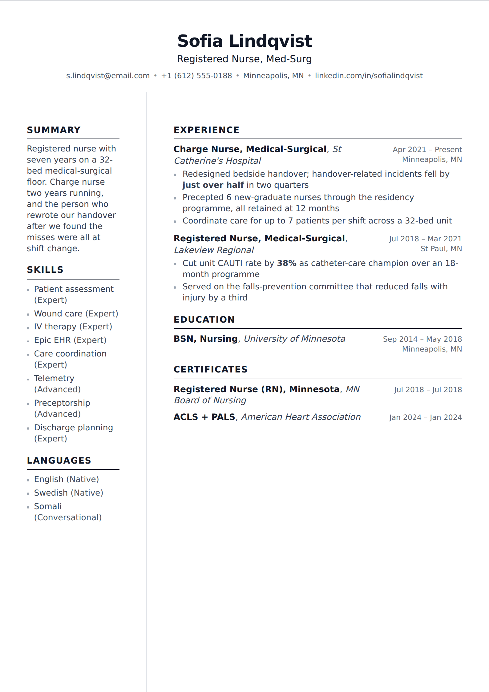
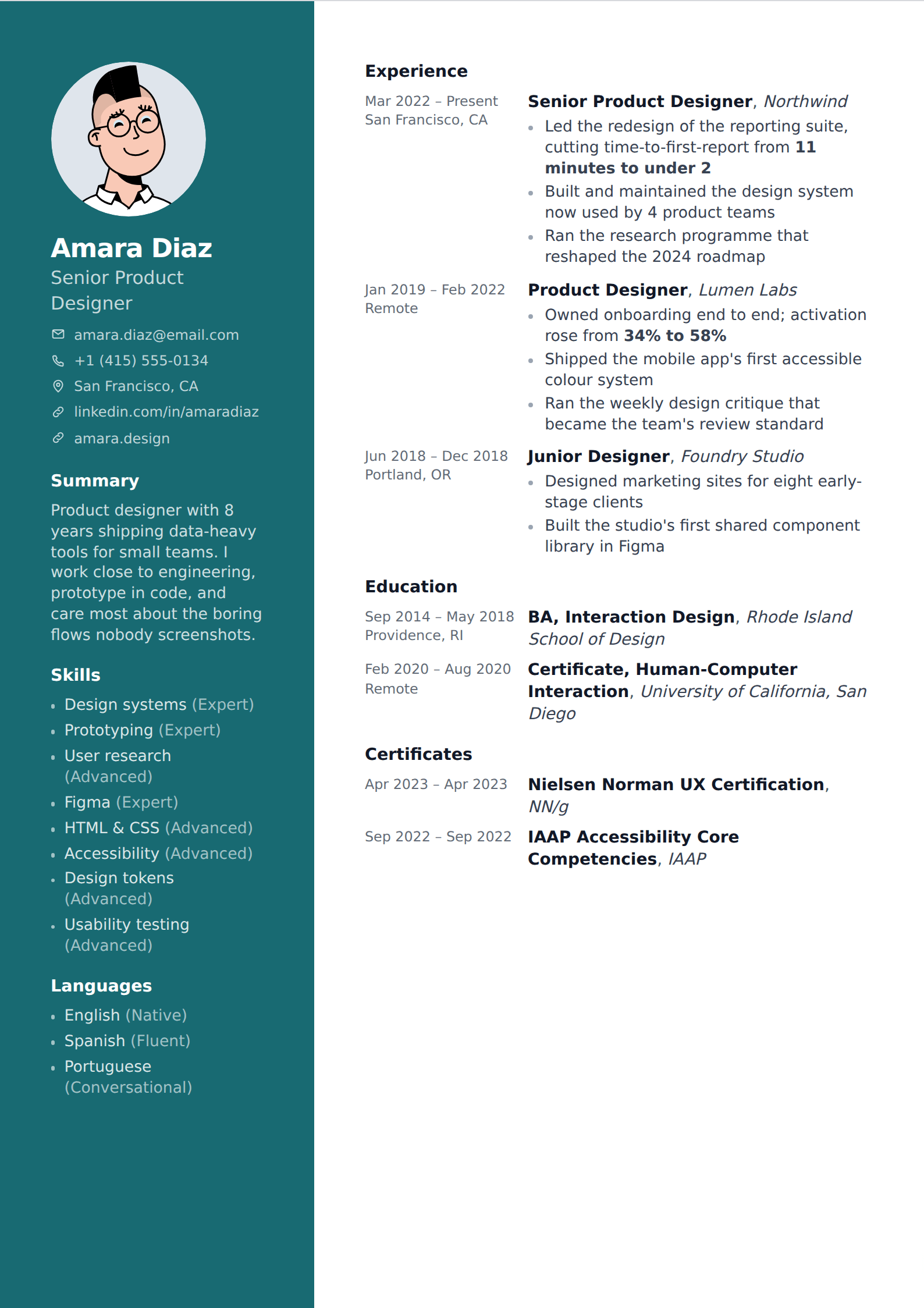
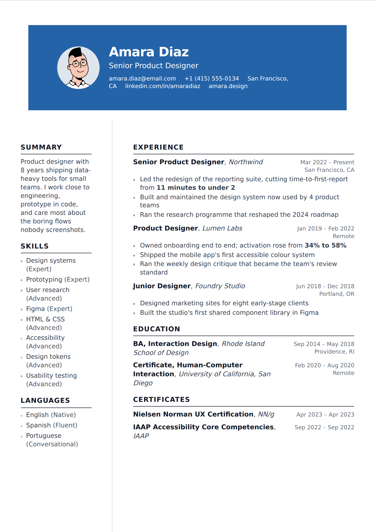
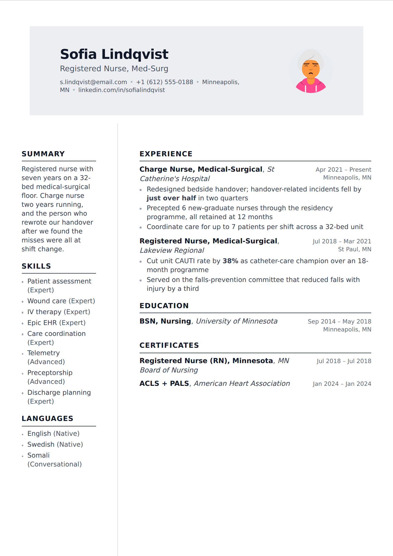
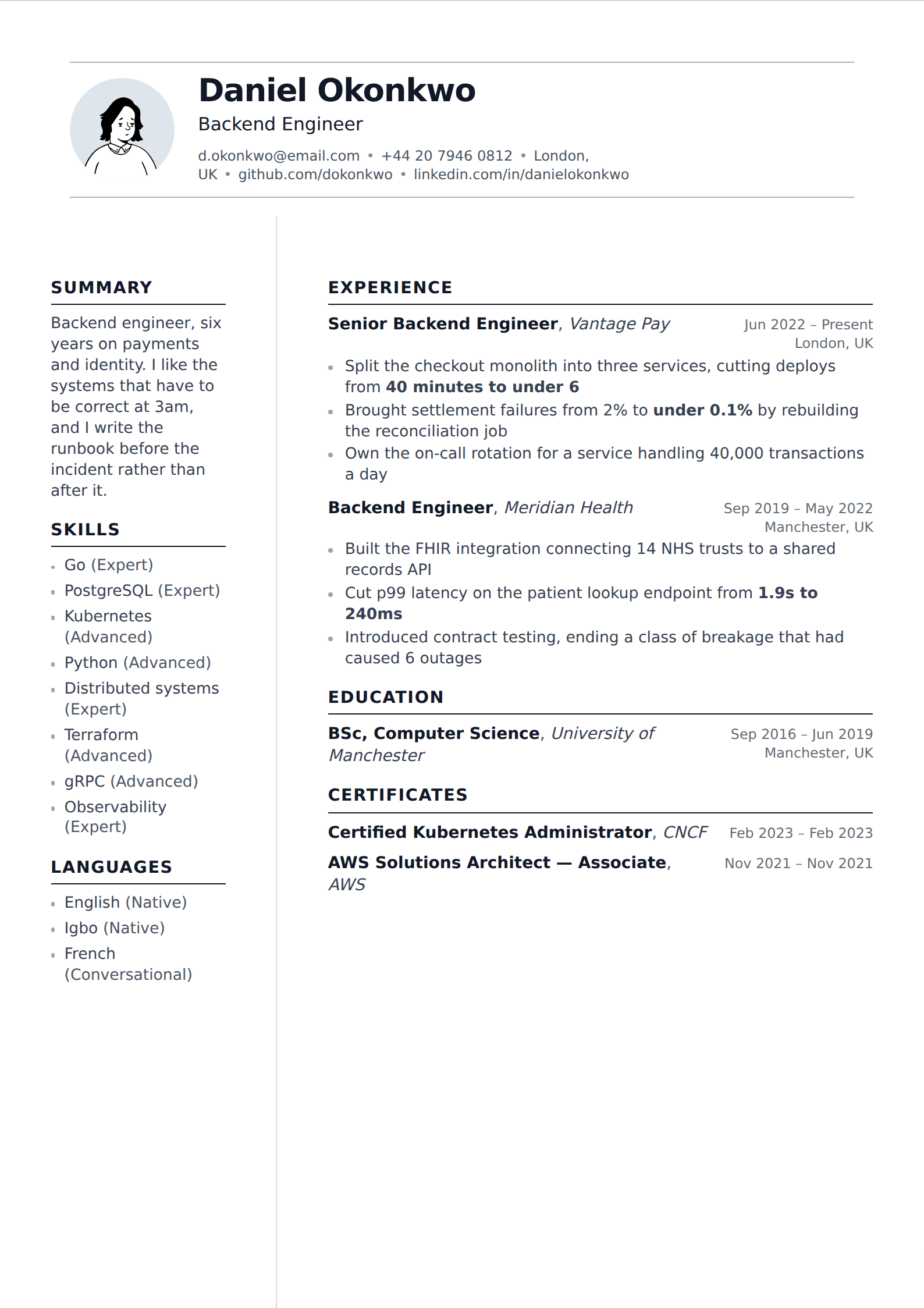
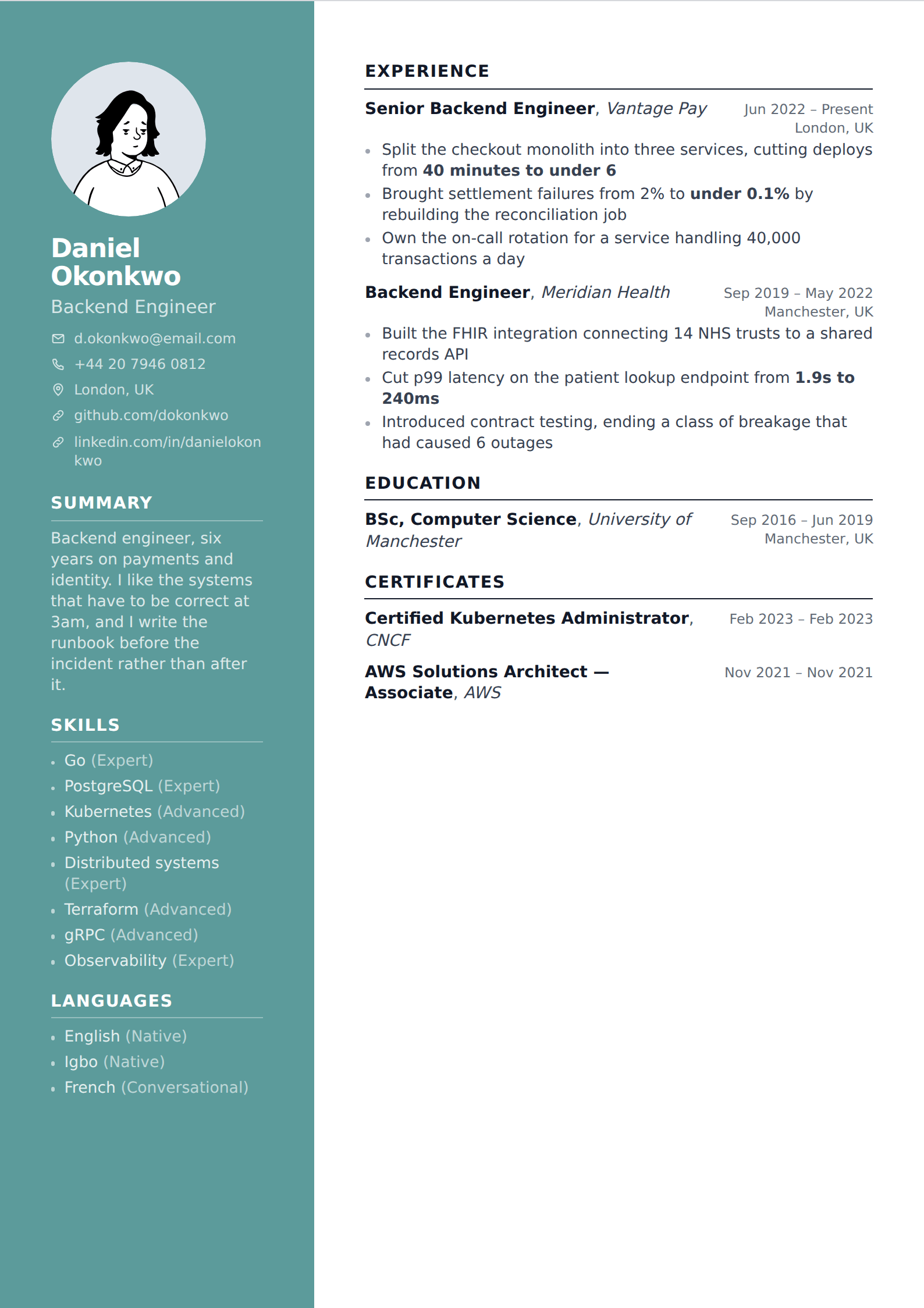
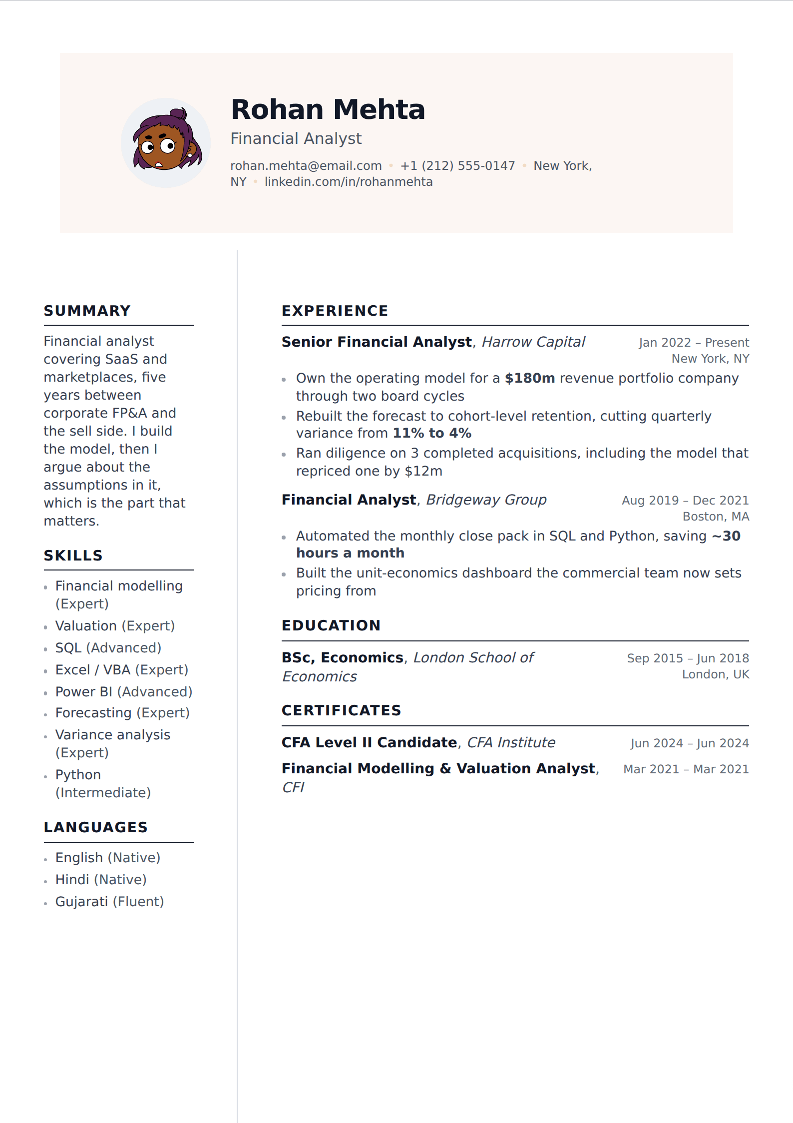
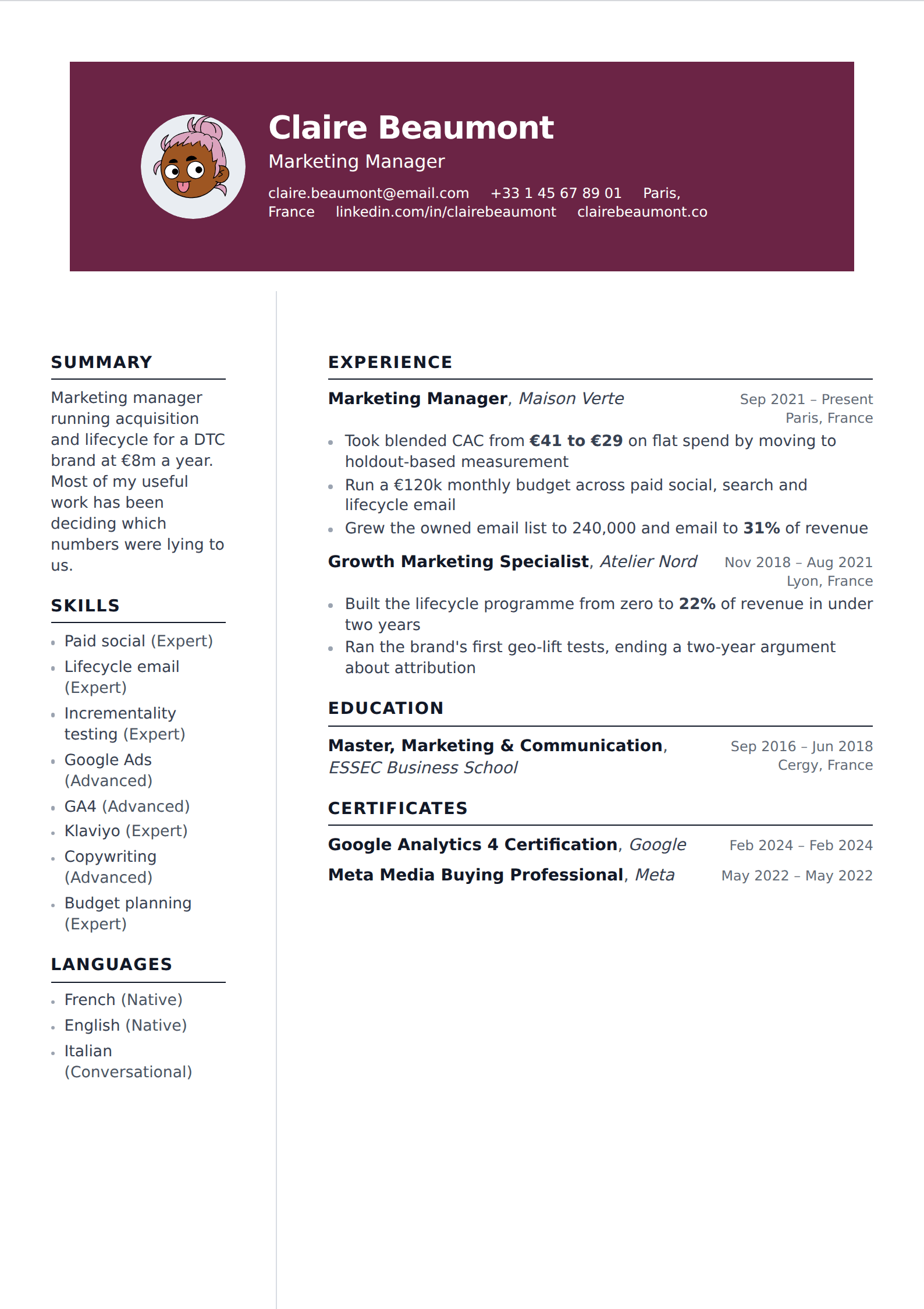
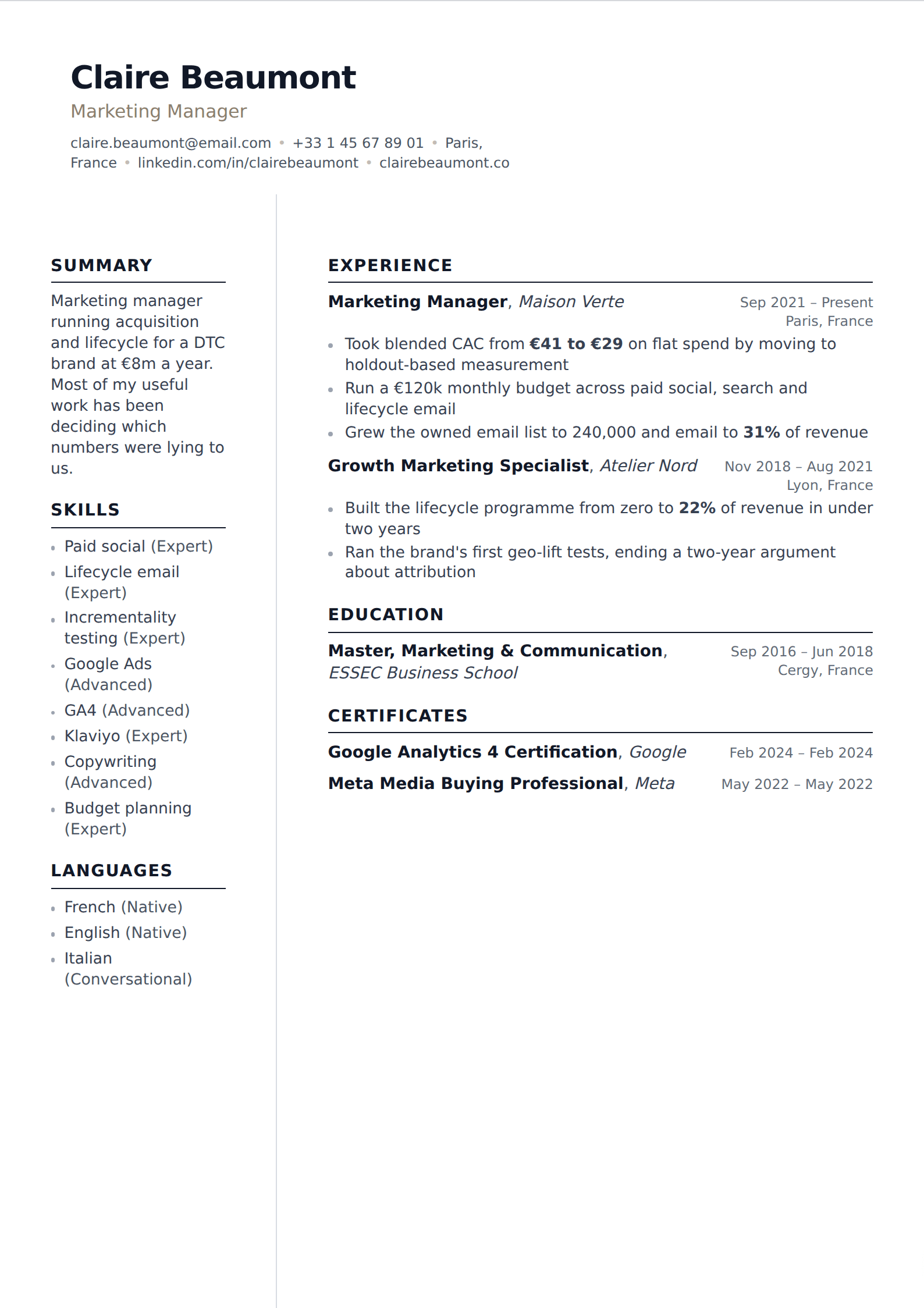
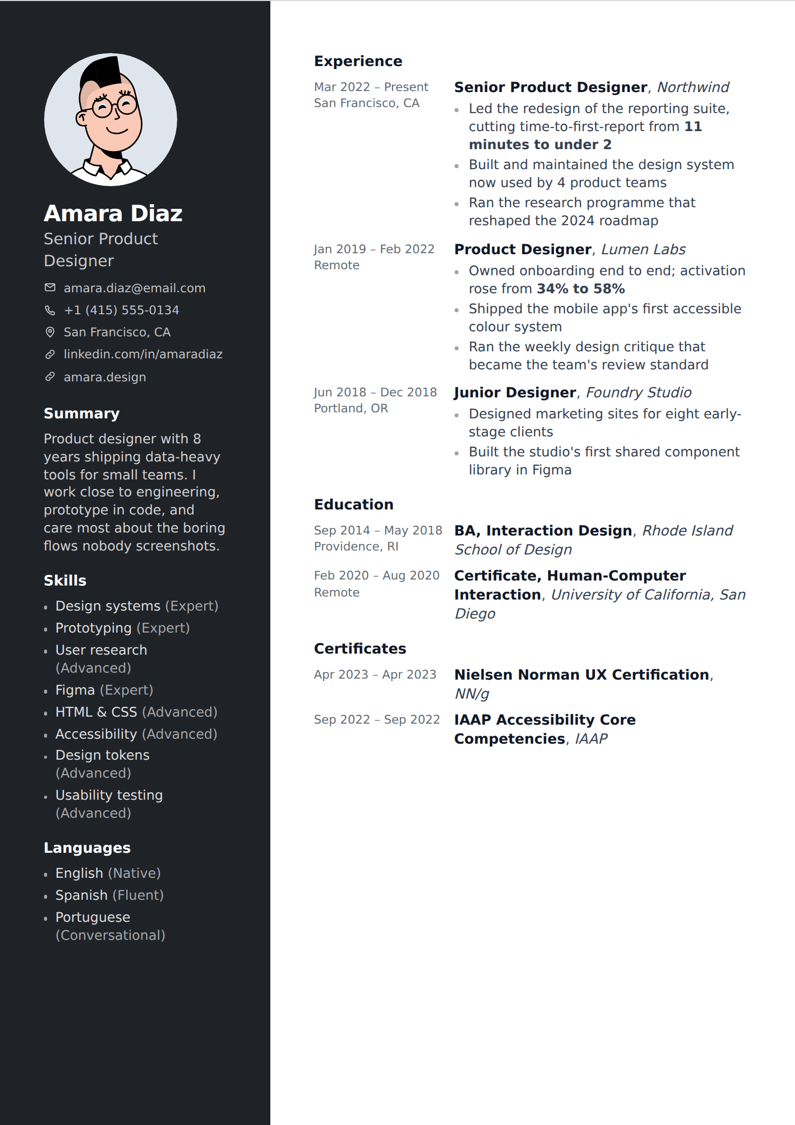
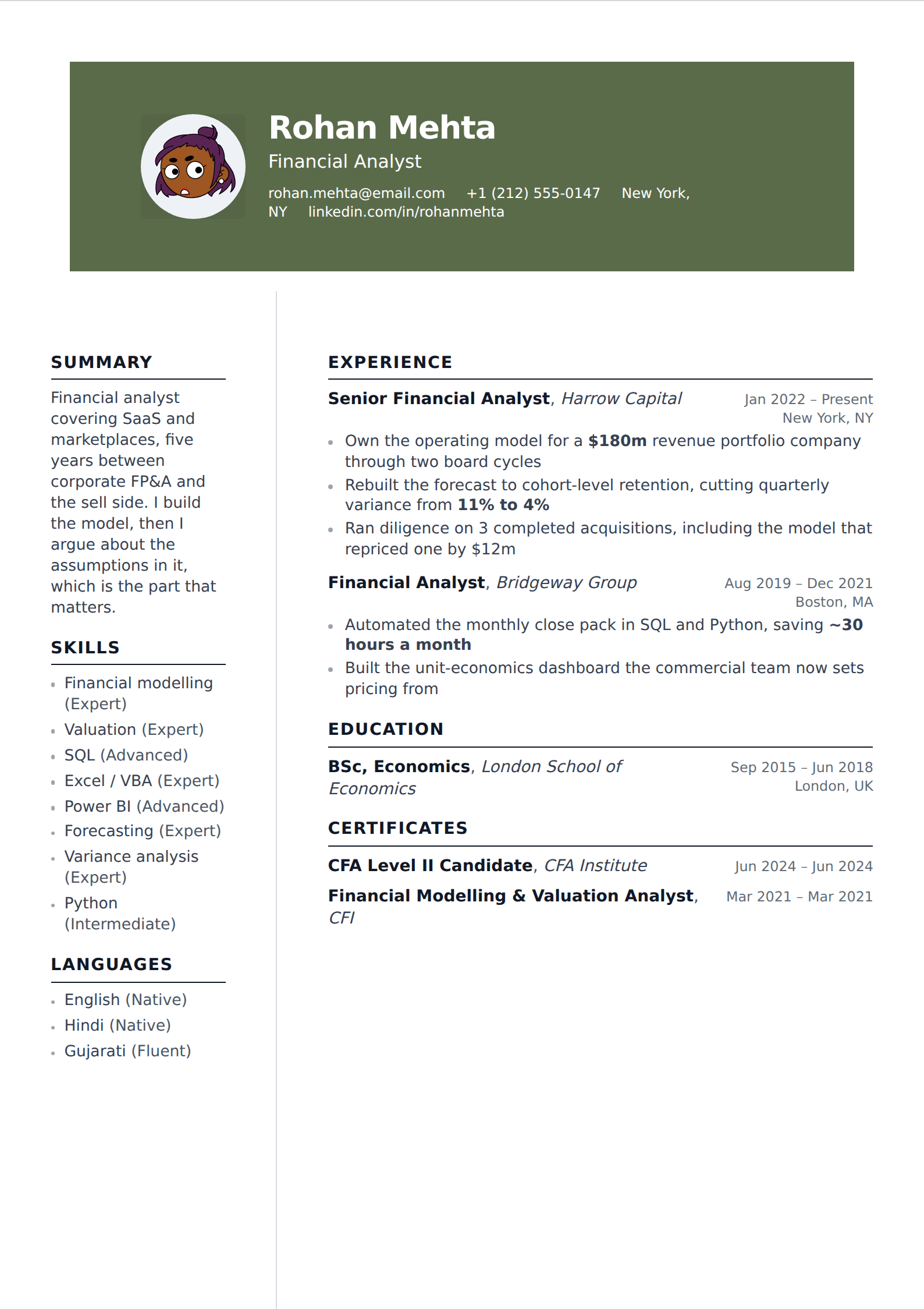
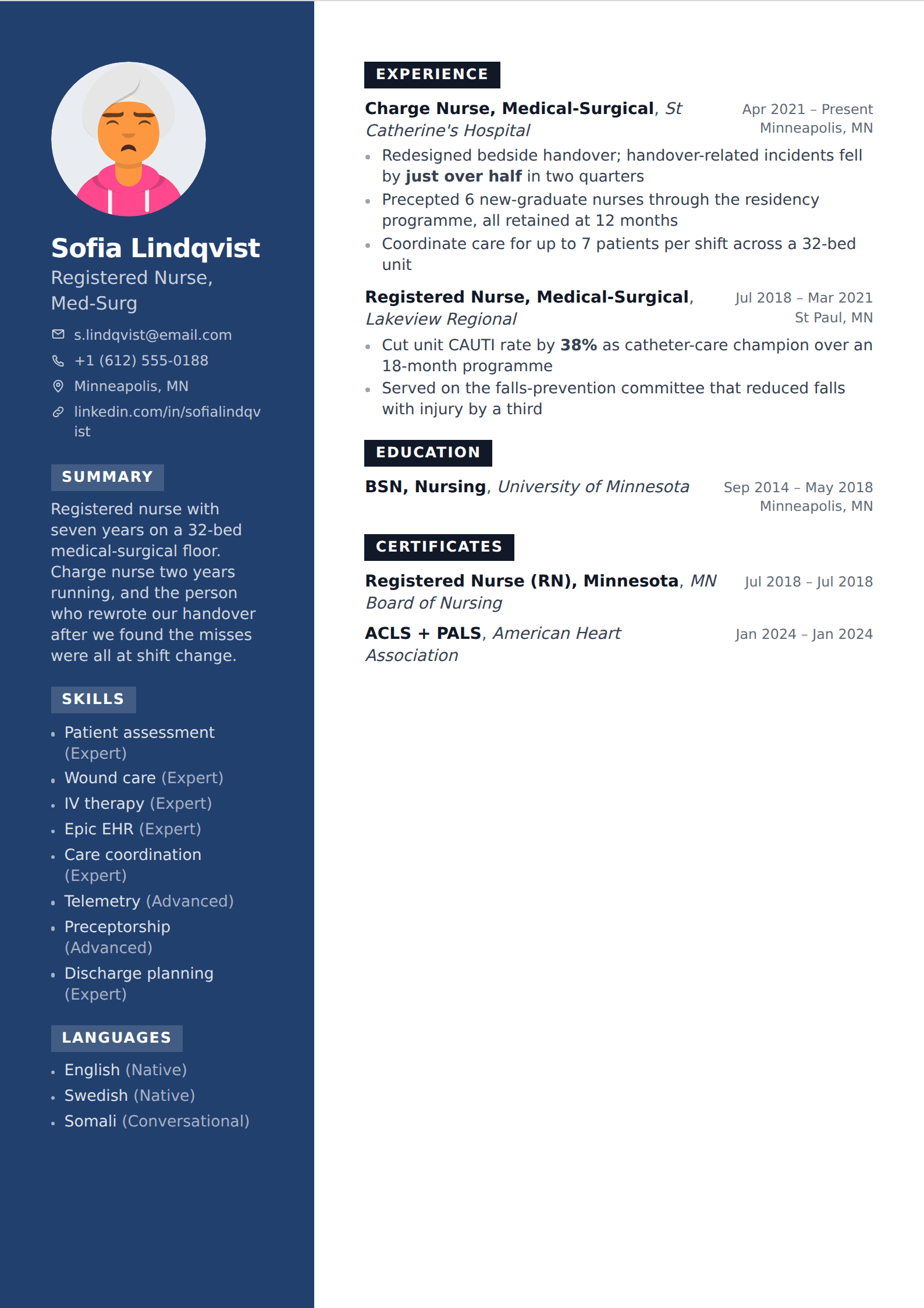
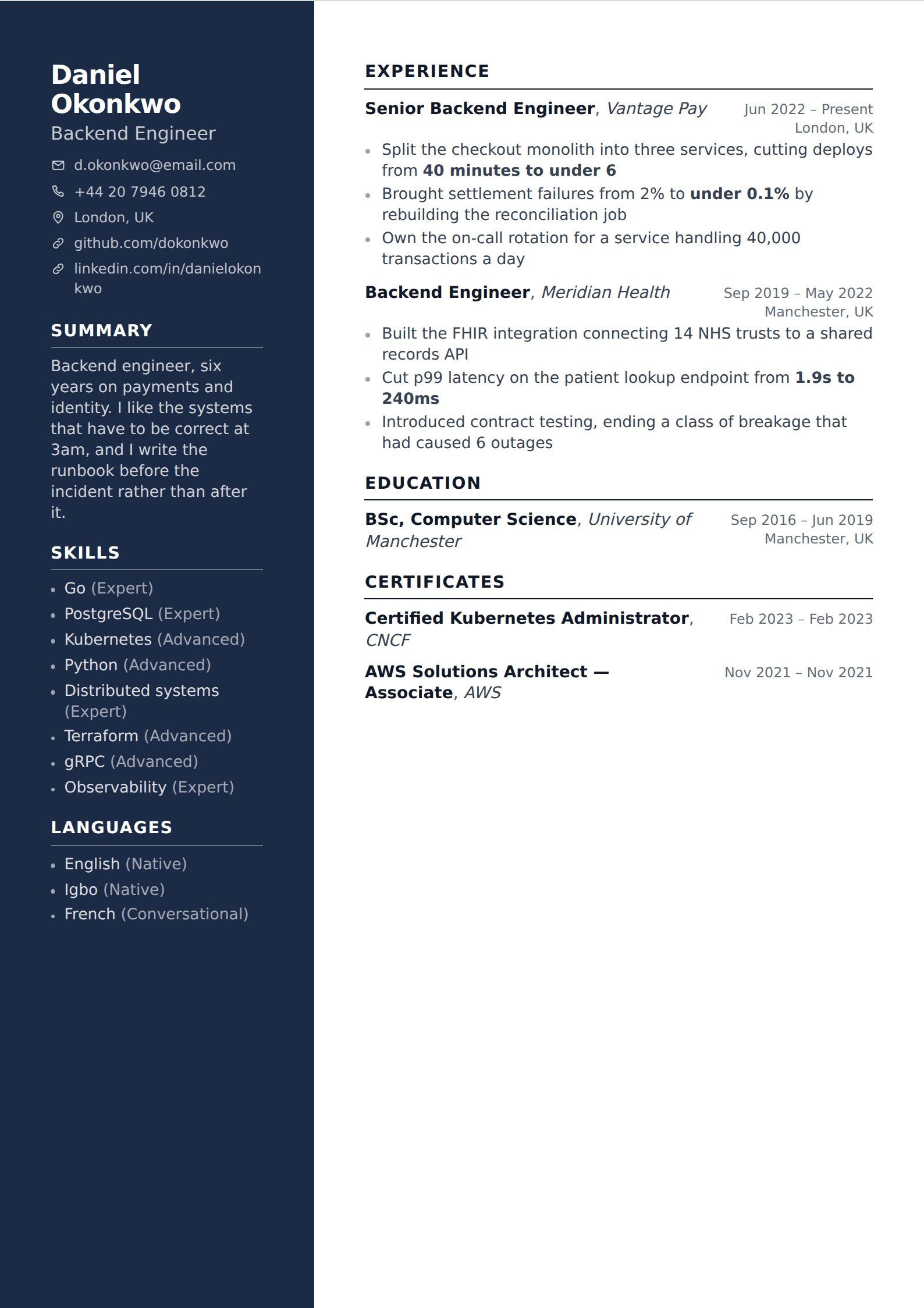
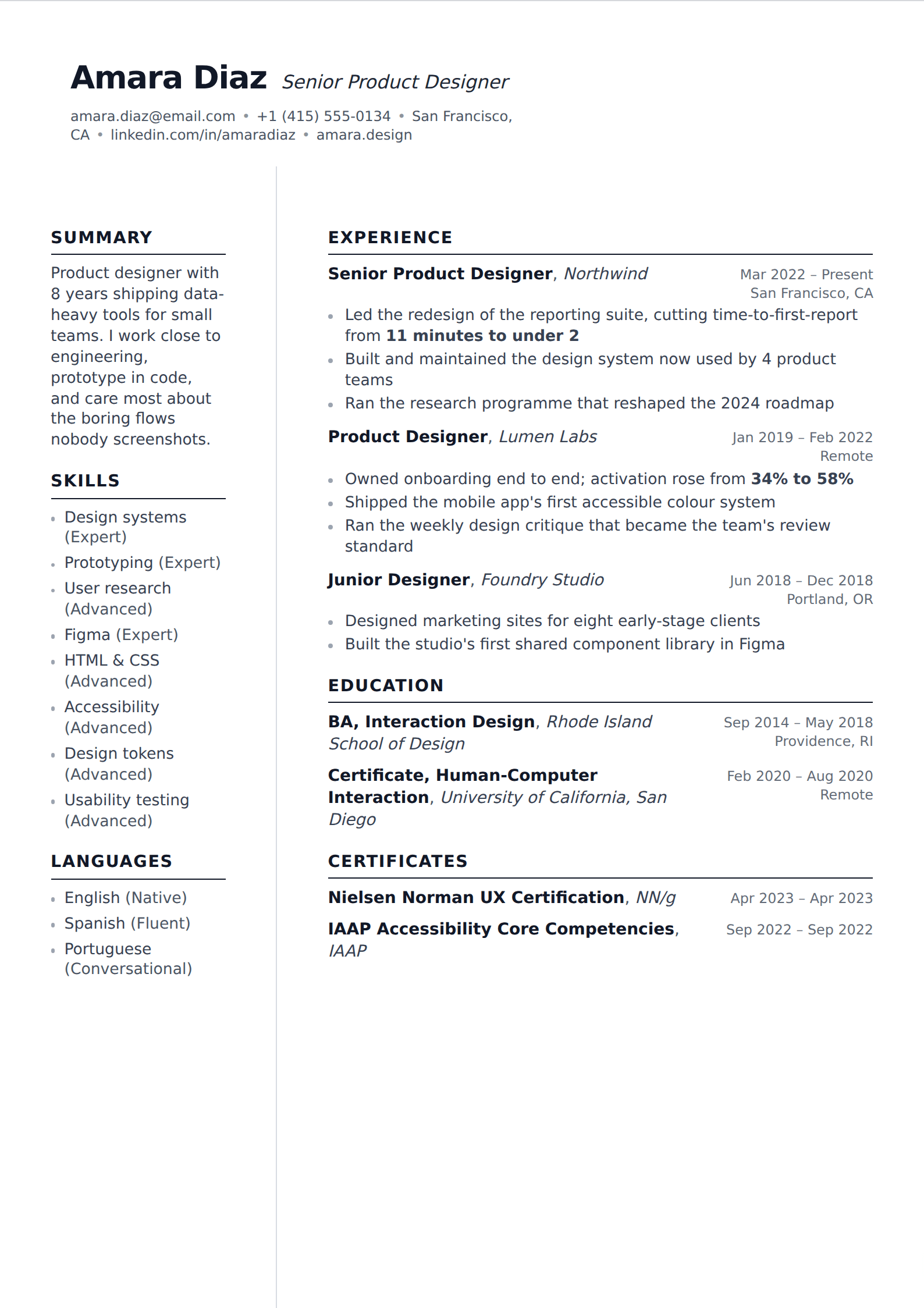
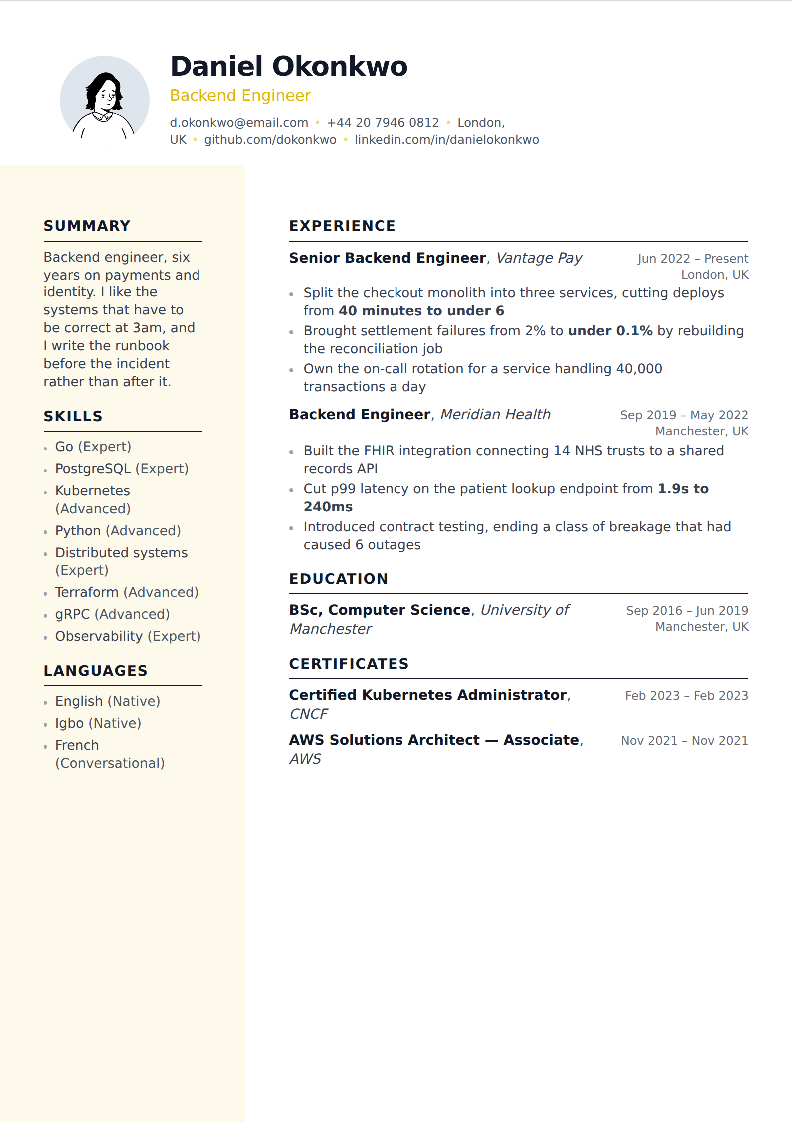
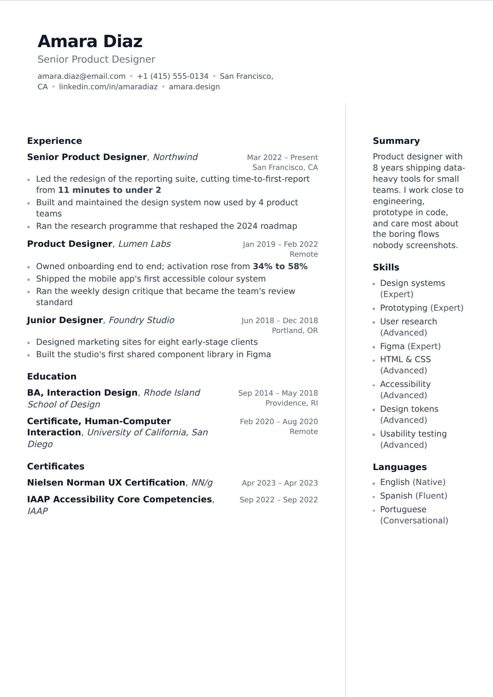
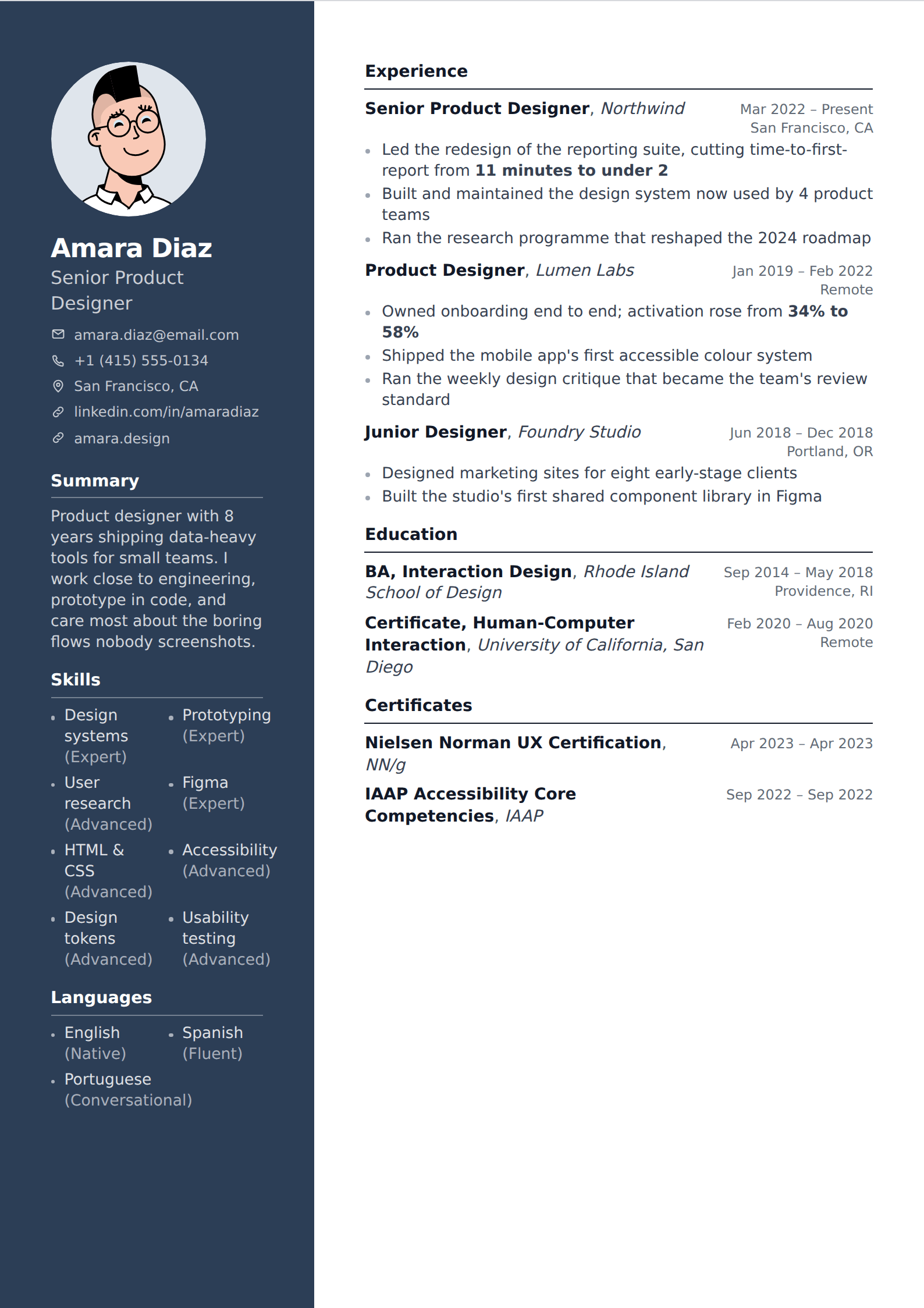
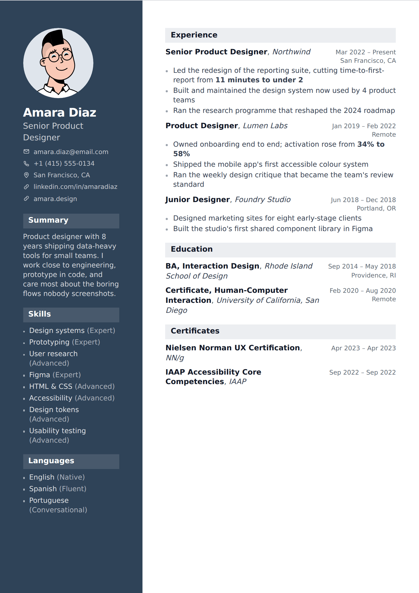
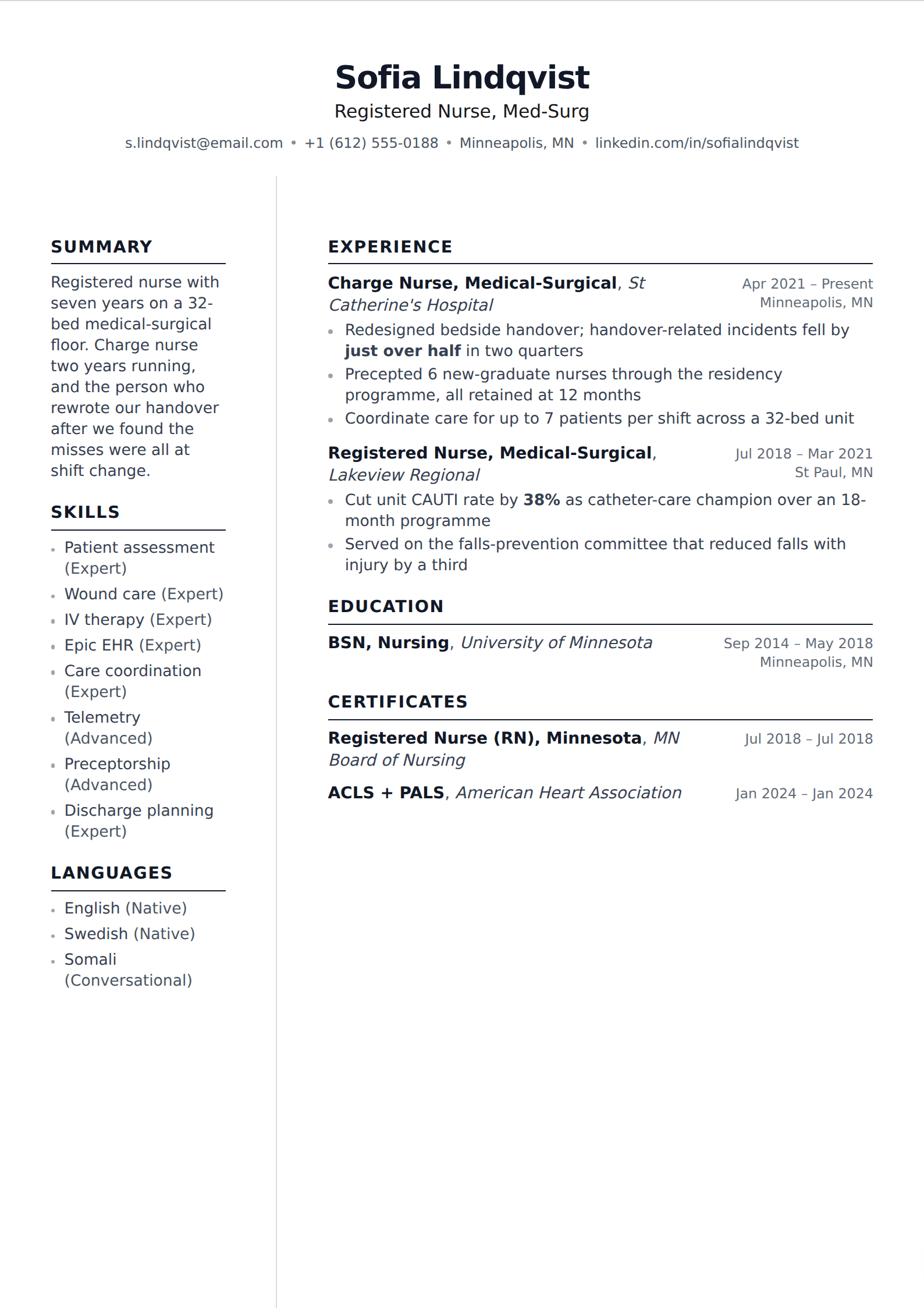
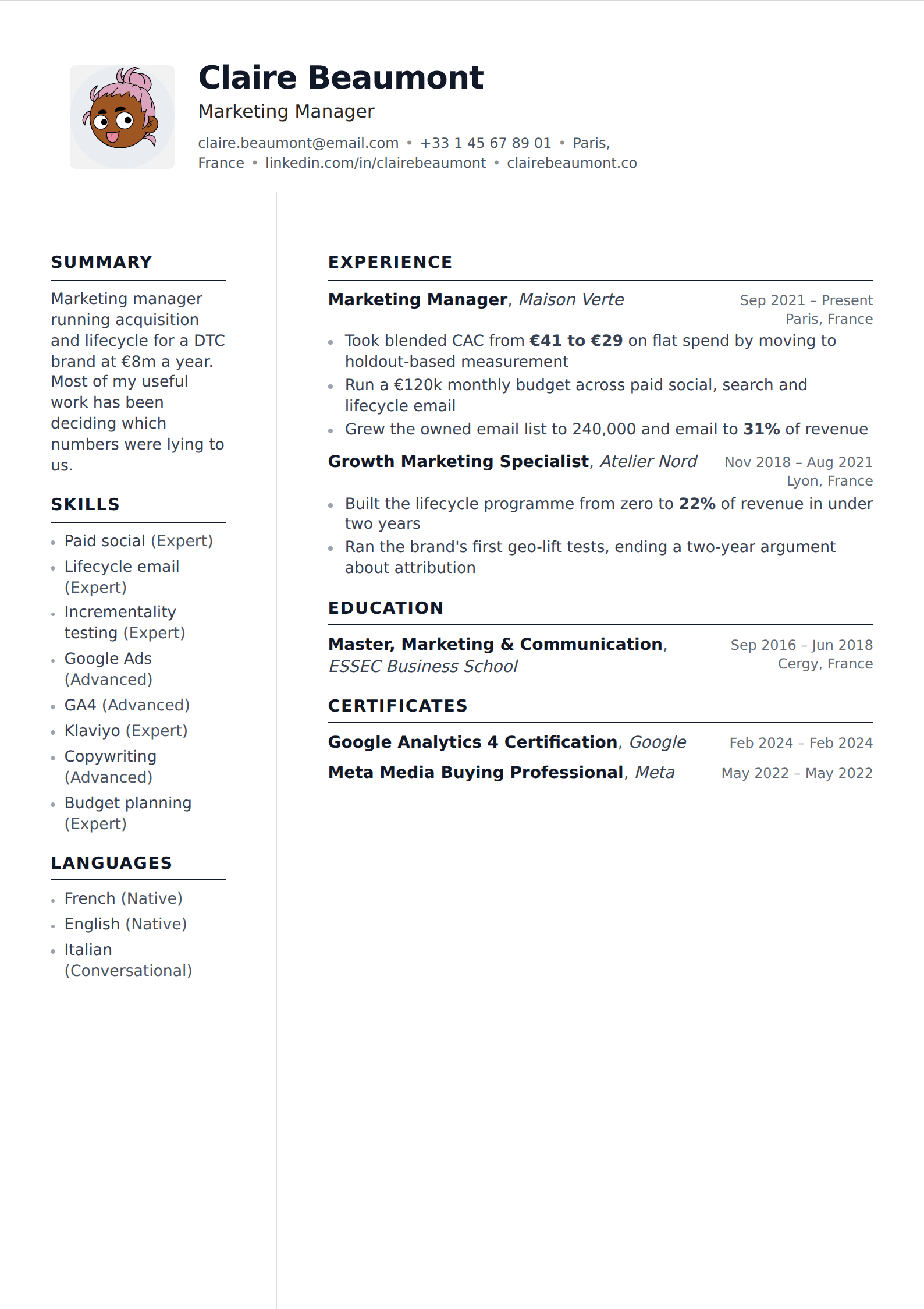
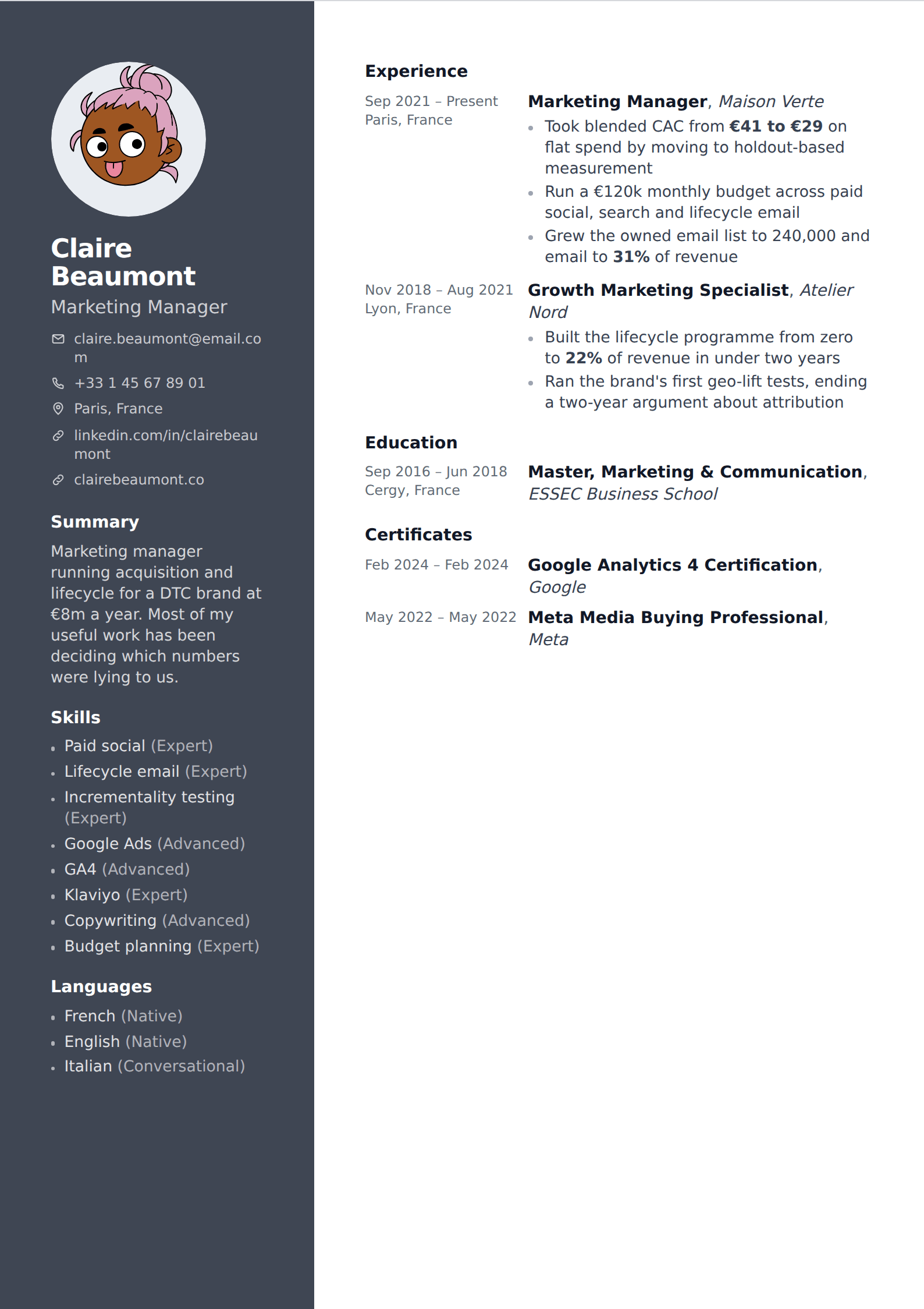
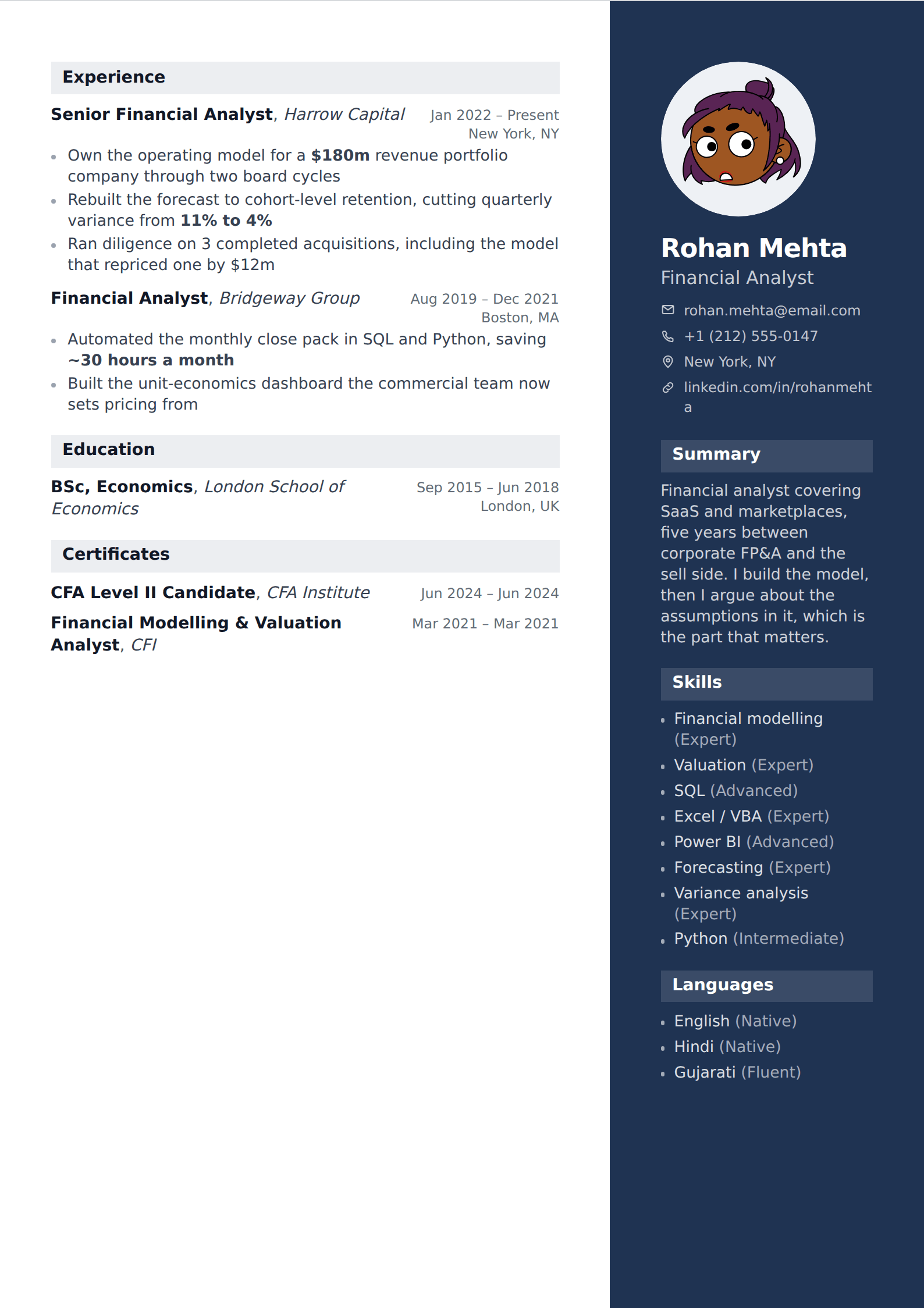
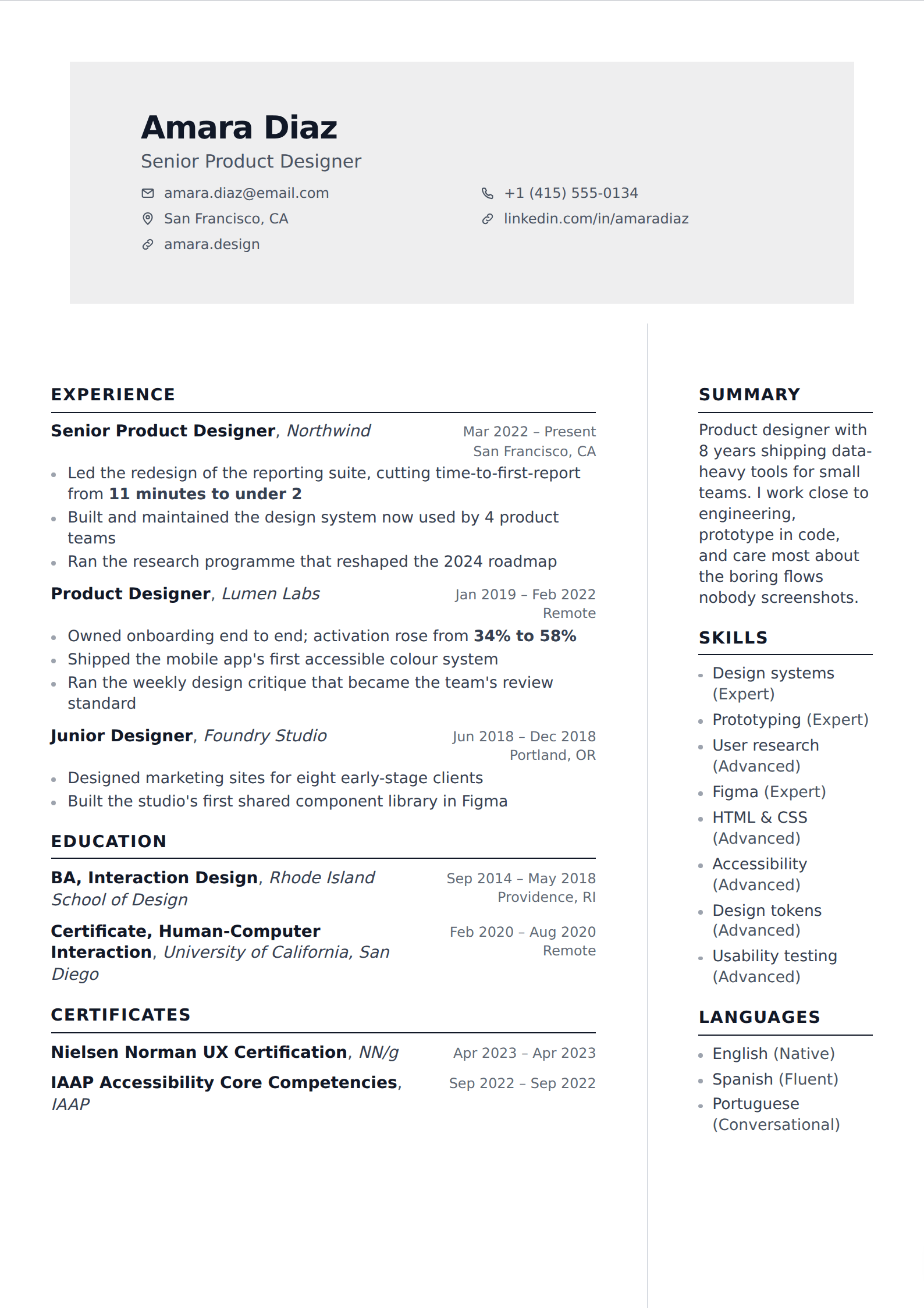
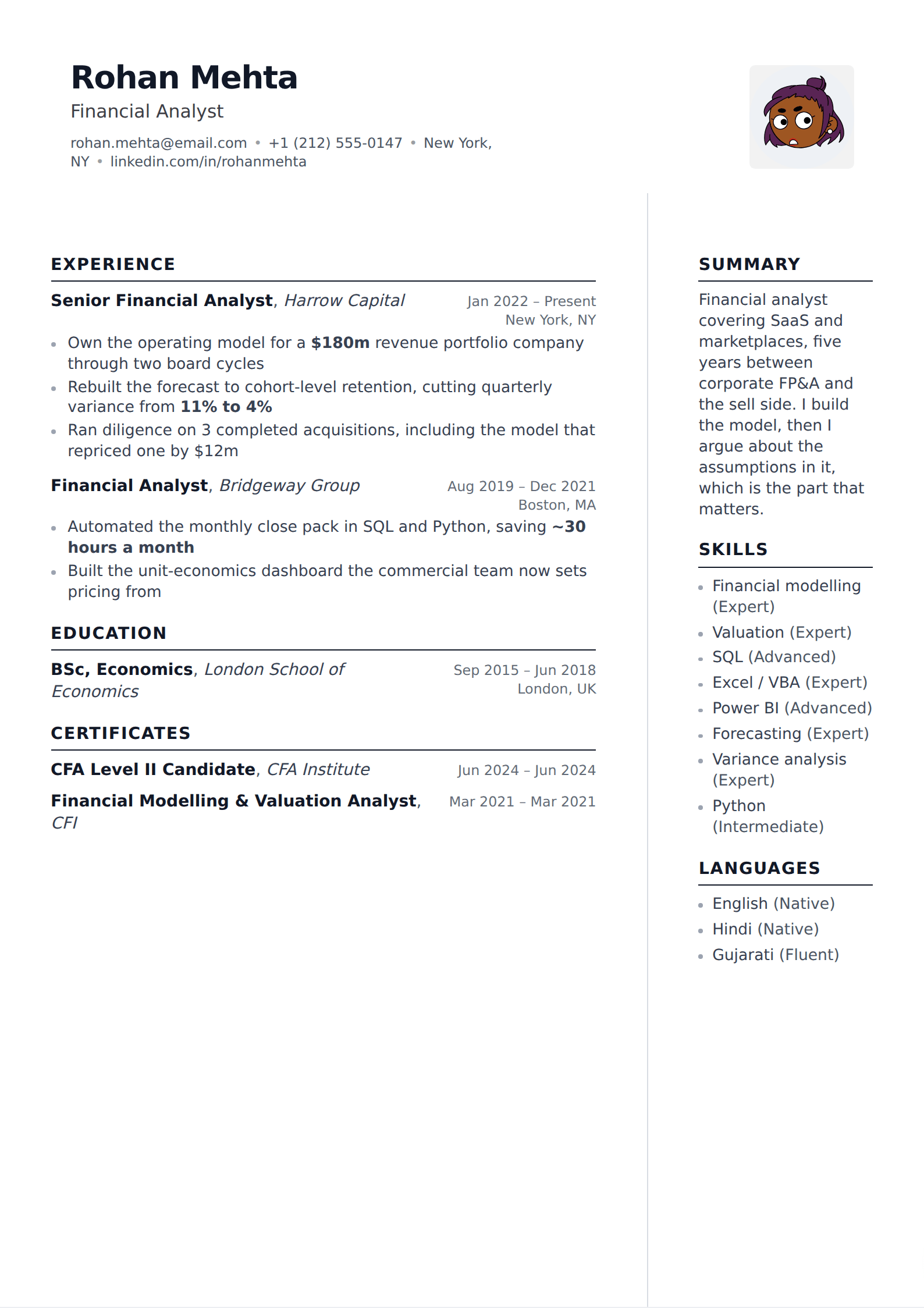
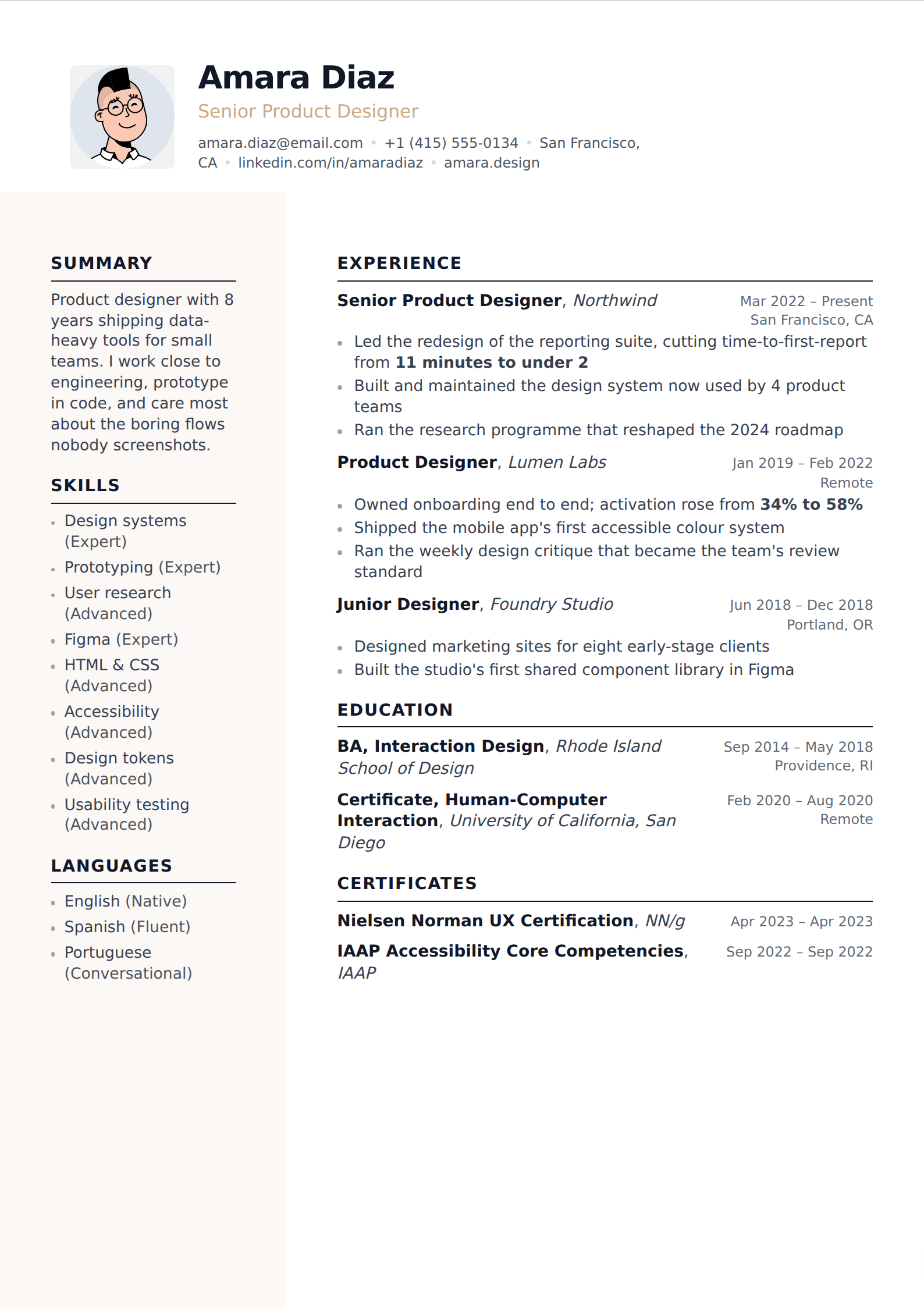
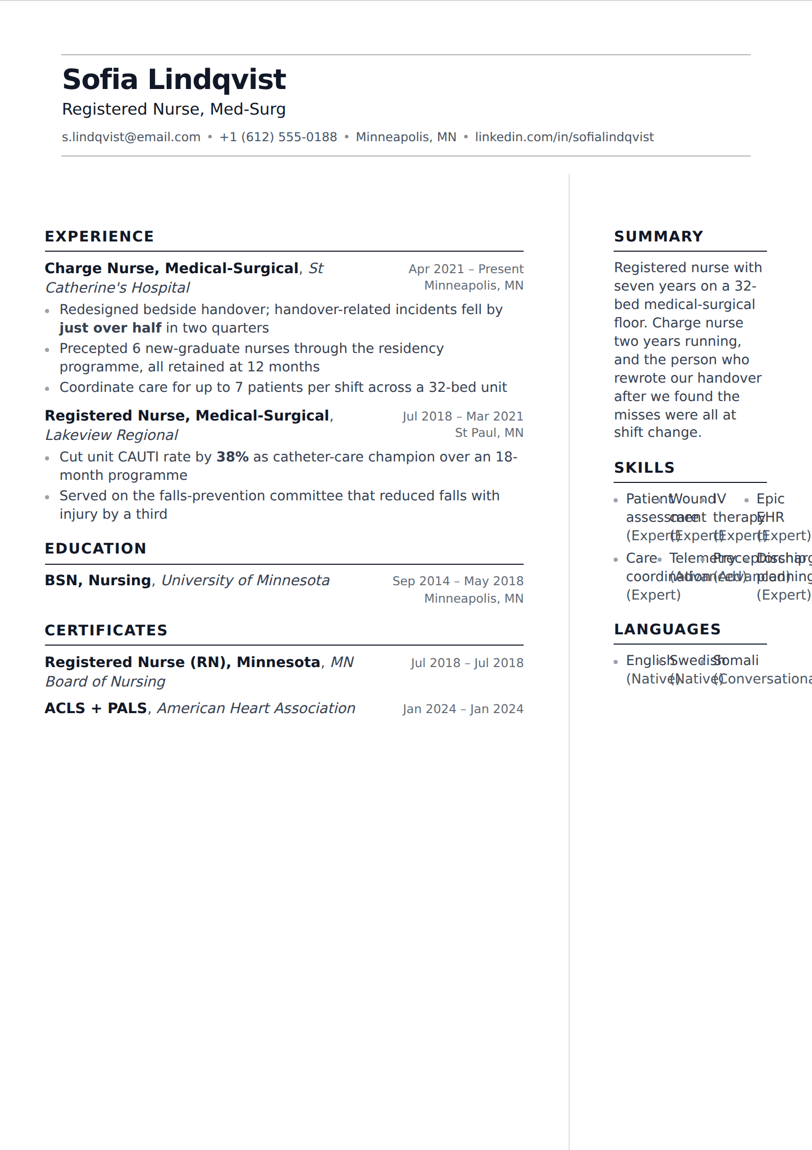
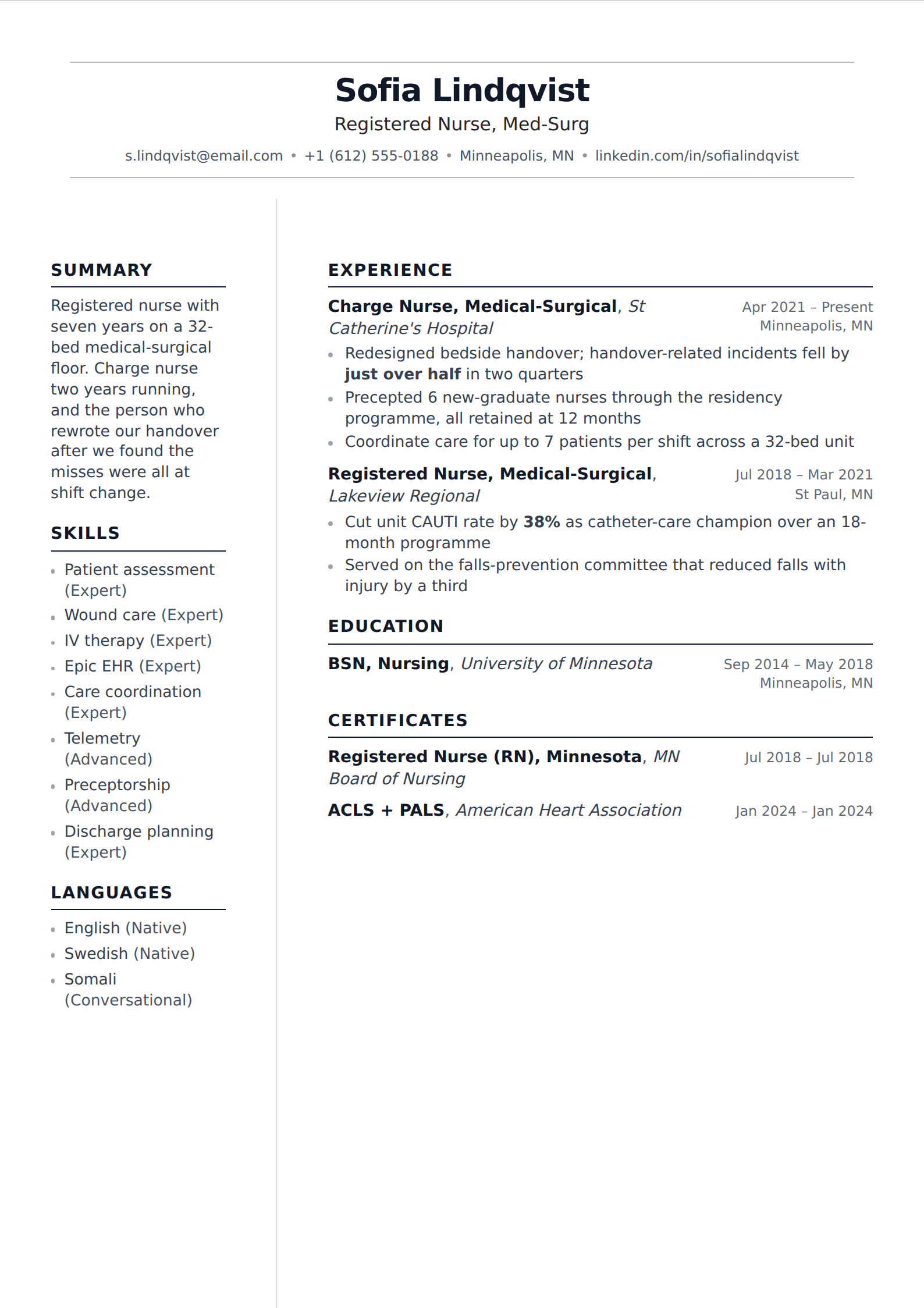
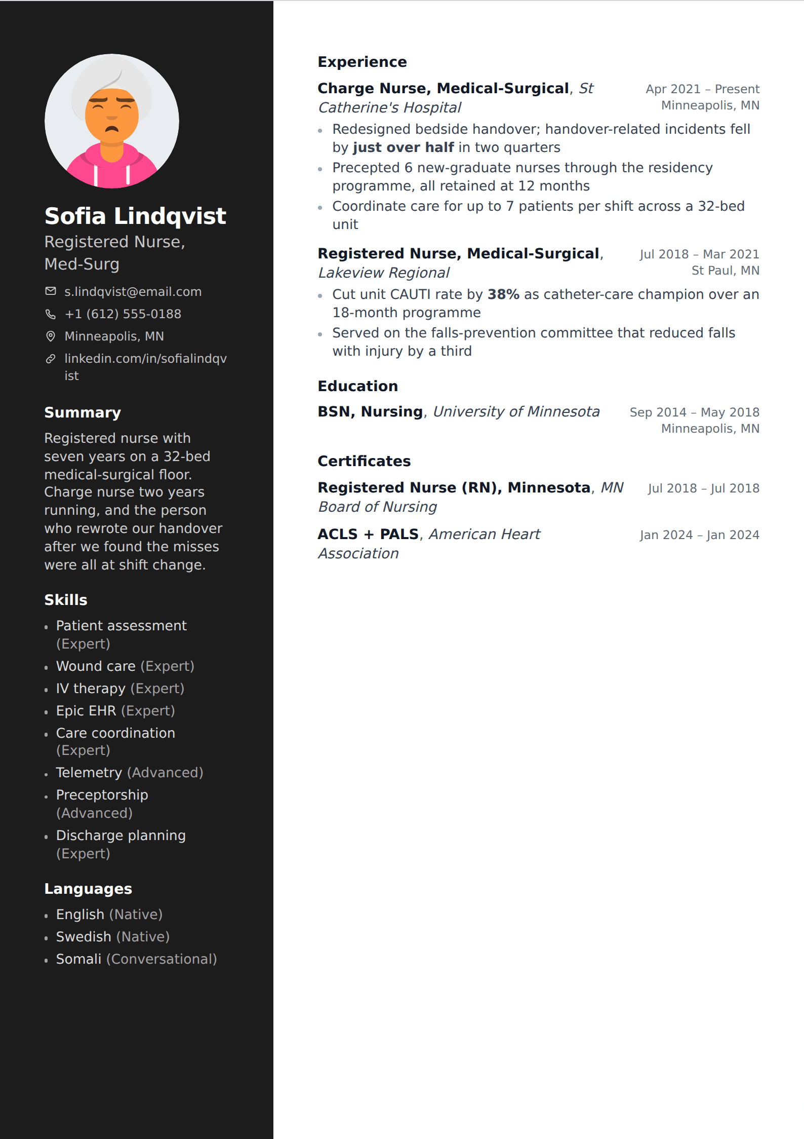
Several templates here use a sidebar, which is the one layout choice with real consequences for applicant tracking systems — the text can extract across both columns rather than down each in turn. That does not make them unusable. It makes them worth checking: export the PDF, copy the text out, and confirm it reads in a sensible order.
If the role is likely to be screened heavily by software, the ATS-friendly collection is the same aesthetic with the sidebar removed.
Common questions
Are modern resume templates ATS-friendly?
- The typography is irrelevant to a parser — sans-serif and serif extract identically. What matters is column count and whether the text is real. The single-column templates in this collection are as safe as anything on the site; the two-column ones are worth running the copy-paste check on.
Should I use a modern template for a corporate job?
- A clean sans-serif layout is safe almost everywhere now, including finance and law. What still reads as out of place in conservative industries is colour used heavily, a photo where the local convention is not to include one, and anything resembling an infographic.
Can I change the font on a modern template?
- Yes. Each template ships with a typeface it was designed around, but font family stays a control under Customize, along with size, line height, margins and accent colour. The live preview and the exported PDF follow them together.
Other collections
Build it in the editor
Live preview, AI writing help, and an ATS-ready PDF. Free to start, and no card at any point.
Start your resume