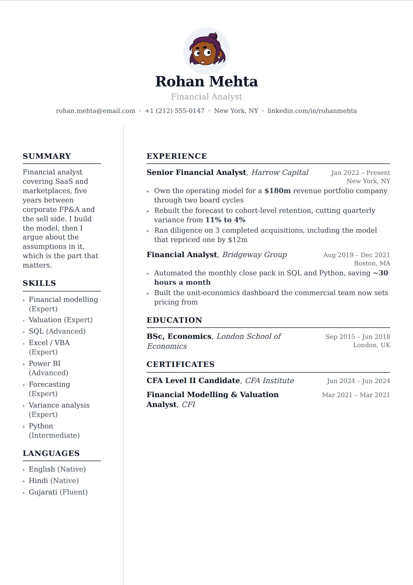

What it is
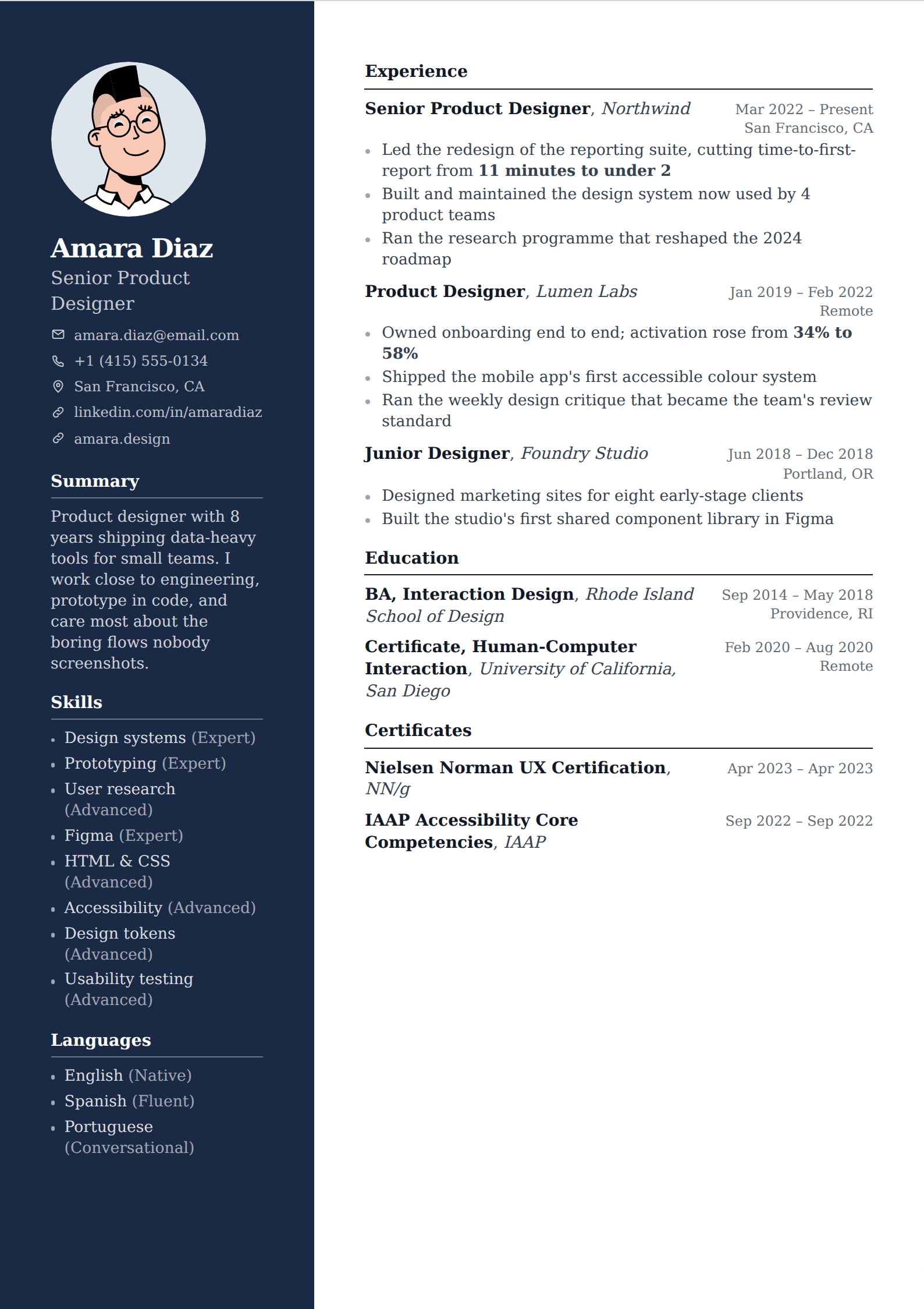
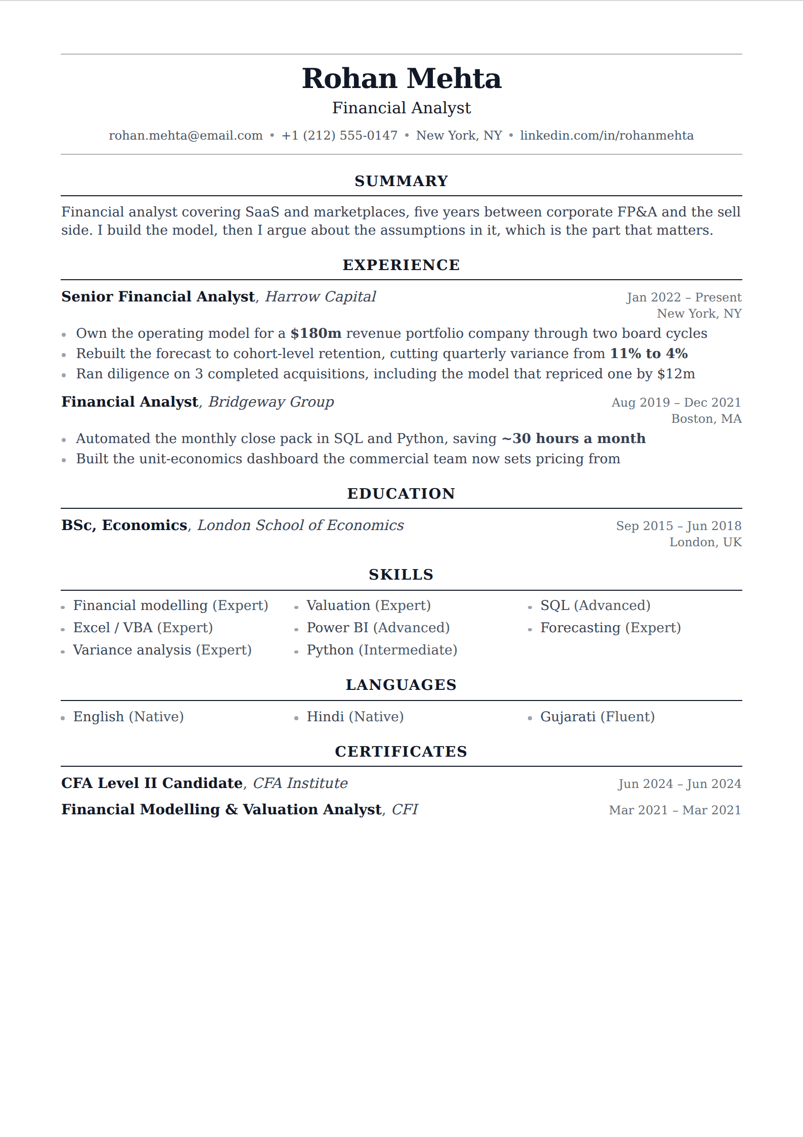
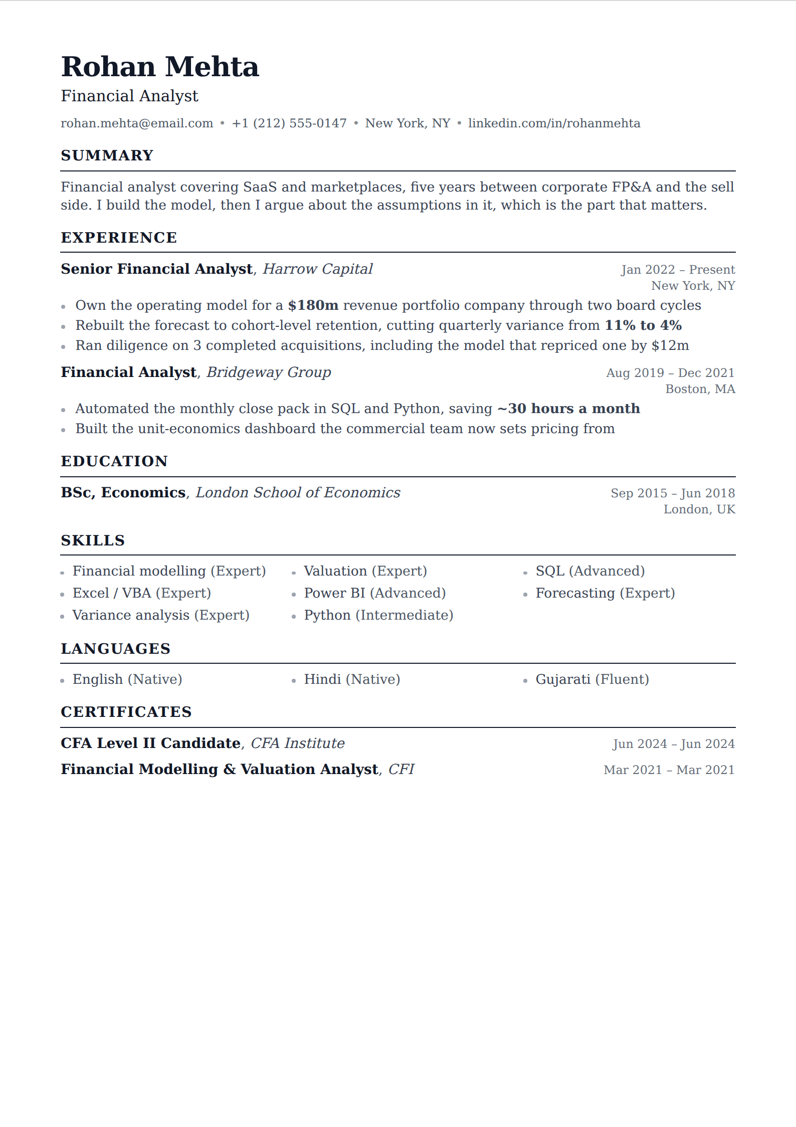
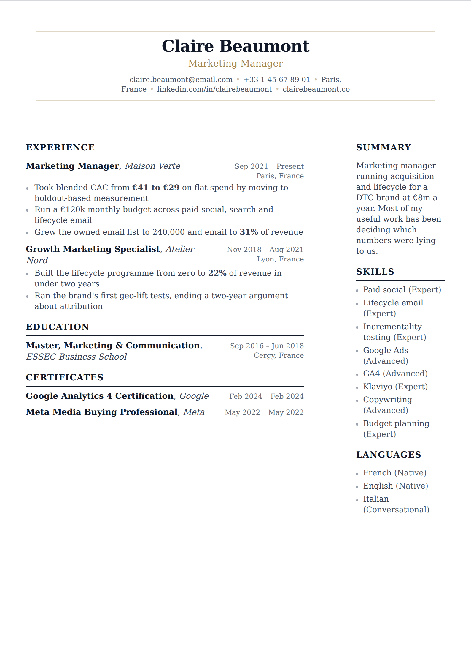
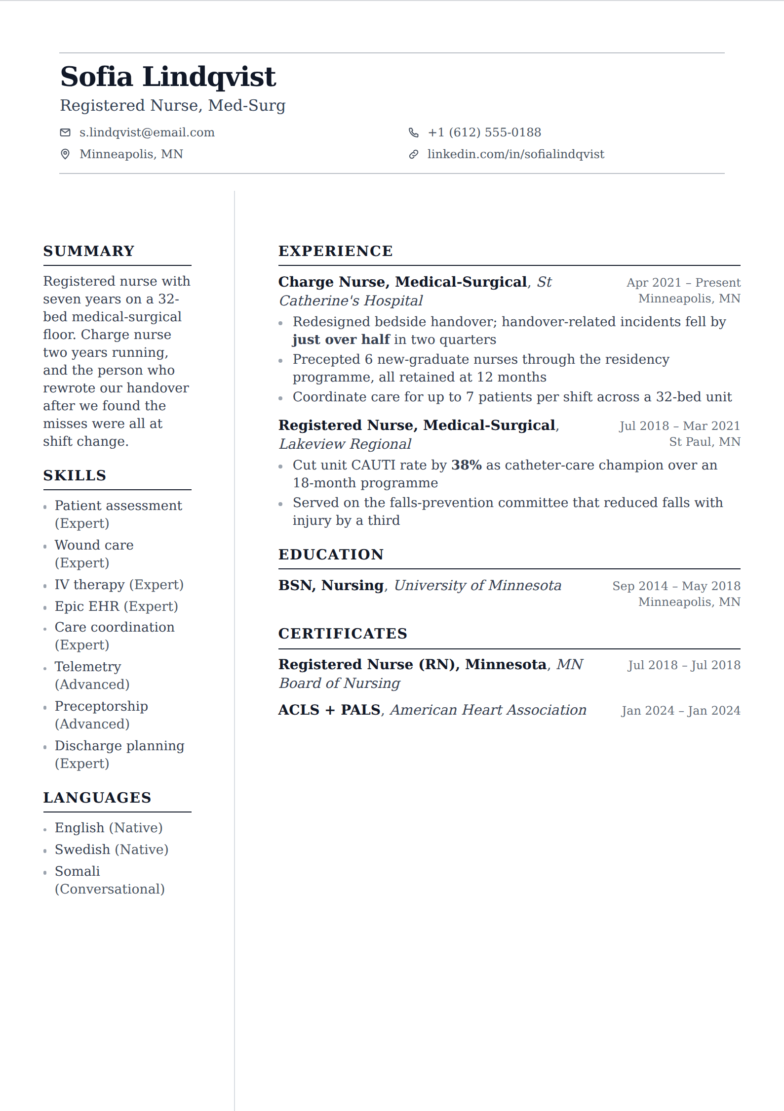
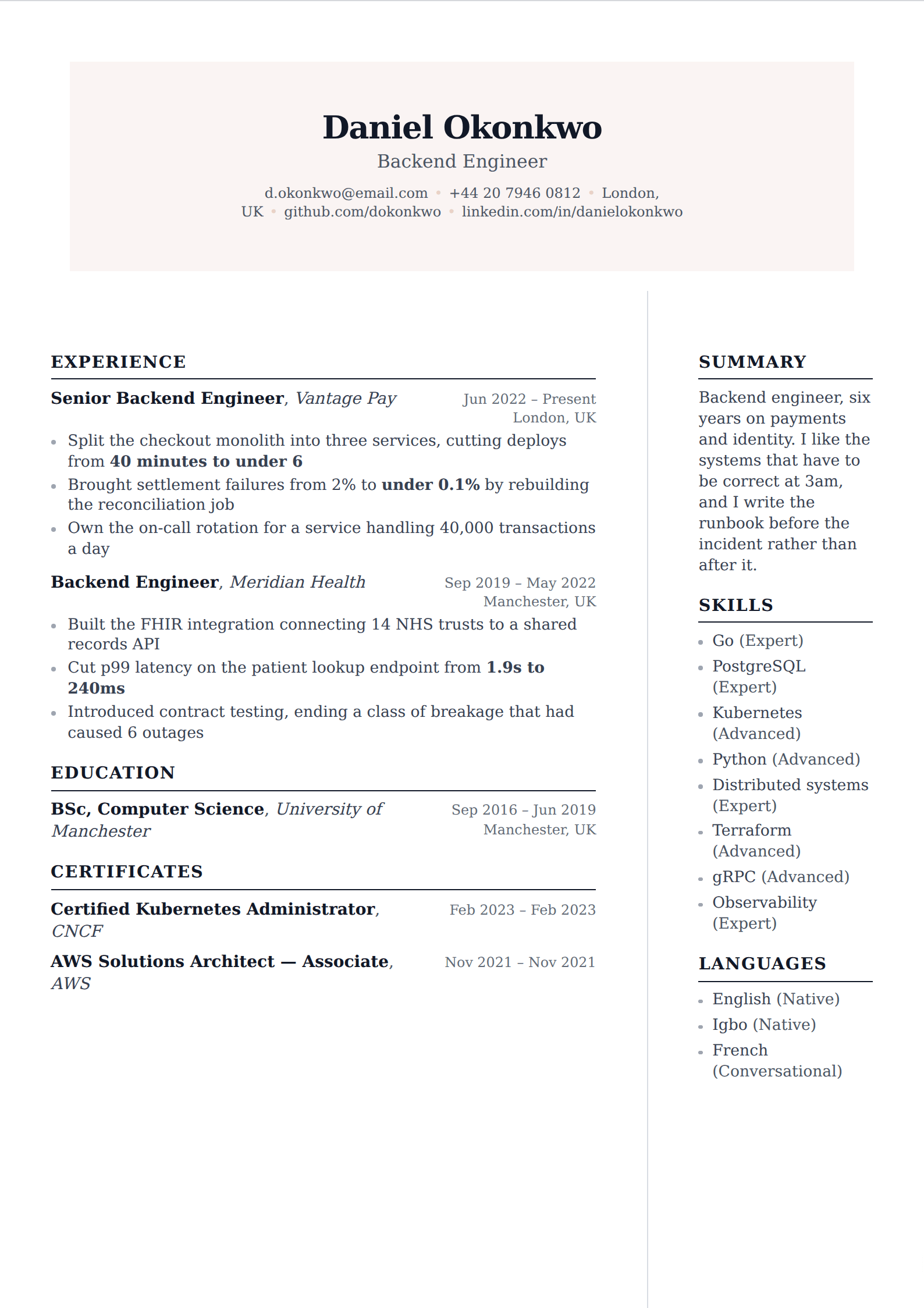
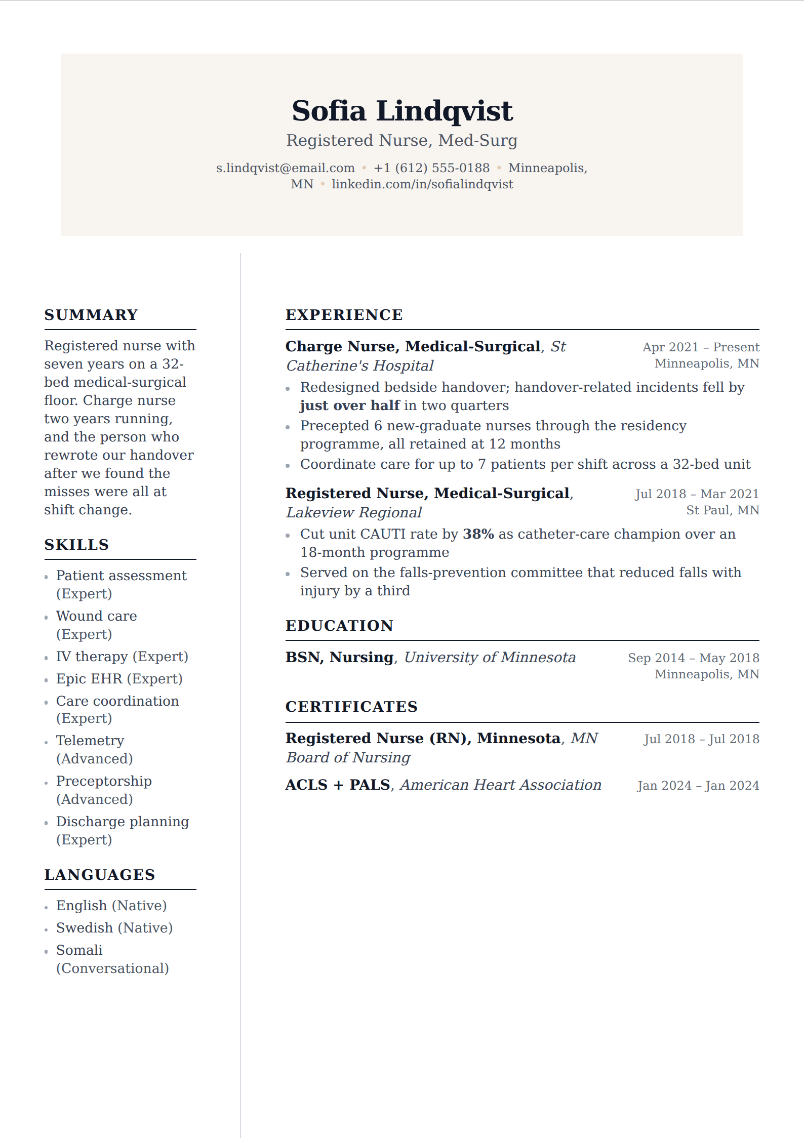
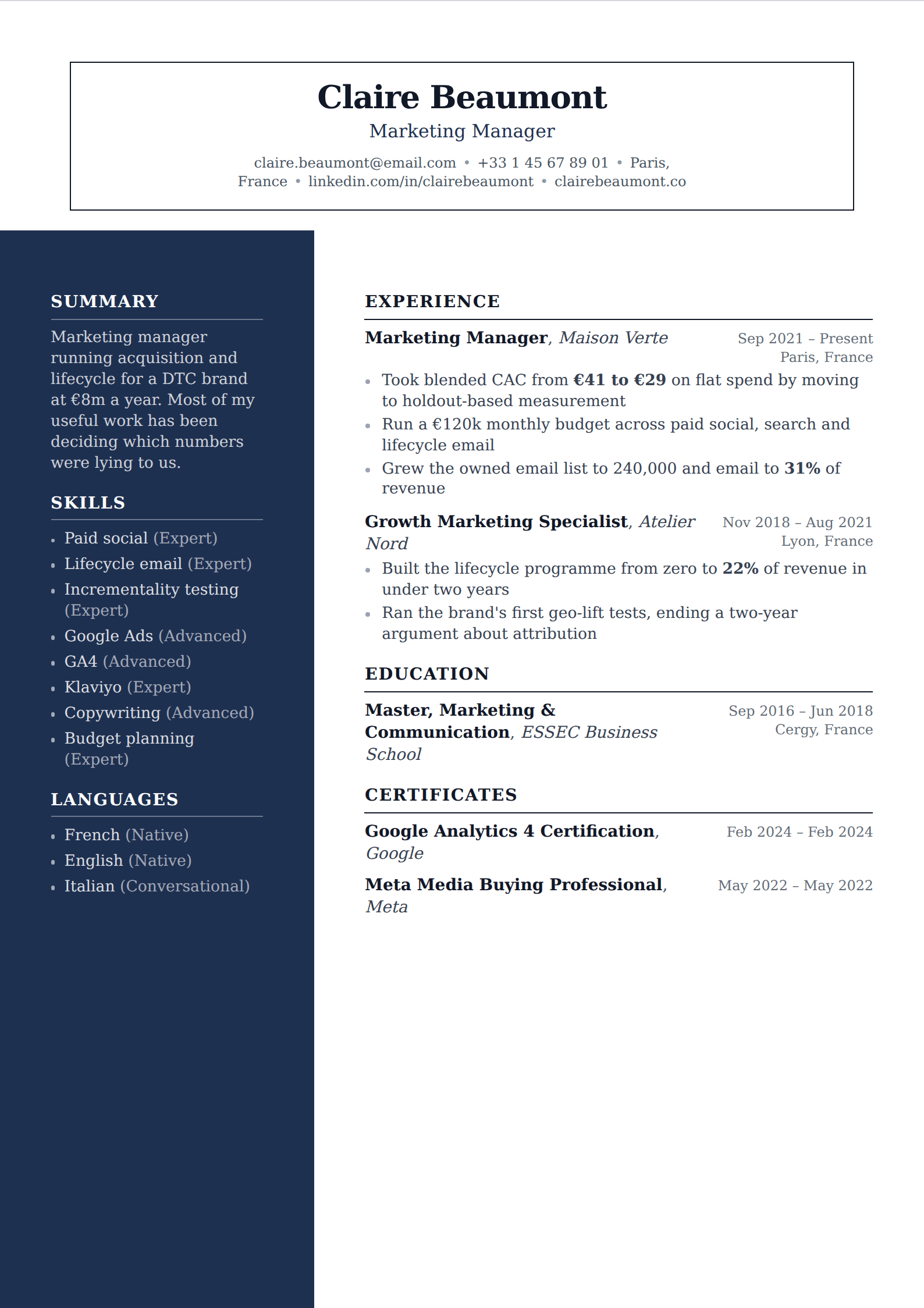
Your most recent role first, then the one before it, working backwards. Each entry carries a title, an employer, a location, a date range and a handful of bullet points. Education goes underneath unless you graduated within the last year or two.
That is the whole format. Its dominance is not a matter of fashion: it answers the reader's first question — what are you doing now, and at what level — in the first two lines, and it gives an applicant tracking system exactly the shape it expects to parse.
Getting the details right
Within the format, a few decisions do real work. These are the ones that separate a chronological resume that reads well from one that is merely correctly ordered.
- Lead each bullet with what you owned and end it with what changed. "Responsible for" is the phrase to search for and delete.
- Use a consistent date format throughout — "Mar 2022 – Present" parses reliably, seasons and graphical timelines do not.
- Put the strongest bullet first within each role. Readers skim the top of every block and skip the bottom of most of them.
- Give your current role three to five bullets and older roles two. Space should follow relevance, not seniority at the time.
- Compress anything older than about ten years to a single line, or drop it. Nobody is assessing you on a 2013 internship.
- Do not leave a role's dates off because the tenure was short. A missing date reads worse than a short one, and some parsers drop the entry entirely.
When it works against you
Two situations, and the honest answer in both is that the alternatives are worse rather than that chronological is fine.
The first is a genuinely fragmented history — a decade of short unrelated contracts, where a strict list is noise rather than narrative. The second is a career change where your most recent role is the least relevant thing on the page, so the format leads with your weakest argument.
For the first, a hybrid opening with a skills summary above the timeline usually solves it. For the second, the summary does the work: one sentence naming the direction, then the chronology beneath it. What neither case justifies is a fully functional resume, which recruiters read as concealment even when it is not.
Handling gaps
The format makes gaps visible, which people treat as a reason to avoid it. It is not. Gaps are far more common than the advice industry pretends, and an unexplained one is only a problem because the reader fills it in themselves.
Use years rather than months if the gap is short and you would rather not draw the eye to it — that is presentation, not deception. For anything longer, one line naming it plainly is enough: caring responsibilities, study, illness, redundancy in a bad market. A named gap stops being a question.
Choosing a chronological template
Almost any resume template is a chronological template, which is why searching for one specifically returns a general gallery. The format is a decision about ordering, not about design — you are not looking for a special layout, you are looking for one that does not fight the ordering.
In practice that means three things. Dates aligned consistently and visible without hunting, because in this format the timeline is the argument. Job titles set more prominently than employers, since the title is what a reader scans for. And enough vertical separation between roles that the eye can tell where one ends and the next begins — a dense block of six jobs with identical spacing is chronological in structure and unreadable in practice.
A single column is the safe default. This format's whole value is that a parser can extract clean title/employer/date records from it, and a sidebar layout can interleave text across columns and destroy exactly that. If your role is likely to be screened by software, do not spend the advantage.
- Dates in a consistent position, right-aligned or immediately after the employer
- Job title more prominent than the employer name
- Clear separation between roles — space, a rule, or a heading weight change
- Single column, so the title/employer/date records extract cleanly
- Room for three to five bullets on recent roles and one or two on older ones