
Where it goes
Below experience for most people with a career. Your work history is the strongest evidence you have, it belongs where the reader lands first, and the skills section functions as an index to it rather than as an opening argument.
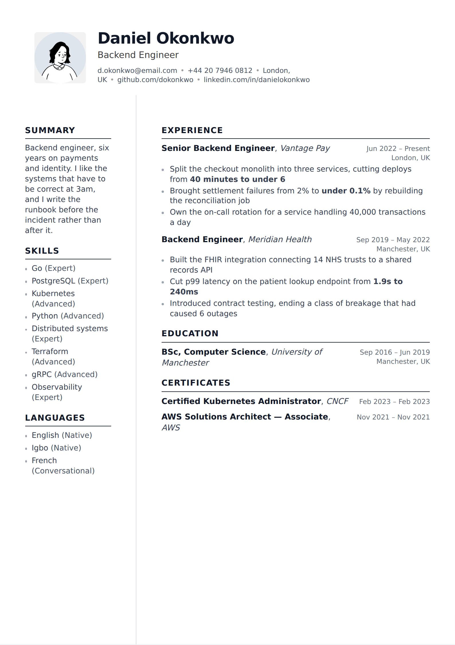
Above experience in four situations, all of them cases where chronology would mislead. Students and recent graduates, whose experience section is thin but whose capability is real. Career changers, whose recent titles describe the job they are leaving. Contractors and consultants with a long list of short engagements, where a capability summary orients the reader before the chronology overwhelms them. And heavily technical roles where the stack is the first thing a hiring engineer checks.
There is no third position. A skills section in the middle of your experience, or split across the page, reads as a formatting accident.
How to group it
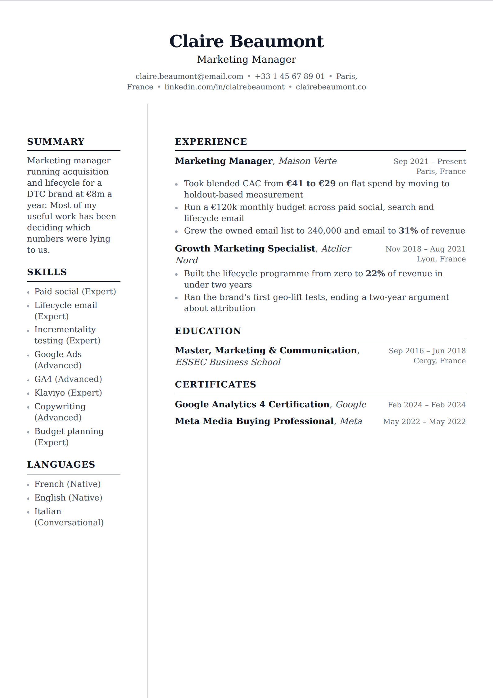
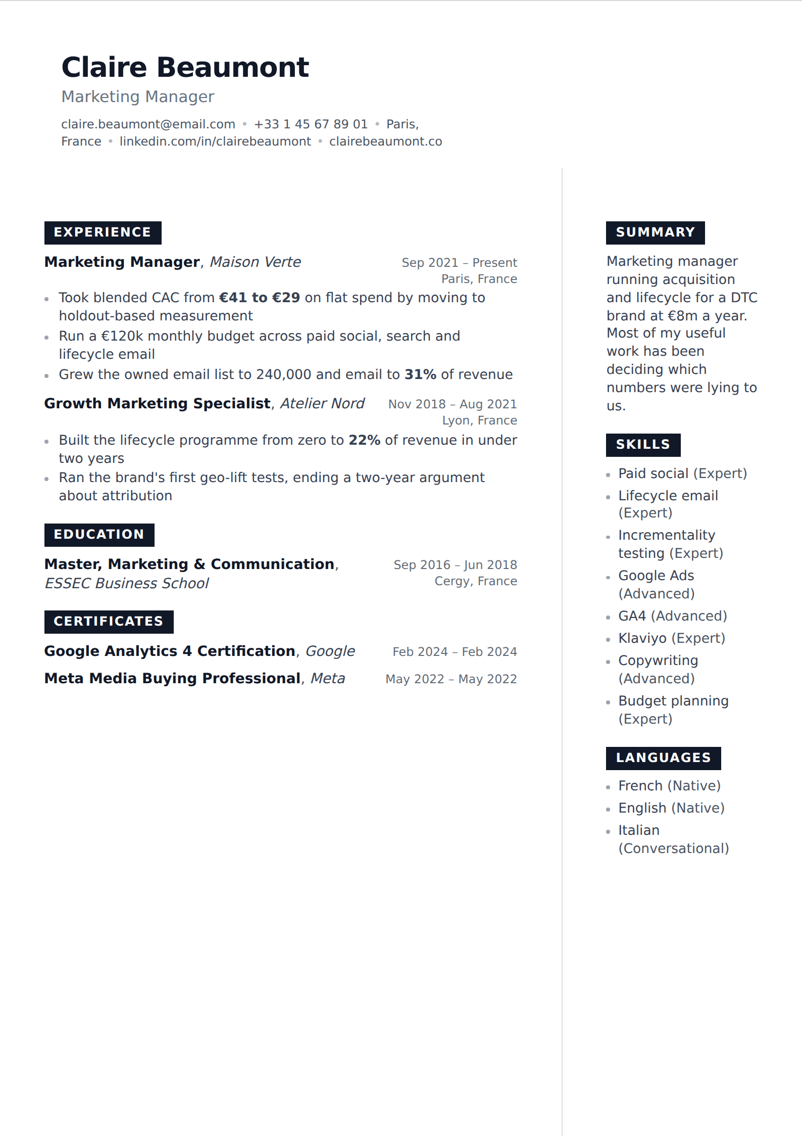
Under about ten items, one line of comma-separated terms is fine. Above ten, group — three or four labelled categories, four to six items each. The labels do real work: they tell a reader what kind of skill they are looking at before they read any of them, and they make the section scannable rather than a block to be skipped.
Sensible groupings depend on the field: Languages / Frameworks / Infrastructure / Tools for engineering; Clinical / Systems / Certifications for nursing; Platforms / Analytics / Channels for marketing. What does not work is grouping by your own assessment — "Expert / Intermediate / Beginner" as headings invites the reader to discount two thirds of your list.
Order within each group is read as priority, whether or not you intended it. Put what you want to be asked about first.
- Twelve to twenty items total for most professional roles.
- Three or four groups, four to six items each, once you pass about ten.
- Label the groups by kind, not by claimed proficiency.
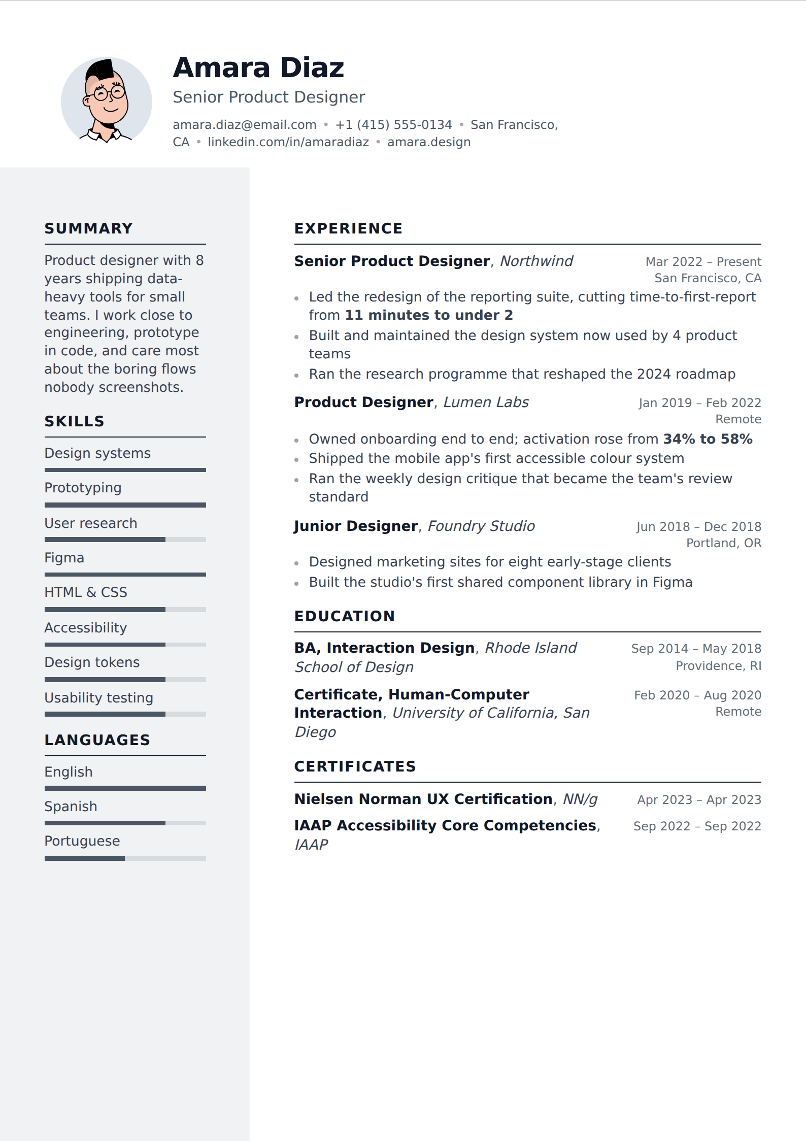
- No ratings, meters, stars or percentages.
- Match the posting's vocabulary where you honestly can — "React" and "React.js" are the same thing to you and two different strings to a matcher.
The sidebar problem
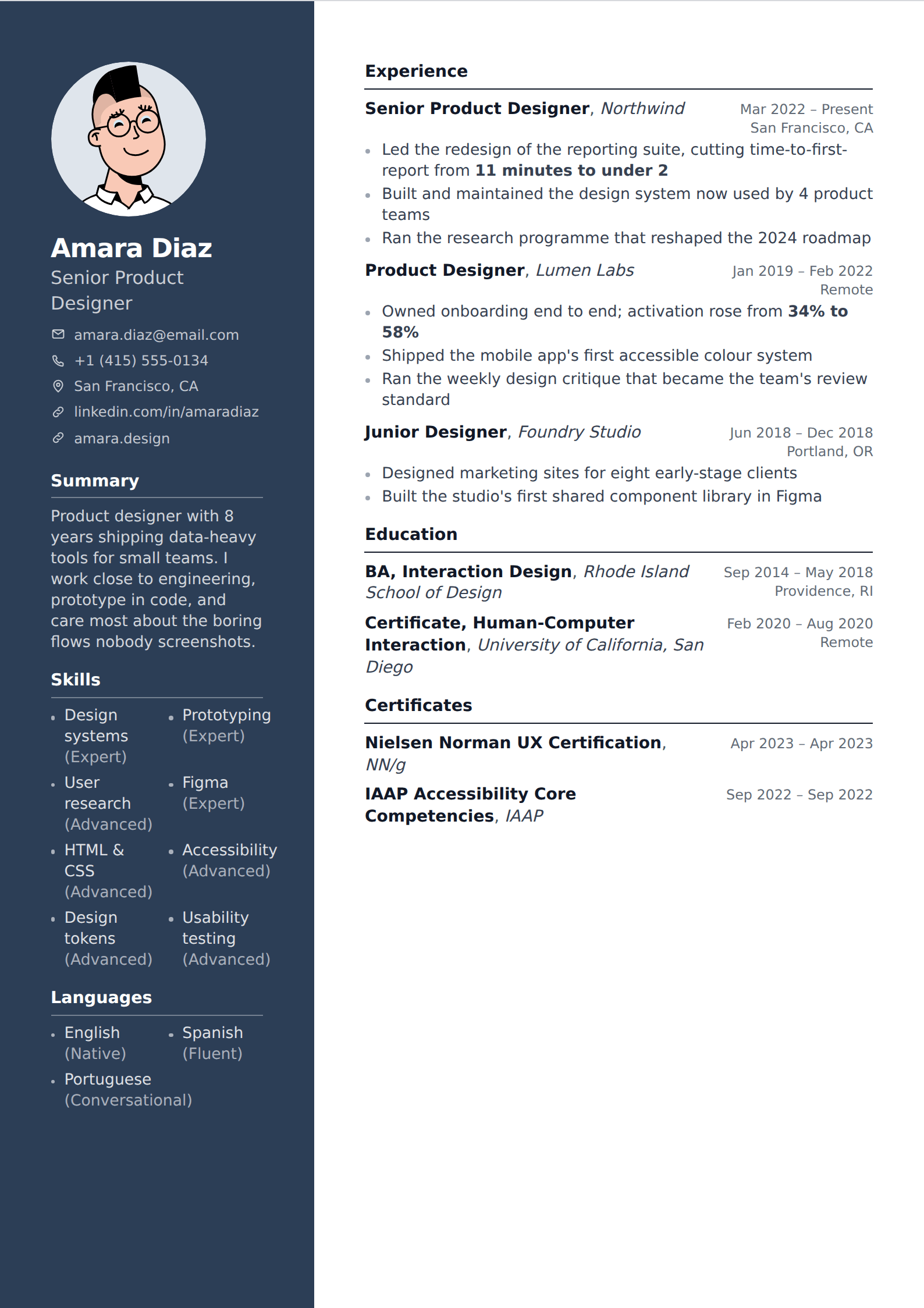
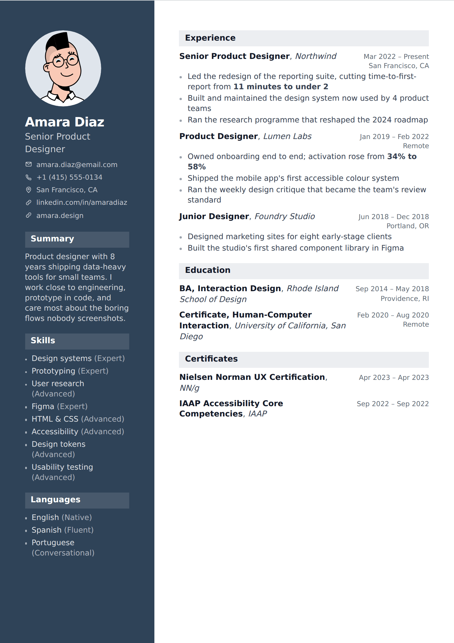
Most templates that put skills in a coloured sidebar look excellent and carry one real risk: when text is extracted from the PDF, a parser may read straight across the page rather than down one column and then the other. The result is your skills list interleaved into the middle of a job description, which can also take out the job title and dates on that role.
The check takes ten seconds and there is no reason to skip it. Export the PDF, select all the text, paste it into a plain text file, and read what comes out. If your history is intact and in order, the layout parses. If it is interleaved, switch to a single-column template — your writing is untouched, because a template is a rendering choice rather than a container.
Nothing gets auto-rejected for this. What happens is quieter and worse: the record is garbled, the resume ranks low against the posting, and no person ever sees it.
Matching the posting without stuffing
The legitimate version of keyword optimisation lives here. Read the posting, list every named tool and competency, keep the ones that are true of you, and use the posting's exact wording for them. That is not gaming anything — it is answering the question in the language it was asked.
The illegitimate version is listing skills you do not have, or hiding terms in white text, which every modern parser strips and which reads as fraud when found. The cost of being caught is an ended application; the cost of a slightly shorter honest list is nothing, because the interview was going to test it anyway.