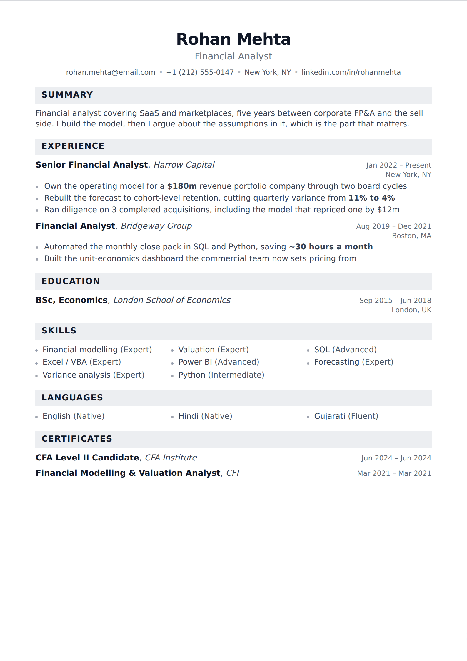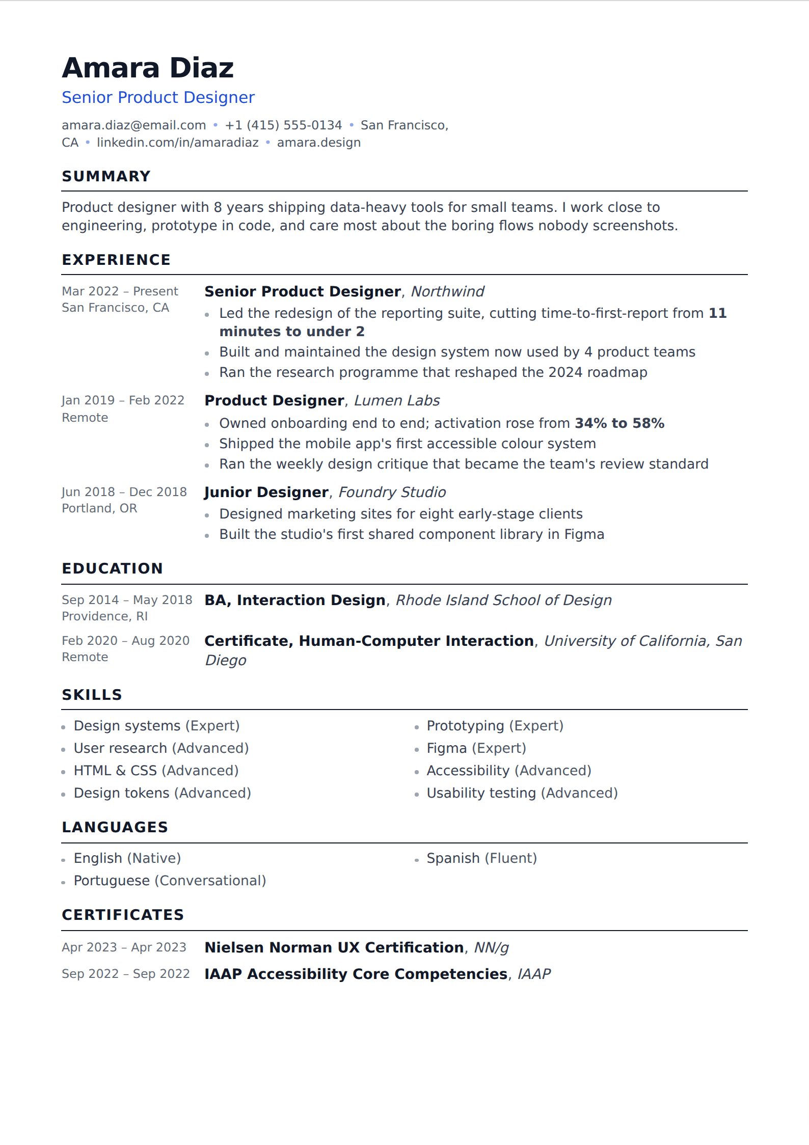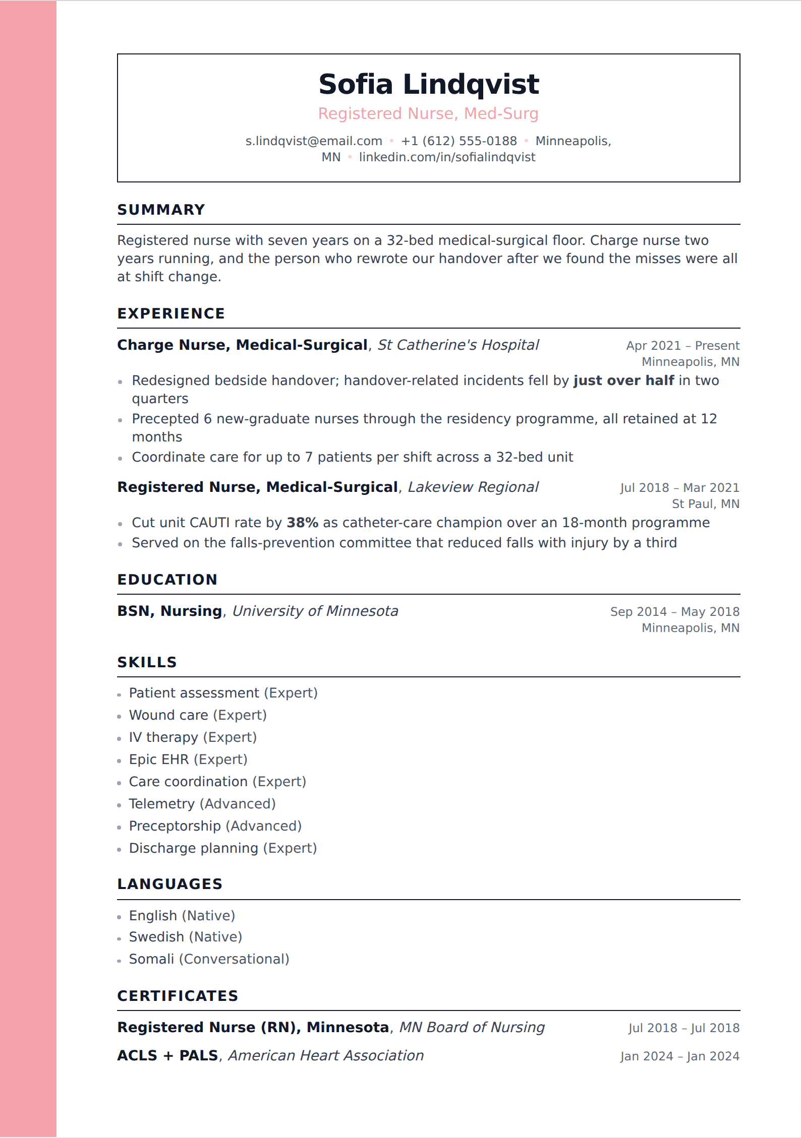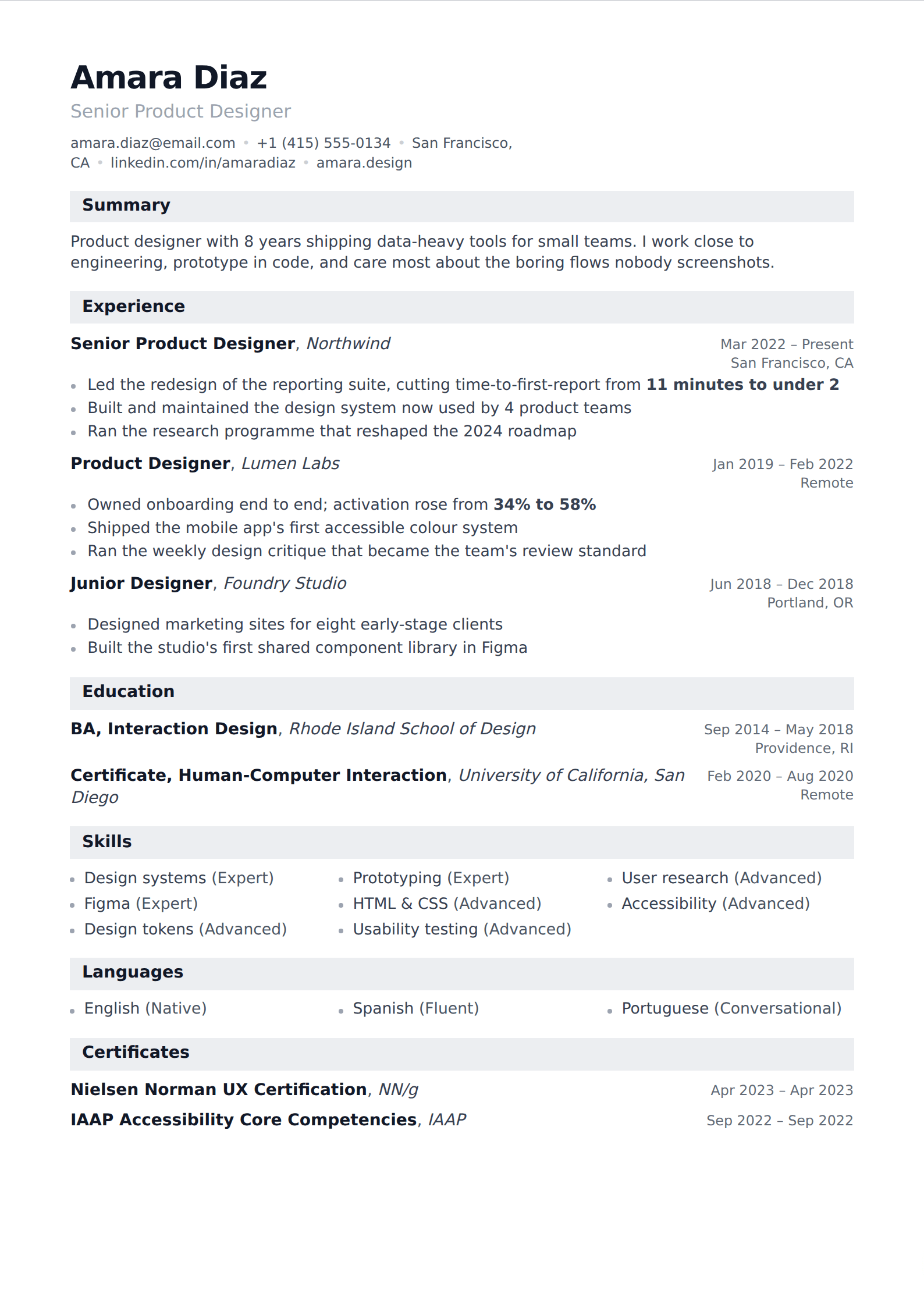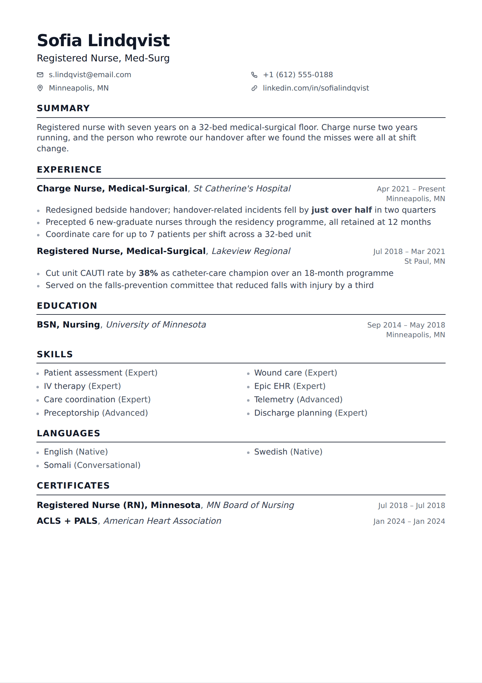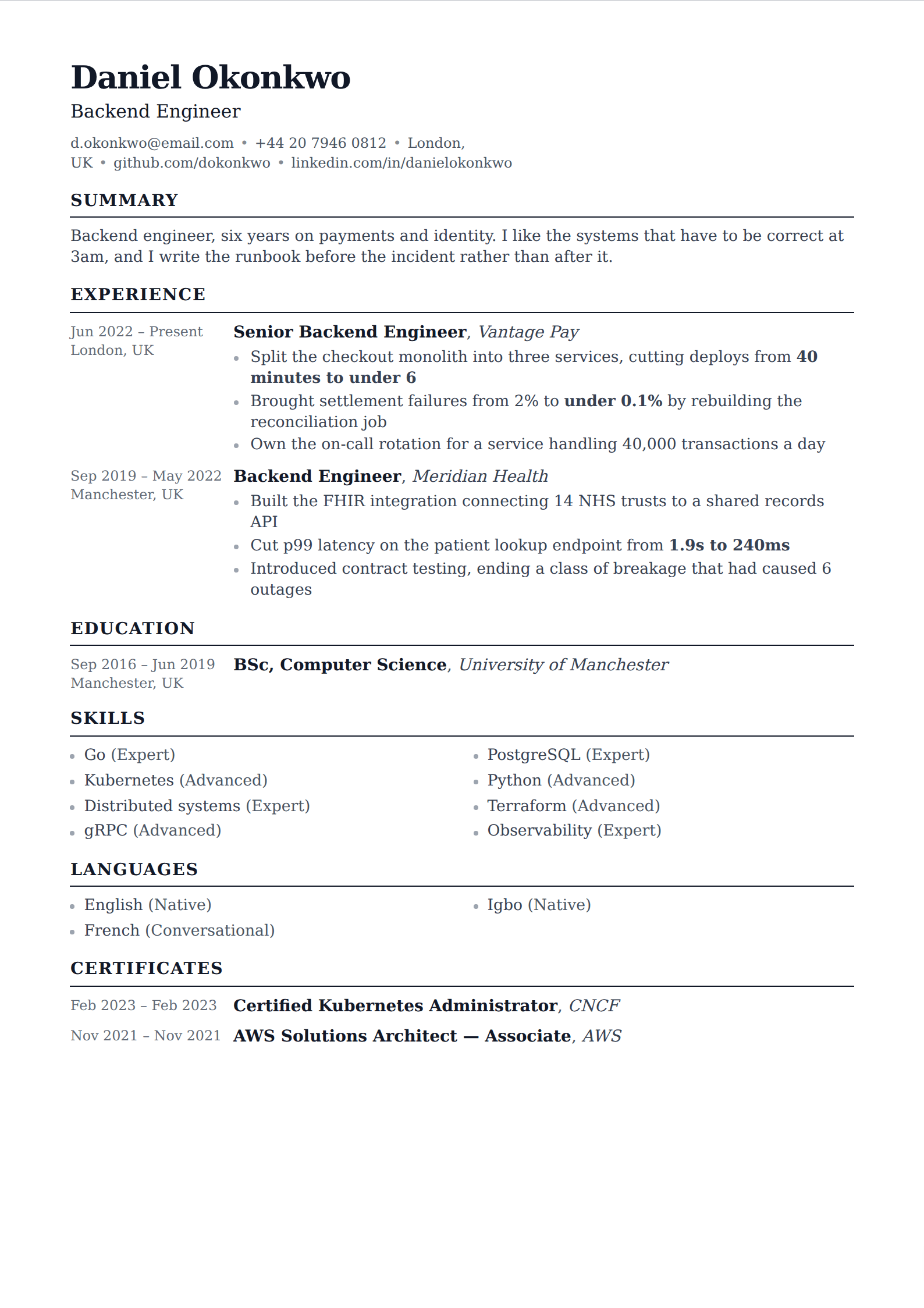

What it is
A one-page, single-column, black-and-white resume with the name at the top, no photo, no objective statement, and four or five plainly-labelled sections. There is no colour, no sidebar, no icon set and no graphic element of any kind. That austerity is the point rather than an omission — it puts every ounce of the reader's attention on the content.
It is taught to undergraduates and graduate students at a school whose alumni are read closely by consulting firms, banks, law firms and academic departments, which is a demanding and conservative audience. A format built for those readers is a safe default for almost anyone.
The version circulated online is a Word or PDF handout from the university's career office. Nothing about it is proprietary or restricted, and reproducing the structure is entirely ordinary — this is a convention, not a brand.
The structure
Five sections, in this order, with education first while you are a student or recent graduate.
- Header: name, then one line with email, phone and city. No address, no photo, no title line.
- Education: institution, location, degree, graduation date, and where relevant GPA, honours, thesis and coursework. First on the page for students.
- Experience: reverse-chronological. Employer, location, title, dates, then bullets. Internships, research posts and part-time work all sit here as equals.
- Leadership and activities: societies, sport, volunteering, student government — with what you did rather than what you belonged to.
- Skills, certifications and interests: technical skills, languages with a stated level, and a short interests line, which is the one place the format allows personality.
The bullet formula, which is the actual content
The structure is the easy half. What Harvard's career office teaches, and what makes the format effective, is a formula for the bullets: start with a strong action verb, state what you did with specifics, and end with the result or the scale.
"Responsible for the weekly sales report" fails the formula in every respect — no verb worth the name, no specifics, no outcome. "Rebuilt the weekly sales report in SQL, cutting preparation from six hours to twenty minutes and freeing the analyst team for forecasting work" passes, and the difference is not the format.
Two supporting rules travel with it. Past tense for past roles, present for current ones, applied consistently. And quantify wherever a number honestly exists — people, dollars, percentages, hours, volume. A bullet with a number in it is read; a bullet without one is skimmed.
Where it is strong, and where it is not
It is strong for students and recent graduates, for conservative industries — consulting, banking, law, government, academia — and for anyone applying through an applicant tracking system, because a single column of plain text is the easiest thing in the world to parse. It also travels: it prints, it reads on a phone, and it survives being pasted into an internal portal.
Its limits are real but narrow. It is one page by design, which is wrong for a senior candidate with fifteen years of history to represent. It puts education first, which is wrong once your work is the stronger argument. And in visual fields — design, art direction, brand — a page demonstrating no typographic judgement is itself a signal.
The adaptation for a mid-career candidate is straightforward: move education below experience, allow a second page, and keep everything else. What you are keeping is the useful part.
Using it here
Any of the simple single-column templates on this site produce this structure — one column, no sidebar, plain headings, real-text export. Choose one, put education above experience if you are a student, and spend the time you would have spent on layout on the bullet formula instead.
That is the honest version of this advice. The format is a five-minute decision that is already solved. The verb-specifics-result rewrite across every bullet is the work, and it is the entire reason the Harvard resumes read the way they do.